Thumbnail composition feedback
-
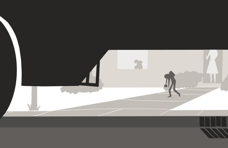
Hey everyone!
I'm working on this "back-to-school" illustration (a little late for this year, haha
 ), but am struggling with the composition. I've narrowed it down to this angle from all of my other thumbnails, but I'm wondering what people think about all of the black space.
Thoughts:
-
I feel like the wheel is needed (left side) to make the school bus obvious so I don't want to crop it out if I don't have to
-
I want the darkness of the street and bus to frame the kid in his long walk, but don't want the viewer to only see black
Thoughts on if this works or how to make it better? Thank you in advance!
Josh
-
-
I like it. I see the black space as reinforcing the dejected black
") mood of the student. I like the sort of mirrored shapes of the negative space under the bus and the bent silhouette. It's a unique view and because of that I like it.
mood of the student. I like the sort of mirrored shapes of the negative space under the bus and the bent silhouette. It's a unique view and because of that I like it. -
@djlambson Thank you! I'm glad the darkness plays into the dejected look of the child. I'm hoping it comes across as funny-ish/cute as opposed to depressing!
-
I think the wheel is a perfect cue that it's a vehicle, although I'm not sure I'm reading bus from the silhouette alone. But the context of the rest of the piece will sell that for you.
I know it's a thumbnail, but the size of the humans vs. the background and the large foreground object is skewed. They look super tiny as is. (although maybe it's a giant bus?) I think a more upward angle from under the bus would help with the foreshortening. Also the amount of space the child takes up between the planes of the underside of the bus and the edge of the curb.
Really cool thumbnail! Love the unique perspective

-
@Elliot Very helpful. Thank you! I see what you mean by using a more upward angle. And yes, I need to work on the child's size/relationship to the scene for sure.
Do you think it would benefit from the child taking up more of the space? I was thinking about cutting him off at the top a little so you just see his dangling arms, but I'm afraid the slouch part would be lost. I'll definitely play around with it.
Thanks again!
-
@JoshuaDages I think making the child bigger would help but I would try to angle it so they aren’t cut off much if at all for exactly the reason you said. You don’t want to lose that emotional energy!
-
@JoshuaDages I like the composition, there seems to be a nice balance of light and darks, I'd just reiterate what @Elliot said about size.
-
@Rachel-Horne Thanks Rachel!