CMYK or RGB?
-
@chrisaakins
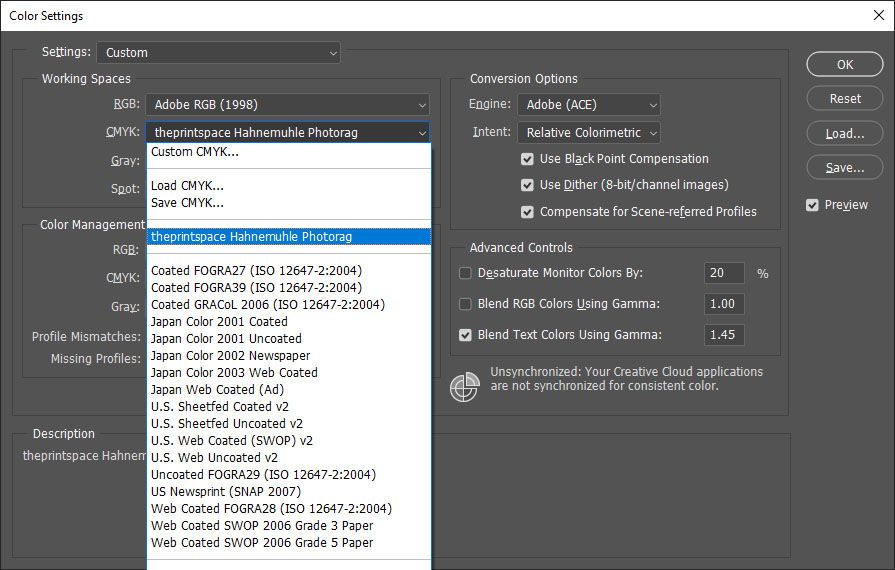
if printing on paper you can load it's paper profile into here to get an accurate look of what colours will print like on your screen.My fave paper is Hahnemuhle Photorag so I check my final against that profile first.
-
@chrisaakins from what I've heard CMYK in Procreate is not that accurate. Perhaps convert your image through Photoshop (or a similar program) before you print.
-
@chrisaakins Don't use CMYK in Procreate. It's not actually CMYK. It's Procreate's attempt at emulating CMYK, meaning it's actually a modified version of RGB that only allows you to paint with CMYK colors. Procreate does not have a true CMYK color profile. This is a known issue by Savage Interactive (the creators of Procreate) that they can't fix without increasing the operating memory capacity of the Procreate App itself. And that's dictated to them by Apple.
When you work in Procreate, always use the color profile "sRGB IEC61966-2.1". It is the most commonly used form of sRGB out there. The other color profiles do wonky things with the white point/white balance of your images when printing. Don't use them unless you're specifically told to...
If you need to create an image for printing, use the "sRGB IEC61966-2.1" color space profile and export it to Photoshop to make it CMYK by changing the image's color profile in that program.
Please note the default "P3" color space profile on Procreate is a color gamut used almost exclusively by Apple products. It was created by Apple to maximize the vivid use of colors for their Retina Screen products. It is not the normal sRGB color space that is used by most other monitors. So if you're creating a color image using the default "P3" color space profile, and your image has a lot of rich reds, red-purples, oranges, intense yellows, or yellow-greens, the likelihood that those colors will become slightly de-saturated on different monitors is pretty high. Much like the Adobe Color profile that favors blues and greens, "P3" favors colors on the other end of the gamut. Lots of people have problems when creating color images using Procreate that then become less vivid and less colorful when viewed on anything other than an iPad or another Apple product.
In other words, don't use "P3" if you're trying to get something printed, either.
One last thing: If you're sending off your image to have it printed professionally by someone else, make sure that printer service actually wants a CMYK image. Many printers nowadays actually want images sent to them in sRGB, so their own printer software can translate the color profile itself for their machine's specific printing calibrations. Just an FYI.
Children's Illustration Portfolio: https://www.coreyartusillustration.com
Art Portfolio: https://www.coreyartusimagery.com
Mastodon: https://mindly.social/@Coreyartus
Pixelfed: https://pixelfed.social/Coreyartus -
@Coreyartus this is very informative
-
@Coreyartus oh wow thank you so much for this info - it really explains a lot of the "problems" I've been having with color while working in ProCreate! I super noticed the difference between P3 and looking on a screen literally anywhere else and I'm super glad to know what the problem is now!
-
@Coreyartus Thank you so much! This is very helpful and informative!
-
if you are sending the file to a printing service, ask them what they prefer. Many printing services prefer RGB as their RIP will convert the file properly for their workflow. Sending a CMYK file when they need RGB can change the colors for your final print.
-
@Coreyartus Thank you! Super helpful!!
-
So I actually had a similar question a while back and @Coreyartus helped a lot with the info.
@chrisaakins I actually just finished a chapter book illustration fully on Procreate using the "sRGB IEC61966-2.1" color profile and converted it to CMYK in Photoshop. Unfortunately, I'm still learning so many of the layer blending modes in Procreate translated very differently on Photoshop (and in this particular project, I used a lot of blending modes) so it did take me a lot of time to fix it in PS while maintaining the layers.
If you flatten out these layers and convert it to PSD CMYK, it works pretty well, but independently the layers act wonky.
It wouldn't have been so much trouble if the client had just asked for JPGs but they wanted the PSDs as well (as many publishers would).
Anyone else had this problem before with translating Procreate blending modes to Photoshop?
-
@Neha-Rawat I've seen that exact lament from a lot of Procreate users on the Procreate forums. You're not alone. I fear the export system from Procreate to Photoshop still has a lot of bugs to be worked out. I hear about export problems all the time, and that layers just don't translate well.
They've released the beta for the next update to Procreate to some favored users privately (right now it's called Version 5x). Notably, Nikolai Lockertson (who is a well known Procreate advocate very friendly with the company) did a livestream for LiteBox that featured some of the new features they're working on, and some people have already tried parsing it out to predict features.
I'm personally hoping they actually address the "export to Photoshop" issues that a lot of people keep running into. I myself have had issues sometimes. It's like the layer settings are all off and have to be redone, the layer thumbnails become impossible to read, and I even sometimes have to re-set the blend modes entirely because they don't export over at all and I get multiple layers of "normal". And sometimes they're out of order! It's really really frustrating. You're not the only one. Sometimes it works, sometimes it doesn't. It really needs to stop being a gamble... <sigh>
-
@Coreyartus Ok that's a little comforting to know that it's not me who's totally screwing up the process and a little annoying that the feature is not already foolproof. Which is making me consider investing in a cintiq because I don't want to do double my workload because of Procreate but I also love the onscreen experience

-
@Neha-Rawat You could try Sidecar, maybe? To connect your iPad directly to your Mac computer and use Photoshop? That's part of what it's there for. It works better if you turn off all the other programs you're running, and don't use the Bluetooth option to link them, but in the end you get a close approximation to a Cintiq. I can't use it because the Photoshop interface takes up so much of the on-screen real estate of my iPad, it feels like I'm drawing on a playing card... <sigh> But it might not feel that way for you.
Of course, that option wouldn't work if your computer is a PC. Sidecar won't work.
I'm also thinking I need a Cintiq soon. I just need a bigger screen, and want to draw more with my whole arm. I love the iPad dearly, but I am drooling over the larger 24"/32" screens... Someday.
")
-
@Coreyartus I wasn't aware of Sidecar. Thanks! I'll check it out!
-
@Coreyartus Thanks so much for this! It's so informative and answers so many questions that I have since learning procreate!