Ink Fairy WIP
-
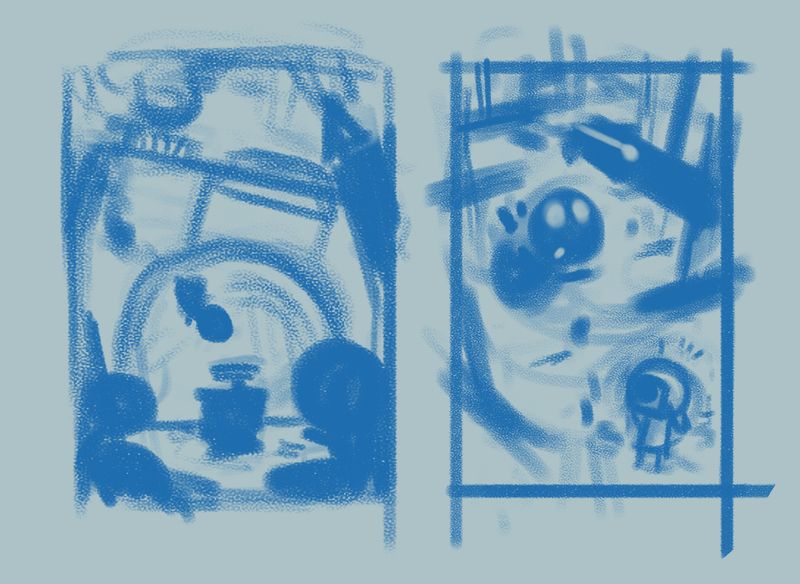
Tried to adjust the composition and add some foreground ink fairies warning the one entranced by the ink pot. I think it gives it a bit more life and more of a story (thanks @Heather-Boyd). Added another concept of the ink fairy flying towards pens that have been hung up by Ellie in an effort to take a picture while the fairy is focused on the pens.
-
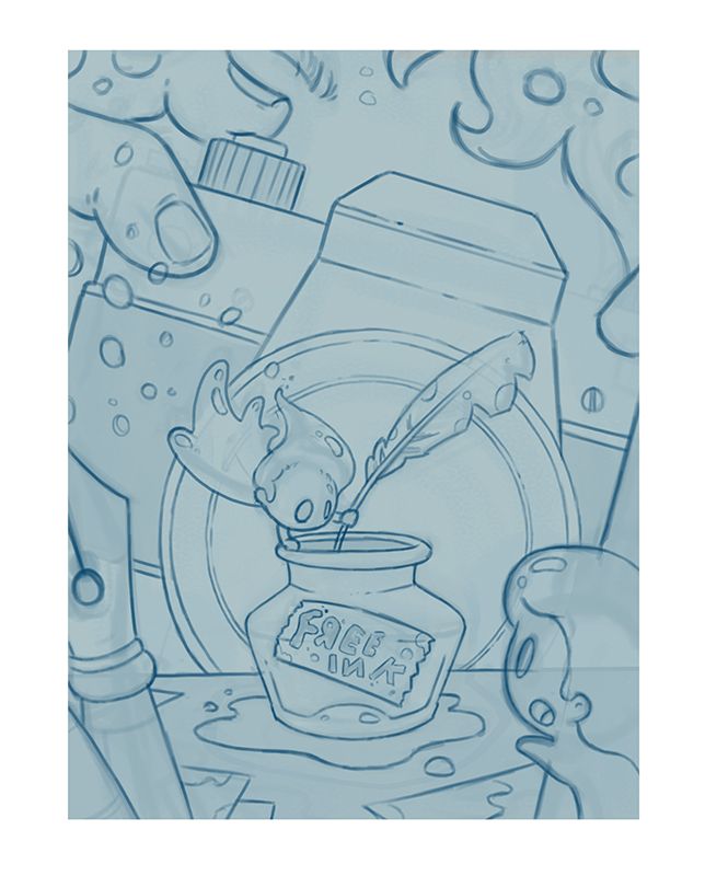
@Gary-Wilkinson you are right 3 is most clearly recognizable and it's adorable. 2nd one is harder to pin point, I like 1 but it comes across more like a gas creature (that pokemon lols). There is more recognizable elements in the 3rd one. Perhaps re-work 3rd and see how far you can push it without entirely loosing it.
Also I understood the ink fairy was going to be in the lower middle of the page. It still comes across to me as very center like a vertical reflecting, what's on one side is roughly the same on the other side.
-
@Gary-Wilkinson both are great improvements. The 1st one has nice diagonal line adjustments (camera and I assume the photographer girl). It also gives the feeling of underwater (but that may be because you did it in blue and the ink fairy going towards it looks like a fish swimming towards the bottle) lols. Did you know there was such a thing as an ink-fish haha.
I think both have an increase of excitement, energy and movement -pushing us towards a more engaging feeling.
I can't clearly identify the hanging pens in the 2nd work thumbnail, I see rafters but that's easily fixable.
-
@Gary-Wilkinson I like number 3 she is so cute.
-
@Gary-Wilkinson I don't think #3 is too boring and I think it reads really well. #1 read way too much like a ghost, and #2 I don't think the wings translated to "fairy" off a first read.
-
Love the second thumbnail! But after the last critique arena they talked a lot about not centering the composition.
-
I like the 3rd blue one just because you varied the 2nd one from being so perpendicular to the edge. I would just watch out for size variation in the dark shapes. I like the concept though.
The pens in the air idea is a little hard for me to imagine. Maybe you could pull it off but it’s not as clear of an idea as the other one. I love your style. -
@Gary-Wilkinson i like the composition in 2 but I love the concept in 1.
-
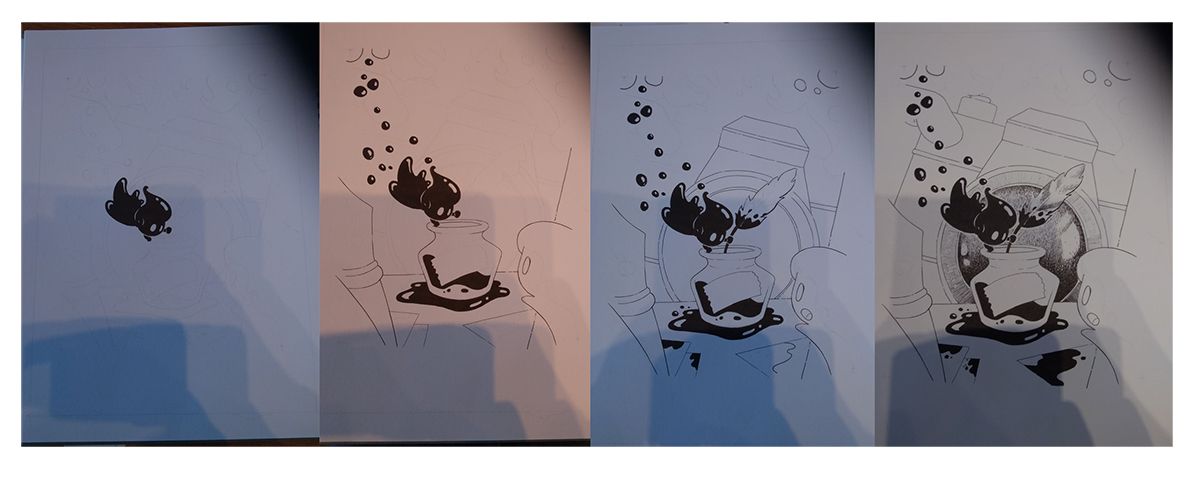
Had a little time to jump back into it. Now I need to find out how to best ink it.... If there are any big issues or areas that can be improved feel free to point them out
-
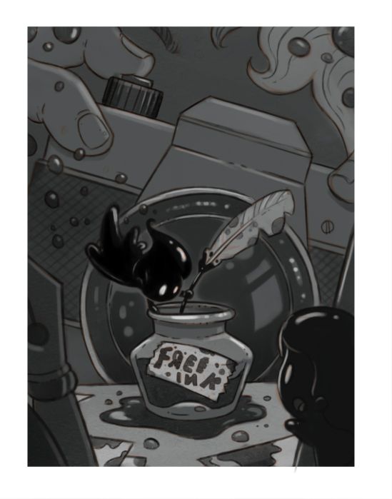
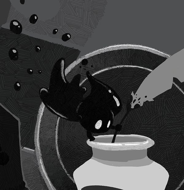
Did a mini paint of the idea i'm thinking of and a value study. when I "ink" it up ill try to add some pen textures to give it less of a digital feel and add some more lighter values. I stopped doing gradually value studies a while ago so it feels a little tough getting back into the fundamentals
-
@Gary-Wilkinson wow this is a really nice piece I love you character design on the fairy! Can’t wait to see it finished

-
@Gary-Wilkinson This is so sweet!
-
I like it! Maybe the background behind the character can be a little lighter for better readability of the character?
-
@Gary-Wilkinson said in Ink Fairy WIP:
Did a mini paint of the idea i'm thinking of and a value study. when I "ink" it up ill try to add some pen textures to give it less of a digital feel and add some more lighter values. I stopped doing gradually value studies a while ago so it feels a little tough getting back into the fundamentals
little suggestion in term of values to let your main "target" pop out more.
left the original, right side the "paintover"

-
@Molambo Thank you for taking the time to do a paintover. That should really help it pop!
-
@Gary-Wilkinson Aw man, we had similar concepts and compositions but you beat me to it and did a FAR better job than I would have
 I LOVE it!
What are you thinking of for finish? Straight black and white with hatchy gradients, or a nice ink wash effect?
edit holy crap it's September 26th. I thought I had more time this month

-
@Braden-Hallett I was thinking of some cross hatching, but wondering whether it's working or not. Made a start on rendering it, as a bit of a test, but still got a bit to go (hopefully before the end of the month..)
EDIT - Thinking about things with a fresh eye, I think i'm going about this the wrong way and i'll try and ink it traditionally
-
@Gary-Wilkinson is the deadline on the 30th?
-
@ambiirae unfortunately so

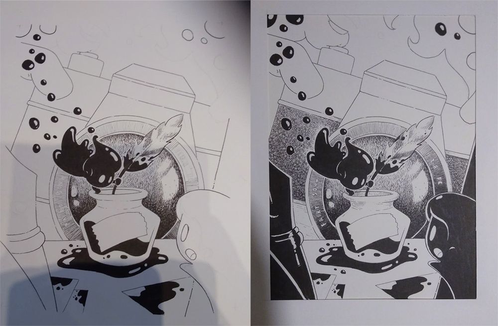
Decided to pull out the ol' sketchbook and start working non-digitally. I forgot how tense it can be when everything is permanent... Haven't inked in years too so most of it is guesswork but slowly working my way there.
-
Another step forward to completion. Need to decide how best to tackle the upper area. I tried to give the body of the camera a slightly rough texturized look which I think is working somewhat. 2 days left