Society of Visual Storytelling

    SVSLearn Forums

    • Register
    • Login
    • Search
    • Recent
    • Tags
    • Popular
    • Users
    • Groups
    • Search

    Ink fairy polishing advice?

    Contest
    6
    8
    426
    Loading More Posts
    • Oldest to Newest
    • Newest to Oldest
    • Most Votes
    Reply
    • Reply as topic
    Log in to reply
    This topic has been deleted. Only users with topic management privileges can see it.
    • Cayleen
      Cayleen last edited by

      Okay, my private critique group (my kids) is split on which finished version they prefer. Any thoughts? I'm open to suggestions and advice about better value use or composition too!

      Thanks!

      Which version do you prefer...

      'Glowing girl' (my attempt at trying to highlight the girl and fairies more):Screen Shot 2020-09-24 at 5.50.46 AM (2).png

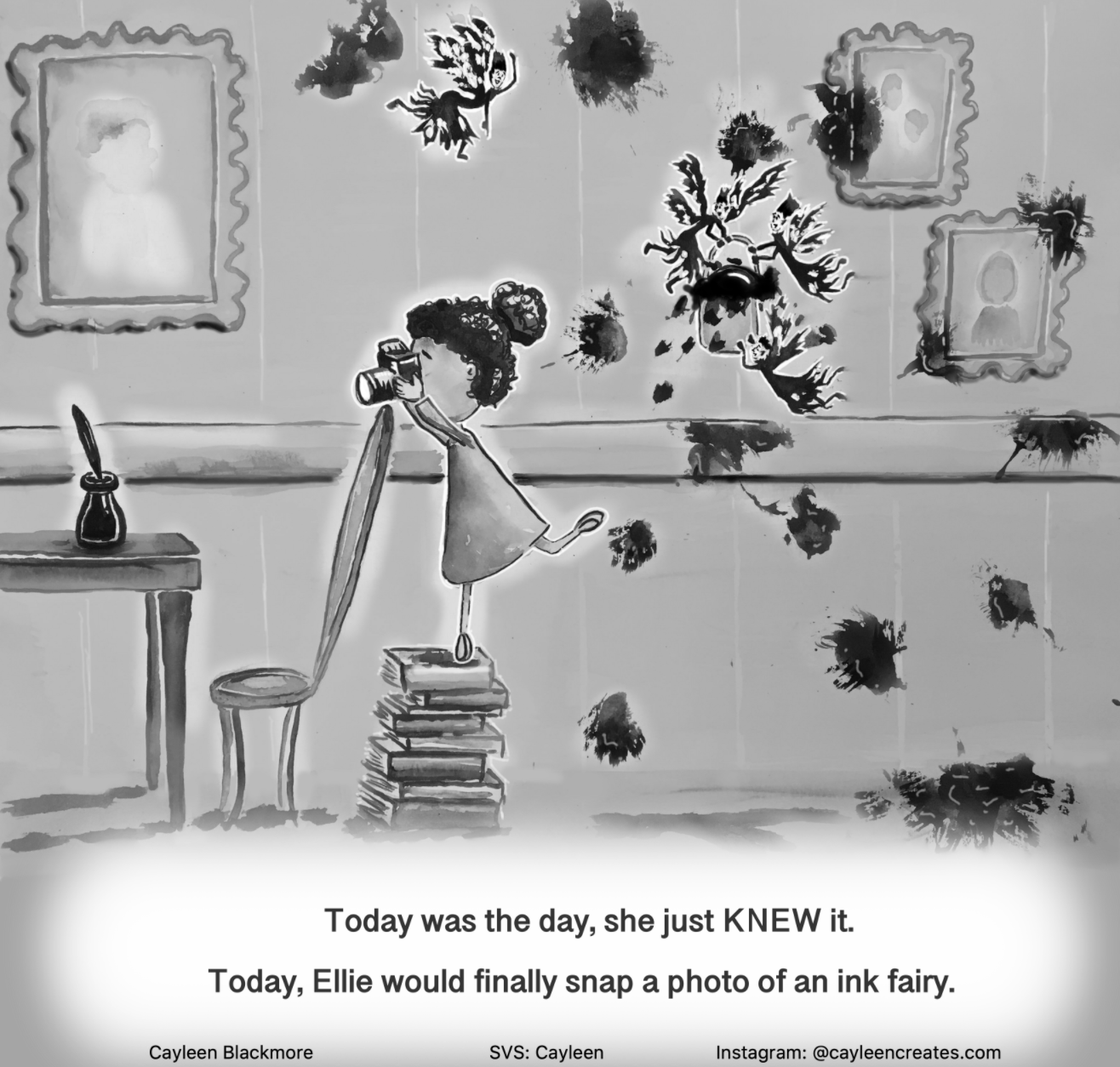
      Or 'Dark Edge' (trying to heighten the contrast while not fading out the background as much):
      Screen Shot 2020-09-24 at 7.57.59 AM.png

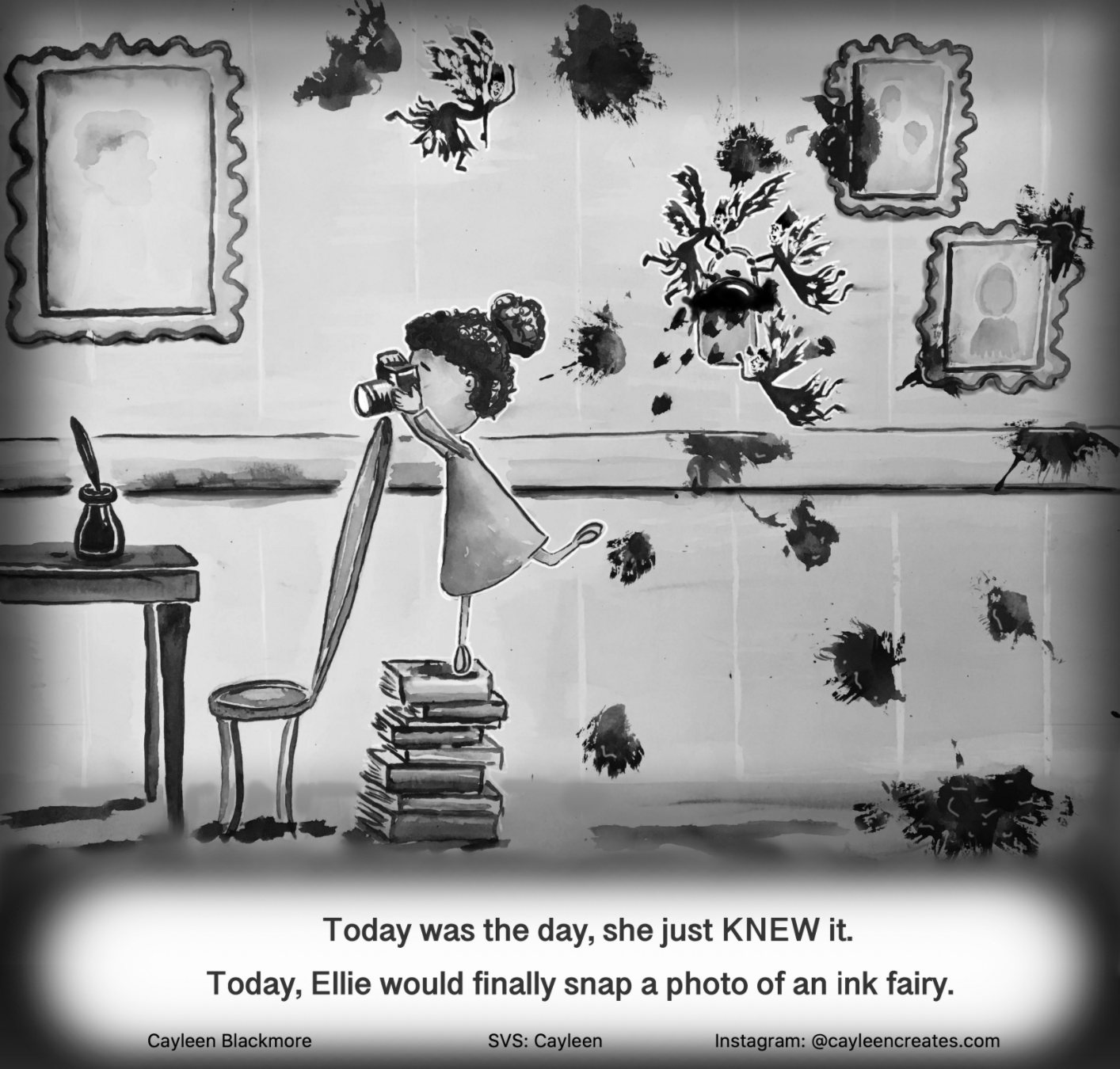
      Or is there just not enough difference to worry about and I should stop tweaking.... 😉 ?

      Thank you !

      Cayleen Blackmore

      cayleencreates.com
      https://www.instagram.com/cayleencreates/

      ambiirae Nyrryl  Cadiz 2 Replies Last reply Reply Quote 0
      • ambiirae
        ambiirae @Cayleen last edited by

        @Cayleen I'm leaning towards the bottom one!

        Cayleen 1 Reply Last reply Reply Quote 1
        • mamadraw
          mamadraw last edited by

          I would say the bottom one!

          1 Reply Last reply Reply Quote 1
          • Cayleen
            Cayleen @ambiirae last edited by

            @ambiirae Great, thanks!

            Cayleen Blackmore

            cayleencreates.com
            https://www.instagram.com/cayleencreates/

            1 Reply Last reply Reply Quote 0
            • demotlj
              demotlj SVS OG last edited by

              If I'm not too late to add my opinion, I also vote for the bottom one.

              Laurie DeMott
              instagram.com/demotlj

              1 Reply Last reply Reply Quote 1
              • ?
                A Former User last edited by A Former User

                bottom one but i would get rid of the black soft airbrush borders which i guess should act as some kind of vignette?
                its not needed in my opinion.

                Cayleen 1 Reply Last reply Reply Quote 1
                • Cayleen
                  Cayleen @Guest last edited by

                  @Molambo I was trying to get more focus going to the centre. The original picture is just one value all over, and I wondered if having a darker border might help define where to look. It's so hard working in just black and white! A good challenge though. Thanks for your thoughts!

                  Cayleen Blackmore

                  cayleencreates.com
                  https://www.instagram.com/cayleencreates/

                  1 Reply Last reply Reply Quote 0
                  • Nyrryl  Cadiz
                    Nyrryl Cadiz SVS OG @Cayleen last edited by

                    @Cayleen bottom

                    Portfolio: nyrrylcadiz.com
                    Instagram: https://www.instagram.com/nyrryl_cadiz/
                    YouTube: https://www.youtube.com/channel/UCbJCF1Im8ZO7hpGWTKOJMuA

                    1 Reply Last reply Reply Quote 0
                    • First post
                      Last post