Serious Critique requested for Sept contest.
-
@chrisaakins I thought your piece was funny and I really liked the concept of your fairy. Here a couple of suggestions, I am not sure if they are reasons why they didn't pick your piece or not. Overall your piece feels mostly mid-tones with a few dark tones. I didn't really see the whites very well until I looked really close. Maybe make the background white or add more white somewhere. I also feel like the fairy is cut off at an odd point on their body. I want to see more of it or its whole body. Maybe you could move the whole bottom edge of the composition to show the rest of the fairy's body. I thought your piece was really nice, and what I am saying are just suggestions. It always seems like they pick ones that I would pick, and others I wouldn't pick. It was nice when they critiqued all the pieces a few months back so you could know what could be improved upon or why it wasn't picked.
-
Chris, I’m with you. I’m really deflated right now. I too was believing my piece was stronger. I have strong feelings for their process. Well I realize I’m just venting so I’ll get back on topic.
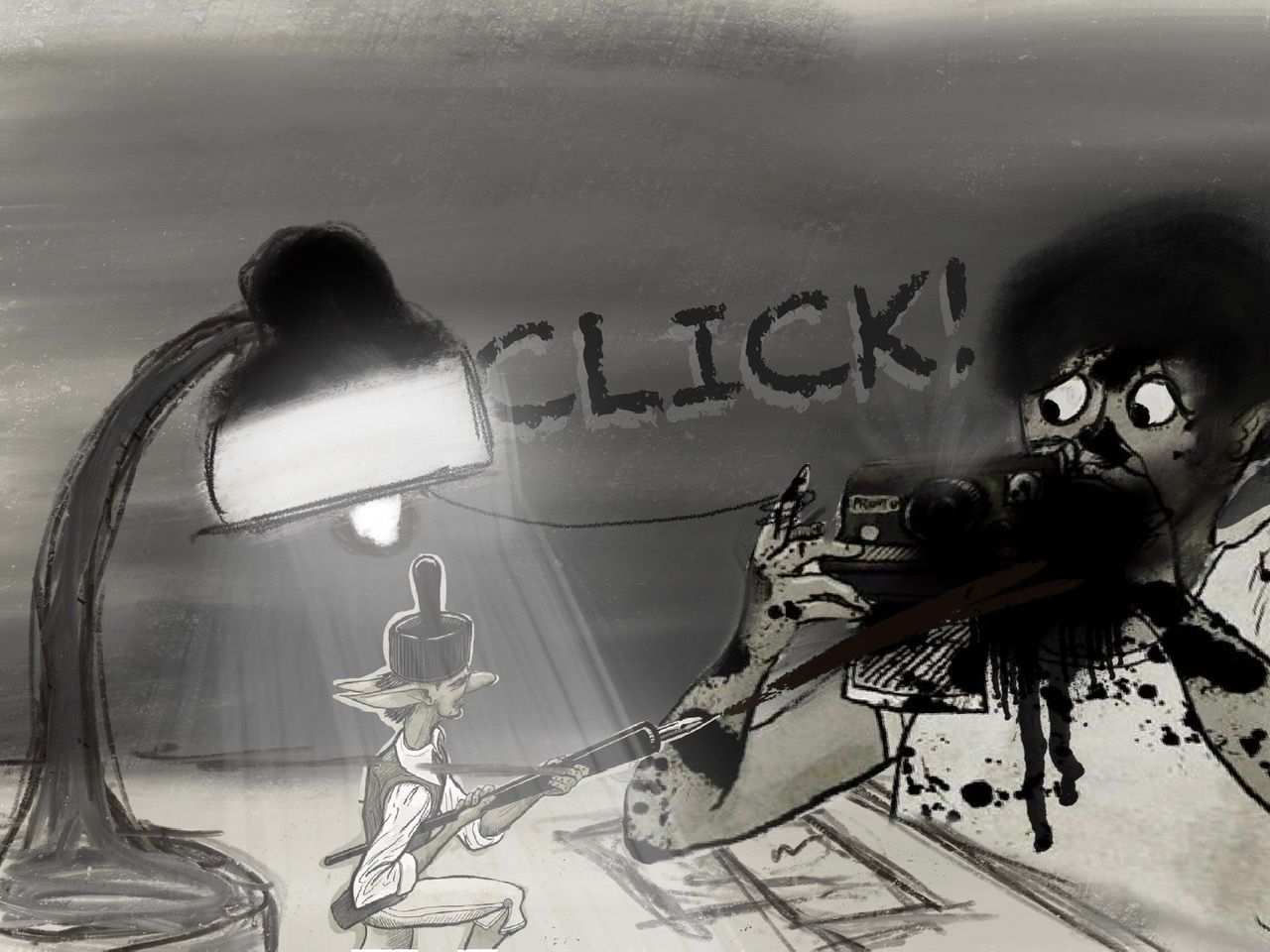
I’m thinking the angle of the ink pen stands out to me, however i don’t know if that is even an issue. He sprayed the ink and it is off it’s path.
I like yours a lot. We may have to just hope they are feeling ours that day. Keep your head up. Your work is great and it is a pleasure going through these trenches with you!
Much love
-
Hi @chrisaakins, I think you have a strong piece and feel the drawing elements are very good.
Personally, I feel like the lamp and table are unnecessary and don’t quite fit in the perspective. For example, the bottom right shows the wall touching the floor, but the lamp looks farther back which is off.
Also, I feel the fairy and pen are too big. Lee likes to preach big, little, small, so I would scale down the ferry and move Ellie slightly.
I ho’pe you don’t mind, but I did a draw over pretending I know what I’m doing (I really don’t), but if it helps a little, I’m happy.
-
@NessIllustration Thanks for saying this "In a background design class, I was told that you should be able to tell who uses a room and what they're like just from the environment." I don't know that I had ever really thought too much about that. It makes complete sense, now I will have to make sure that I do it.
Instagram: https://www.instagram.com/kiminyrose/
-
@Kim-Rosenlof It blew my mind too when I heard it haha! Thank you Nicolas Demers, my background design teacher
") There are so many possibilities. If it's a living room, then are there toys around because the person has a child? A cat tree? Old lady furniture and carpets? Messy with books everywhere? Super modern and clean freak? Is it pink all over? Are there African masks or decorative landscape paintings? You can tell so much from an environment about the people who live there. It can help as an exercise to draw some backgrounds without any characters in them - it's great practice because it forces you to stop using them as a crutch and let the environment do all the talking.
There are so many possibilities. If it's a living room, then are there toys around because the person has a child? A cat tree? Old lady furniture and carpets? Messy with books everywhere? Super modern and clean freak? Is it pink all over? Are there African masks or decorative landscape paintings? You can tell so much from an environment about the people who live there. It can help as an exercise to draw some backgrounds without any characters in them - it's great practice because it forces you to stop using them as a crutch and let the environment do all the talking. -
@chrisaakins
Hi Chris!I really liked your take on the prompt. I think your character design is really good (I love his hat and his style), but I agree with @ajillustrates that he could have used some wings to push him closer to faerie instead of elf--that might have been a big deciding point for them.
For a critique, I'm noticing a couple of things with the composition. The top 1/5th of the image could probably be cropped off since it's virtually unused and doesn't add anything to the image. Also, both characters are the same size in the image (which I believe Will talks about in some of his videos). Since the characters would be dramatically different sizes in actuality, it's might be more interesting to take advantage of that in your composition.
Other than that, I think your values and lines are really good. I look forward to seeing what you submit for next month!
-
@chrisaakins My support systems keeps reminding me it is just their preference. It's frustrating. I always enjoy your pieces and and I thought it was dope. I know we are just trying to close the gap, but its difficult without that guidance. Maybe ultimately I'm thinking it's time to find a mentor. Probably would allow me to take these live critiques punches better. Like I said before, keep your head up and keep putting in that work.
Much love and God bless!
-
Hi @dafoota, love your piece by the way, and best of all, you have a portfolio piece!
Mine was next to yours on the critique (left) side. For my piece, I agree I didn’t have enough value contrast to make it interesting. Hundreds of submissions were entered, but you made the semifinals! That’s HUGE! Don’t get discouraged or disappointed, keep going!
-
@chrisaakins Yeah basically echoing what has been said, I do really think it was a great piece. I would be pretty confident it would do very well when the voting starts it would do rather well in the mix. In terms of community votes, yours was very well upvoted, so to me that's probably one of the better barometers.
I think my only real critique for improvement would be the surrounding area. I almost feel like maybe it would have been stronger with just a white background. Spatially, I think I'd be looking for some other objects around where that lamp and table might be. I don't know why those two things would be in the middle of an empty wall. She's knocking the lamp over, but the plug is behind her, so that table and lamp seems like it's kind of the middle of the floor. I'd either add more to the background to make it feel like a real room or take that stuff out completely and focus on the character (which your faerie is one of the more interesting designs which didn't follow the standard conventions imo).
@ajillustrates I agree with your comments there. It's a bit difficult sometimes to determine because it seems like the criteria sometimes is so broad it leaves way too much room to figure out what the "right" focus is or it's more narrow but despite following the prompt, pieces get pushed through or held back. And after pieces are sorted through and selected, it's not even the people that picked them that do any of the voting. I'm not saying this is a bad way to go; it's just something to bear in mind with this particular prompt/contest.
Something to maybe think about is to have more than one type of prompt (they talked a little about doing a champions battle yesterday), or maybe an ongoing rotating prompt type, for example you could do something like:
- November is a community driven prompt that operates much like they do now where the community is the only party voting. The top entries would be easy to select - it would just be the top 16 or 20 or 24 entries based on number of upvotes on pieces. Lee/Will/Jake/ could still give feedback as they normally do.
- December would be a judge driven prompt where pieces are selected by the judges, voted on and winners are exclusively selected by Jake/Will/Lee.
- January would be a runner's up contest. We'd still have a monthly prompt and everyone is invited to make pieces for it, but the arena would be exclusively a battle between the runners up.
- February could be a champion's arena where the winners battle it out in a similar way.
-
@chrisaakins i think this piece has good foundations. The composition is good, the postures and expressions are alright, the values are working, etc. What I think this piece falls short on is the concept. I’ve seen the concept in many if not most of the other entries. I don’t see anything new. If I were the judge aside from evaluating your use of the fundamentals, I’d also look at your concept, your story. If it’s bland, that’s a point off for me.
-
@Jeremy-Ross Thank you. I really think the mentor part should be my focus. Thank you again for the reminder.