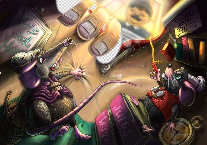
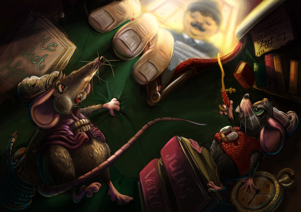
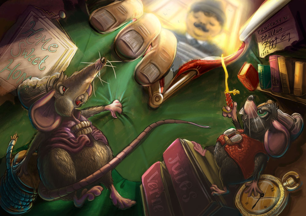
I would love your feedback on my Around the world in 80 days illustration.
-
@Peter-Jarvis Happy New Year to you too!!
-
really nice work, the lighting and the color are great! I could not find anything wrong with the image I think it's very solid!!!
-
Great work! I only noticed that the fingers were fanned out which looks unnatural. His fingers are probably curled as he's opening the bag. When you curl your fingers they angle in towards the middle finger.

-
@Peter-Jarvis haha, nice piece Peter! Love it!
-
Hi Peter, nice piece you're working on, there's a lot going on in this one!
There are a couple of suggestions I'll make, the first being that there may be a bit too much contrast in this. I think dramatic lighting is great, and the sun shining behind the man looks really nice, but the very dark areas contrasted with several areas that seem to be at almost 100% white end up making the overall image look harsh. Maybe play with taking those dark area up a little and adding some blue hues which might contrast really nicely with the warm sunlight coming in. One of Will's pieces comes to mind: http://www.willterry.com/photoswipe.html?imgstart=57
The other thing is that there are a lot of colors going on in here and I wonder if the palette needs to be refined. If you thumbnail this it's hard to see a unified mood or color usage, and accent colors are dispersed throughout the illustration as well, so the eyes isn't drawn to anything in particular. Some of the colors seem to compete or clash with others I think. The bag for example, is the same color as the fingers, there's kind of hot pink with bright red, the mouse on the left's cape is the same color as his skin.
I'm sure others can chime in on color suggestions, but I thought I'd put this out there and see what you and others thought. This is going to be a really nice one when you're done!
-
@gimmehummus thank you so much for taking the time to comment and create the image. I can see where you're coming from and your suggestion is definitely better than my original. I'll make the changes now. Have a great day. Pete.
-
@natiwata Thank you so much for commenting. I agree, there is a lot and the more I worked the idea, I more complicated it looked. I lost my way I think. I can see what you mean regarding the colouring. I am going to work on it and I will re-upload. Thanks for your giving such constructive feedback. It's just what I needed. I will re-upload the amended version soon. Have a great day. Pete.
-
I just want to say thank you for your help on this piece. I have made some changes which I think create a definite inside and outside of the bad. I am just completing getting rid of some to the muddy colours, but with your help, I think it's a far more solid piece of work. I would love to hear your thoughts.

-
@Peter-Jarvis Wow, I loved it before but it is so much more dramatic now! Very nice piece, I know you are proud and you should be!!!
-
@Peter-Jarvis I really like the new version, but I'd be mindful of print. If this is for a book (or a fake book assignment for uni), I'd do a couple of test prints, but things tend to print darker so I'm not sure how lost the image would be printed. Don't get me wrong, it may be fine, it's just something to think about.
Ace
-
@Thrace-Shirley-Mears Thank you so much for your lovely comment. I will keep working it until it's right. Have a lovely day.
-
@Ace-Connell Thank you for your thoughtful comment. I will definitely do some test prints before committing to the design. have a lovely day.
-
@Peter-Jarvis I checked our your portfolio. I love your work. We live pretty close too. I'm based in Hull.
Ace
-
@Ace-Connell - Thank you so much for saying so. I really appreciate that. You've made my day. I have family in Hull. If I am ever visiting, I will let you know and If you're free we could meet to discuss all things art. Hope you are well.
-
I love this! I was going to make a couple of minor suggestions about the original, but I see they've been 'fixed' with the new version - beautiful work!
-
@amberwingart Thank you so so much for your comment. I means a lot. Out of interest, what were the suggestions?. I don't want to take up any of your time. Thanks in advance. Have a great day.
-
@Peter-Jarvis That's no problem at all - I could sit on these boards "talking art" all day, lol... I was going to say that in the original, the purple tail of the rat on the left side and the wand of the other rat both looked flat compared to all of the great detail in the rest of the piece...That was really it - I just love the angle and inventiveness of this! There is one other thing, actually - my eye doesn't understand what the thing holding the left rat's cloak shut is - it looks like teeth...maybe that could be clarified just a bit? It's one of the first thing my eye notices every time I come to the image...Aside from that, I'd say you nailed it with the second pass of this!
-
I still think that the overall contrast and darkness of this image is way too high. Aside from small details and looking at the big picture, if you squint at it you lose the overall forms of the characters. This is due in large part to the fact that they are dark on dark background with very hot spots of light scattered throughout. Also there are a lot of very saturated varying colors.
On the lighting, even just putting out the characters as the closest foreground layer, then the bag, then the outside would help clarify depth and make it more readable.

-
Hi @natiwata. Firstly, thank you for taking the time to give me such amazing feedback and taking the time to edit my illustration. I can see what you mean about the losing the forms when you squint. I will take a look at that. As for the contrast and darkness, I stuck with that as it gave more of a victorian dark, dank atmosphere to the inside of the bag. Plus, as you said in your original comments, it shows a real distinction between the outside and inside of the bag. I'd love anyone else to give input. I know it's a personal piece, but i really want to get it right. Thanks again. Have a great day.
-
This post is deleted!