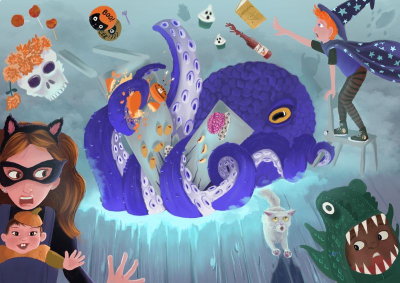
Halloween feast wip
-
Thank you so much @Lovsey! I really appreciate the feedback! Some of the things you mention I had been playing round with myself but hadn’t quite found the right way to implement (widening the crop, darkening the boy) and you’re so right that there isn’t enough threat presented by the kraken and the table dominates when the tentacles/the threat they represent should be more immediate - I will definitely think on how to address that. Good catch on the hole being too regular - another thing I had realised was “off” but couldn’t pin down the why. You’ve given me a lot to think about and work on and I honestly can’t tell you how much it helps!
-
I think I have now gone a bit art blind from looking at this one so I think I need to step back for a few days! Looking forward to looking at what everyone else has been up to! As always any opinions really very welcome! (Not sure why but the quality of the image is low on the main thread but if you click it you go through to a higher quality version - or at least that is how it shows on my iPad)

-
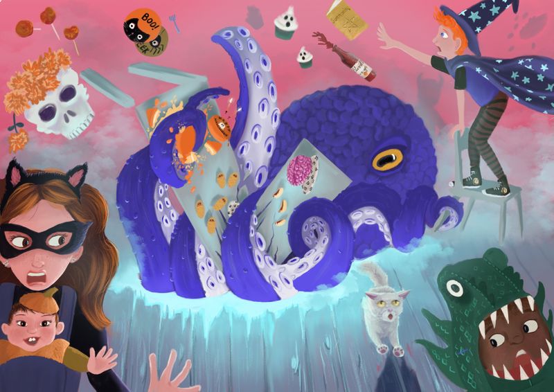
Also, trying out some different background colours - pink??

-
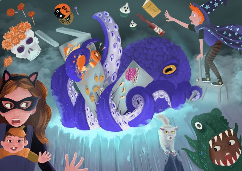
Or something a little darker?

-
@mamadraw I'm liking this darker background more. It seems to give better contrast from the foreground and the background

-
@Jacy13 I see that too, I think it is what I will work with adding in some final touches! Thank you for the feedback, much appreciated!
-
@mamadraw Nice work, I’ve been wondering how you’ve been going with this and it’s looking great! Loving the greater impact of the bigger monster. I prefer the darker background but I also like the contrasting warmth of the pink so I can’t choose between them

-
I like the changes you made! I think it works better as a wider canvas and I also think the dark background works better.
-
Maybe add some more harsher blue lighting on the Octopus creature to make it pop off the dark background a little more
-
@K-Flagg Thank you! Yes, I’ve got some lighting to add still and I’ll definitely look at putting more around the octopus. I sort of imagine it shooting up around it but after a couple of goes already I’m finding it a really delicate operation hitting that fine line between just right and too much! I am working in Procreate atm but I think I need to switch it over to photoshop for this final stretch and get some more nuanced gradients going!
-
@Lovsey Thank you, and thanks again for your feedback, it really gave me some areas for improvement to run with and made all the difference!