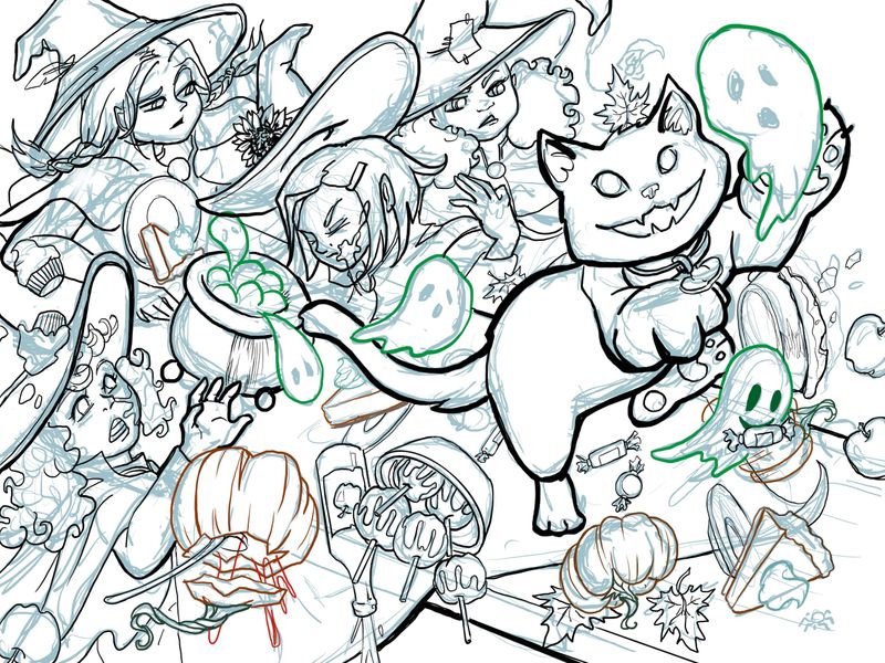
The Feast, its Ruined! WIP
-
I’m still tightening up a few of the lines but is there anything obvious not working that I might not have noticed? Any feedback welcome.

K.Flagg
-
@K-Flagg Wow you are really fast! I think what you have is really nice so far. I would just be careful to organize your shapes and values so that it reads well on the first pass and stays organized even in its complexity. I remember in the Draw 50 Things class, Will Terry talking about chunking values so that things that are complicated can remain simple. Hope that makes sense. If you haven’t seen the Draw 50 things class check it out. It will definitely help to organize your ideas.
-
@K-Flagg I love the concept! Such a great idea. The perspective is looking really cool. I agree with everything kimmypie stated. Be sure to keep the image readable as you continue working on it
")
-
@K-Flagg wow this looking good! I immediately noticed the cat chasing the ghost and the rest read as chaos, which is perfect! A second look shows all the witchy girls in disarray.
-
Nice details and composition layout! I love the expressions on the characters (and the ghost with the candy in its mouth), too!
I also agree with what @kimmypie said in that you want to be careful in how you color this piece, since the focal point is the cat and all. You want to make sure the rest of the work doesn't overpower it, while also making sure the background doesn't look muddied (if that makes sense). Keep that in mind and I'm sure everything will look great!
-
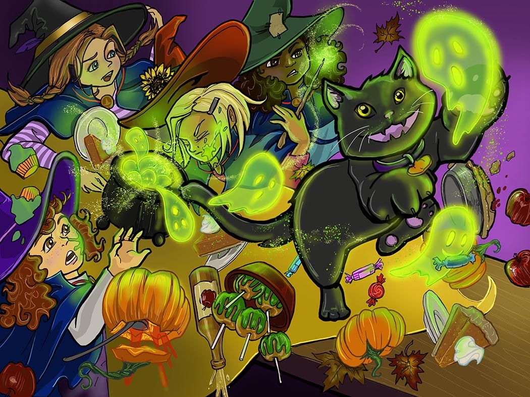
okay it's still pretty busy but it should separate a little better now with colors. Any last minute advice?
K.Flagg
-
@K-Flagg Your coloring does indeed help separate the elements in the image from blending into one another and causing confusion; amazing job with that!
When I look at this piece now, my eyes are torn between looking at the cat and looking at the ghosts coming out of the cauldron. I initially assumed the focal point was the cat because it was the largest and most contrasting character in the initial sketch. Now, however, with the cat not being colored pure-black, I'm unsure about which element to look at first. Currently, I think my eyes are drawn more towards the cauldron. Having either the cauldron or the cat as the main focal point can work, but at present, it feels like both are fighting for my attention. My recommendation would be to (if you want the cat to be the focal point) make the cat's fur color darker and the color of the cauldron lighter (almost swap colors between them). If the cauldron is the main focal point, then I'd experiment a bit: try lightening the fur color of the cat and/or make the cauldron even darker (and maybe add some more contrast between the ghosts coming out of the cauldron, too).
A couple other small color nitpicks; for me, the color of the tablecloth blends a bit too much with the orange of the jack-o-lantern lid near the bottom and with the pumpkin pie slice in the center (behind the cat's tail). Consider making the orange lighter or the tablecloth darker in those areas. (Of course, this might be what you want since these elements aren't the most important to the scene as a whole; in the end, it's your decision)
You've got a great piece here, and it really shows that you put plenty of time and effort into it! Keep it up!
-
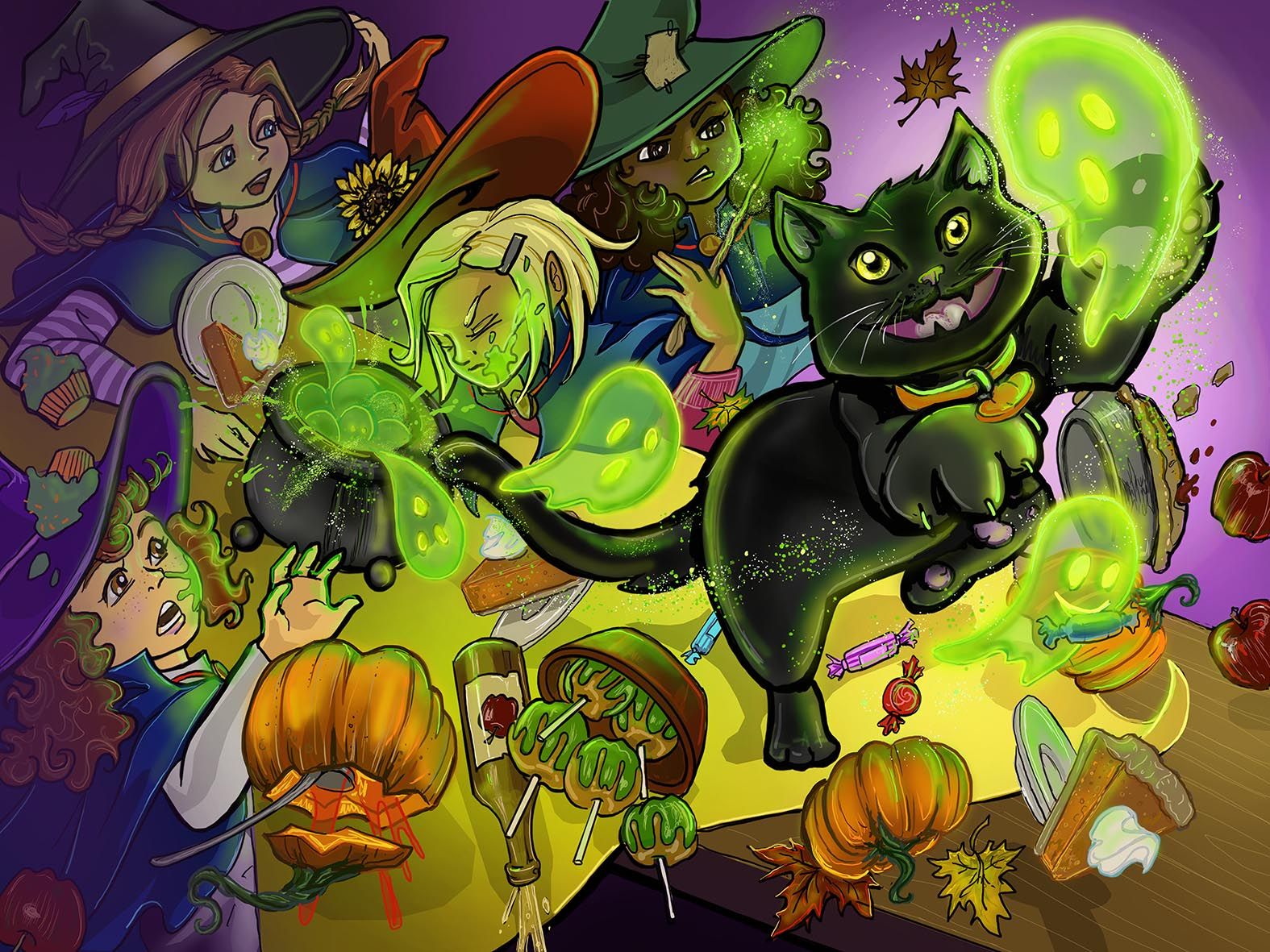
@Jonathan-Malski Thank you! That is very helpful! I did want the eye to go more toward the cat chasing the ghost. I also wasn't quite sure which way to separate the pumpkins from the table cloth more so I will mess with that and see what I can do. Thanks a bunch
-
@Jonathan-Malski I finished the adjustments you suggested and I can't thank you enough. I am much happier with the new version. Thanks for the advice.
K.Flagg
-
@K-Flagg I agree! I think this one looks a lot better! Nice job with the finishing touches, and good luck!

-
@K-Flagg I love all the movement you got into the piece as it makes it feel really chaotic.
Website: http://www.seelliottcreations.com/
Facebook: https://www.facebook.com/SEElliottCreations/ -
@seelliott thank you!