Slovember WIP
-
This post is deleted! -
-
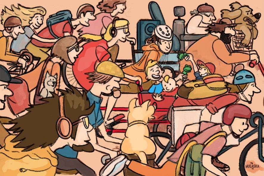
Hi Aska! I really like the colours you've selected for this image, they feel warm and like a big full family! The issue I have with this image is that I don't quite know what to look at. It would help if you made sure that you 'focus person' was the only one not facing right. And maybe you could avoid using blue anywhere and only use it on your "focus" person. Having high contrast around your focus point also helps!
I think the course "creative composition" could help you with this

Hope this helps
-
I really like the organized chaos of this piece. It has a cool graphic quality. If you were interested in developing more of a sense of depth (not sure if you are, so if you aren't, please disregard..) you could consider adding a bit of atmospheric perspective to the folks in the back - make them a little more washed out/less contrast/less saturation so they appear to recede into the background a little.
-
@emergingeden @mcucchi thank you for taking time to analyse my pic. I am thinking now of putting a big blue fluffy bear behind kids or replace kids with a funny fluffy monster... it could be fun
")
-
@aska I have to respectfully disagree with @emergingeden a little bit ( not really but maybe a little?) My eyes are immediately drawn to the kids because they are the only ones facing a different direction. If you wanted to emphasize that more you could do all the riders ina cool palette and do the kids in a warm palette to heighten the interest and focal point. Or vice versa as @emergingeden said. Then the spot of blue sticks out even more.
-
@chrisaakins thank you Chris! indeed, kids are supposed to be a focus point
Thank you for valuable comments. I didn't quite know how to approach color and not loose my focal point. -
I really like spirit of this piece--it's fun, with a bit of a where's Waldo feel! I'm a city person too, so I like people watching and kids causing chaos
.The where's Waldo aspect makes the focus problem extra tricky to work out, though. When I looked at the first black and white version of your sketch, my eye went first to the woman with the headphones (the mom?). She's central and there is contrast between her hair and the headphones. The kids were, in fact, the hardest thing to make sense of. It's already better in color.
Now that the color is laid in, the blue does draw your eye to the boy in the blue shirt and the green to the two boys playing, but it's still kind of hard to tell what's going on. I know that the boy with the red cap is linked to the group because he has a frog, but I can't quite tell spatially whether he is in the cart or not.
Also, the dog in front, though he blends in value-wise, is very central and he has his back turned directly to us. If he were slightly turned, and also slightly less central, he would fit in more naturally. I guess the baby is waving at the dog? (I just now saw that!)
Not sure what I'd do, but maybe move the guy leaning down with the backpack up just a little so you can better establish where the hat boy is (his teeth are currently on a tangent with the backpack), clean up some of the stuff going on behind the boys a bit so it doesn't compete quite as much with them, and then maybe move the dog slightly (to the left?) and turn him a little more, but in such a way as the baby can still be waving at him.
Haha! Easy for me to say! (Now I see the cat looking at the dog, too, and all the eyes turned towards them--fun!) Again, I don't mind the full composition at all, and I love your theme. Just make the focus a little clearer and I think you've got a really good piece.
-
@LauraA hi, thank you! All your comments are very much appreciated! I am still learning how to make a good composition and play with color
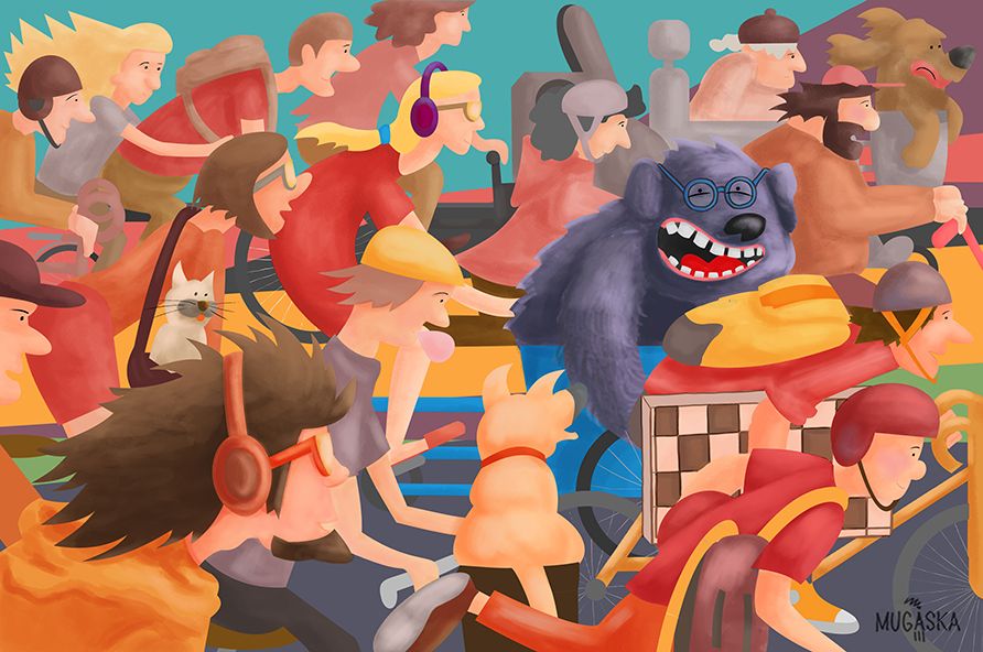
I have created a bit different version today... maybe this will work better? 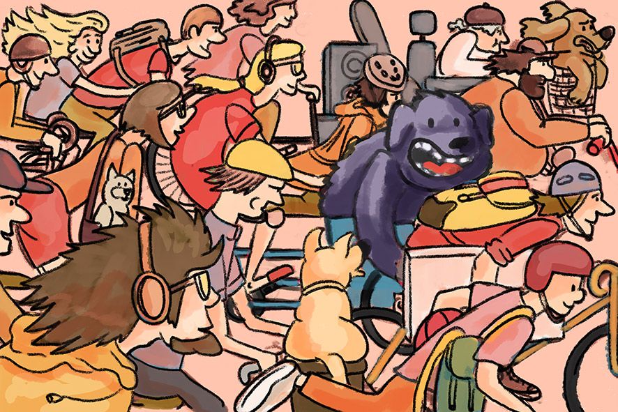
-
@aska Bahahahaha!
 That certainly fixes the focal point problem!
 -
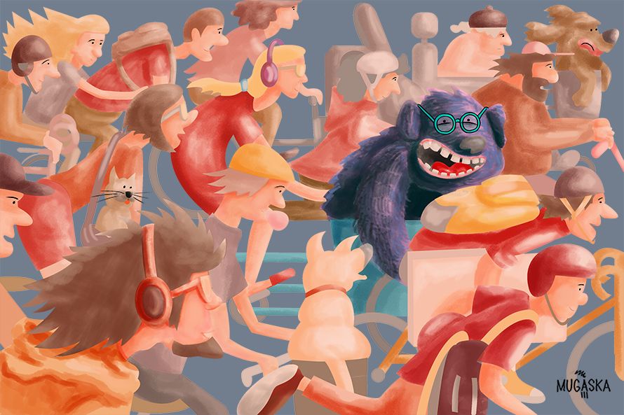
hi guys, I need serious help to finnish this. I feel totally lost about choosing colors and making it appealing... I don't want to use black outlines, but maybe I should? Here I two versions. First one is an experiment. Thank you!
 I
I -
I put it aside for 3 hours. And then I had an idea about background. And so its done!
There is still time left in November, so I open to critiques. 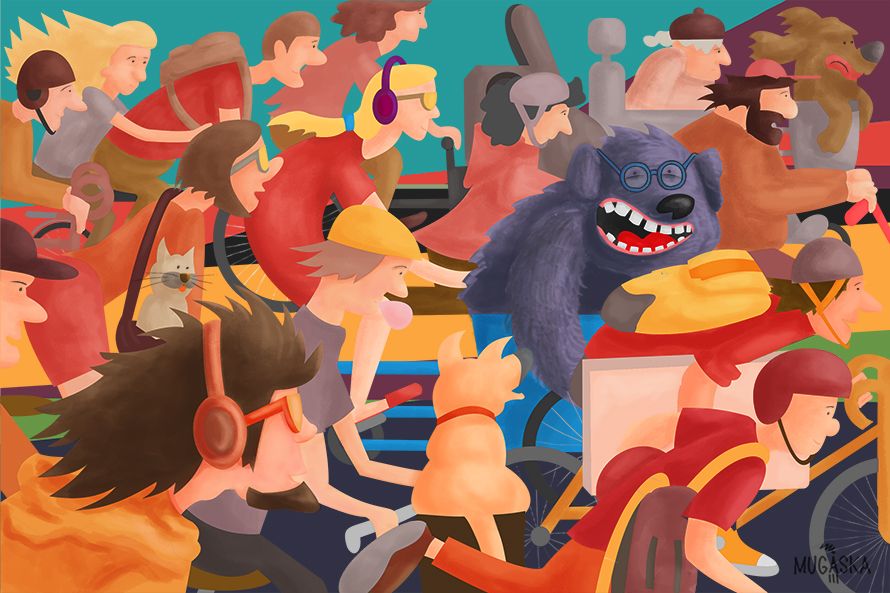
-
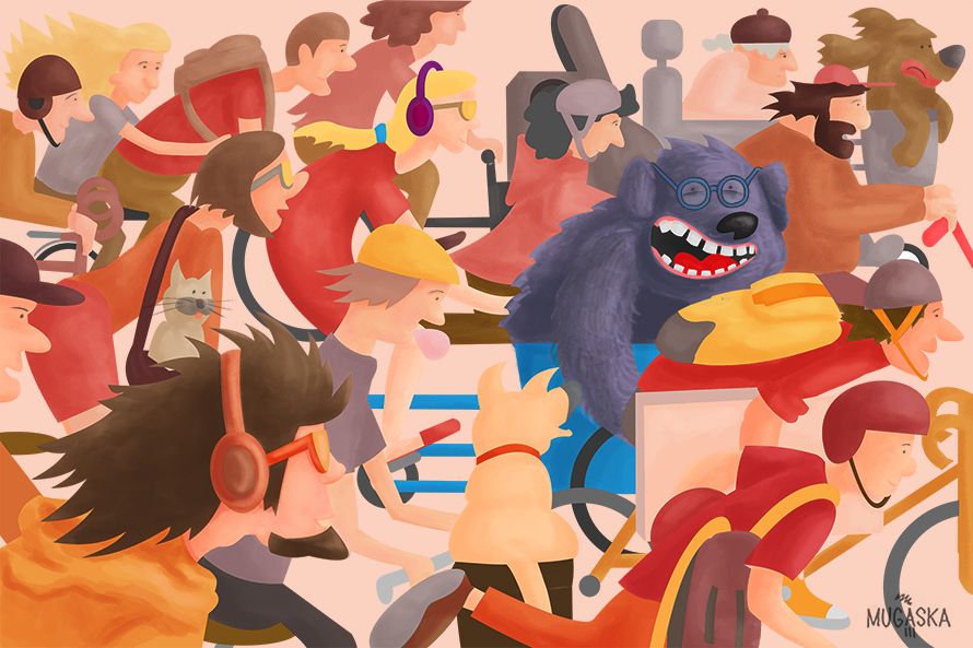
This is really final version
-
This post is deleted!