Feedback needed
-
How can I make this book cover better?
-
@Matthew-Oberdier hi, I’m really sorry but I have very little time so I’ll keep it short and sweet.
-
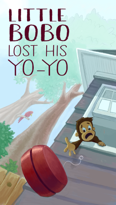
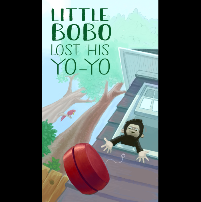
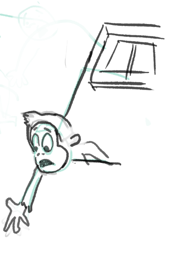
Bobo looks indiferrent. He looks like he doesn’t care he’s losing his yoyo. He even looks like he’s purposefully throwing away his yoyo. Improve his gesture and expression. Give Bobo a devastated/panicked expression. Draw Bobo leaning forward, arms stretched, trying to catch the yoyo.
-
Green title on green background. Maybe choose another bg color to make the text pop.
I’m excited to see where you’ll take this.
Portfolio: nyrrylcadiz.com
Instagram: https://www.instagram.com/nyrryl_cadiz/
YouTube: https://www.youtube.com/channel/UCbJCF1Im8ZO7hpGWTKOJMuA -
-
@Nyrryl-Cadiz THanks for the feedback.
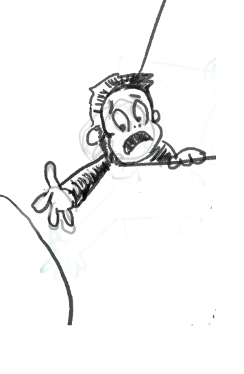
What do you think about this pose?
-
Pose #2
-
I'm a little keen on 2 because foreshortening.
-
@Matthew-Oberdier I prefer the 2nd pose. It definitely feels like he's in distress over his yoyo in this one!
-
@Matthew-Oberdier 2 looks great
-
The first thing I notice is that it doesn’t seem like the yo yo is lost it just seems like he has dropped it. Unfortunately this would probably require a total redesign.
I also noticed that the background is taking up too much of the image. The background is not important and doesn’t add much here and for that reason I think the house and Bobo should be more at the center of attention. Bring them into the composition more. But this may not be necessary if you do a redesign as I mentioned before. Hope this helps
-
@Griffin if the background lacks intertest, seems like the easiest thing to do would be to the add something interesting back there. Personally, I like the balance of the composition and didn't want to make a static, centered comp.
-
It’s not the the background is uninteresting it’s that’s feel like it’s competing a little bit too much with more important parts of the image. After thinking about it some more I think just removing the bird in the tree might fix this unless the bird is an important part of the story
-
Thank you all for the feedback. I'm pretty happy with the finish.