DECEMBER CONTEST: YETI - first sketches - feedback please
-
@Naters-Calderone Thanks so much for pointing this out! going to try it.
-
@doro_thea I love the crutches idea! The forward 3/4 the crutch to the back seems too short for when the shoulder and crutch are in the front. Also the face in the one of him sitting seems a different shape than the rest of them.
-
@Meg-Clayburn-0 thanks for pointing that out, so true. I will need to look at that in the next round of working on it. for now, I worked on colour today.
-
Hi, here are my updates. I worked on the colour and it took me quite a while to figure out what colour the snow could be and how to make the character pop. I looked at some snow by night pictures and really liked the ones where it went into the purple/ blue direction. Do you think it is too purple?
I am super into stencilling that the moment, therefore I basically did digital stencilling. I really like the flatness of this technique, do you think I should add some shadow on the ground though, to make the yeti more grounded?
Anything else that you see that I should be working on?
-
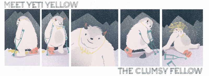
Which one do you like better? with or without the necklace / wording?
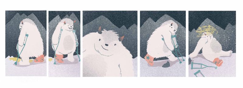
Is it okay if I turn all the poses into a small story strip?

-
@doro_thea without the necklace is better. I'm back and forth on the wording and really like the panel idea! It looks so clean!
-
@doro_thea back to the paneling, I would try not to cut off any part of the character or put it to close to the edge of it creates a tablet and that's where my eye goes. Specifically in the 2nd one, it's barely cuts part of the crutch off and it's kinda distracting, and in the 4th one ours super close to the edge on the right side.
-
@Meg-Clayburn thanks, that is great feedback. I will try to fix it... Is it the letting I used that leaves you unsure, or the wording it self?
-
@doro_thea I really like the way you incorporated all five poses into one piece with an organic approach that makes it look like one image instead of a handful of images slapped on a sheet (like I did lol). Your rendered yetis look so good too! Nice work:)
-
@doro_thea I think it's the lettering. I feel it's kind of distracting.
-
@DaveLeekArt Thank you! yours is stunning though, I love how much character he has!
-
@doro_thea thank you so much!
-
@doro_thea Your yeti is looking too cute! Love what you did with the overall design of the character sheet itself

-
@doro_thea I definitely prefer the yeti without the necklace

-
@Jacy13 that you! and I went without the neckless... I think that it was just me thinking it could be funny at one point...