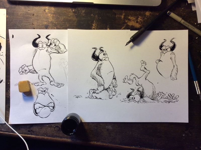
Society of Visual Storytelling

    SVSLearn Forums

    • Register
    • Login
    • Search
    • Recent
    • Tags
    • Popular
    • Users
    • Groups
    • Search

    90's Cartoon Yeti

    Artwork
    yeti character design challenge december
    11
    20
    1961
    Loading More Posts
    • Oldest to Newest
    • Newest to Oldest
    • Most Votes
    Reply
    • Reply as topic
    Log in to reply
    This topic has been deleted. Only users with topic management privileges can see it.
    • shereen said
      shereen said last edited by

      Looks great, great poses too!

      1 Reply Last reply Reply Quote 0
      • Naters.Art
        Naters.Art last edited by

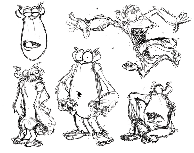
        Here are some more drawings. I'm trying to figure out it's personality. I have two questions for everyone.

        1. Are there any props or costume elements you think I can add?
        2. Should I keep the horns? I'm not sure if they make it look too much like a generic monster.

        IMG_2640.JPG

        my Sketch Blog
        https://www.instagram.com/naters.art/

        L 1 Reply Last reply Reply Quote 6
        • L
          Lorna H @Naters.Art last edited by

          @Naters-Calderone - I LOVE these!!! Your drawing style is just awesome. Lovely to see pen and ink sketches too rather than purely digital. I love the horns so would definitely keep then even if you decide to adjust their size, they give him an edge ๐Ÿ˜I love the falling on his face image, so funny. I canโ€™t think of any additional props at the moment but will mull over. I just wanted to say these are AWESOME and he is adorable!

          Lorna

          www.lornashawart.crevado.com
          www.Instagram.com/lorna_shaw_art

          Naters.Art 1 Reply Last reply Reply Quote 1
          • Naters.Art
            Naters.Art @Lorna H last edited by

            Thanks @Lorna-H I like the horns too but they kind of take away it's "ape" feel.

            my Sketch Blog
            https://www.instagram.com/naters.art/

            1 Reply Last reply Reply Quote 0
            • Naters.Art
              Naters.Art last edited by

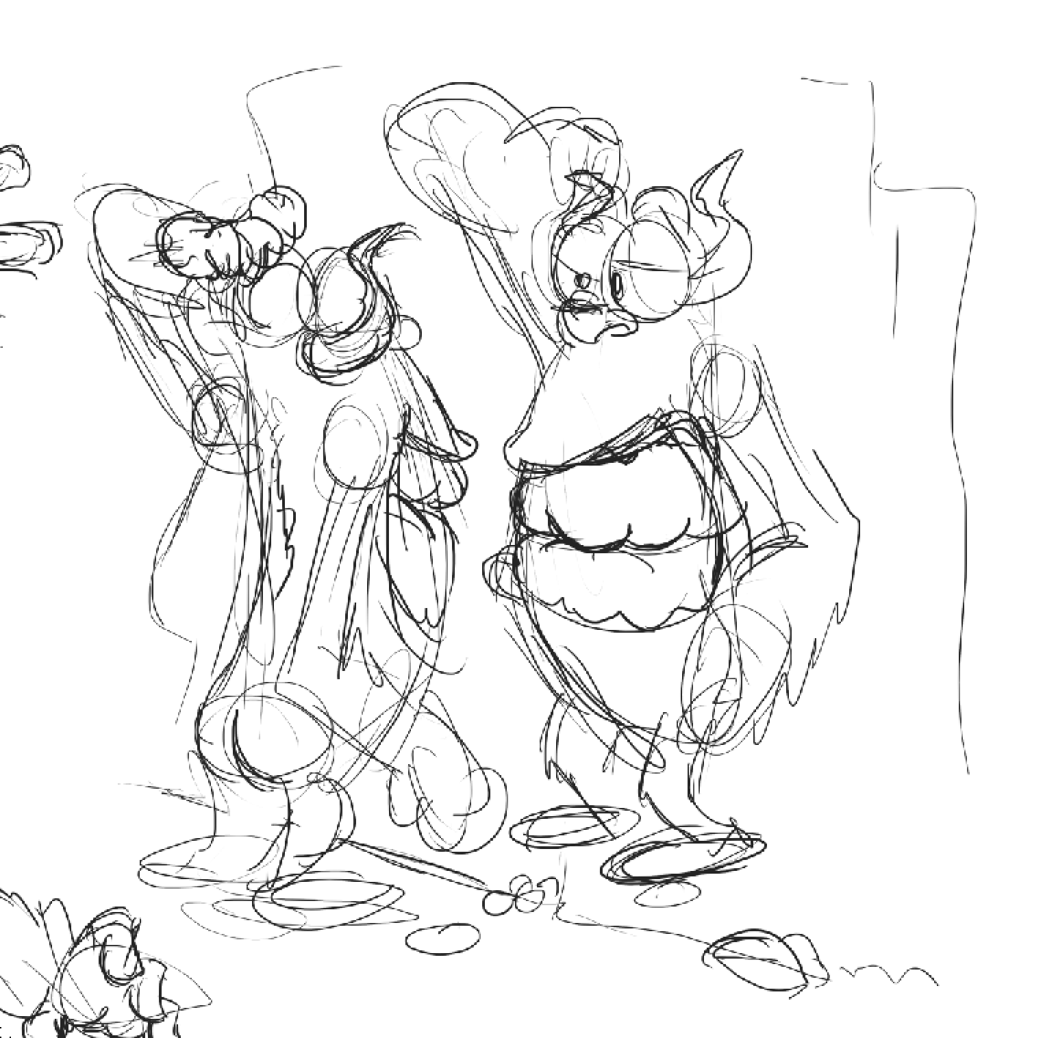
              I'm working on the final layout for the character sheet and I wanted to share a fun idea. It knocks out two of the poses in one image while giving it a bit of personality. It's looking at its reflection in a wall of ice.

              Screen Shot 2020-12-15 at 10.02.52 AM.png

              my Sketch Blog
              https://www.instagram.com/naters.art/

              Georgios Christopoulos 1 Reply Last reply Reply Quote 3
              • Georgios Christopoulos
                Georgios Christopoulos @Naters.Art last edited by

                @Naters-Calderone I think looking himself in the mirror is pretty clever!I don t know if it would work on a concept character sheet, but for a study challenge is a neat idea!
                Also the design is awesome! Ready to give Bugs Bunny a whole lot of trouble! Well done mate!

                Instagram : https://www.instagram.com/g.chris.artwork/
                Deviantart : https://www.deviantart.com/g-chris

                Naters.Art 1 Reply Last reply Reply Quote 0
                • Naters.Art
                  Naters.Art @Georgios Christopoulos last edited by

                  @Georgios-Christopoulos Yeah I was thinking the same thing. It's a fun illustration, but not a great character sheet idea.

                  my Sketch Blog
                  https://www.instagram.com/naters.art/

                  1 Reply Last reply Reply Quote 0
                  • Naters.Art
                    Naters.Art last edited by

                    Alright, here is my sketch layout. I like the poses and the expressions but I feel like its lost its "character" somehow. Or maybe it's character changed along the way. What do you all think?
                    Screen Shot 2020-12-16 at 3.14.36 PM.png

                    my Sketch Blog
                    https://www.instagram.com/naters.art/

                    1 Reply Last reply Reply Quote 2
                    • K.Flagg
                      K.Flagg last edited by

                      I think heโ€™s still got plenty of character. Looks great! I think yours will be one of the most original designs.

                      K.Flagg

                      1 Reply Last reply Reply Quote 0
                      • Naters.Art
                        Naters.Art last edited by

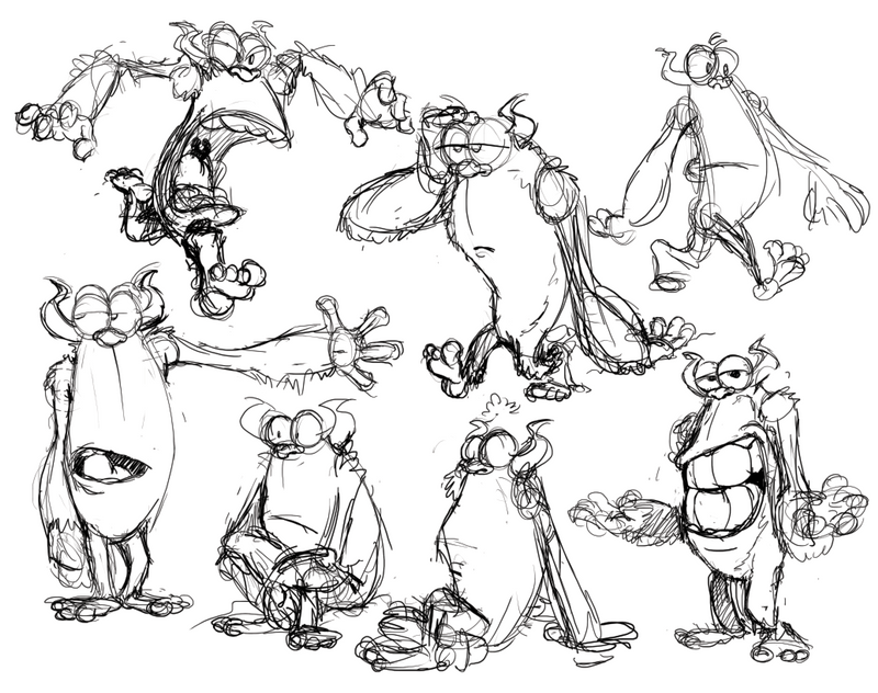
                        Too many more sketches... but I feel like these capture it's personality a bit better.

                        Screen Shot 2020-12-17 at 3.53.27 PM.png

                        my Sketch Blog
                        https://www.instagram.com/naters.art/

                        miranda-hoover 1 Reply Last reply Reply Quote 2
                        • miranda-hoover
                          miranda-hoover @Naters.Art last edited by

                          @Naters-Calderone These look great! I definitely get the 90's vibe.

                          https://www.instagram.com/mirananemone

                          1 Reply Last reply Reply Quote 0
                          • Naters.Art
                            Naters.Art last edited by

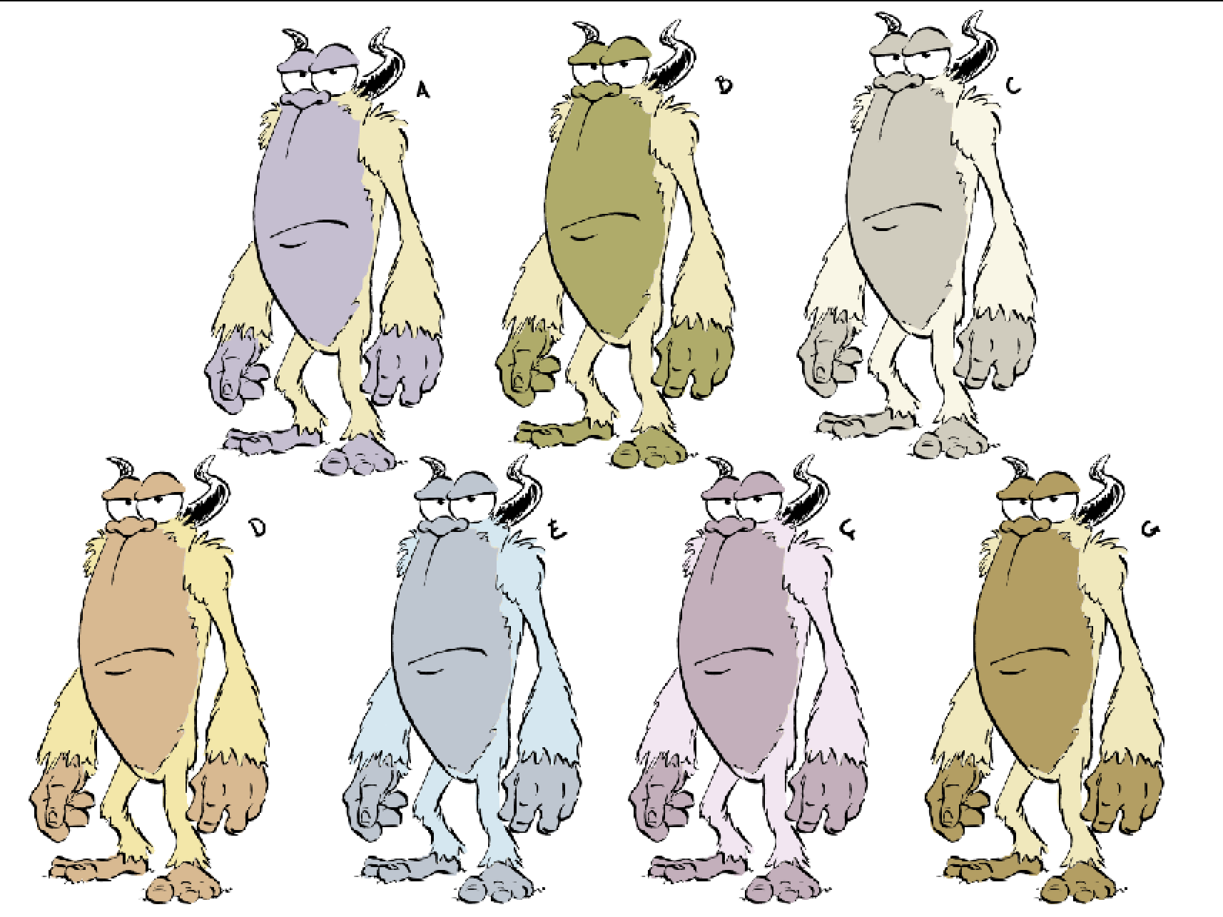
                            Alright I'm working on the color scheme. I'm leaning toward yellow fur like a polar bear. What are your thoughts?
                            Screen Shot 2020-12-21 at 9.03.20 AM.png

                            my Sketch Blog
                            https://www.instagram.com/naters.art/

                            Meg Clayburn Jacy13 2 Replies Last reply Reply Quote 1
                            • Meg Clayburn
                              Meg Clayburn @Naters.Art last edited by

                              @Naters-Calderone I am liking A. I really don't like b. The green accent color makes the yellow fur look like a not appealing green color instead.

                              Meg Clayburn

                              Instagram.com/meg_clayburn

                              1 Reply Last reply Reply Quote 0
                              • Jacy13
                                Jacy13 @Naters.Art last edited by

                                @Naters-Calderone I really like A as well! It's the most visually appealing color scheme to my eyes ๐Ÿ™‚ My 2nd choice would be D.

                                Deviantart: https://www.deviantart.com/jacy13
                                Instagram: https://www.instagram.com/jacy13draws/?hl=en
                                Portfolio: https://jacy13.artstation.com/

                                1 Reply Last reply Reply Quote 0
                                • First post
                                  Last post