Society of Visual Storytelling

    SVSLearn Forums

    • Register
    • Login
    • Search
    • Recent
    • Tags
    • Popular
    • Users
    • Groups
    • Search

    illustrated poster

    Projects
    14
    35
    10698
    Loading More Posts
    • Oldest to Newest
    • Newest to Oldest
    • Most Votes
    Reply
    • Reply as topic
    Log in to reply
    This topic has been deleted. Only users with topic management privileges can see it.
    • Christina Brown
      Christina Brown @Lee White last edited by

      @Lee-White Well I'm so glad that y'all do! It's such a great help!

      I quickly made some adjustments in PS since I was short on time tonight. I think I got the feel of motion down a bit more.
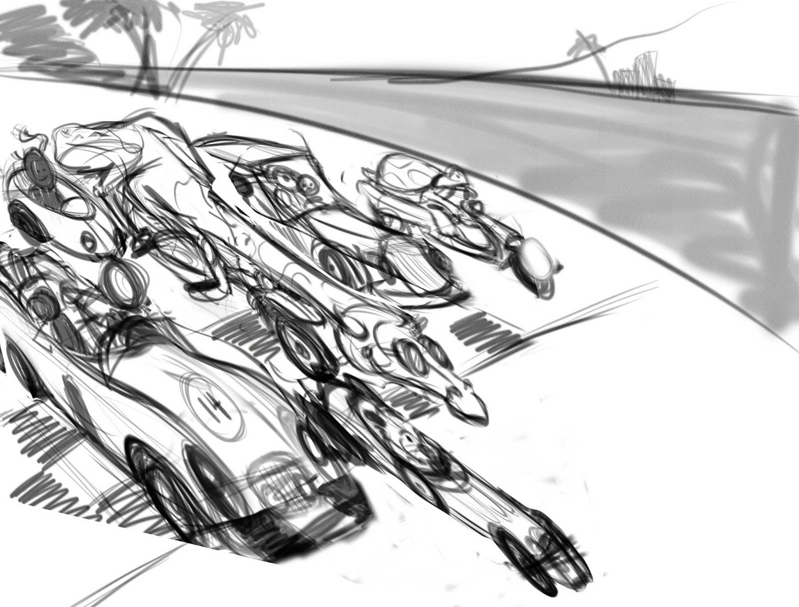
      I did 11 different placement sketches adding in environments. I ended up liking these three, but still question if my original idea is working best. For me, It's between the rock-arch, the close up, and the rocky scene. I found myself drawing dessert environments most lol.
      What do you think?


      Follow me on Instagram and twitter! @christinabdraws
      Facebook: https://www.facebook.com/cbrownillustration/

      1 Reply Last reply Reply Quote 1
      • Christina Brown
        Christina Brown last edited by

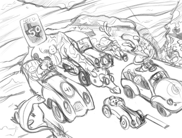
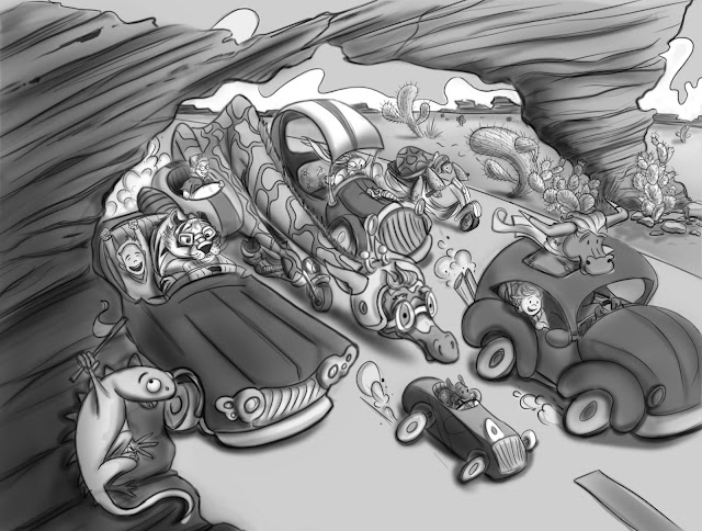
        I decided to go with this. I really like the desert environment i wound up with. I'm going to do one more draw over before I color it. Does anyone see anything I should fix in the sketch before I do? Oh and the round faces are where kids will go, they're just place holders for now.

        Follow me on Instagram and twitter! @christinabdraws
        Facebook: https://www.facebook.com/cbrownillustration/

        1 Reply Last reply Reply Quote 1
        • Christina Brown
          Christina Brown last edited by

          @Lynn-Larson, Hey Lynn! Do you have any suggestions for this? Anything sticking out at you that I should fix?

          Follow me on Instagram and twitter! @christinabdraws
          Facebook: https://www.facebook.com/cbrownillustration/

          1 Reply Last reply Reply Quote 0
          • Lisa M Griffin
            Lisa M Griffin last edited by

            I love seeing the progression of your work. It looks really lively/engaging! The change of the environment is great, as is the addition of the little lizard looking over the rock ledge. Is the giraffe on a motorcycle? For me, the speed limit sign is a bit distracting, but that may be a non-issue once you go to color... currently my eye glances off in that direction - possibly due to the wording and large/knocked out copy of the #50.

            instagram: lisamgriffinart

            Christina Brown 1 Reply Last reply Reply Quote 0
            • Christina Brown
              Christina Brown @Lisa M Griffin last edited by

              @Lisa-Middleton-Griffin Thank you! Its so helpful to have fresh eyes of another artist to help with your work. Really grateful for your comment! I was wondering about the sign. The client wants a sign or something indicating that this place is Texas. I'll move it around or get rid of it, and i'll post my updates soon!

              Follow me on Instagram and twitter! @christinabdraws
              Facebook: https://www.facebook.com/cbrownillustration/

              1 Reply Last reply Reply Quote 0
              • Beatriz "Bett"
                Beatriz "Bett" last edited by

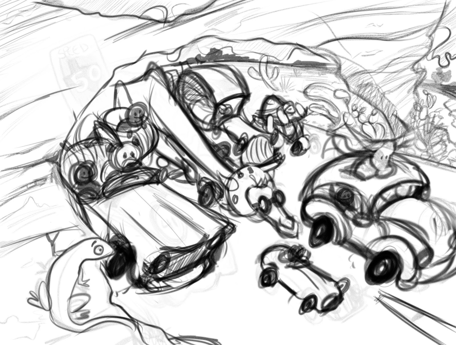
                I love your poster. My only comment goes with Lee's original comment about leaning the cars and characters forward for the illusion of speed. Your cars look like they are leaning backward or standing still, so my impression is that it is a traffic jam not a race. I'm just a beginner, but I hope this helps.

                NoWayMe Christina Brown 2 Replies Last reply Reply Quote 0
                • NoWayMe
                  NoWayMe @Beatriz "Bett" last edited by

                  I agree with @B-Macia, I think the piece is great, but I would definitely lean the cars foward!

                  And also, you moved your original point of view to more of a "top view". I think it can work, but I feel it might be better to lower your camera angle a bit and overlap the cars more. It would add depth to your image I think... I hope this is clear...

                  Great illustration though!

                  noemiegionetlandry.squarespace.com
                  noemie_illustration on Instagram

                  1 Reply Last reply Reply Quote 0
                  • Christina Brown
                    Christina Brown @Beatriz "Bett" last edited by

                    @B-Macia @NoWayMe Thank you both! I did a messy sketch over and lost the sign. What do you all think now? I know i need to improve the sketch, just seeing if it look right in the skeleton stage? If the idea looks good, i'll start refining it. I really want to move on to color!

                    Follow me on Instagram and twitter! @christinabdraws
                    Facebook: https://www.facebook.com/cbrownillustration/

                    1 Reply Last reply Reply Quote 0
                    • Beatriz "Bett"
                      Beatriz "Bett" last edited by

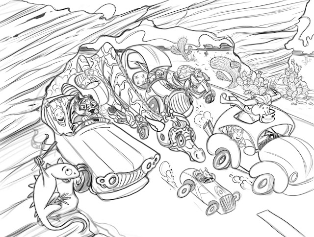
                      I like the composition and the viewpoint. I've got to say, the giraffe cracks me up. Did you ever hear the old Bill Cosby routine about the baby buggy races? This reminds me of that. Look it up on YouTube, it is hilarious! Every car had its own theme music, Batman, The Green Hornet, etc.

                      Christina Brown 1 Reply Last reply Reply Quote 0
                      • Christina Brown
                        Christina Brown @Beatriz "Bett" last edited by

                        @NoWayMe and @Beatriz-quot-Bett-quot
                        Thanks for your advice! Here's my final sketch before I move on to color. Will Terry's "There Once was a Cowpoke" illustrations inspired most of this, the giraffe was my own idea though. Excited to get to coloring! I'm also going to paint it Will Terry's 10 steps. Let's see if I can!

                        Follow me on Instagram and twitter! @christinabdraws
                        Facebook: https://www.facebook.com/cbrownillustration/

                        1 Reply Last reply Reply Quote 4
                        • Christina Brown
                          Christina Brown last edited by

                          Applied cast shadows, occlusion shadows and tone...

                          Follow me on Instagram and twitter! @christinabdraws
                          Facebook: https://www.facebook.com/cbrownillustration/

                          Jiří Kůs 1 Reply Last reply Reply Quote 1
                          • Jiří Kůs
                            Jiří Kůs @Christina Brown last edited by

                            @Christina-Taylor-Brown The rock will probably cast some shadow too 🙂

                            Follow me on
                            https://www.instagram.com/yiri_kus/
                            http://yirikus.tumblr.com/
                            https://www.facebook.com/yirikus/

                            1 Reply Last reply Reply Quote 0
                            • Christina Brown
                              Christina Brown last edited by

                              Ah! Thanks! Almost forgot that!

                              Follow me on Instagram and twitter! @christinabdraws
                              Facebook: https://www.facebook.com/cbrownillustration/

                              1 Reply Last reply Reply Quote 0
                              • Christina Brown
                                Christina Brown last edited by

                                Color tests: I'm having trouble deciding. Can anyone help me pick?

                                Follow me on Instagram and twitter! @christinabdraws
                                Facebook: https://www.facebook.com/cbrownillustration/

                                1 Reply Last reply Reply Quote 0
                                • Lee White
                                  Lee White SVS Team SVS Instructor Pro SVS OG last edited by

                                  These are looking good. Although I might suggest going back to the value stage and working that out a bit more. If you turn off your line layer, you will see that your have mostly middle greys without real darks and lights. Think about local tone a bit more. Some cars will be dark, and some cars will be light. Then the lighting pass gets added on top of those values, but you never lose that value structure.

                                  SVS Faculty Instructor
                                  www.leewhiteillustration.com

                                  Christina Brown 1 Reply Last reply Reply Quote 0
                                  • Christina Brown
                                    Christina Brown @Lee White last edited by

                                    @Lee-White Thank you ! I was wondering about that. When I do values, I'm always scared to go too dark. I really need to work on that!
                                    Here's what I've got and i'm happy so far. I normally work traditionally, so this is probably my third attempt at a digital piece.

                                    Follow me on Instagram and twitter! @christinabdraws
                                    Facebook: https://www.facebook.com/cbrownillustration/

                                    1 Reply Last reply Reply Quote 1
                                    • Stephanie Hider
                                      Stephanie Hider last edited by

                                      This looks so fun!

                                      http://stephisdoodling.com
                                      http://stephaniehider.com
                                      https://www.instagram.com/stephhider/

                                      Christina Brown 1 Reply Last reply Reply Quote 0
                                      • Lynn Larson
                                        Lynn Larson SVS OG last edited by

                                        Oh girl, this is so amazing!! I love the whole feel of it!! The only thing was the speed limit sign, and it looks like you took care of it! I like color study #4, everyone knows red cars are fastest hehe

                                        https://instagram.com/lynnlarsonart/
                                        https://twitter.com/lynnlarsonart

                                        1 Reply Last reply Reply Quote 0
                                        • Naroth Kean
                                          Naroth Kean last edited by

                                          that looks really good

                                          http://narothkean.com
                                          https://twitter.com/narothkean
                                          https://www.instagram.com/narothkean

                                          1 Reply Last reply Reply Quote 0
                                          • bharris
                                            bharris last edited by

                                            I really like your design, you've done a great job problem solving! Personally I'm liking number 2 and number 4 for your color tests.

                                            www.brittanyharrisillustration.com/
                                            www.instagram.com/britillustration/

                                            1 Reply Last reply Reply Quote 0
                                            • First post
                                              Last post