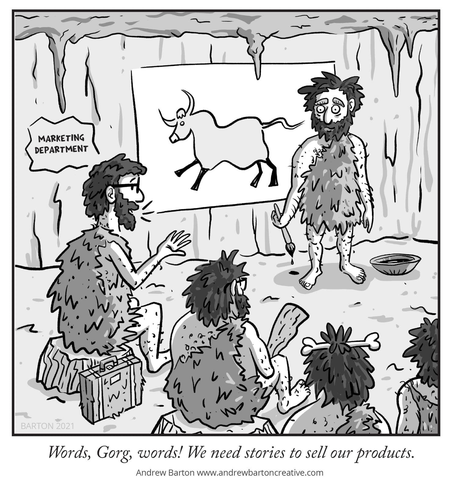
Overworked? (cartoon critique)
-
Hi - just joined SVS and this is my first time posting here. Thank you for your time.
For the artwork, I'm going for a simple New Yorker style b/w cartoon style. I don't want to overwork it, but it's SO HARD not to. What are your thoughts? All thoughts welcomed.

Thanks again.
Andrew
www.andrewbartoncreative.com -
Made me chuckle
 . You’ve nailed the style. It does feel a litttttle busy/chaotic, and I honestly think it is bc of the black texture lines on their clothes. They’re pointy and very directional and won’t let my eye rest. Otherwise, it think it’s really well done.
 -
@ABCre8ive I agree, there's a little bit too much black line texture. On the ground, on the wall, the stumps they're sitting on, the clothes, the leg hair. Almost every surface is covered in texture except the white paper. It's a bit much and I think you could be more economical with your black lines. Apart from that though, the story is very clear, well presented, and extremely funny! You are very good at this!
-
Fun! I will just agree with what others have said, finding ways to still indicate their hairy caveman quality without things getting so busy is the biggest visual issue I see.
One thing, and it might just be me, but if they're cavemen wouldn't he be painting directly on the wall?
Otherwise though, I like the idea and the overall feel of the piece! Nice work!
-
@KayPotter Thank you so much. That's great feedback.
-
@NessIllustration Thank you. I will go back and see if I can tone it down a bit. Really appreciate your thoughts.
-
@robgale Haha - yes it was tricky to figure out what should be modern and what shouldn't. Perhaps I could make the whiteboard look more prehistoric-looking (like the briefcase). Thank you for your thoughts and time.