Yeti home WIP
-
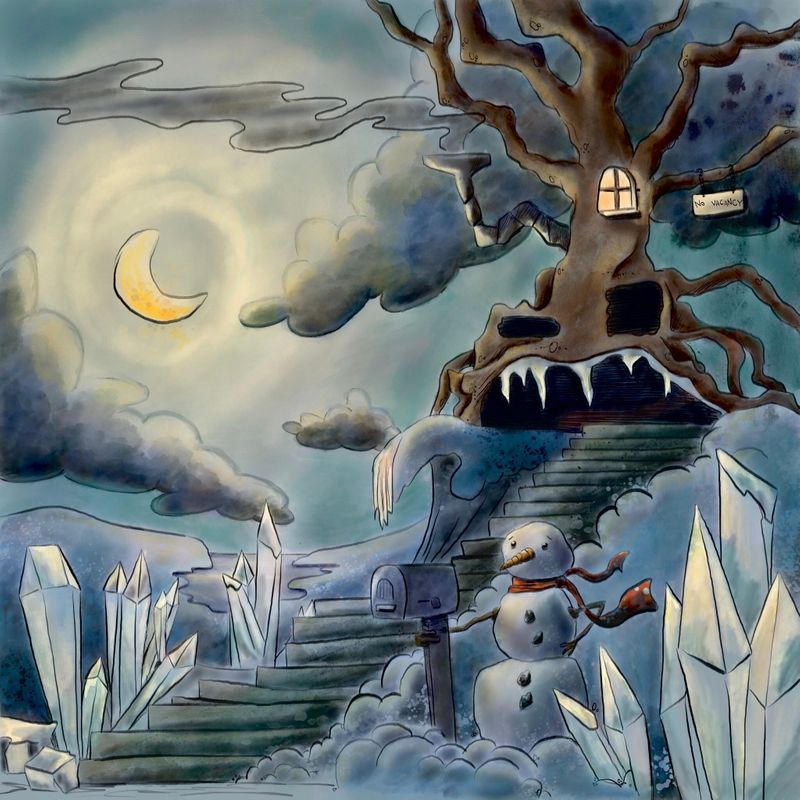
I seem to really struggle with dark and light in my images. I tried to really work on it in this illustrations. Any tips for getting better at finding the right amount of dark/light balance? I’m open to any advice I can get
-
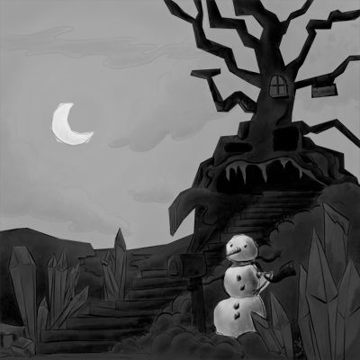
Hey @juliemillardart Ideally for me, I work out my values early on in the process by doing small 3 value, black and white thumbnails and working out the big shape design before I dive into painting.
One way you can kind of mimic this process if you're already deep into a piece (as you are here), is to create a white layer and a black layer, with a mask, and some transparency and on top of the image. You then work only in the masks to figure out your big shapes. I suggest working small so you don't get into the fine details. You want to just focus on a few shape areas. This also doesn't instantaneously solve all your problems, but it does give you some direction. Often with values, there is a tendency to go too far in the dark or light direction and we end up with a kind of "noisy" image. Really, the range of dark and light is much smaller than we usually think in any particular are. So for example, the shadow on the snowman could be lighter overall than it is (that's just one example).
I don't know if that makes sense, but values are such a huge subject, so it's challenge to try to put it into words.
I've attached a photoshop comp that I quickly put together with the black and white layers so you can see what I'm talking about. I use this trick and variations of it sometimes when I find my values getting out of control. You can see how just doing this quick "study" helps to group and design the image into big shapes and makes it read more clearly. I'm not saying this is the right grouping or values by any means, it was just a super quick pass.
Add the fact that the composition of your line drawing is quite solid made it really easy to just throw this on top, so you're not as far off as you might think!
Let me know if that makes sense and if you find that helpful at all!
Rob Gale
instagram: www.instagram.com/robgalestudio/
website: www.robgaleillustration.com -
@robgale that was so helpful. I’m not too familiar with masking yet, but I will play around with it and see what I can come up with. I really appreciate your feedback. Thank you!
-
@juliemillardart I can't really suggest much as far as values go, (I struggle with this as well!) but I just had to say I love what you're doing with this yeti house. It's so cute

I think robgale's advice is a great starting point though
") Solid advice!
Solid advice!Deviantart: https://www.deviantart.com/jacy13
Instagram: https://www.instagram.com/jacy13draws/?hl=en
Portfolio: https://jacy13.artstation.com/ -
@Jacy13 thank you! Values will be my next big study I think...

-
looking good! I like your composition. Other than separating your values a little like others have mentioned, the only thing that sticks out to me is that the ground has lots of snow and ice but the tree doesn't. I would add some snow and frost to the tree.

K.Flagg
-
I like the scarf blowing in the wind it gives the peace a wibe that I like. The snowman is the hero in this picture so if you want to have more focus on the house try to find something that pulls the attention there.
(I´m not that use to writing in english hope you understand what I mean) -
I really like the feel and overall tone of this piece!!
As for values I would make the sky a bit lighter so the tree could stand out a bit more.
And I would place clouds in a different way. When a dark cloud is behind the tree, they muddy eachother, becoming almost the same thing if you squint your eyes.Also, is the eye level in this piece, around the top of the snowmans head? If so, would we be seeing the tree moreso frrom an angle beneath it?
This piece is already cool, but if the tree had more oppressive scale to it, that would look extra awesome!My Drawing Show: https://www.youtube.com/ArtParlor
Instagram: https://www.instagram.com/frostdrive/ -
@Frost-Drive thank you for the insights! Point of View is also something I struggle to remember during the beginning phases of my work. I will play around with it and see what I come up with.
-
@Sara-Nilsson thank you! I like the idea that the snowman is the hero.