Illustration Critique
-
@lpetiti I liked your colors! I don't think they're muted
") I'm someone who has a tendency to go overboard with the saturation and it can quickly look very garish, so I like you restraint in picking tones! Michael makes some really good points about all the other stuff, though I would personally do the opposite for fixing the ellipses: instead of straightening the teapot, adjust the other elements to match it. I like the angle of the teapot better because it looks like we're looking at it from above - which is very fitting for the subject matter! This is a very lovely piece, good work
I'm someone who has a tendency to go overboard with the saturation and it can quickly look very garish, so I like you restraint in picking tones! Michael makes some really good points about all the other stuff, though I would personally do the opposite for fixing the ellipses: instead of straightening the teapot, adjust the other elements to match it. I like the angle of the teapot better because it looks like we're looking at it from above - which is very fitting for the subject matter! This is a very lovely piece, good work vanessastoilova.com
instagram.com/vanessa.stoilova/Check out my Youtube channel for tips on how to start your career in illustration! www.youtube.com/c/ArtBusinesswithNess
-
@NessIllustration thank you for the crit! I definitely see what you and Michael are saying about the perspective, I’ll work on that too! I appreciate the encouragement about the color palette, I enjoyed making it!
-
I didn't say they we're full on muted. Perhaps I could rephrase what I mean? I just thought it needed a little bit more saturation.
-
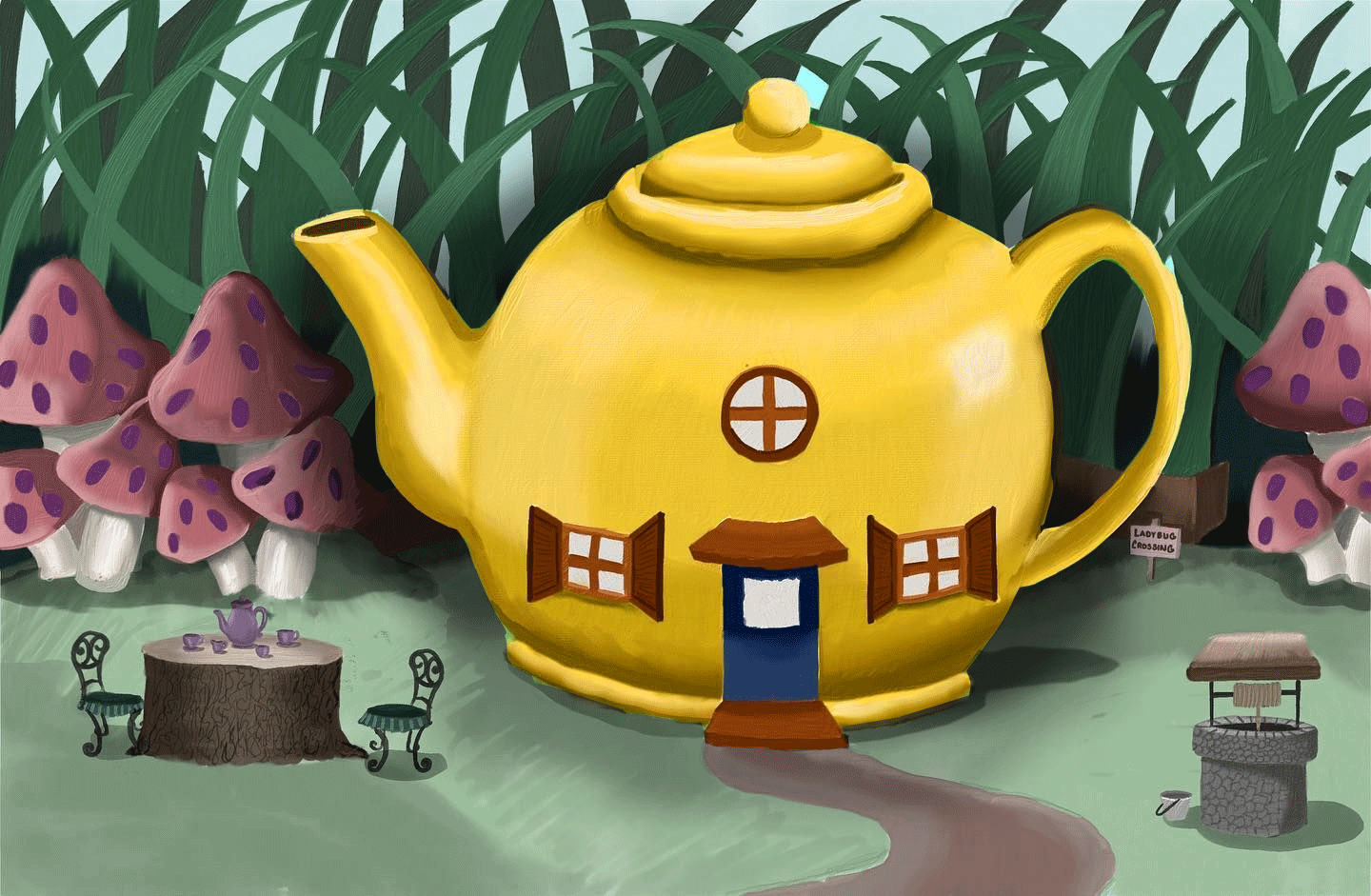
What's the focal point in this picture?
it feels like everything is put on equal importance. And there's no foreground. I would putt hat well REALLY close to the camera or something!
Also, personally I think the colors overall are too saturated. but that could be due to just the lack of contrast in values. I feel like the mushrooms especially should be lighter and fading into the background. And that the grass leaves could use more backgrouund atmospheric perspective too.
My Drawing Show: https://www.youtube.com/ArtParlor
Instagram: https://www.instagram.com/frostdrive/ -
@Frost-Drive is it a hard and fast rule that there always needs to be a foreground? (I'm not questioning your critique, I'm legitimately curious because it's been a while since I've taken composition classes). I see what you mean about the atmospheric perspective.
The focal point was supposed to be the teapot. I figured it was larger and more centered than the others (the original sketch had the mushrooms the same size and the table far too small so I made some adjustments). It's also why the teapot is bright yellow.
Website: laurenpetiti.myportfolio.com
Instagram: @laurenpetiti"So the man who really loves God could...paint his pictures, even if no man ever saw them. He knows God looks upon them." - Francis Shaffer.
-
I'm a little late to the party but just wanted to add my 2 cents. I would de-saturate everything apart from the teapot and push up the saturation on the teapot. This will make everything a bit cooler and your focal point warmer.
I would also add a bit of a shadow behind the teapot to push it out from the background.
-
@skillydan That's an interesting approach! I see what you mean about the shadow, though I feel like desaturating everything except the teapot is making it look a bit like there are two separate pieces.
-
@lpetiti It's not a hard and fast rule to include foreground, but it's just one of many compositional tools. Just throwing numbers out there, lets say theres 50 compositional tools. Any piece should probably have a dozen or so of those in them. (Cuz not all pictures can have EVERY tool. and when a picture doesn't have enough, it will look unbalanced and awkward.)
Also I think what skillydan did looks good! Doesn't look like two pieces
My Drawing Show: https://www.youtube.com/ArtParlor
Instagram: https://www.instagram.com/frostdrive/ -
@Frost-Drive That's what I thought about composition, but I wanted to refresh myself so thanks for the clarification.
Website: laurenpetiti.myportfolio.com
Instagram: @laurenpetiti"So the man who really loves God could...paint his pictures, even if no man ever saw them. He knows God looks upon them." - Francis Shaffer.
-
And maybe others can offer insight into this, but worrying about a dozen or so different compositional tools seems a bit...complex? What if a piece is simple and minimalistic (not saying mine is, that wasn't my goal, again, just curious)...it seems like worrying about creating a complex composition would take away from that?
I'm realizing how many different directions I can take this work. This is very interesting.