Musicians of Bremen, How does it look?
-
@KaraDaniel thank you so much!
-
@chrisaakins i love how you painted the animals. My one issue is that it looks too crowded at the top. A slight canvas extension will do the trick.
-
Nice work, Chris! The simple, stacked composition has impact.
Just a few thoughts that might give this portfolio piece even more polish:
-
Is that the moon behind them? If so, consider adding some rim lighting or moonglow around the characters. If they are backlit by the moon, they would definitely be limned with light.
-
Is each character on a separate layer? I'm getting that feeling, like they're slightly unconnected even though they're stacked on top of each other. Perhaps putting some grounding shadows and having some hairs poking up around their feet would help give that sense of connection?
Hope I explained myself clearly. Love the expressions on your characters and how you've given them all such distinct personalities and movement. Now I want to go check out the rest of your portfolio!
illustrator - author - smiley person
mbaileyart.com
instagram.com/mbaileyart/ -
-
Wow! This is awesome! I wouldn't mind seeing a little more definition in the green feathers. Also it looks to be a crisp eraser line around those feathers. The bottom left of the left most falling feather has that texture into the background.
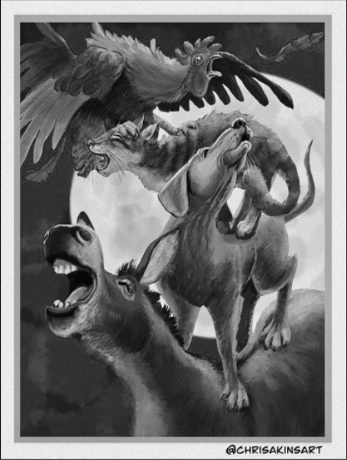
I like the value balance. I think back to @Jake-Parker saying go light (foreground) > dark (mid) > Light (back) or dark > light > dark...
I would be curious to know what it would look like with a foreground object that is light and giving the moon a glow to lighten of the background.
You know how i feel about all your work. I think you are an awesome artist! Thanks for sharing.
Much love and God bless!
-
@dafoota @chrisaakins Also remember take what I say with a grain of salt. I'm still a beginner. haha
-
@Melissa-Bailey-0 I agree about the rim lighting. I tried it and it just looked like their edges were disappearing so I decided to punt and go with what I call the Hollywood Nightime lighting like there was another hidden light source so you could see the characters.
As far as the layers go, I did have them all on separate layers and I was worried that that might be an issue. I will work on making them look more connected a bit more. Good call!
@Nyrryl-Cadiz you are right! I added some more to the top and it looks better. Thank you!
@dafoota haha! Thanks for being a fan! I am not sure I understand what you meant about the feather and the eraser line. And I do value your opinion! Always feel free to give it!
Thanks everyone! -
@chrisaakins I like this! I like the S-shaped composition and the moon behind the figures.
I think you're really getting there, but I also think that @Nyrryl-Cadiz and @dafoota have made good points here. The main things to work on are some crowding at the top and making sure your values are distinct. For instance, the dog's face and donkey's neck have light areas in the front, but why? Is there a second light source? Probably part of the reason for the crowded feeling is that your rooster is easily the most saturated thing in the image and the most distinct silhouette. I might either differentiate a lot between the values of the donkey and dog, or make the dog a more saturated color. (Maybe the former, but I would have to think about it.)
In addition, I think there may be a slight drawing problem with the cat's head and where it meets the rooster's foot. All your other animals look really 3D, but the cat's head is a little flat and I want to turn it a bit more towards the viewer. But I also find there to be a bit of a disconnect between the cat's feet and the dog's back, so maybe what @Melissa-Bailey-0 said about grounding shadows would help as well.
Having once done a Musicians of Bremen drawing, I clicked on this right away to see what your take would be. Your work is making leaps and bounds!

-
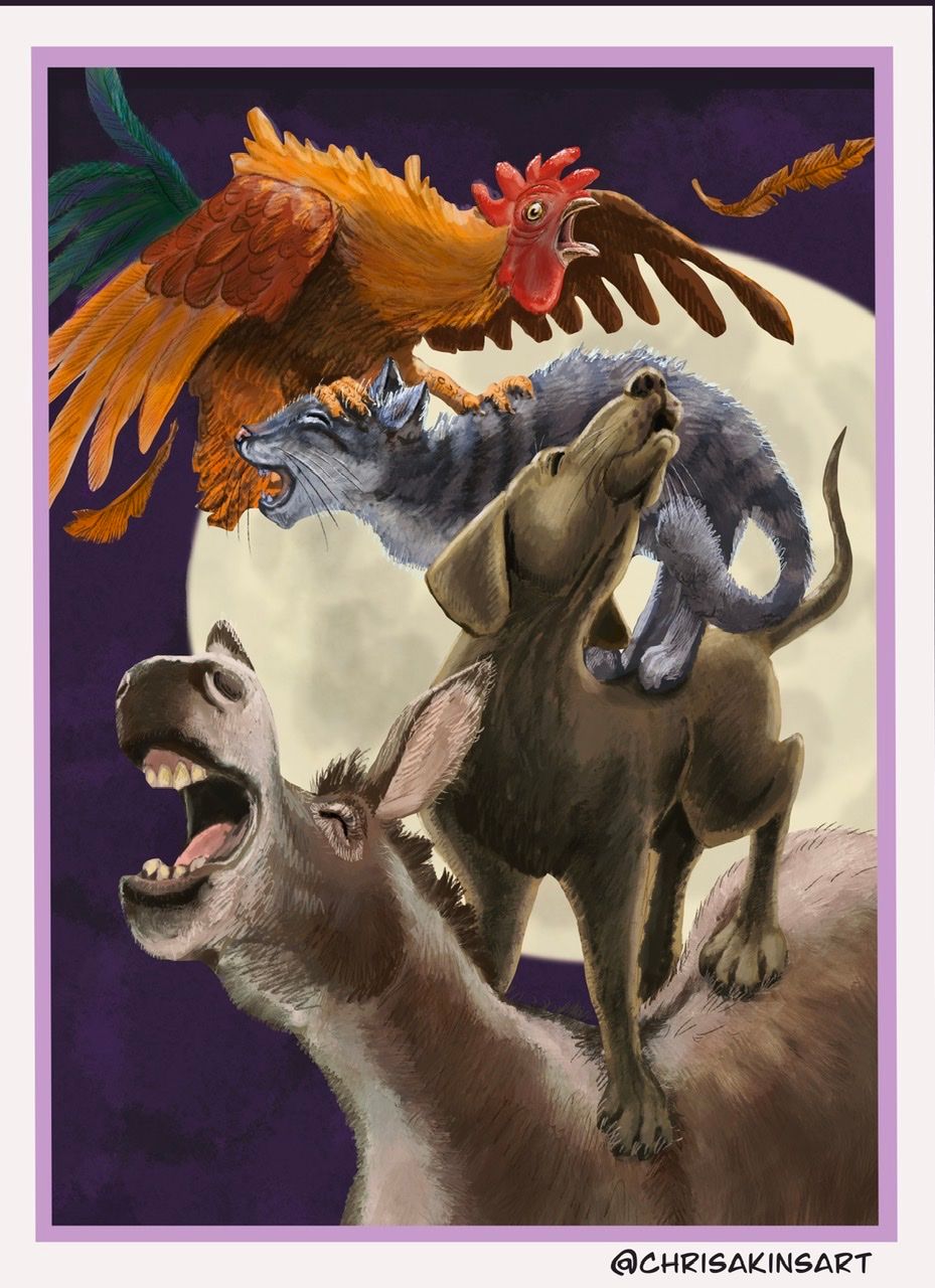
Thank you @LauraA @dafoota @Nyrryl-Cadiz @Melissa-Bailey-0 and @KaraDaniel . I did the best I could to incorporate your suggestions. I think it looks a lot better. Let me know if you think it looks better or more work should be done.
Here is what I did:
I enlarged the canvas at the top to eliminate the crowding.
I connected the forms by including overlapping fur and shadows.I saturated the dog and added a fill layer of brown and added a fill layer of light blue on the donkey. I also added a little light on the donkey’s mouth to show the other side of the jaw (that was bothering me). Hopefully this provides enough contrast, now.
-
I really like the energy of the picture. One small thing that stood out to me though is the area where the lower jaw of the cat intersects with the tail of the rooster. I think there is a tangent line(?) which, to me, makes it feel like the cat has the tail of the rooster in his mouth as opposed to being in front of it. Just a little shift of the tail would remedy that.
Again really like the picture and I am still a novice so take my advice with a grain of salt.
-
@chrisaakins I think it looks great!
-
I really like it.
-
As someone who lives out in the bush with chickens and pigs and a dog I can fully appreciate the context of this illustration and it makes me giggle when I think about how our animals like to make chaotic choruses together haha love it! On the technical side, I am not super experienced myself, I have only just started learning more about illustrating but I really like the composition and I do love the story it’s telling
")
-
@chrisaakins Nice work! The paint textures really come through.
-
Love that composition! So much energy, and you really get the impression of "noise" because of the zic-zac pattern they form.