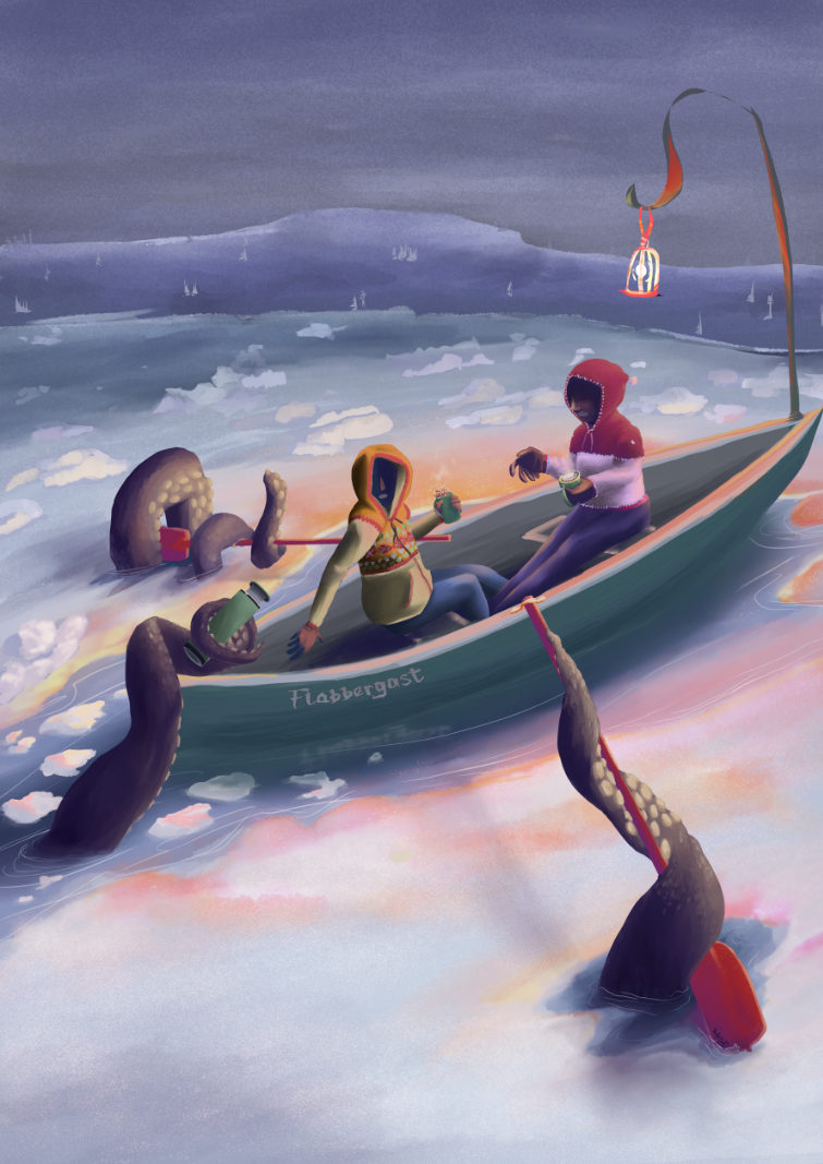
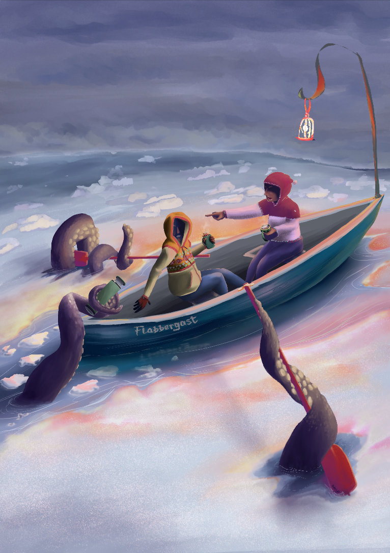
"Flabbergast" Feedback?
-
Hello Shani! I really love the color palette in this, and some of the movement you're putting in the areas of color transitions.
Here are some ideas and reactions about the composition that you can totally take with a grain of sat: I think the narrative wasn't immediately clear to me, of the sea monster stealing the oars and hot drink. The kayakers look startled, but not in danger. I wonder if you can experiment with trying to put more motion in the people and the tentacles- maybe the oar or the thermos has just been pulled out of someone's hand, or he's still fighting for his grip, or maybe the boat is rocking or splashing? Unless the monster snuck up on them and they just noticed? One thing that might help with building a sense of depth would be to make the foreground tentacle much bigger, maybe breaking the frame, or overlapping the boat. Maybe you could also push sense of depth further by making it darker in the background, out of range of the light from the lantern.
Hope this was helpful. I'm excited to see where you go with this piece! -
@TheArtBard Hello and welcome!
Love the water and it's direction, looks calm but in movement, the tentacles have soul too, you can see his intention of sneaking and silently taken away the belongings of the kayakers. The body language in the kayakers is superb, I can tel that they are cold and they are like saying "WTF?"
Abut your questions:
1- Yes, looks cohesive except perhaps for the lamp.
2- not, really.
3- Yes.
4- Yes.
5- Yes.
6- The kayakers are suppose to be normal people? because my firs read is like they are ghost or "deaths" Caron an a soul crossing the stix.
If you want to portray as normal people perhaps you could work his clothes a little more, a big explorer jacket, some colors (more on the colors later) make them look different, a cap below the hood of one of them, etc.
The lamp could and should have light all over it and this light reflects on the kayakers were you can put some colors and clothe patterns.
Tune down the pink of the cups, right now is the most saturated thing in the painting and that's not good.
The perspective looks great, you could try to make a little bigger the tentacle at the bottom right, see if that improve the painting or not. And the tentacle atop can be blurred a little and that I think can improve the painting too. The same with the horizon line with the little mountain.
Some texture in the boat and in the oars I think is needed.
I think colors can be taken farther in general in the whole scene, more variety, not more sturated except in the focal points and the areas where light from the lamp is reflected. Perhaps you can experiment with this if you feel the same.That's mi view, take what you want and left the rest.
Have an amazing day -
Thank you both for your feedback! You both made really excellent points and noticed a lot of little details! I appreciate your time and critiques

It sounds like the palette is strong and transition of color is strong
") Sounds like the tentacles seem active and conscious and that the water has movement to it. The feedback is a little mixed on the kayaker's body language, but that's alright.
Sounds like the tentacles seem active and conscious and that the water has movement to it. The feedback is a little mixed on the kayaker's body language, but that's alright.-
It was mentioned that the kayakers look startled, not scared - that's great. This is a holiday card, so I'm not looking for fear, I'm looking for surprise, a bit of the unexpected. Do the characters emote that? The tentacle is suppose to have a sense of sneaking up on them to quietly take their thermos.
-
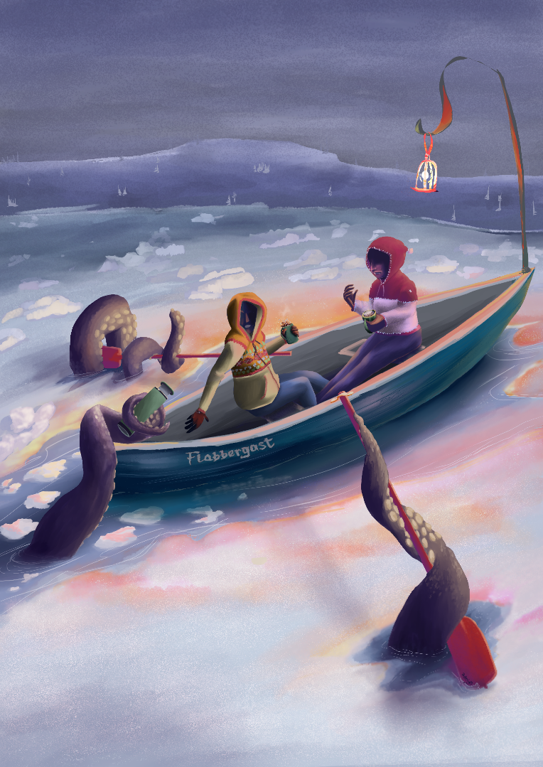
I experimented with ways to make the foreground tentacle look closer: I made the tentacle a bit bigger. I didn't want to have the tentacle breaking the plane because I intend to have a holiday greeting (either on the top or bottom) and wanted to maintain the balance. I gave the foreground tentacle another highlight and more scales to make it more detailed by contrast with the other tentacles. I also wrapped it around the oar and have it overlapping the boat (good suggestions!)
-
I made the background gradually darker. I'm a little worried though that the different hues between the hills and the snow might seem inconsistent?
-
I fixed the lamp(ish). I fixed the cups of hot liquid, I refined the thermos to give it a more identifiable silhouette, I refined the kayakers to look less like reapers going down the river styxx (hahaha, two separate folks said the same thing). I added a bit of texture to the boat and oar, but I'm not sure if you can tell at this resolution...
Okay! I think that covered all of the feedback! I'm going to continue working on this piece again tomorrow, but here's my updated version! I'd love feedback, but no pressure, of course. Thank you for your time and wisdom! Enjoy
Best!
Shani -
-
@TheArtBard
Nice work on the changes you made!
Adding clothing detail to the characters gave way more information about who they might be, and I think startled is coming through, more so in the yellow-hooded figure. The one on the right doesn't feel fully grounded in her seat, almost like she's hovering a little, and the right hand pose is reading awkwardly. Maybe fingers pointed up, palm out, might work for the sense of unexpected you're working towards?The boat seems much more grounded in the water, and I love the detail on that larger lower right tentacle now! I think my eye goes first to the yellow-hooded figure, but it takes a moment of parsing out what's happening in the image before I find the thermos, because it's very similar in color and value to the boat.
-
@Valerie-Light said in "Flabbergast" Feedback?:
Heyhey Valerie! Thanks so much for the feedback! Very helpful!
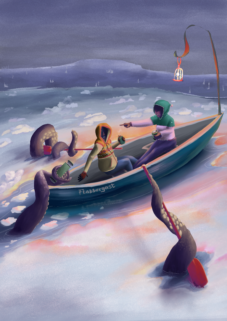
It sounds like the character personalities are coming through (at least with the yellow-hooded figure).- I've added a bit of shadow and reflected light to the red hooded figure so that it looks more like she's sitting.
- I changed the color of the boat to contrast with the color of the thermos (was it effective? I'm trying to get a recognizable thermos [typical green thermos] but am afraid it may be washing out a bit). Is the thermos reading as a thermos (somebody else said it looked like a flashlight)? Is it still taking a moment to parse out?
- I did and redid the red-hooded figure's hand. It's been a pain in the $%^ so I think I'm gonna edit the whole arm and having them gasping into their palm. At first I wanted the hand to be cradling the steam, but that read awkwardly. So, now I'm considering an entire arm readjustment.
- I think your eye is being pointed to the yellow hooded figure because of the oars and colors. Just a thought.
- I'm sincerely unhappy with the red-hooded figure's face , I think the face is too close in hue to the hood so it's getting drown out. I'm going to change the hood color, maybe to an orange?
Of course no pressure to respond! Thank you for all your feedback, time and wisdom! I hope all is well by you~
Best,
Shani
-
And here's an updated updated version - changed the sweatshirt color and the position of the arm. Thoughts?
Best!
Shani -
@TheArtBard
I like the improvements you've made so far.You mentioned that you didn't like the face on the guy to the right, so maybe you still have a plan to change it. Regardless, with your most recent change, I feel that the face does not fit with his gesture. The pointing hand indicates surprise but the face is too passive to match it. Maybe a slightly open mouth would do the trick.
There are a couple of things that do not read well for me.
Firstly, I was surprised when you mentioned hills since I had totally read those as waves or a way to create depth in the water/ocean. Looking again I can see the trees but I guess I had just considered that "texture". I'm not sure how best to fix it - maybe change the color ever so slightly away from the color of the water or maybe add some trees at the top to clarify the silhouette of the hills.
I'm not sure whether the tentacle on the left is touching the edge of the boat or not. The position seems to indicate that it does, but the shadows (or rather lack of shadows) indicates the opposite. If the tentacle is supposed to touch the boat, maybe make it go slightly into the boat. If the front edge of the boat hides a bit of the tentacle then it becomes clear how close it is to the viewer. This could further be established by adding a bit of shadow on the boat edge near the tentacle. If the tentacle is not touching the boat, on the other hand, you may want to raise it slightly up to clearly separate it from the boat edge.
The last thing is the ice on the water. I'm not 100% sure if it is ice or not. I would guess that most of the water is covered by ice and show, since the front tentacle seems to come up through a crack. However, the edge between the ice and the water is very soft, causing me to doubt the conclusion. The small white clumps of snow/ice on the far side of the boat are separated from the general surface in a harder fashion which seems strange if they are both supposed to be snow/ice. I hope it makes sense - its a bit hard to explain. If not, I can draw over you image to clarify.
-
@TheArtBard You know, I liked the color of the right side figure better in a warm color rather than a cool color. Maybe it helps the two boaters read as part of the same team? But I see what you mean about the red being too close in hue to her face. Maybe something more orange or rust than the red it is now? Or a more yellowy green? That's just my take, feel free to ignore.
I still think that figure looks a bit floaty, maybe because it seems like her feet are landing on a higher plane than the left figure's feet are.
I like what the pointing hand does for the composition! -
Of course, thank you both so much for your feedback! You've given me a lot to think about and I've made adjustments accordingly! Lots has changed, ideally for the better~
-
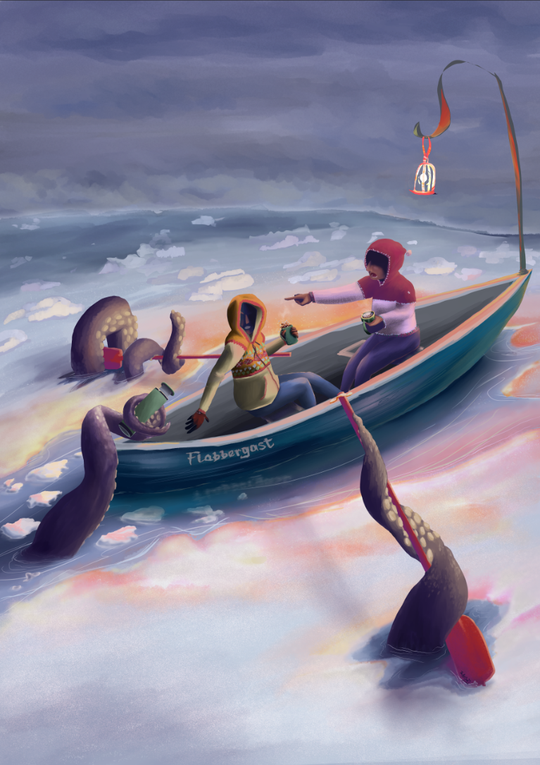
I changed the face, wasn't a fan of it before, was tired of forcing it to work, so I just redid it. I think it's something I can live with now (granted it's legible to the viewers?).
-
I scrapped the hills - the trees just weren't working for me. The hills should have had a different silhouette to begin with, but since this piece isn't about the hills, I replaced them with snow clouds. Thoughts?
-
The tentacle on the edge of the boat is now hovering just above it. The opposite boat side is now viewable, and there's a shadow under the tentacle - great note!
-
I added a few details to show that the water is water, the ice is ice, and the snow is sitting atop the ice. I HOPE that comes through. There's wave lines, ice planes catching the light, and fluffy snow textures. Thoughts? Is it clearer now?
-
I agree, I liked the figure on the right in red. Yes, it conflicts with the face, so I switched up the values a bit to add some contrast. I don't need all the details to come through, just for the person to read as though they're startled and are consistent with the style and skill of the rest of the piece. (Of course it looks way better up close, but this is for a holiday card, so the face won't be that large anyways.... hmm, thoughts?)
-
I've adjusted the red figure's legs (both figures' legs) - you were right, the legs were waaaay too long. Hope the legs add to the feeling of being startled? And don't look like she's floating?
Anywho, so that's it - lemme know what y'all think! No pressure of course, thank y'all so much for your time and wisdom!Best,
Shani -
-
@TheArtBard
The updated background really helped a lot. There is a hint of something that could be land within the mist, which I like. While the new face is definitely better, I see two issues with it. It is hard to tell if the mouth is open or if the person has full red lips Also, the shadow kinda looks like black hair going down over the person's eyes for some reason. These two things has the side effect that I now clearly identify the person as female where it was clearly male before. The mouth could perhaps be fixed by darkening it a bit and making the teeth stand out a bit more clearly. You could embrace the hair thing and draw some highlights in a couple hairs. Otherwise, it might help if you show a small bit of the face breaking the solid darkness, such as a brow. -
Thanks so much @Morten-Christiansen! That really helped~
Love the note about the misty/land - victory!
And very long sigh, that ding dang face. I pulled the hood lower to limit the shadow space, and I highlighted the eyebrows and cheek/chin - not that you'll be able to see the edge highlights, but still, it's there, hahaha. I whitened up the teeth a bit and added the top teeth (I was on the fence about that). I also removed part of the hood so that the face profile can show better. I changed the value of the snow pile behind the face for contrast.
We're obviously at the small details phase, which is great, hahaha, it means this piece is almost done! But of course, I'm open to more feedback and critiques! No pressure though, thank you very much for your time and wisdom!
All the best,
Shani -
@TheArtBard
Sorry about the face") I think it works better now. The direction of the brows communicate anger more than surprise to me though. I'm not sure thats what you intended. Unless you want the person to be yelling at the tentacle. In that case, you nailed it
I think it works better now. The direction of the brows communicate anger more than surprise to me though. I'm not sure thats what you intended. Unless you want the person to be yelling at the tentacle. In that case, you nailed it 
Instagram: https://www.instagram.com/mortenchristiansenart/
DeviantArt: https://www.deviantart.com/mortenchristiansen -
@Morten-Christiansen Hahaha, that made me laugh!
No worries, I really do appreciate the feedback~ I've adjusted the eyebrows accordingly
And if there's nothing else, I think I'm ready to forget about this piece for a few months, hahahaThanks for all y'alls help! It really makes a difference~

Best!
Shani -
@TheArtBard
For what its worth I think the face ended up hitting the right emotion.Instagram: https://www.instagram.com/mortenchristiansenart/
DeviantArt: https://www.deviantart.com/mortenchristiansen -
@Morten-Christiansen Heeeeey, thanks for that! Hahaha, makes it all worth it, lol - I'm pretty satisfied with how this came out! Thank you!
Hope you're well!
Shani