Looking for Feedback: 10 Step Digital Painting WIP
-
@Valerie-Light Looking good! One thing I think you can try, is to turn their head a little bit, now we see them straight one and completely in profile. I think a little turning can make them look more dynamic.
-
@mellanrumsformer Thanks for the suggestion! I do think that would make it easier to connect with the characters. I'll try out some options!
-
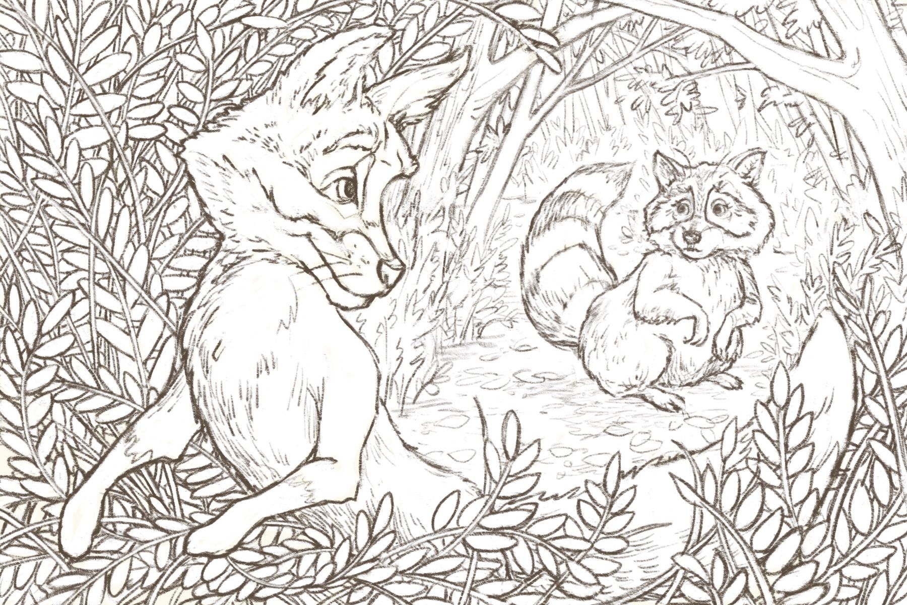
@mellanrumsformer I took your suggestion of turning the raccoon's head, and in the process discovered a pose for her that I think looks friendlier.
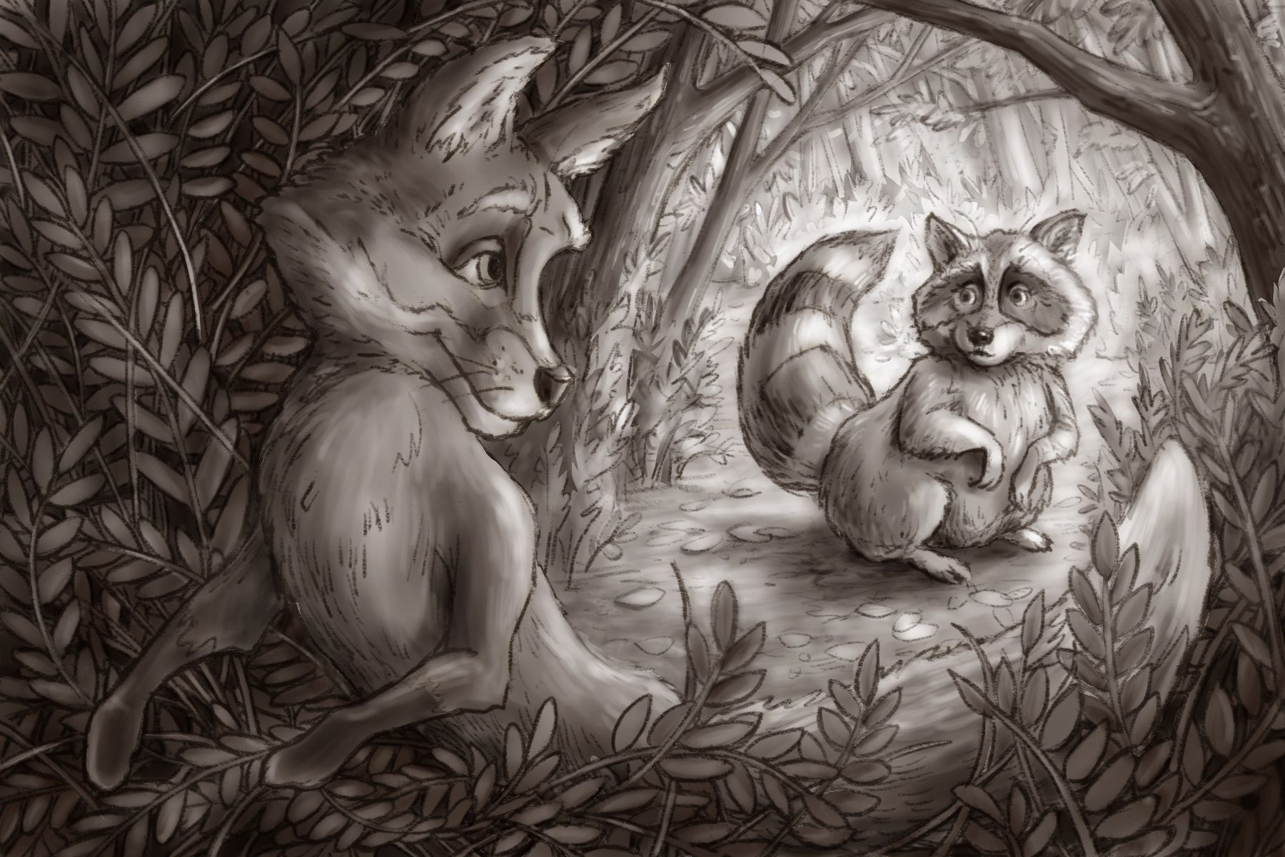
Here's my cleaned up line drawing, and my value thumb (which for some reason is huge.) Getting ready to start developing shadows over the line drawing now.
-
I'm zipping right along, and posting progress here for accountability to myself, and to keep asking for feedback.
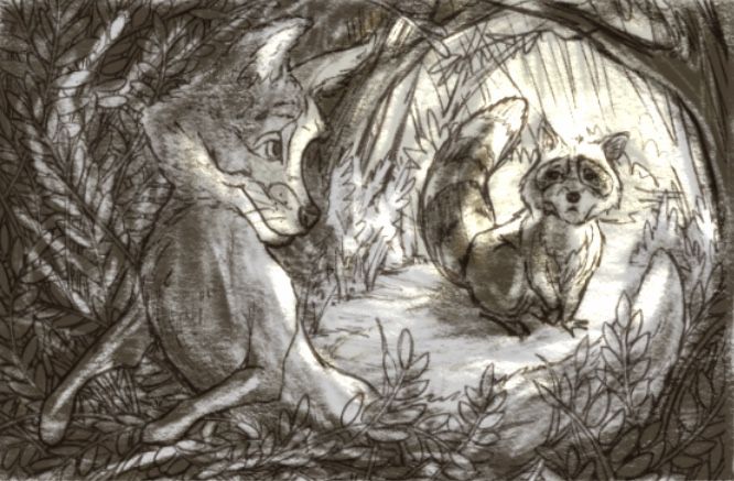
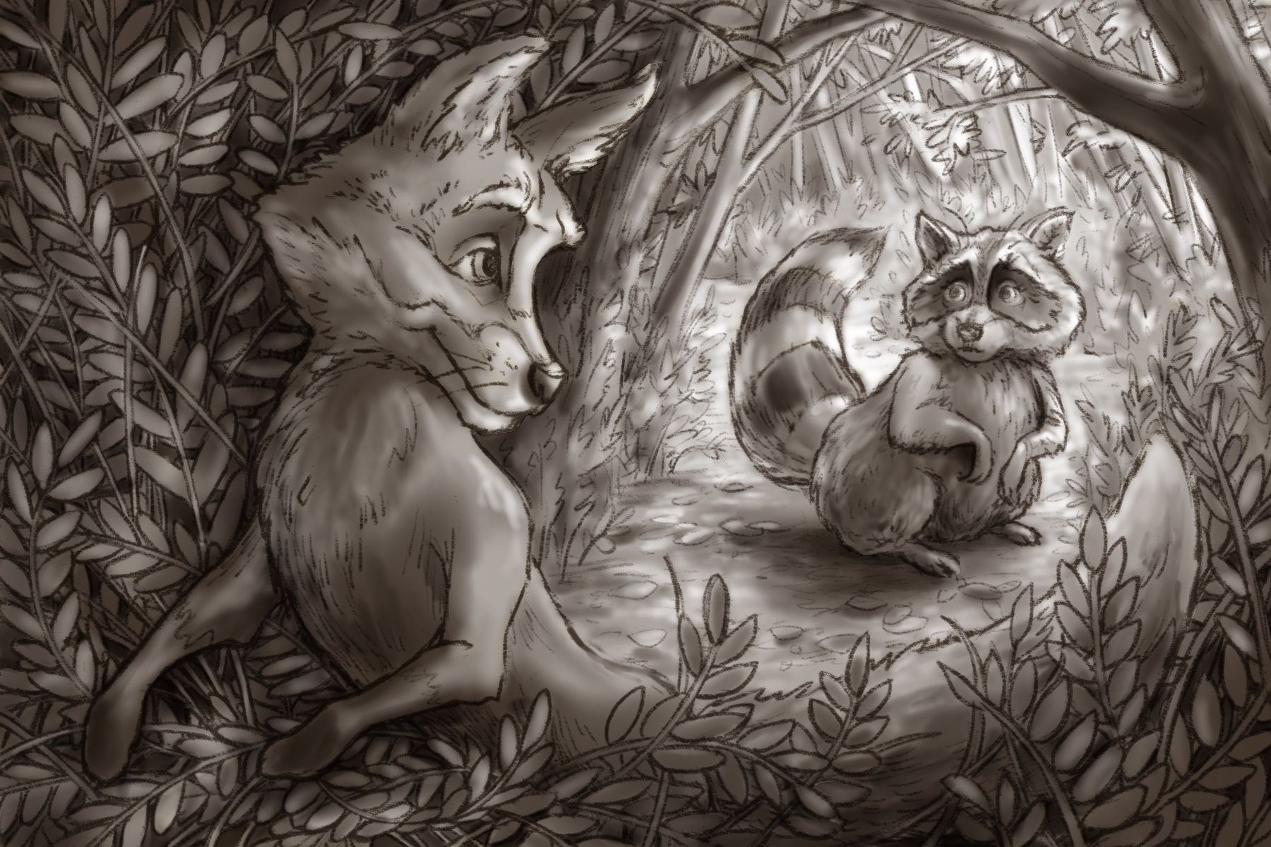
This is Steps 1, 2, and 3 from Will's process. (Occlusion shadows, cast shadows, and tone.) Those three steps got a bit muddled up in layers, I think, because I'm getting used to this new workflow. But wow I found it so helpful to have my value study in front of me while I did them. I had a hard time, in particular, differentiating cast shadow from overall tone. Looking at it now, that seems to be a problem especially in the area around the fox's feet.
Does the lighting make sense right now?
Next I'll do some color thumbnails, and I think that might suggest some new adjustments to the lighting. Right now I'm thinking warm yellow light coming from the right through the trees behind the raccoon, and some cool green/blue reflected light on the fox coming from the left.
-
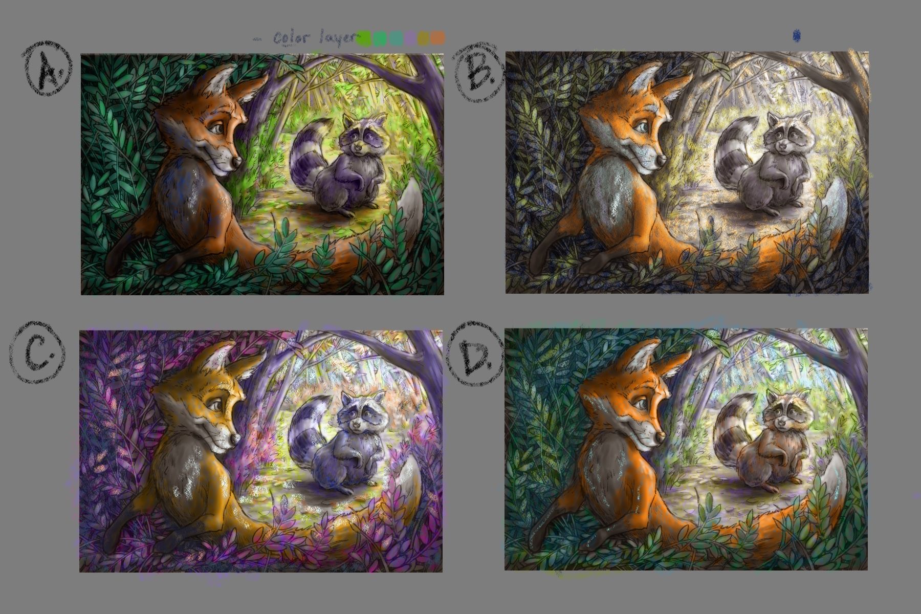
Here's my Step 4: Color Thumbnails!
I think A is closest to what I had in my head, but I totally can't decide which one to go with!
Anyone want to weigh in with thoughts on which one works best in terms of composition balance, and a mood of the safe zone vs. the unknown new thing?(also, this method of digital painting is totally exciting right now. Never before have I gotten an idea this developed at this stage of completion. I love working on top of a clean drawing and value study!)
-
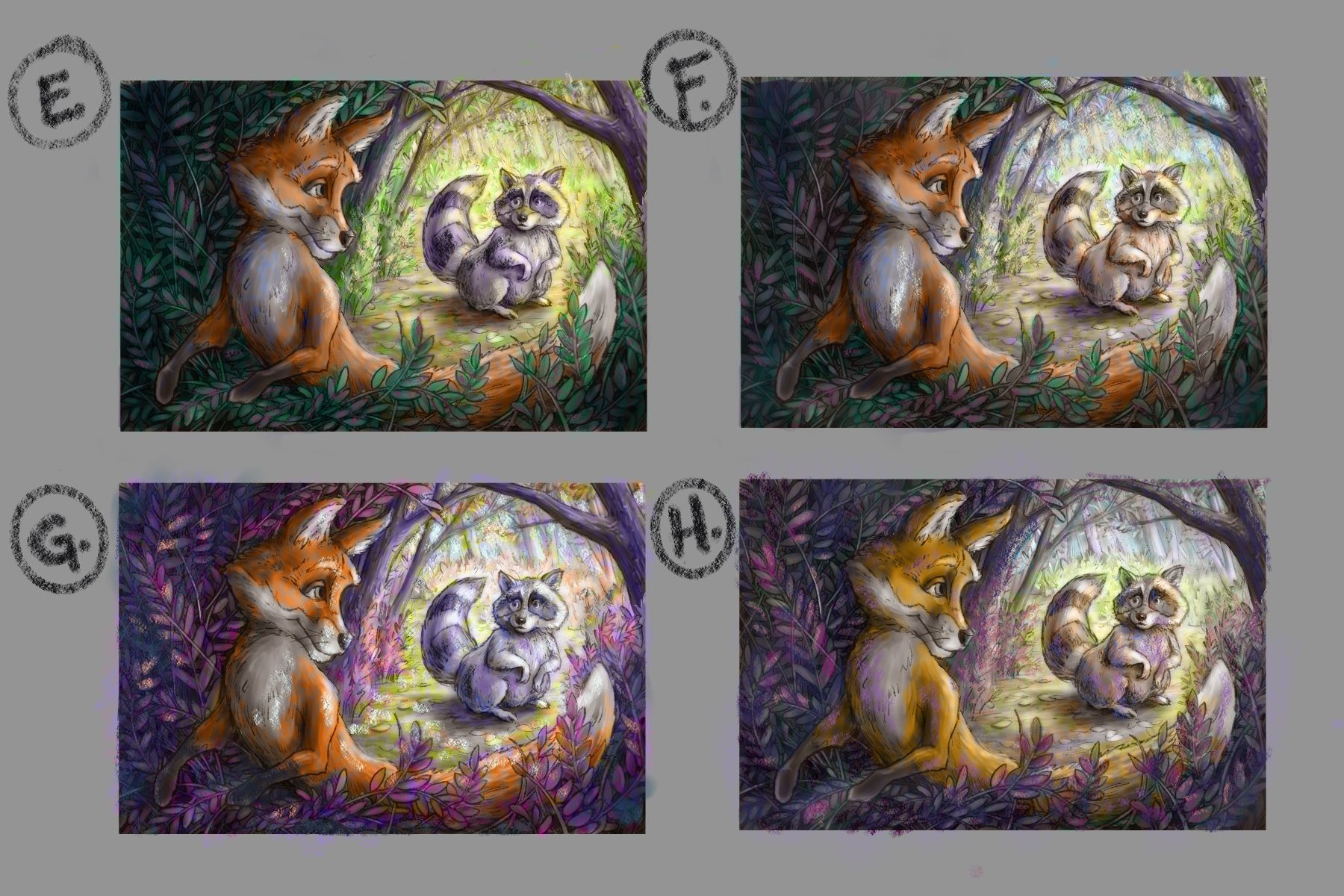
Thanks for sharing your progress with this course. It's really nice to see how this one develops. I think I prefer the “D” for the safe feeling and maybe you can combine it with a purple light coming from our left that hits the fox on the side, hinting there something weird happening there. Maybe then you can even darken that side of the picture even more to give a more dangerous vibe… And I agree it’s a nice feeling to start to be more deliberate in the development in an early stage, for me it feels like a big key.
-
@mellanrumsformer Thank so much for the feedback! Looking at it with fresh eyes this morning, I tend to agree with you that D is the way to go. But I just noticed your thread on this same class from 9 days ago! Your value work is so clean, I'm considering redoing parts of mine.
And I just found the flowchart notes that @dafoota posted on your thread, and it reminded me that I totally ignored Will's advice of building it from background to foreground, and painting within selections. I think that might be a lot of what feels muddy about it this morning. -
@Valerie-Light I am really enjoying seeing the process you're working through with this piece. It already feels like it's coming to life!
")
I just wanted to say that I really love C for the color thumbnail. I don't know if the colors are a little too "wild" for what you're going for, but I think it could make for a really interesting and unique atmosphere!
Deviantart: https://www.deviantart.com/jacy13
Instagram: https://www.instagram.com/jacy13draws/?hl=en
Portfolio: https://jacy13.artstation.com/ -
@Jacy13 thank you for the encouragement! I think I might do another couple of thumbs that combine some favorite color ideas. It's so hard to decide!
-
@Valerie-Light Thank you! I did the “Light and Shadow for Illustration” before this one, and I do feel like that course breaks down the value stuff in a cleaner way, so I probably took a lot from that course while doing this one. After I had my sketch I also made more masks than Will did so I had a mask for the background mountains, midground castle, and foreground character which I also think helped with keeping it clean but I didn't use a clipping mask or anything like that, but I had them ready when I needed them, its a balance, I definitely feel like too much masking can slow me down and make it look to clean and stiff… I might also add it's not too late to start to work from back to front, if I remember correctly it was sort of after the color studies that Will started from the back and doing the refining.
-
@mellanrumsformer I watched that Light and Shadow class a few months ago, but I was very new to digital painting and I didn't do the assignments. Now I think I'd like to rewatch it more carefully! I'm used to working in traditional media, so simple stuff like working with a mask or multiply layers is honestly feeling like a breakthrough. Will helped translate to me what digital media can do with the acrylic and gouache mindset that I have.
I did decide to redo my value steps, and another round of color studies. In the value sketch I like that there's more definition in the bushes, and less line work in the trees.
In the color studies,@Jacy13 I think you were right about those purples. I think I'm going with G! I just love it.
-
@Valerie-Light Very cool! Can't wait to see your progress!

-
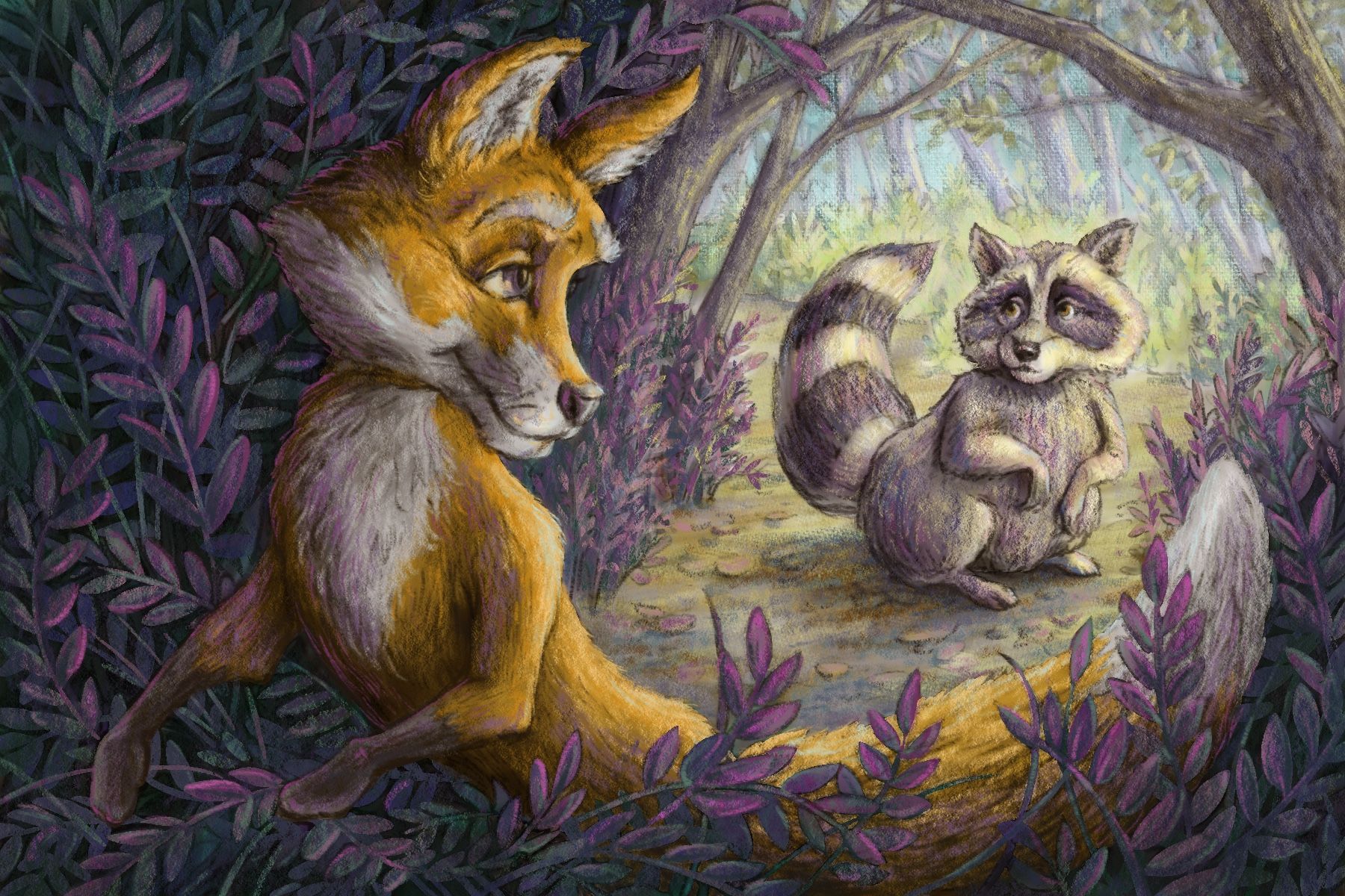
Finally got some time to revisit this project. I spent a few evenings working this up from background to foreground. I'm ready to start some color adjustment, and fine tuning. Some things I plan to work on are the expression in the fox's eyes (looking out of frame right now) and the raccoon's color, which was just more interesting in my color studies. What else do you all think would help pull it together?
-
@Valerie-Light Love the way the colors are turning out, it's beautiful! I think you are correct on the fox's eye looking out of frame. With that correction it'll look even better! I can't think of anything else off hand for critique. You are doing great!
Deviantart: https://www.deviantart.com/jacy13
Instagram: https://www.instagram.com/jacy13draws/?hl=en
Portfolio: https://jacy13.artstation.com/ -
@Jacy13 Thank you for the encouragement!
-
@Valerie-Light Looking good, nice to see the development... I would maybe try to turn the fox a bit more orange, especially in the shadows, maybe raising their level and adding some more saturation, they look a bit muddy now. The leaves and environment are looking great!
-
@mellanrumsformer Yes, I think you're right about the fox color. Looking at the color studies from a few days ago, G has a much more harmonious look than that yellow fox.
-
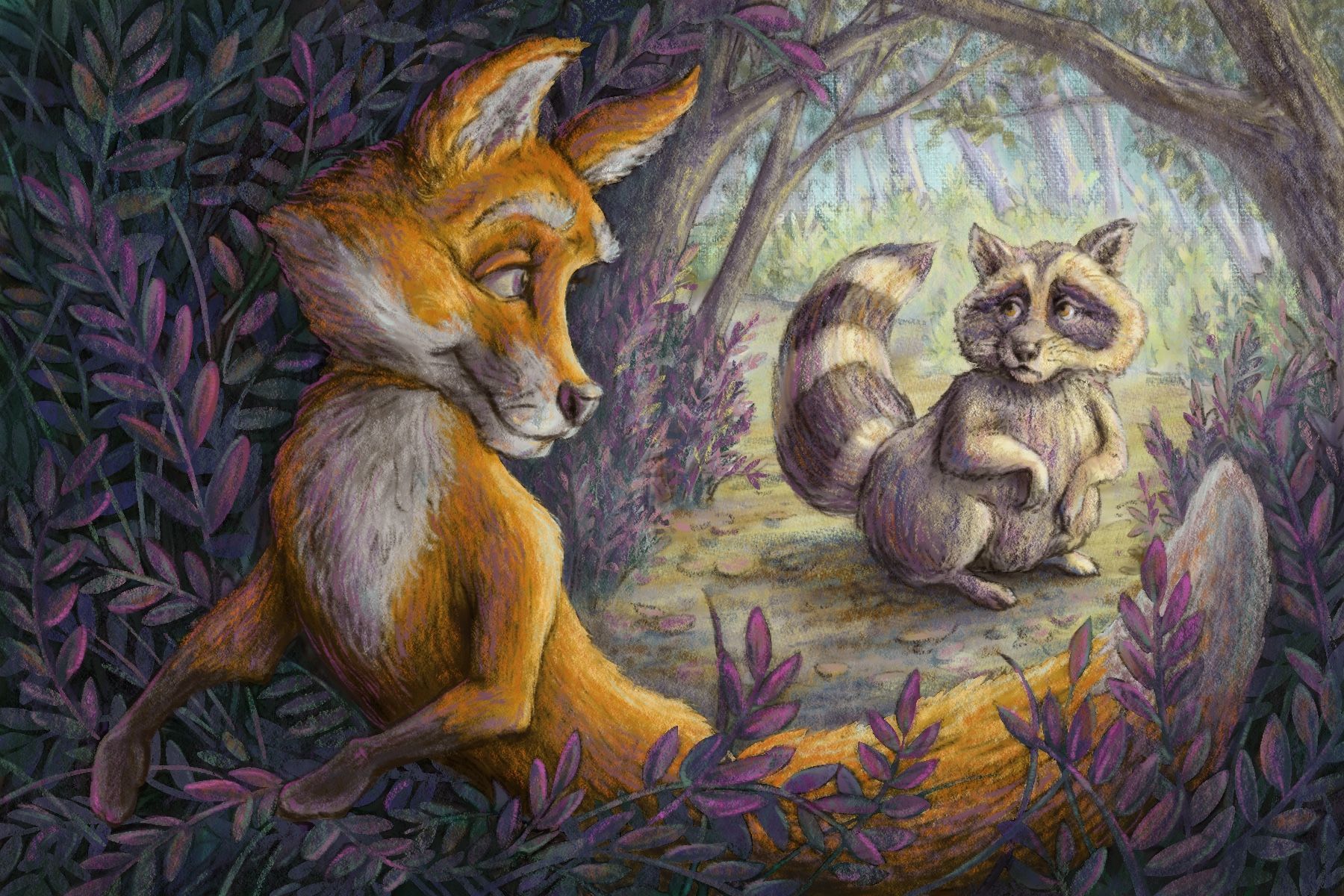
I think my 10 step digital painting class experiment might be finished? 95% finished? I left it alone for a few days and came back to it with fresh eyes to make adjustments to color and expressions. I'm feeling like working through this class was a big step forward for me, and I'm looking forward to more. Thanks for all the invaluable feedback, everyone!