February Yeti cooking -update with 3d model
-
@Richard-Matthews Very glad you like the beam! Part of me felt like i was shoehorning it in...which i guess i did .. but wood beams definitely have a cozy factor which is what i was try to increase - i edited the bunny question out of my post before i saw your response ... i decided to keep the little fellow
") - thank you for your feedback!
- thank you for your feedback! -
@Kevin-Longueil I am going to go hard core and suggest a major change. According to the definition given by @Lisa-F a spot has limited background. What if you lose the roof and crop it more like this:
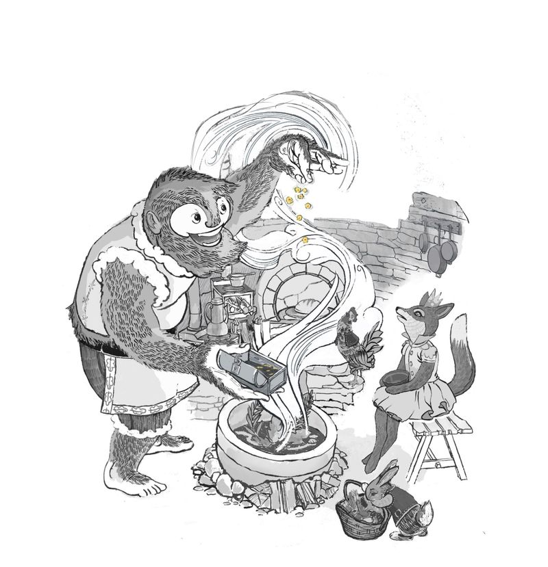
Here is my reasoning:
It helps create a nice silhouette for your character, his action, and one of the central aspects: the wafting aroma.
Second, the ceiling competes for my attention with his hand and smoke because of the repetition of the curve and leads my eye off the page.
Lastly, it fits more with a spot illustration definition.You lose nothing but gain impact.
Just my two cents.
Lovely job as ever, a winner for sure. -
@chrisaakins This change really helps with the focus and you can see the silhouette better!
-
I really like the style of this piece!
-
@chrisaakins Chris, thank you so much for the thoughtful feedback and the paint over!! These are great points you make and something i have struggled with. Painting out the background is definitely a possibility - @Melissa-Bailey-0 mentioned this earlier too - I have a layer similar to your paint over in my stack though i like how you left a hint of the window in your paint over that is a good idea. I'll keep messing with it - i do go back and forth on this one... was really trying to make an interior that was appealing for my portfolio(which has zero interiors) - i have faded the background too..but wondered if it was a bit gimmicky .. it seemed like a cheap fix for a difficult problem too since i have not sorted out my values yet - my specialty does seems to be spending days working on things only to paint them out in the end :). Thank you again for the feedback.
@Kim-Rosenlof Thank you for the feedback Kim - it is really helpful to hear what is working for folks!
-
@Kevin-Longueil yep! As you'll probably guess, I really like what @chrisaakins suggests. In fact, I think if you get rid of the background altogether, the piece will read better as a spot. The focus will be directly on the characters and action, where it needs to be.
However, I understand where you're coming from, wanting a portfolio piece too. But are you asking this one little spot illo to do too much? What if you modified the composition for a spot illustration, then even further expand your original idea into a full page or even spread illustration? There's no reason why you couldn't do two versions. That could be really interesting!

illustrator - author - smiley person
mbaileyart.com
instagram.com/mbaileyart/ -
@Melissa-Bailey-0 interesting insight about making both a spot and a full page/spread for this. I might consider that myself.
@Kevin-Longueil I'm in a similar situation with my composition right now- getting wrapped up in all these lovely storytelling details, but losing the simplicity and impact. It's far easier, however, to tell you to simplify than it is to do it myself. I'm surprised to say it, but I really like @chrisaakins suggestion. -
@Valerie-Light thank you for the feedback Valerie! Very helpful to hear that there is a consensus about getting rid of the background! I have to admit that I am feeling very deflated with this piece at the moment... when I take the background out I no longer like the piece though it is obviously the right thing to do... I am suspicious that it may be because the characters are not interesting enough or well done enough on their own to make a worthwhile image - thank you again for your feedback
-
@Kevin-Longueil I am in the same boat!!
-
@Kevin-Longueil
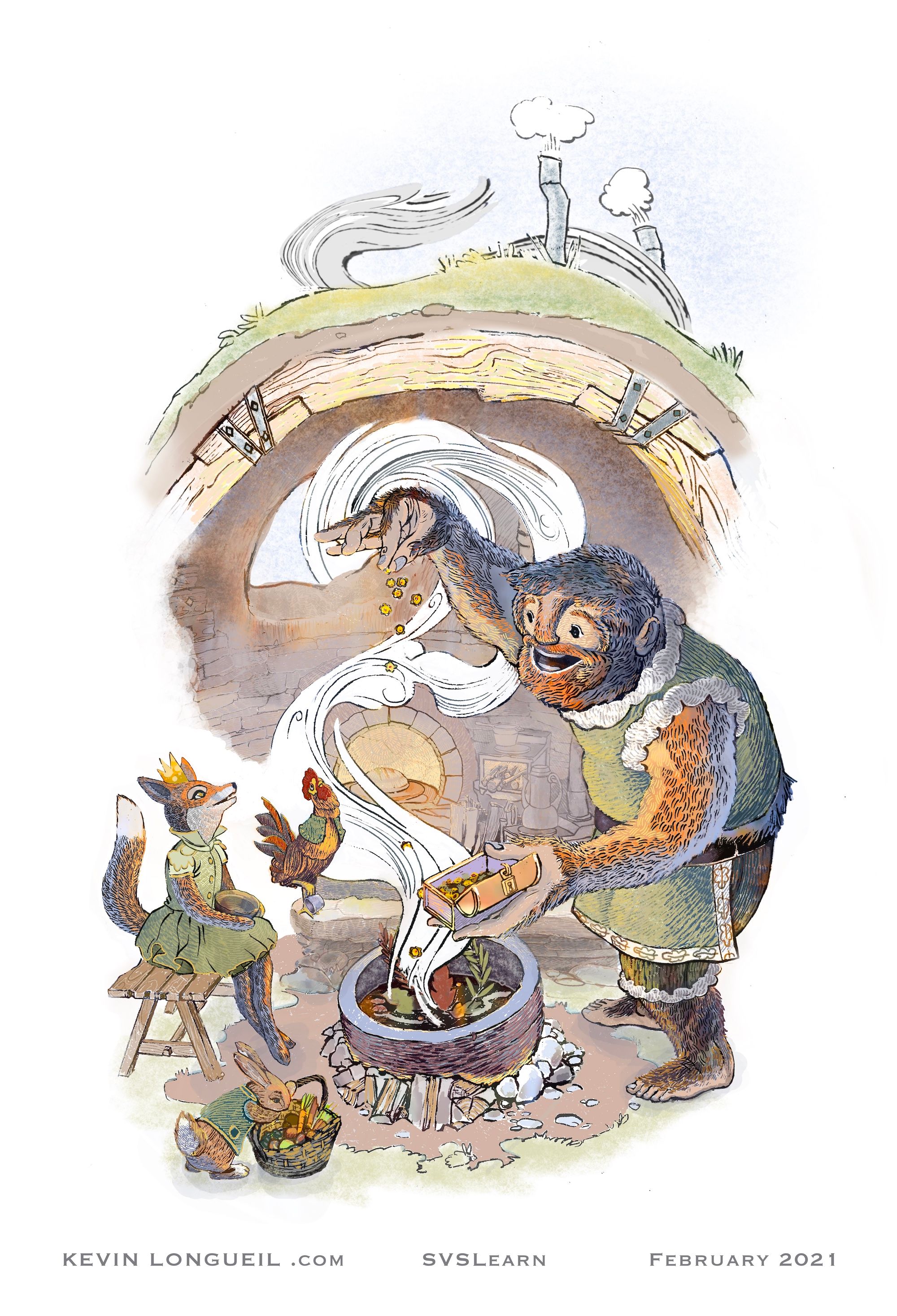
Here is an update...we lost power in our neighborhood yesterday evening so i have been scrambling today to get the color going - only part of tomorrow left to get the background, bench, fluffy stuff on the yeti, and steam done! (and to maybe put a tiny cup in the rooster's raised foot) - this is about my fourth try at a full color piece and am super surprised that i am kind of liking it - @chrisaakins @Melissa-Bailey-0 @Valerie-Light @Kim-Rosenlof i really appreciate your feedback and hope you don't think i'm just ignoring your great advice by trying to still make the roof work for this....it may still end up gone but i really am trying to make a "cozy space" image out of this if i can - thank you again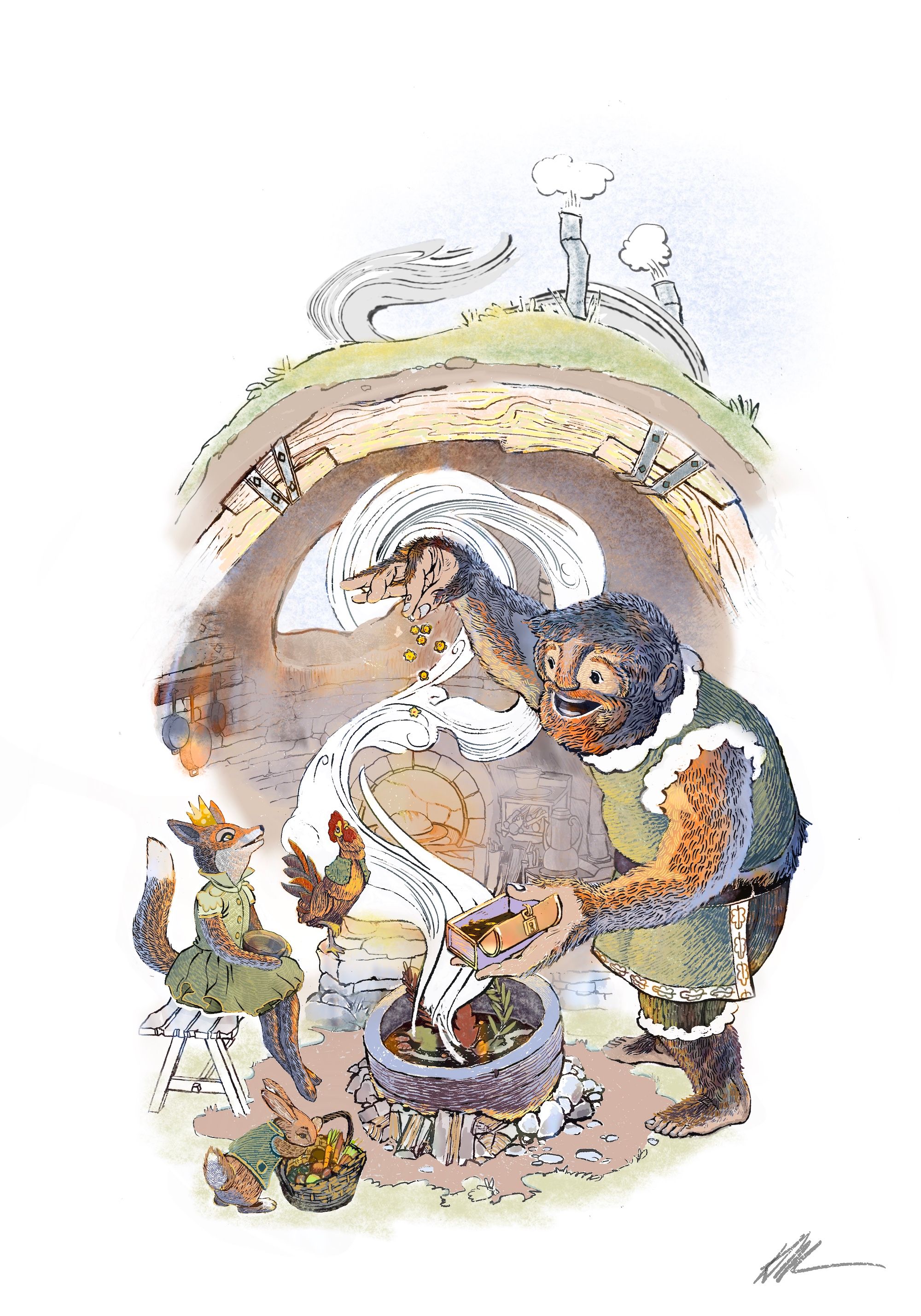
-
@Kevin-Longueil It looks really good! I love the color you chose and the style. This is for you and your portfolio, so in the end, it is up to you. It looks great! And I do love the beams.
Instagram: https://www.instagram.com/kiminyrose/
-
I love where you're going with this. It looks great!
-
@Kim-Rosenlof @Valerie-Light Thank you Both!
-
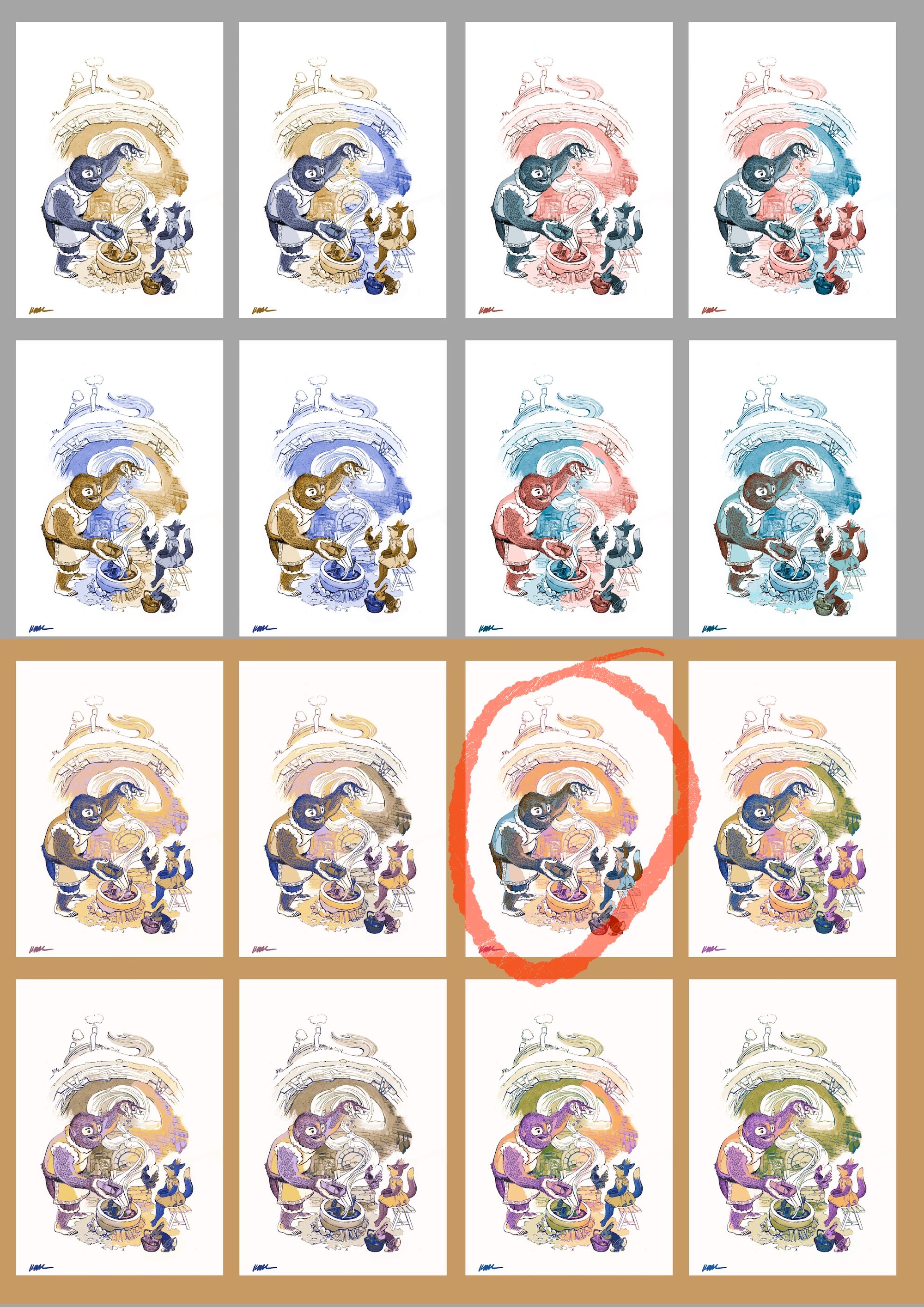
Just posting my final in this thread - all of my color comps looked really bad but the orangey purpley one seemed best - so i went with orange purple green
-
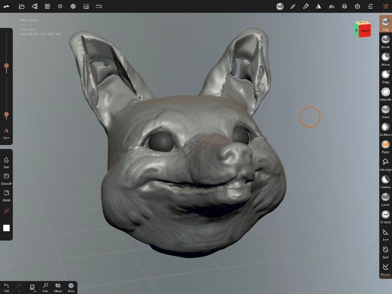
@Kevin-Longueil Thought i would share this in case anyone else thought it might help them too - this is a 3d model i'm working on to try to help me with character consistency for my next piece using the fox from this piece - I've never really done this before hence the holes in the ears i cannot get rid of - i was going to try to sculpt something by hand but thought i would try 3d on the ipad pro just to see... it is super fun if anyone is interested the program is called Nomad
-
Wow so cool!
-
@Asyas_illos Thank you! i think i could be handy to have models of characters.
-
Oh cool! I think I could totally put this kind of thing to use. I feel like I default to the same 2 or 3 angles for faces not by choice, but just because that's how I picture them in my head. Thanks for the tip!
-
@Kevin-Longueil I can't believe this didn't make it to the top 16 or honorable mentions! I suppose it's due to the too human thing that Will talked about at the beginning of the podcast. Incredible work though!
-
@Jeremiahbrown @Kevin-Longueil totally agree.