Please please give my artwork an honest critique!
-
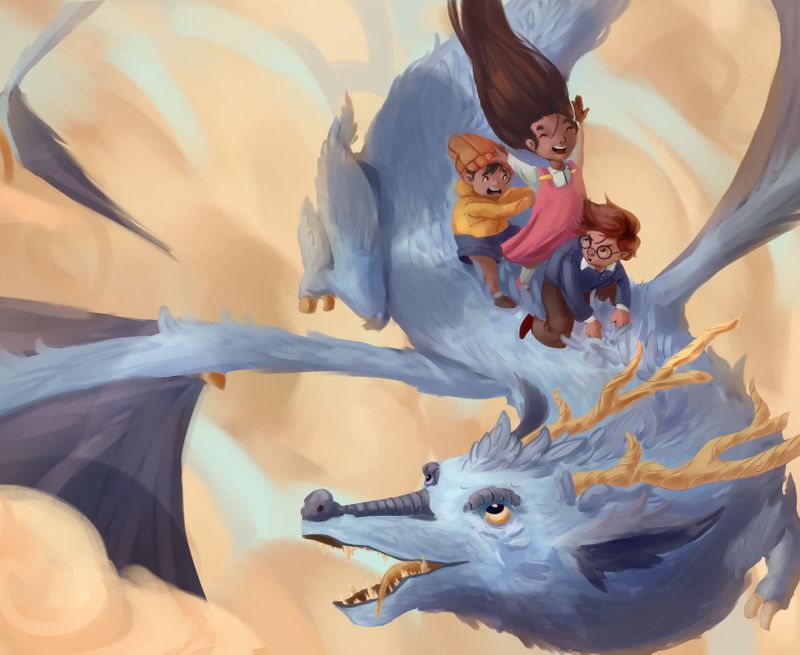
Hello friends! I've been lurking here for quite a while now. And I realize I need to get out of my bubble and ask for much-needed critique.
I'm aspiring to be a children's book illustrator and I wonder if my work is good enough to start to find clients to illustrate for.
Any constructive criticism is greatly greatly appreaciated!
Thanks for looking at my stuff

-
Hey! The overall colours, composition and character expressions are really cool, so I think it's a solid piece!
A few areas for potential improvement for me could include:
- Maybe take a look at the tangents on the characters - the girl's right hand blends into the boy's hat and it took me a moment to really see it. Her neck also seems quite long, since we're looking down at them slightly. Anatomically, she seems a little less appealing than the other two.
The hair of the boy at the front also curves quite directly into the dress, although not as noticeably - that's another tangent to maybe clear up a little bit so the character don't blend together.
-
I wonder if the composition could benefit from a bit more breathing room, giving the painting a bit more of a feel of freedom and flying. The dragon feels very squished into the image in the lower right corner. If the dragon was a bit smaller you could have more clouds for "movement room", but you could even let the landscape beneath shine through the clouds to add more story. Just an idea!
-
The face of the dragon looks a little bit off.. I think it might be because the eyes and forehead make it look like we're looking down onto the dragon's head, but the snout on its own look like a profile-shot. As a result the mouth-eye connection looks a little odd. If I cover his right eye with my finger, I already feel better about the dragon's face!
Hope some of this helps!
It's on the way to being a really lovely image!
-
You have a really great style for children’s book illustration. I agree with @Nathalie-Kranich in regards to minor adjustments. This is a great start for a portfolio though great work!
-
Wow, this is really lovely. You really nailed the different expressions and the color palette and rendering is very dreamy. A couple of thoughts to add into the mix:
-I'd love to see a brighter light cast on the human characters. The dragon's face is illuminated pretty strongly and I think it could be intensified on the kids as well.
-The dragon looks very elegant overall, but the back foot looks stumpy in comparison. I'd consider elongating the talons and making the back foot have a more elegant gesture.Well done! Glad you shared some of your work with us.
Website: www.tessawrathall.com
Instagram: www.instagram.com/tessawrathall_art/
-
@Manuel-Mal beautiful work and yes, I can definitely see this style in a children’s book!
Going to agree with the other critiques you’ve gotten so far — there are changes you can make to the composition that will elevate the piece to the next level.
Is this piece meant to be a full page illustration or a spread? You might consider increasing the width of the canvas and composing this piece as you would for a spread: leaving room for text, designing the composition with the gutter in mind, and being mindful of 0.25” margins. This will show art directors and potential clients that you know how to handle these things.
Your characters are engaging and the dragon is eye-catching, but is there a way to bring in more storytelling? Just looking at it, I’m not quite sure what the story is except that these kids are riding a dragon, and I’m unclear why the boy is looking so grumpy.
This illustration is intriguing; it will be a wonderful portfolio piece. I’d love to see more! Could you add to this concept with sequential pieces? It would be great storytelling for your portfolio and also show that you can draw characters consistently.
Really lovely work. Thanks for sharing it with us, and please show us more!
illustrator - author - smiley person
mbaileyart.com
instagram.com/mbaileyart/ -
@Nathalie-Kranich Thanks for the crit! i'll take that into account and change some things! Thank you!
-
@Asyas_illos Thanks for the kind words! ill try to work harder too
-
@TessaW I'll be trying to post more here, the community is super nice! I'll keep your crit in mind and make some changes about it. Thank you!
-
@Melissa-Bailey-0 hmm what you say makes sense. havent considered the margins and gutter too. thanks for enlightening me! Thanks for the crit! I'll try adding sequential art on my portfolio
")
-
Looks like everyone's covered it pretty well so I just wanted to add this is a lovely piece, the colors and mood are wonderful. I love how the different personalities of each child are so clearly conveyed in their expressions. You definitely have a gift and I'm excited to see more as you progress :). Thank you for sharing!
-
@Tiffany-Thomas thats super sweet of you to say! thank you!
-
I love it overall. The anatomy of the wings attaching to the body (both where they attach and how they attach) feels very strange to me. Terryl Whitlatch would be a great person to look up, and you could study birds and bat anatomy.