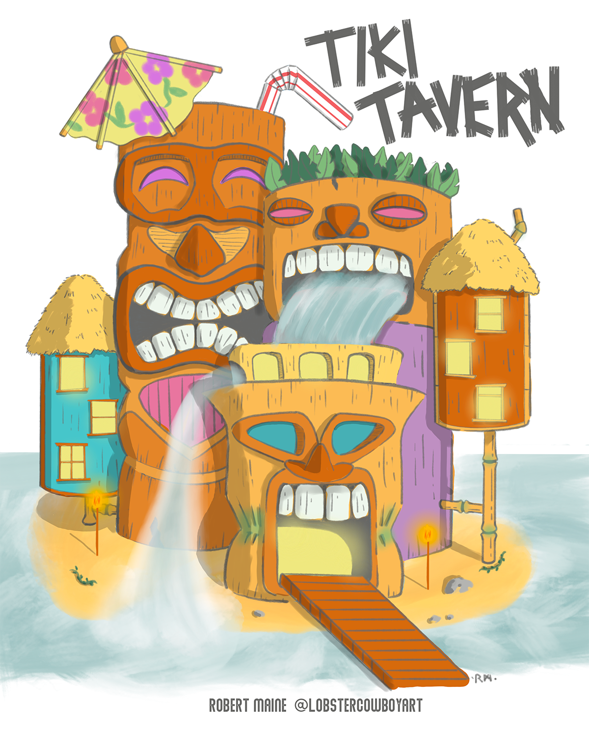
APRIL CONTEST: Design A Fairy-Tale Inn
-
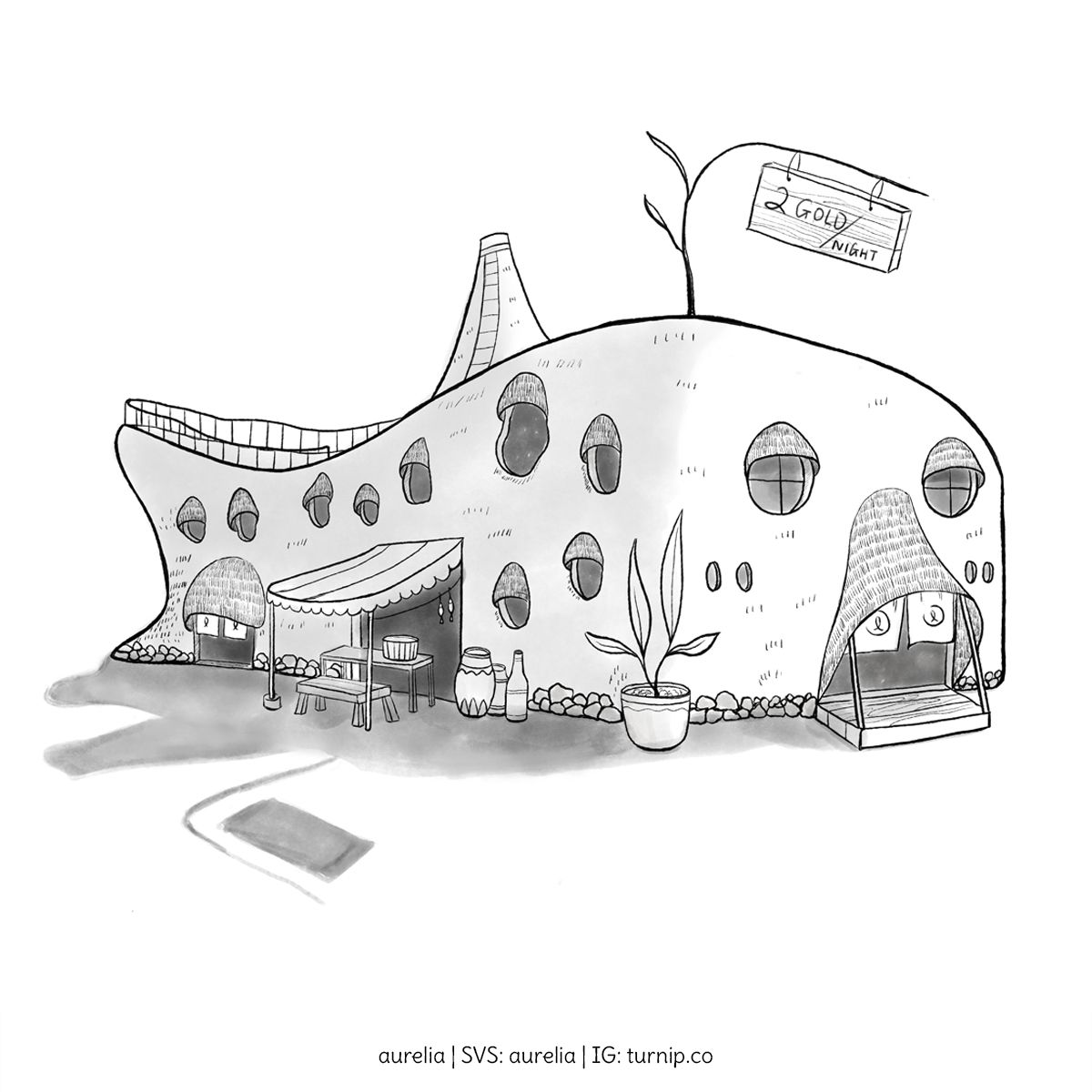
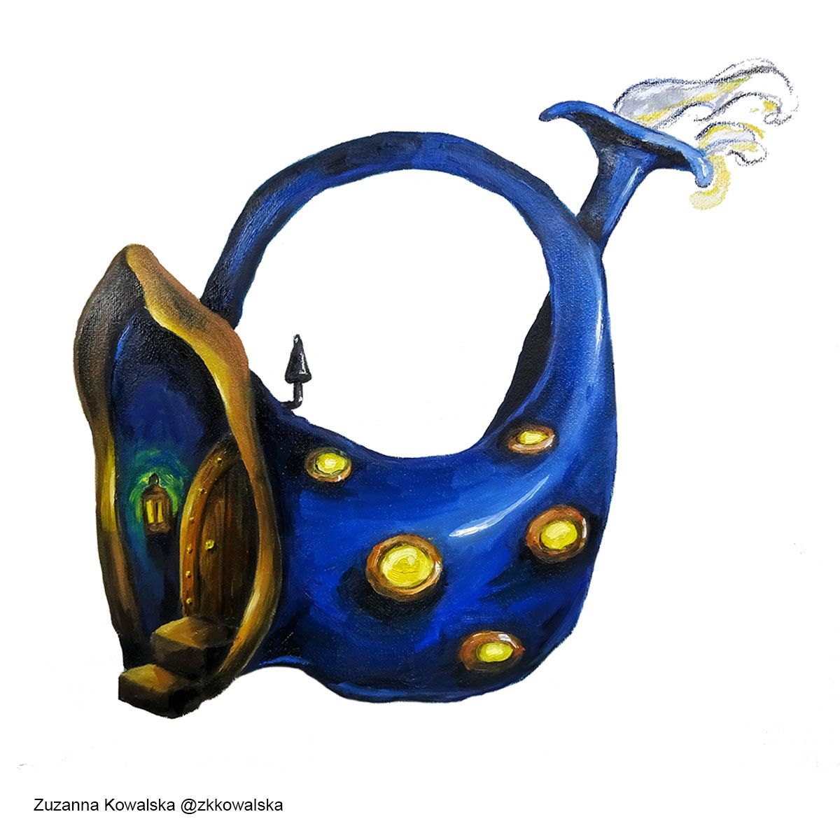
This is my fairytale inn.
It rests at the bottom of the sea.
And is located within a popular undersea city. The city is surrounded by a huge oxygen dome, so there's actually no water inside.
It looks like a fish. But that's not all...
It can even uproot itself and swim away like a fish for evacuation during earthquakes.
-
My April Inn. This was more fun than I expected tbh
-
Think this one is done...
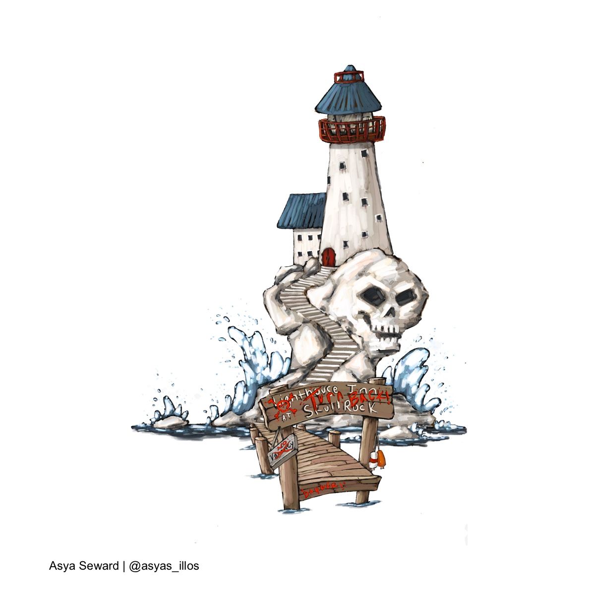
still having trouble with quality using the template though. I try and zoom in and it just goes straight to pixels...
 ️
️ -
Hi everyone! This is my first round as I just learned about the site. It’s been sweet looking at everyone’s entries so far.
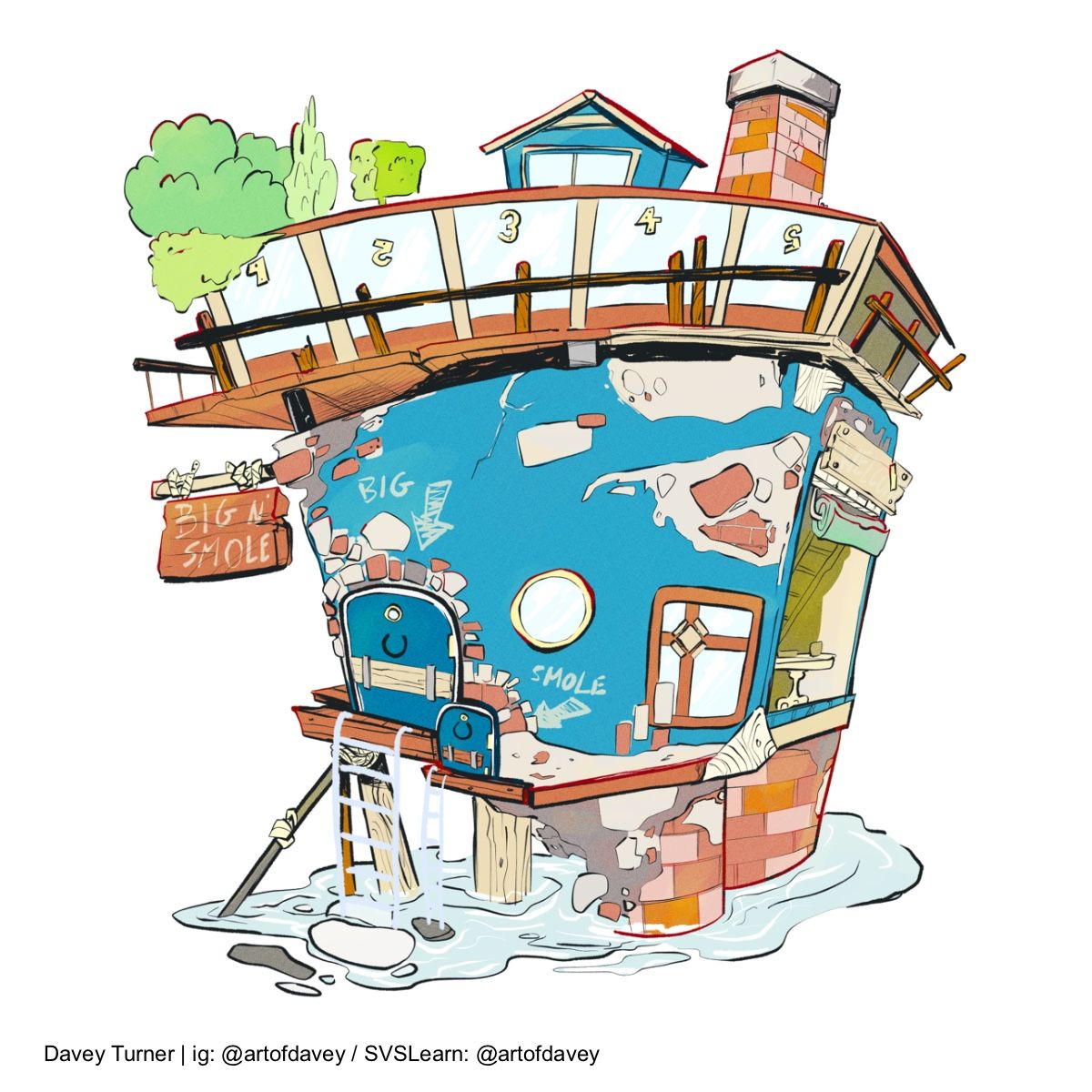
Here’s my entry, “Big N’ Smole”. Lodging for all creatures, both big and smole. Hope you enjoy!!
-
@artofdavey love how wonky your place is!
-
@AustinShurtliff Has anyone else asked about the best way to use this template in Procreate on Ipad? Like @Asyas_illos I'm finding that when I download it and open it in Procreate, it comes out to 1200 px on a side. Alternatively, I can submit a square format image in the size and resolution you specify without that template.
-
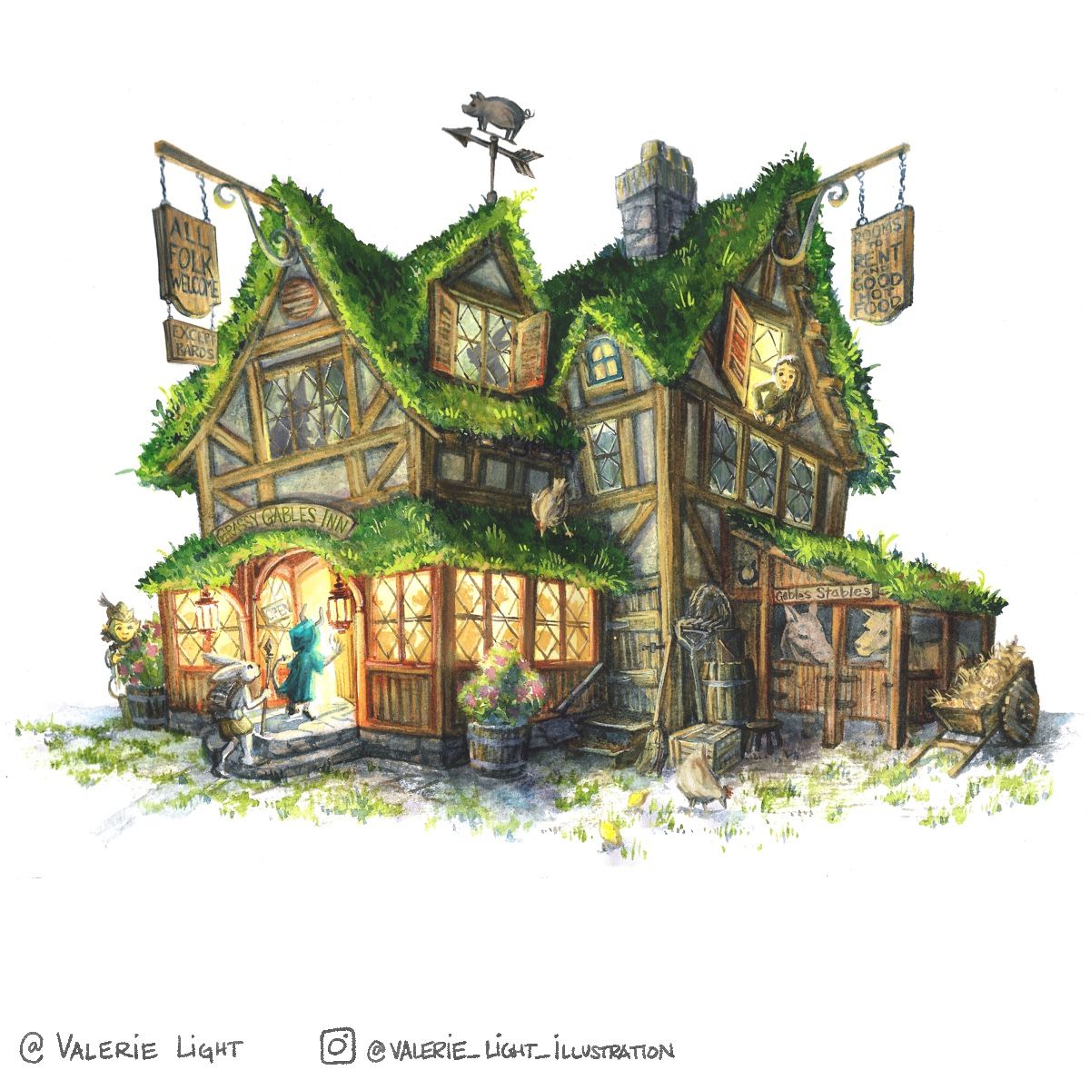
Here's my entry for the fairytale traveler's inn. I've had less time to participate in the forum this month, and I'm experimenting with a style that lets me work in watercolor and digitally together. What do you think?
-
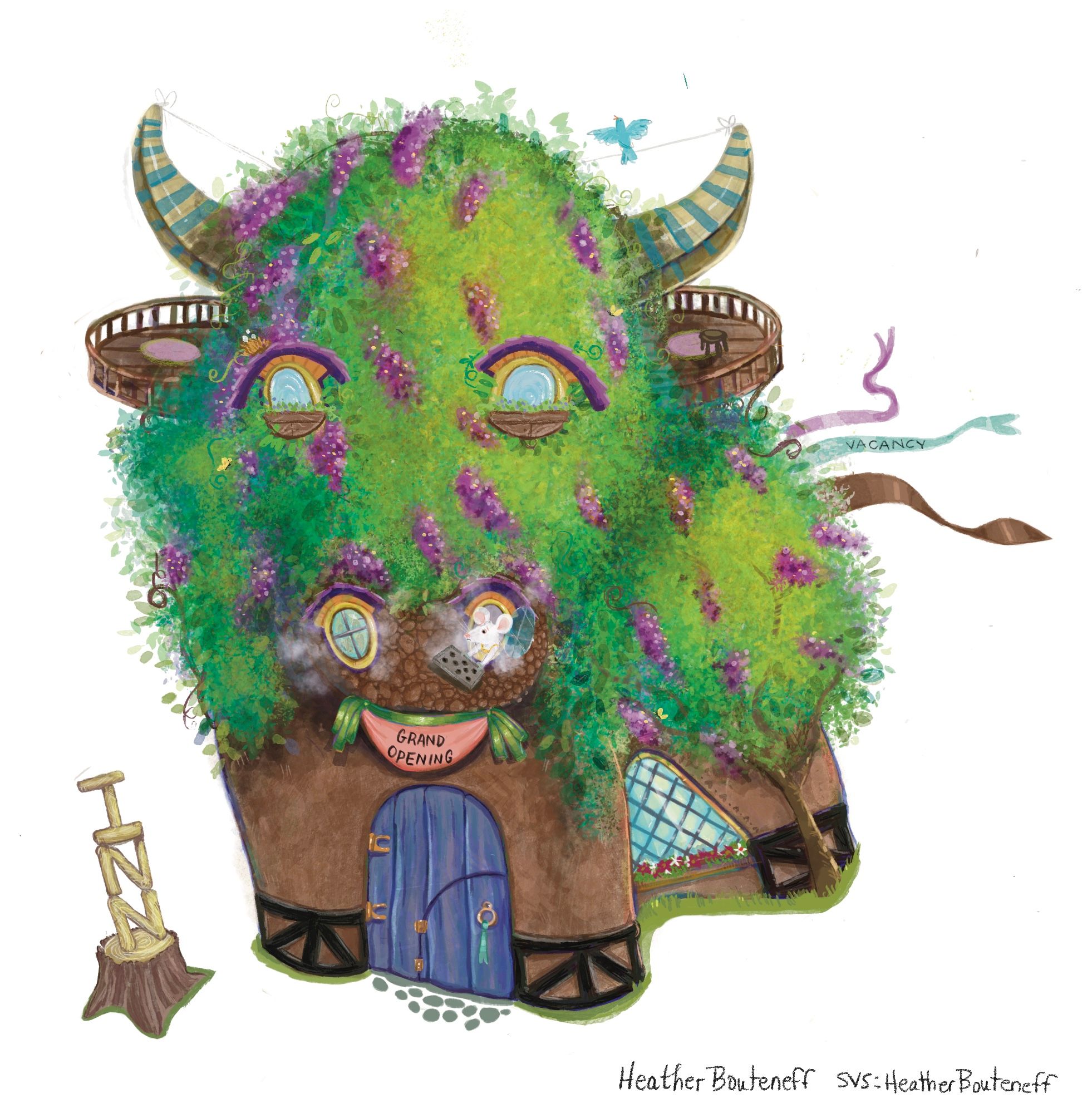
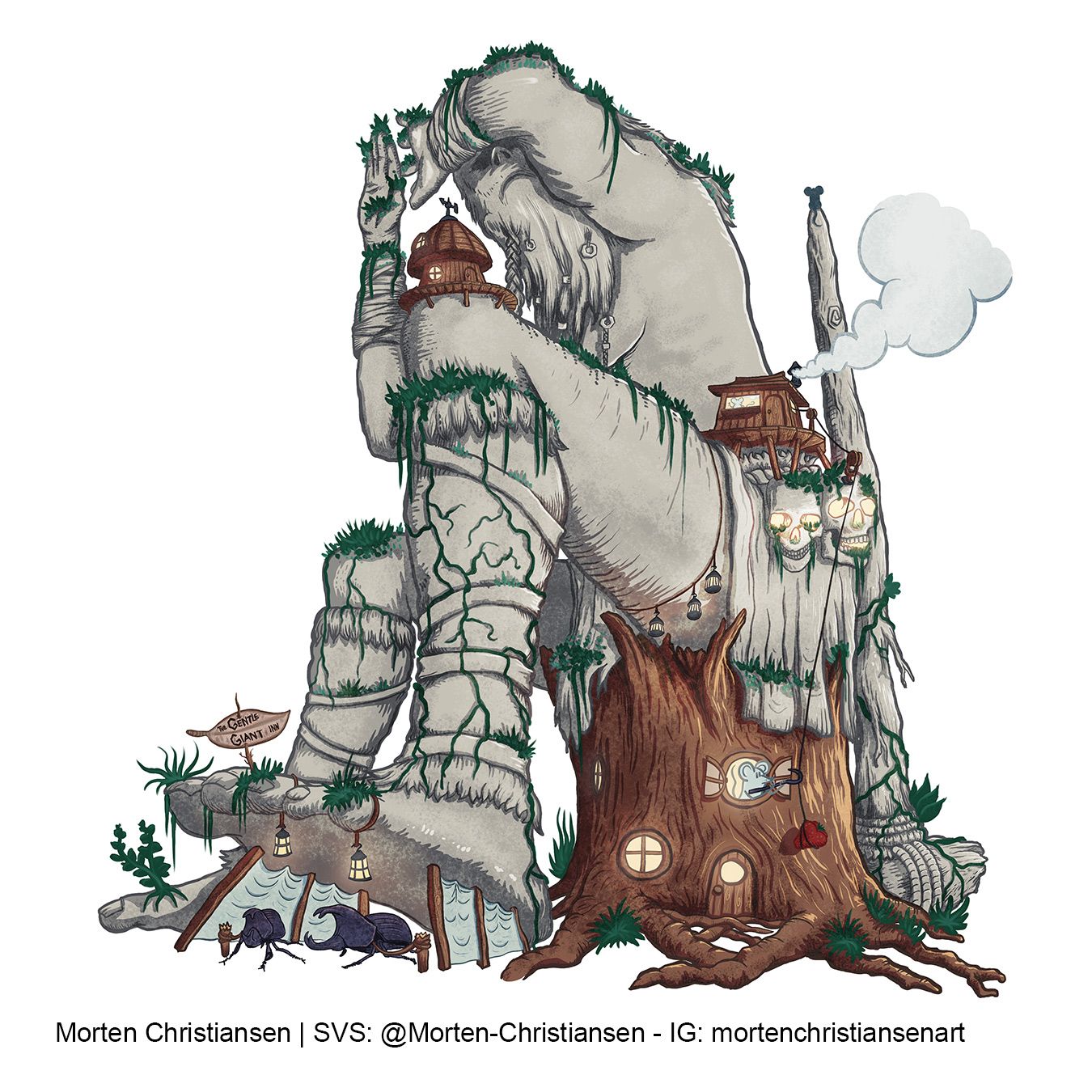
The Gentle Giant Inn - the final resting place of a careless giant has been turned into an inn by entrepreneuring mice.
Like others I find the 1200x1200 pixels of the template to be quite restrictive. The same goes for the 500kb limit to be honest. If that is how its going to be, though, I guess you have to take that into consideration early on in the design. My image is too detailed for that size I think and had I realized this earlier I would probably have chosen another subject.
-
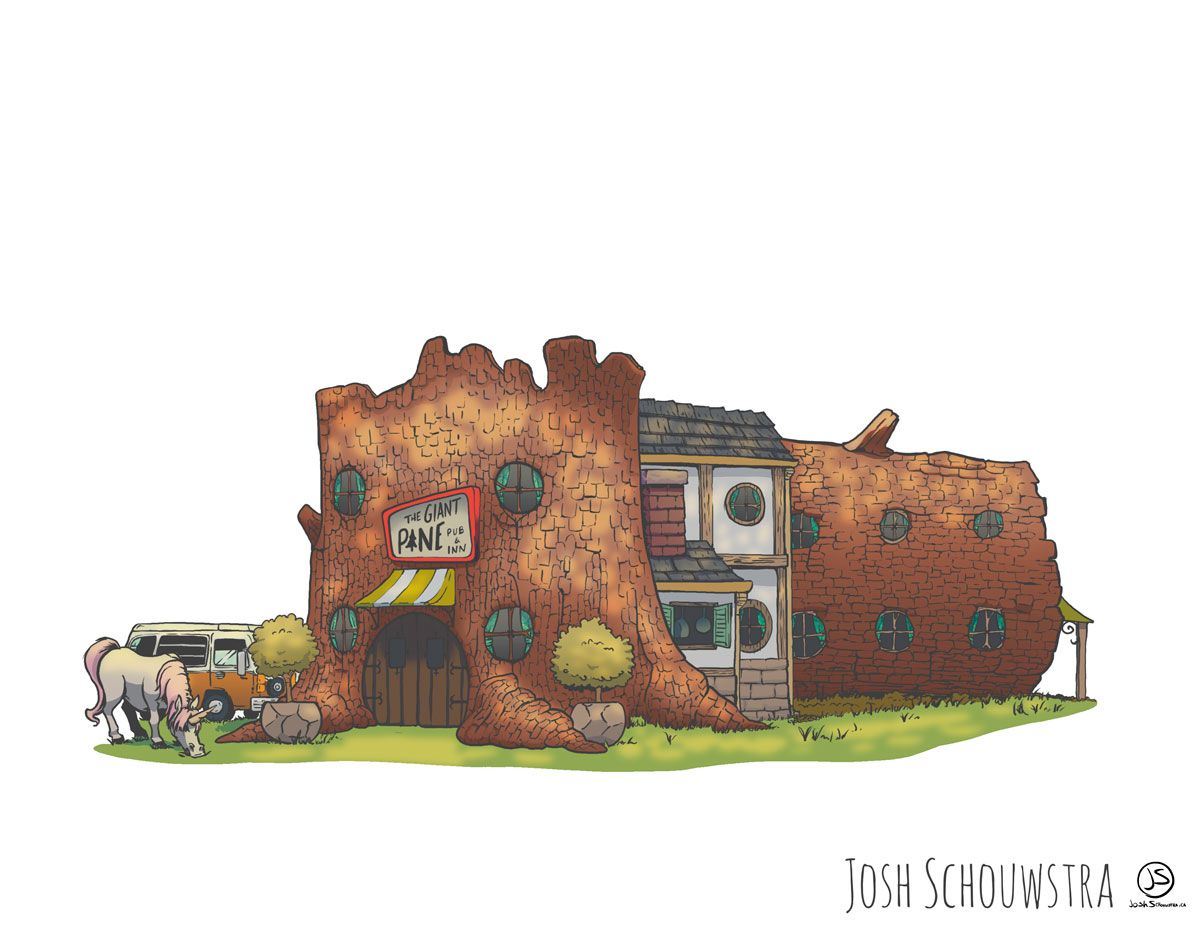
The Giant Pine Pub & Inn. I'm sure you'll find some kind of help for your goblin problem there!
-
Hi guys! Here's my entry

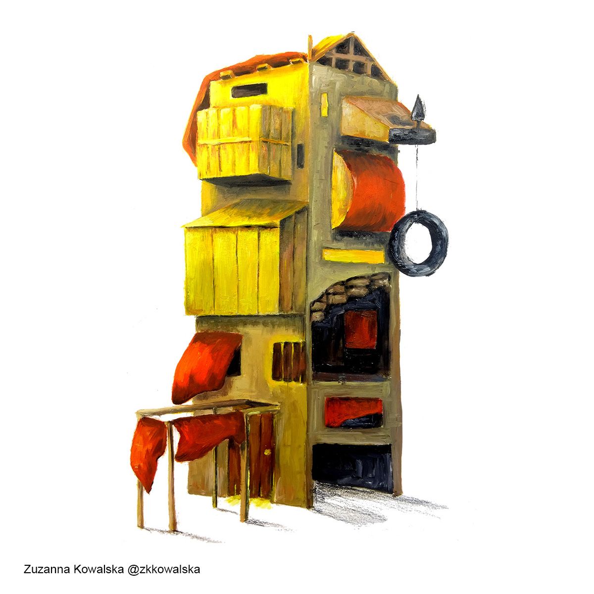
-
So that was fun, here's another one

-
@Valerie-Light It's sooooooo good! I especially love all the silhouettes in the windows and all the little hidden characters. You somehow managed to make it feel like it has a background, even without one. Amazing work!!!!
-
@Valerie-Light love the new style! Beautiful!
-
My entry finally complete !!
https://www.artstation.com/brett_billingham
https://www.instagram.com/brettb_illustration/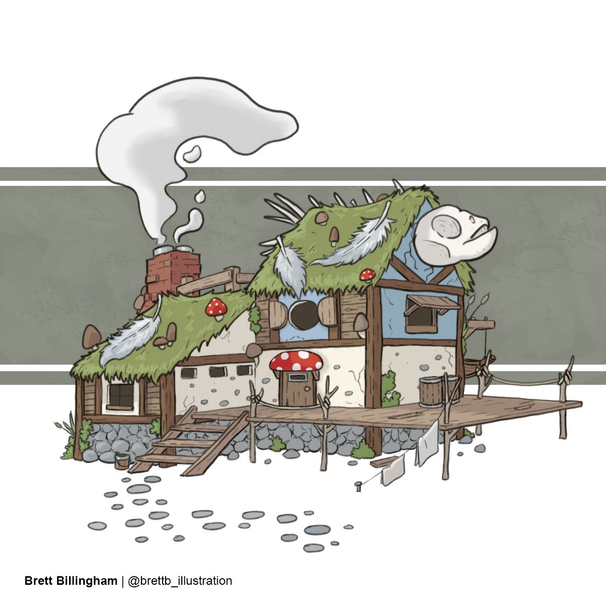
-
So glad I’m not the only one finding issues with the template!
-
@Tiffany-Thomas @Asyas_illos Thank you so much!!
-
@Asyas_illos thanks so much!! Kinda went with an old cartoon vibe like Ed Edd and Eddy or something. : )
-
@artofdavey hahaha I like it!
-
Something a bit different than the classic Fairy Tale.
https://nanohour.weebly.com/
https://www.instagram.com/nanohour_art/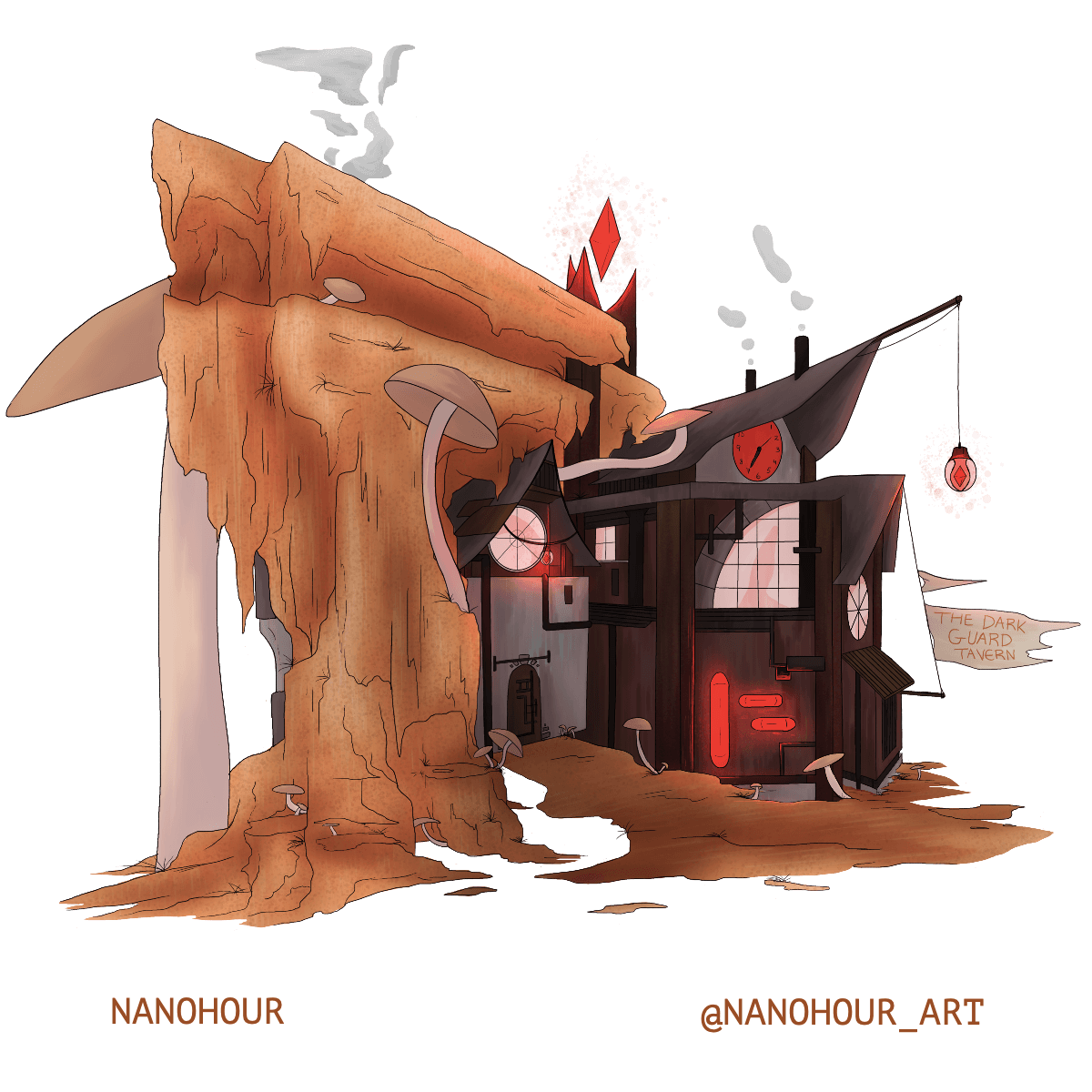
-
