May wip
-
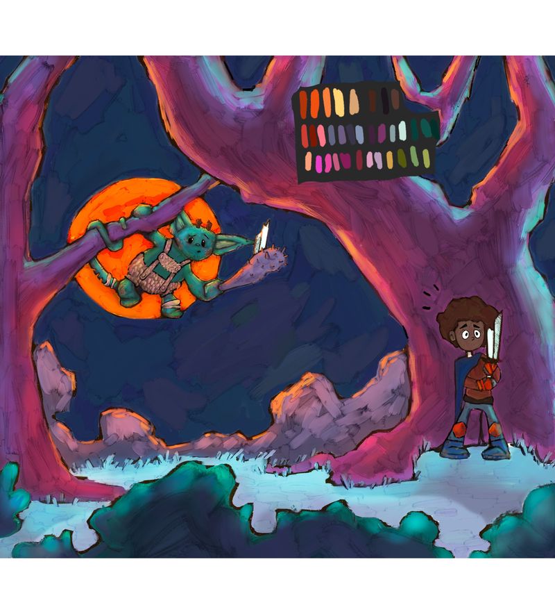
I need some feedback on an entry for this months prompt
Are the colors ok? Is my goblin too cute? Do you see a story here do want to know more? Thanks friends
-
I like the colors of the environment. The rim lighting is cool. I initially thought that the traveler was hiding from the goblin. I didn't see that part of the sword was broken off onto the goblin's weapon. I think that the characters are too far apart right now to understand how the sword got broken. I didn't realize that they were fighting at one point. The goblin also looks like he is stepping onto the orange circle because of his foot is in relation to the circle. You could move the circle up or down (I assume the orange thing is supposed to be a moon, right?) The composition also looks like it is cut in half the goblin half and the traveler half. Maybe make the traveler closer to us so he is bigger and closer to the goblin. These are all just ideas, you can take them or leave them. I like the idea of the sword being broken, I just didn't see it at first what was happening.
Instagram: https://www.instagram.com/kiminyrose/
-
@Kim-Rosenlof thank you for that helpful feedback! Yes that is the moon, I’ll have to adjust it somehow to accommodate the foot... I may be too far into it to relocate the traveler, I’ve been working mostly on one layer. Maybe I can play with sword a bit to make that stand out a more.
-
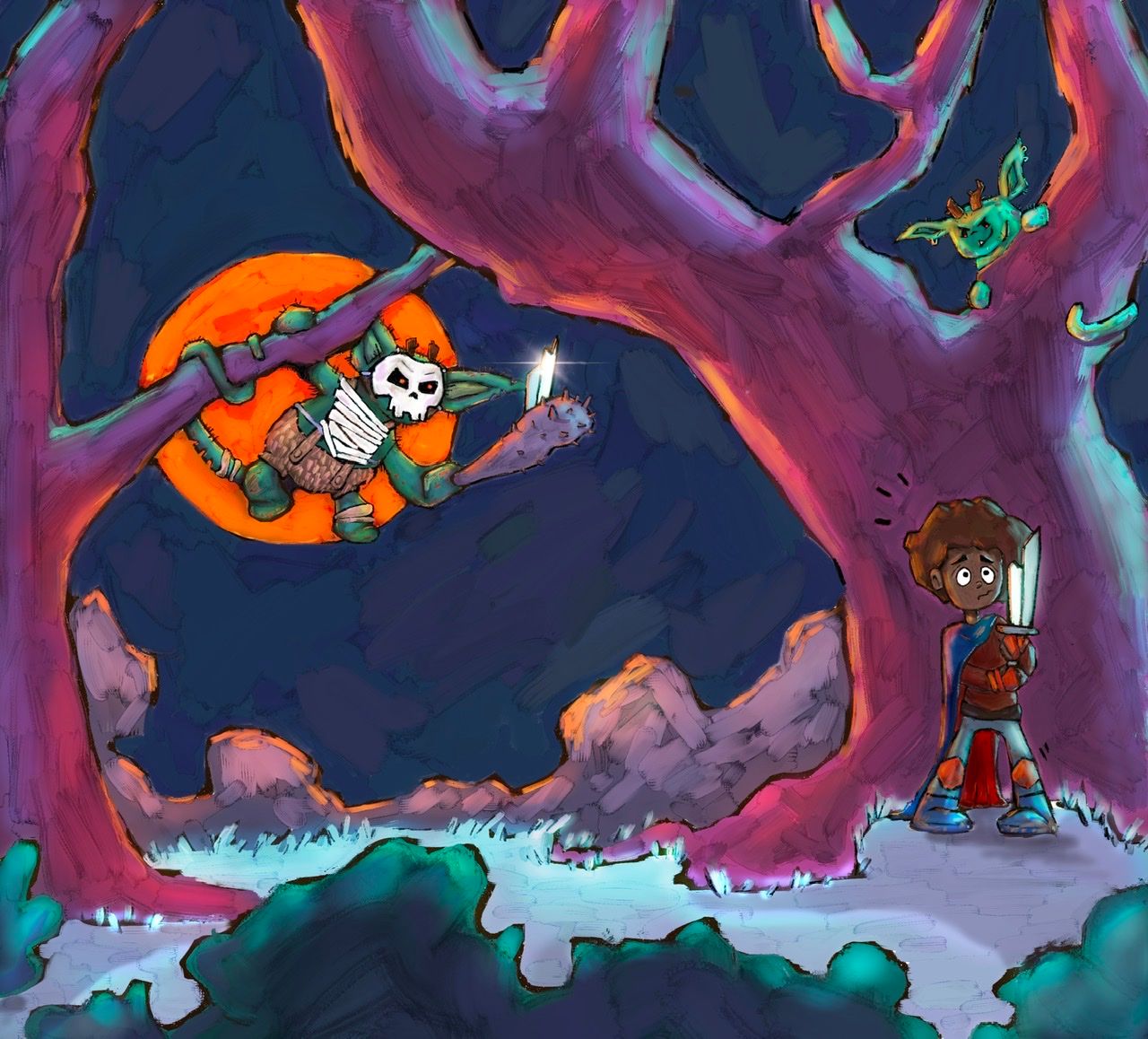
Played around with it a bit more, added another goblin fine tuned it, think I’m gonna call it I’ve got other ideas I want to get started on

-
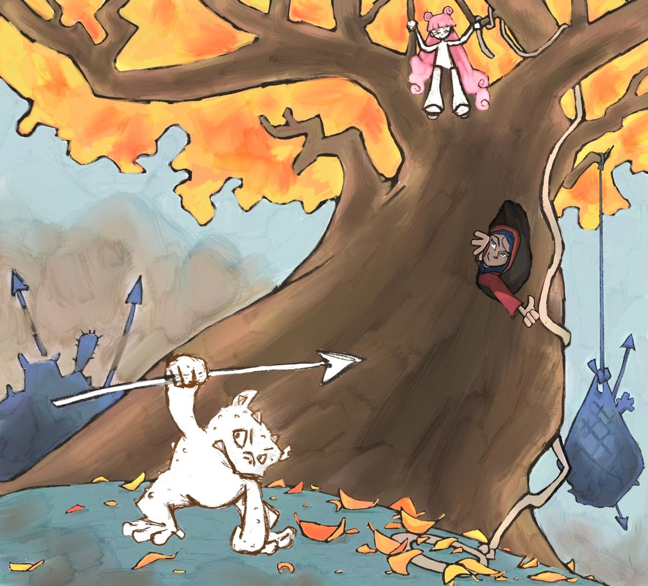
Working on another piece for may.
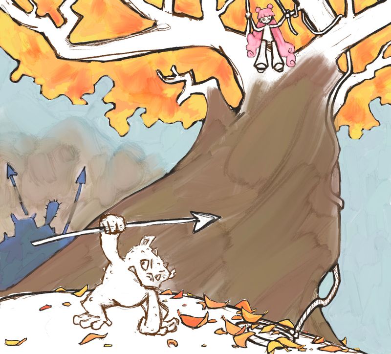
I need to darken her a bit I think, they are a bit similar in value. But anything I may need to adjust as far as composition? -
I still haven’t done anything to her hair, I just really want the hair to be pink for some reason...gonna add some leaf shadows next and figure out what is going in the hole... -
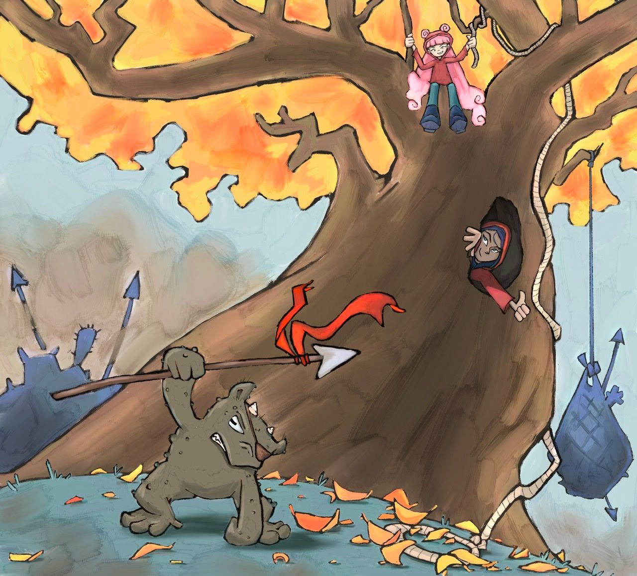
 just noticed the tangent with the character hand and the rope...
 -
Any thoughts on colors for the goblin and the girl in the tree?
-
@Asyas_illos I feel like the girl is really scrunched against the edge of the image. It almost creates a tangent. You might want to scotch her down a little.
-
@chrisaakins mmm I see that now I’ll try and pull her down a bit thanks!
-
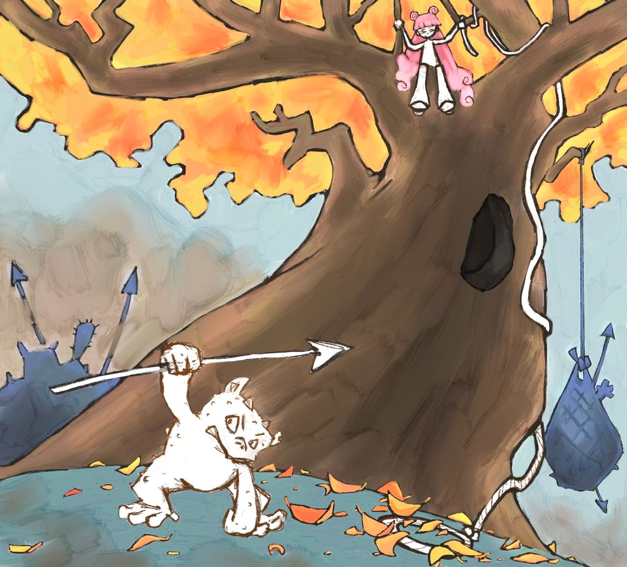
Ok any last thoughts on this? goblin color? Is the flag to bright or distracting? Thanks
-
Here’s the one I sent to critique arena website, my daughter brought it to my attention that the hood of the girl in the tree just didn’t work because she had all that hair flowing out of the back and down in front! So we changed to to a beanie
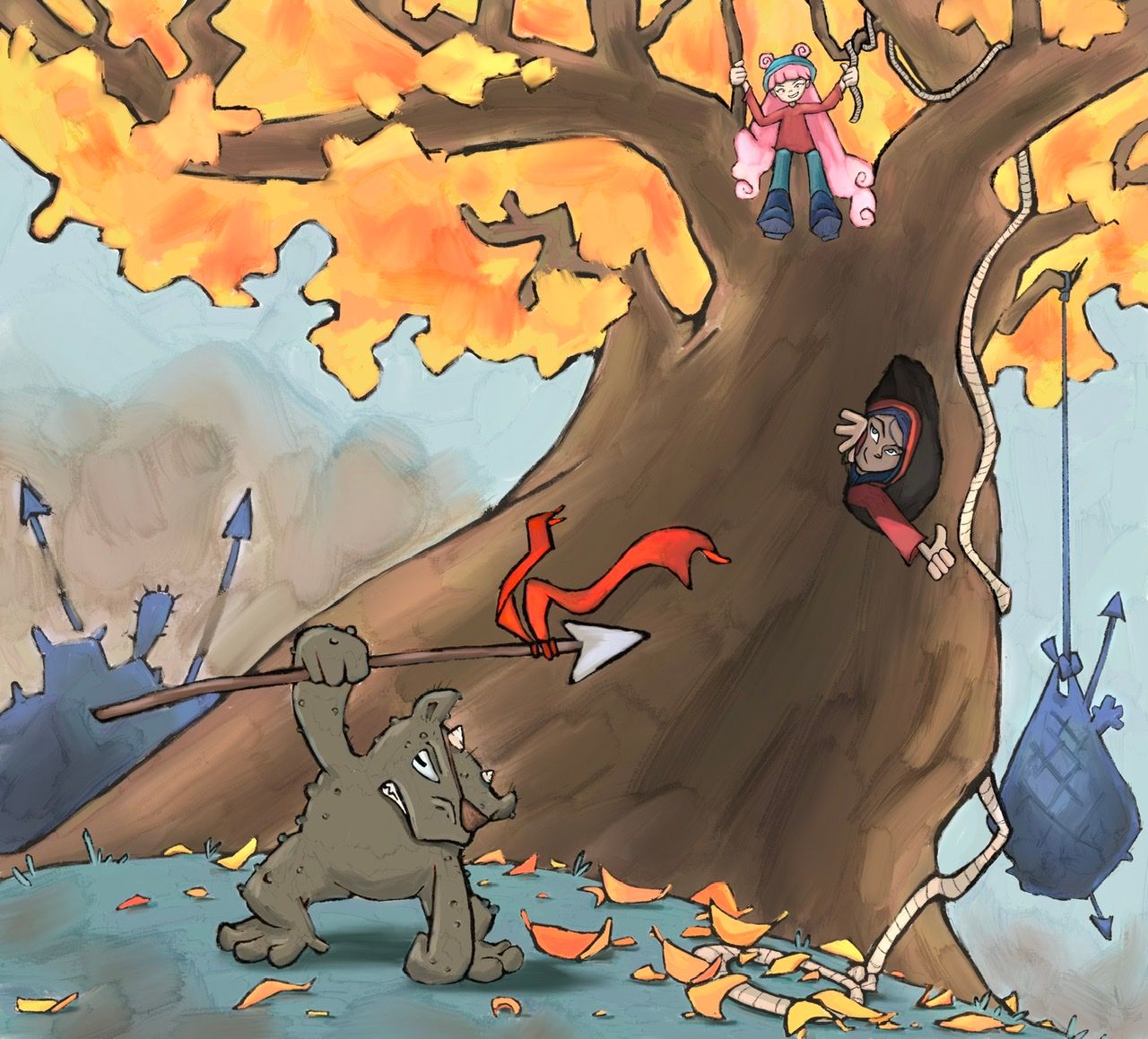
Looking at it now I wish I would have darkened the goblin, more... -
@Asyas_illos Looks great ! I'm terrible with painting and colour, but a line work thing that may be worth trying is to add to really subtle contour lines of the tree to help indicate the angle more. Might not do much but could be worth a try. Hope it goes well, excited to see it when it's done!
-
@brettb_draws thanks for the idea that would have been a good addition but I’ve already sent it in!
-
I’m working on this next piece for may but I’m not sure about the shadows placement. They are just rough sketches at the moment I think I need to get som reference... -
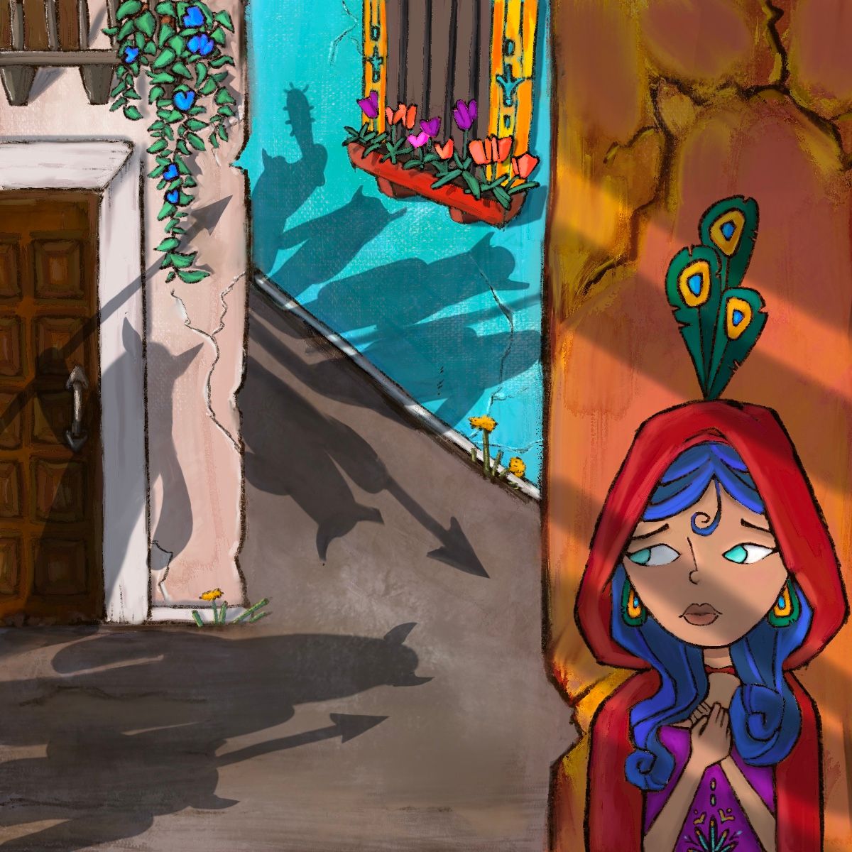
Alright thinking I’m gonna call it for this one. -
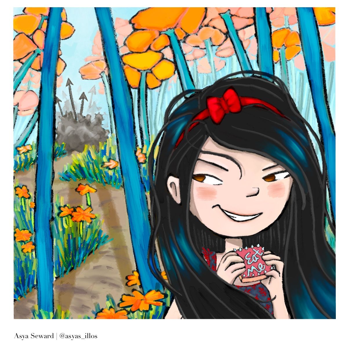
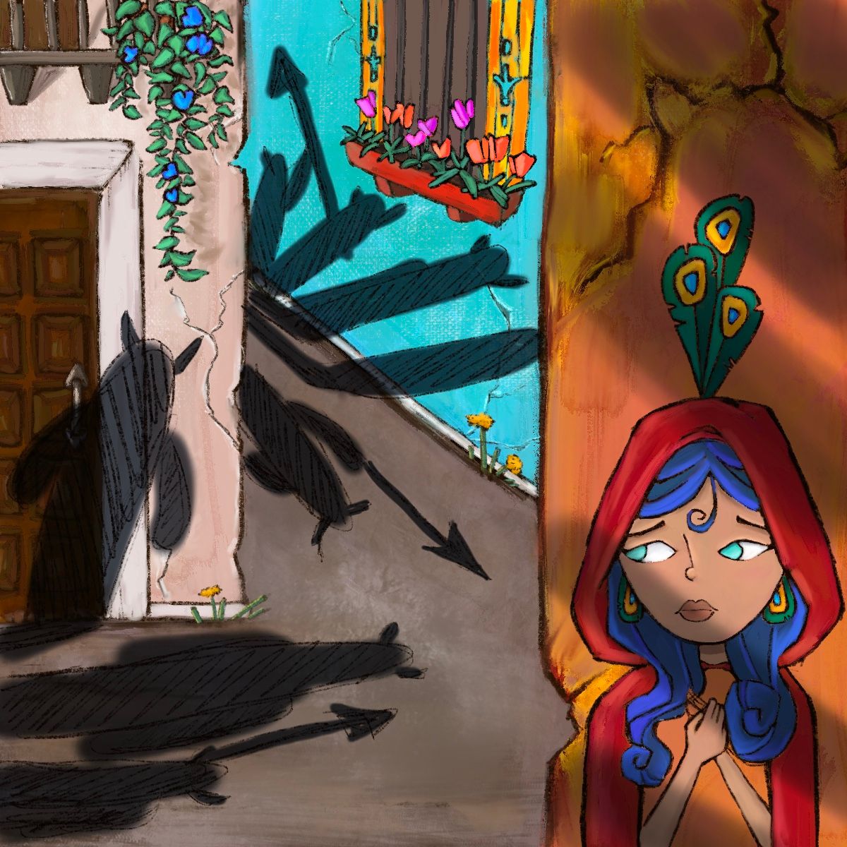
My latest entry, I’m stuck in this composition, all of my entries seem to have the same flow to them not sure if that’s good or not, but definitely need to break out of it! -
@Asyas_illos I really like this one. The colours are lovely.
Art is hard.
https://www.instagram.com/janettehillart/ -
@Janette thank you!
-
@Asyas_illos of all your pieces for this month, this one has the best storytelling (in my opinion). With just a glance, the composition is totally readable and you know what the character's feeling and what she's about to do. Well done!
Don't know if you've called this one "done" or not, but you may want to try playing with size even more. What if the flowers are even bigger, especially showing a gradual reduction in size as you move into the background? That would really communicate that she's a small character facing off against much bigger foes.
 ️
️illustrator - author - smiley person
mbaileyart.com
instagram.com/mbaileyart/