Somethings wrong. I can feel it.
-
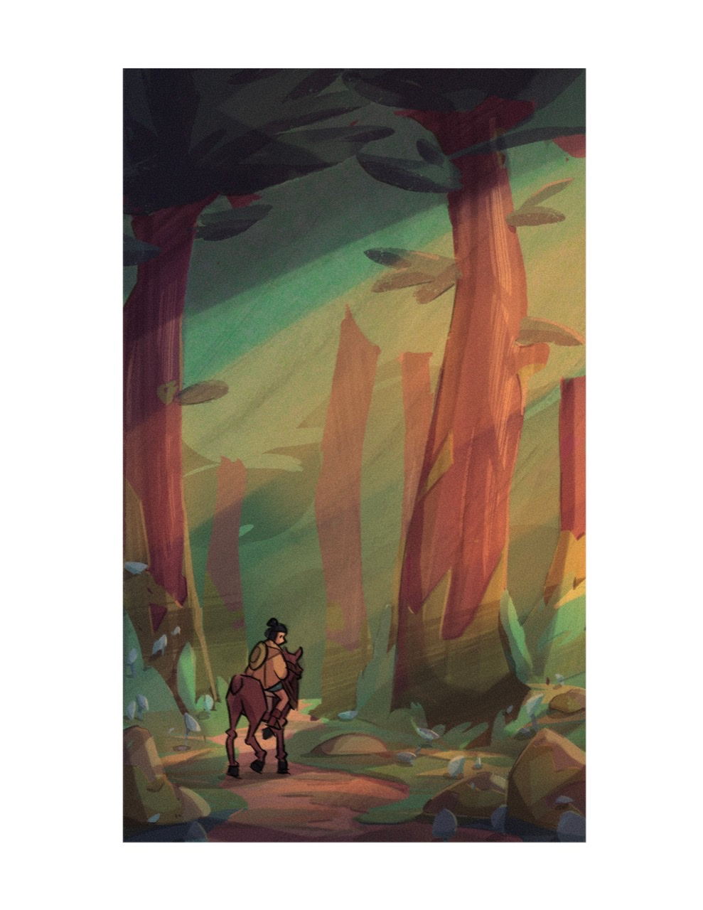
Hey SVS people! I’m trying to get better at painting, and it’s much harder than I thought. What do you guys think of this painting I tried? I feel like something is wrong with it, but I’m clueless to what it is. I think the comp is ok, something just feels off with the rendering. If any of you have any tips or fixes I would love to hear them. Thank you so much!
-
My first thought is that your lightest areas are highlighting a section of the painting (the tree) that probably isn’t meant to be the focal point. That sends the eye to a place where not much is happening. If the figure at lower left is the “story”, consider working on highlighting him more. I’d say the picture lacks a point of view at the moment, so decide what that is, whether it’s the figure or something else.
-
@Randi-Gordon yeah that makes sense. Thanks!
-
@Randi-Gordon
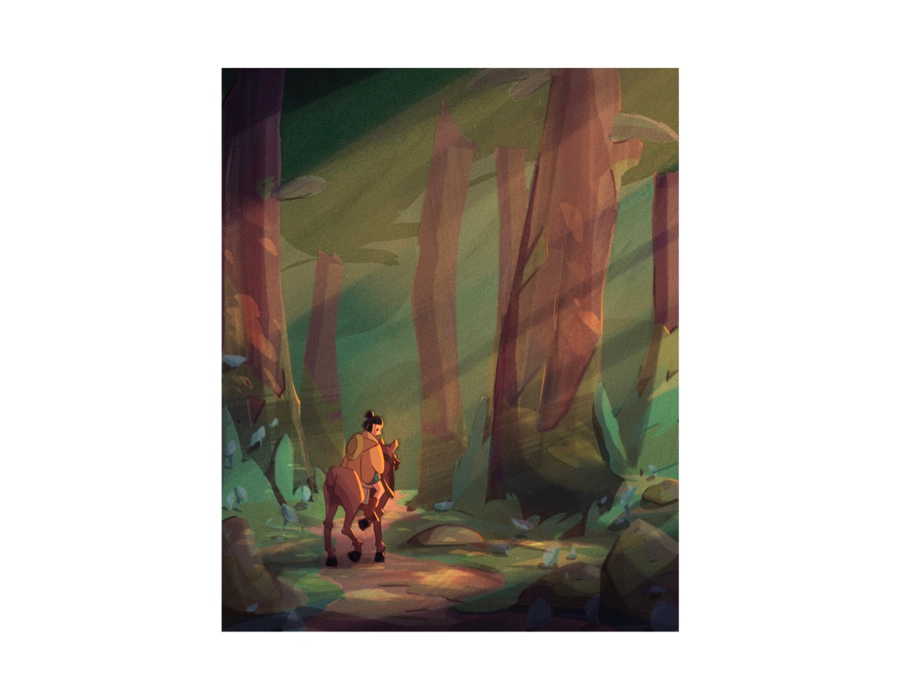
Do you think this is better? I really see what you mean, it seemed so obvious I guess I didn’t think about it. -
@phoenix-yip I’m still learning myself so perhaps take this with a grain of salt but while the highlights are better I feel the foliage in the true back ground is too light and brings it forward as if it’s in the same space as the character. If the light is hitting your character it wouldn’t also be hitting the green space in the back because it would be blocked by other trees? I think darkening the green back there would really help the character stand out… again still learning but hopefully it helps

-
@phoenix-yip one last thing that stands out to me is the lack of shading on the background trees as compared to the front makes them feel a little flat. The front end is wonderfully shanked and highlighted but it doesn’t carry through to the back
-
@phoenix-yip I like the subtle textures you have going on in your piece. For me, what feels odd is that the character and the horse are the only elements that have a thick black outline. Everything else is a shape rendering. You can either remove the lifework from the characters or add some line work to the background and foreground.
Also, the line width seems a little thick for a relatively small and detailed element like your character.
Since you have no black anywhere else in the illustration, try using a dark brown instead of a black outline.But I would try and remove the outline first. You may need to adjust the values a little so that the character stands out from the background.
-
Beautiful style!
The things that really stuck out to me were:
-
The stark black outline on the characters but no line work in the rest of the rendering. There’s a disconnect between the two, reading like 2 different styles.
-
It feels like there should be a stronger light on the characters to make them stand out in the scene. Really spotlight them, don’t be shy.
Those things might be the “something wrong” you’re feeling. Hope this helps.
-
-
I think you are missing out by having the figure standing in the shadow. I would push the light that is hitting the ground and have him lit up by it. Perhaps there is a reason in the scene as to why he is in shadow, but if that is the case I would have painted it differently
-
I'm a complete novice so this might not help but I was wondering if you could crop the image to just the bottom 3rd? You still have the scale of the trees / forestbecause the trunks are huge but it just brings a clear focus. It might be easier to work out the lighting then as well.
I don't like the black outlines on just the character. Can you change the colours of your line work so that it is only a slightly darker shade of the things it is outlining then you still have the definition but it's not so in your face?
-
@Gary-Wilkinson
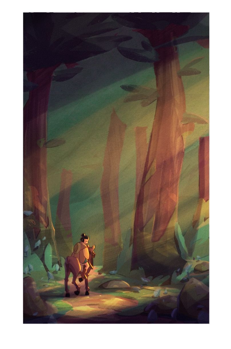
Hey there! Thanks so much for your advice Gary! How does this look? Is this an improvement and what else specifically can I do better? -
@phoenix-yip minimizing the black outlines on your character and lightening that area looks like a big improvement to me. It helps draw attention there rather than the trees.
I would consider maker the background darker and see how that looks. -
@phoenix-yip huge improvement that time! Love the character without the outline and my eyes were drawn to that first before taking in the rest of the image
-
@phoenix-yip love the improvements, I think the taller canvas works better though as it fit well with the composition.
I hope you don't mind, but I did a quick adjustment by returning to the old comp and adding in some blues in the shadows as well as increasing the highlights on the character. It might not be the style you want to do for though, but it's just an idea.
-
@Gary-Wilkinson No yeah i really like it! Thanks for the help