Feedback/critique child playing in the rain
-
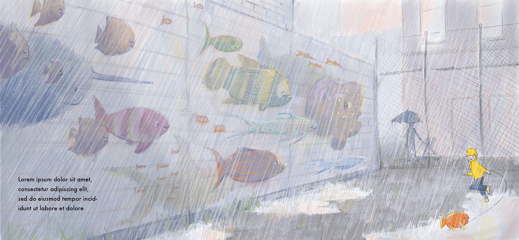
It is a really lovely idea. What I notice most in the picture is the big fish on the left hand side - I can't stop looking at it. If I hold my hand over the big fish then my eyes are drawn to the child playing straight away. If you want us to look at the child then you have to change that fish somehow. Does that help at all?
-
I also meant to say I love how you have drawn the rain and the light coming through.
-
I love this...the colors are so delicate...I know exactly the kind of luminous rain that you've portrayed here. I agree with @geekinm that my attention is drawn to the fish mural. The large size of the painted fish is part of that, but also the intense color. I wonder (I wonder because I don't know!) if greying down the mural a bit would work. I'm also wondering about the the child's red jacket (the color ties the child to the mural, but I almost want the jacket to be rain-gear-yellow) and especially wondering about the dark blue of the fish toy. Would the story still work if the dark blue were a brighter blue?
-
@joosterwijk I agree that the colors of the mural pull the eye away from the child. I wonder, why those color choices to begin with? Most fish are not bright red /yellow anyway, and this is an opportunity to paint soft blues and greens, thereby allowing the figure of the child to really stand out. Great work otherwise.
-
Thanks @geekinm @RachelArmington @Randi-Gordon ! You guys are absolutely right that the mural draws too much attention now. I think I enjoyed drawing it too much and therefore giving it too much focus. I'm going to play with the colors and changing the big fish in the corner. I hope to post an updated version soon!
-
A new try. Better or worse? I let it rest now, time to draw something a bit less rainy...

-
In my opinion I feel the focal point is meant to be the child, specifically the rain coat he is wearing. However I believe it would be more effective if the child would be bigger. Or perhaps expanding the yellow in a reflection in the puddle. I see that you have touched the puddle with a slight taste of yellow, but it does not seem too deliberate.
I don't know what the full premise is with the boy and playing in a harsh urban environment, but I am thinking he is using his imagination. He is playing with his toy fish and imagining he is under the sea. Could you perhaps incorporate the idea where the fish on the wall are coming to life and popping off the wall. Almost as though the city itself is under the water. What do you think?
-
@joosterwijk I like the style and the rain looks really good. I think the child and the fish toy stand out now more than the mural. I actually liked the red jacket that you had on the first one, but the yellow works too. I do feel like the child could move up and to the left a little bit so that it is not so far into the corner.
-
@Kori-Jensen @Kim-Rosenlof Thanks! It is true that the focal point is the child, I can maybe put a bit more emphasis on him, I will play around with that. About the colour of the jacket, I started with yellow, then it became red to have a better value contrast and more focus on it. But when I tuned down the fish I made it yellow again and now I don't know anymore
 I think it stays yellow.
Kori, you are spot on with your premise and I really like your idea to put more imagination/fantasy in the illustration. Hmm, I have to think about it. It is maybe a bit too much for this composition (although if I change the direction of the fish they can follow him off the wall (like Escher!))
Thanks a lot you guys, I will let it rest a bit and then will pick it up in the near future! -
@joosterwijk Like you said my friend rest on it. I know it takes a lot out of me when I think on it too much. but I do like your ideas. Keep it true to your vision my friend.
-
@joosterwijk I think the initial one is better
-
@joosterwijk great work of art! Love the idea. I've been reading people's feedback about the mural and colours focal point. I know I'm late to the game here, but I don't think it's the colours that need to be reviewed but the values and contrast. You should be able to use any colour if the values are correct.
Have you checked the piece as greyscale and also zoomed out so the piece is very small on your screen? When you do that, are the values between the child and its background contrasted enough for it to be the focal point?
Check out Marco Bucci's videos about values on YouTube. They're excellent!
Looking forward to seeing more of your artwork. -
@joosterwijk lovely piece! Love the storytelling and the mural.
Going to second @Adam-Thornton-0 's advice: check your values. I think if you played around with lighting more it would strengthen your focal point and the storytelling.
If the lightest part of the illustration is the child (perhaps a ray of light is breaking through the clouds?) that will draw the eye. Darkening the environment (even slightly) will support that focal point and also add to the feeling of dreary urban landscape.
That's just my take on it, though. Looking forward to seeing what you do with this piece!
-
@Adam-Thornton-0 @Melissa-Bailey-0 You are right that the piece is too flat. I’m going to work on my values. I did actually made a value study and I have a layer in procreate that makes everything B/W (tip: make a layer black and put it on color mode). I think I kept everything too subtle because I was afraid to kill the rain effect.
Im on holiday now so a new version will take a while. Thanks! -
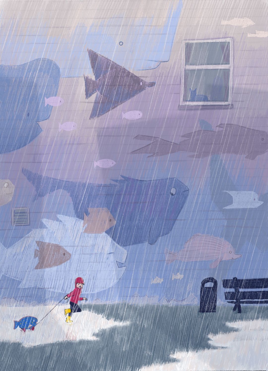
Hi everybody, here is an update. Well… update, it is more a complete makeover

I changed the composition completely because I think by putting the child and the fish together they have a stronger interaction, you are more part of the fantasy of the child. It was also easier to play with scale and focus this way. At first I was worried that everything became too flat and boring, but I think it is ok. Secondly, I added more colour and contrast to make the piece a bit more uplifting / interesting. I have a lot less urban environment but maybe it was too much for this story anyway.
What do you think? Good or bad decision making? What is your favourite and why? Thanks, you guys help me a lot!!
PS. I’m not making an other one

-
@joosterwijk this is wonderful! Love all the changes you made and overhauling the composition was a good call. The focus is on the fish and the boy, but it does still read urban environment. Well done!
-
@joosterwijk I love this color palette! And the fish going
 is so cute.
Nitpicking: I’m seeing a tangent with the kid’s legs and the puddle. I think it could be a stronger silhouette if the puddle extended all the way around. I mean like:

I think the garbage can (or mailbox?) and the bench are distracting me because they’re the darkest and most solid colors in the whole picture. At first I thought the garbage could be a character, it kind of mirrors the kid.
I really like how you made the window interesting, and still balanced with the rest of the wall. -
@Melissa-Bailey-0 Thanks!
-
@LouD Thanks! Those damn tangents, you are always missing one
 . And I will look into the value of the bench and bin.