Looking for critique on Draw 50 Things Thumbnails
-
Hi everyone,
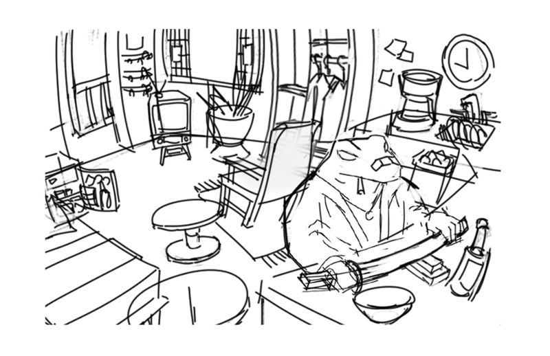
I'm working on a piece for the draw 50 things challenge and the composition feels a little off to me.
I attached my thumbnail in the later stage (more detail).
My main concerns are:
Does the frog read as the focal point?
Should I approach the lighting/values in a different way?
I attempted a wide angle/curvilinear perspective, does it read well or is it distracting?Thanks!
-
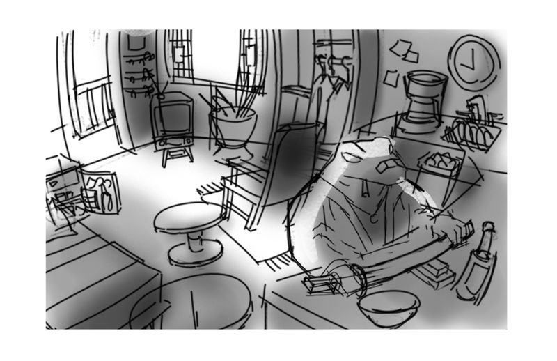
I like the perspective and in the sketch my eyes go to the frog, but in value tones my eyes wander away from him. I think lighting him from the front will ensure he stays the focal point. Maybe have a candle or lantern in his workspace?
-
I feel as if the frog is being pushed off the picture plane by (the almost) concentric circles.
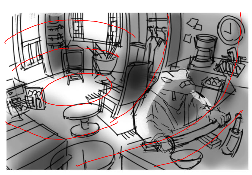
But the almost concentric circles are also my favorite thing about the illustration...perhaps if the backlit area of the frog were moved just a touch to the left to partially cover the shadowed back of the chair, for more contrast.
-
I think this has an awesome amount of detail in it. I think its enchanting and beautiful. However a couple notes.
1 I feel like if it's curve line perspective, should it not be curved at the base of the far wall leading to the TV? I mean the counters and items thereon are perfect and it's subtle but I bet the walls might make it pop. Btw I don't think it's distracting
2 the fog? Is it shadow? Values? If so, you got a hard edge on the epic frog man but soft values on everything else. Kind of gets hard to see where the shadow starts and when it ends... although this is a thumbnail so it's for a general idea so take that for what it is lol.
The overall idea is seriously cool though. Thank you for sharing
-
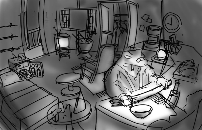
@Asyas_illos That was very helpful, thank you. I messed with the values like you suggested and I actually like it a lot more now.
-
It’s amazing how much lighting can change the mood of an image, looks great please keep us updated as finish your project I’d love to see the finished illustration!