Feedback on recent digital painting
-
Hi all, hope everyone is safe and well during these crazy times!
I just finished this piece today and would appreciate any feedback and constructive comments to help me improve. Sorry for poor quality of upload!
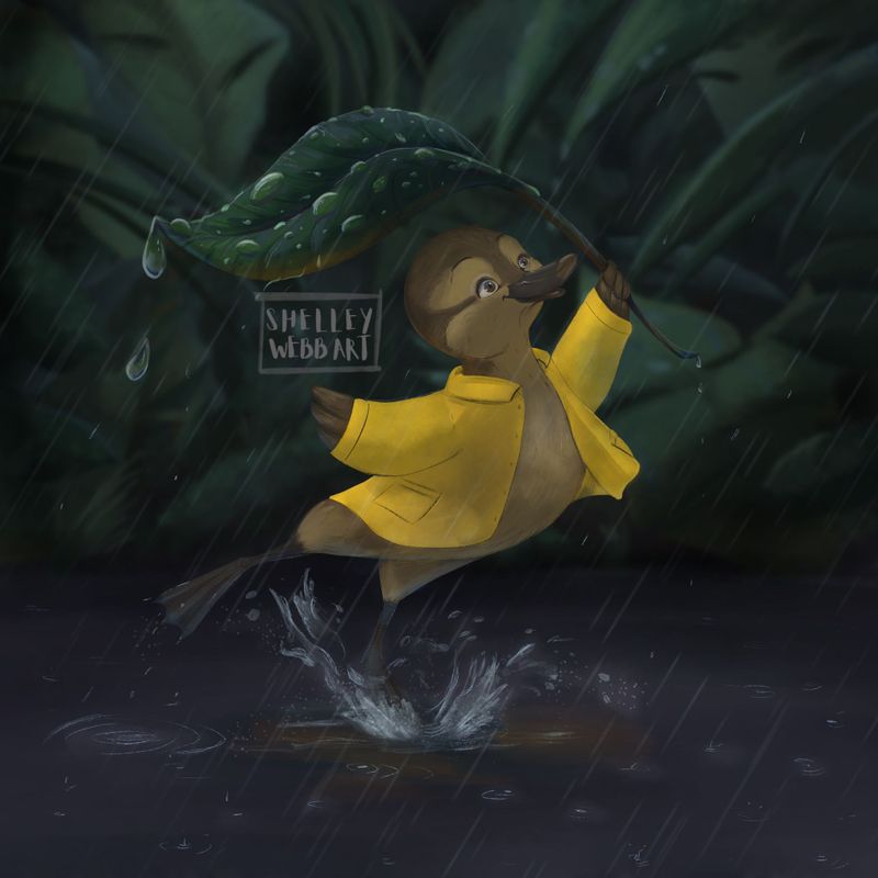
I’m still battling with style but for once I’m actually quite happy with this piece.
Would you say it’s suitable to go in a portfolio that I might send out to an agency?Thank you for looking!
-
@shelleywebbart I think it’s so cute and very well painted but it’s VERY dark
I’ve heard this is common with procreate?
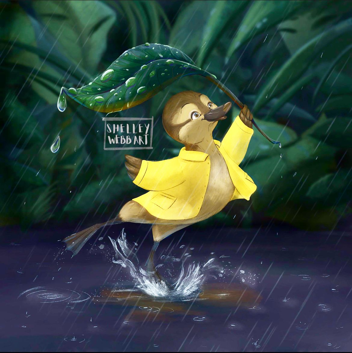
I just did an edit to the values to get this:
Check out my art and tutorials :)
Instagram: www.instagram.com/carliannecreates/
Youtube:
https://youtube.com/c/CarlianneCreatesShop: www.carliannecreates.com
-
Way to make pop @carlianne! I was thinking it looked too dark too.
-
This post is deleted! -
This post is deleted! -
I totally agree now I see it. Is this any better?
-
@shelleywebbart Hi Shelley,
Great painting! Good job with the water droplets on the leaf - that's not easy.
The only considerations that I would offer are about your values and shadows.
The light source is clearly top left. It ust be a fairly strong light because the lower right of the leaf is quite dark. However, there is no shadow from the leaf on top of the character's head. So maybe look at that. Although you have put some shadow on the coat, I think you need more, particularly on the front right of the coat (from the character's perspective) where the cast shadow would be darker. Also, add some cast and occlusion shadows and dark accents under the coat, on the character's body, created by the shadow of the coat because the character is facing away from the light source.
Regarding the overall values, If it's a story about the coat, then fine. But if not then I would adjust the values of the coat (darker yellow) and the character's face (lighter) because the brightness of the coat is currently making that the focal point.
What do you think?
-
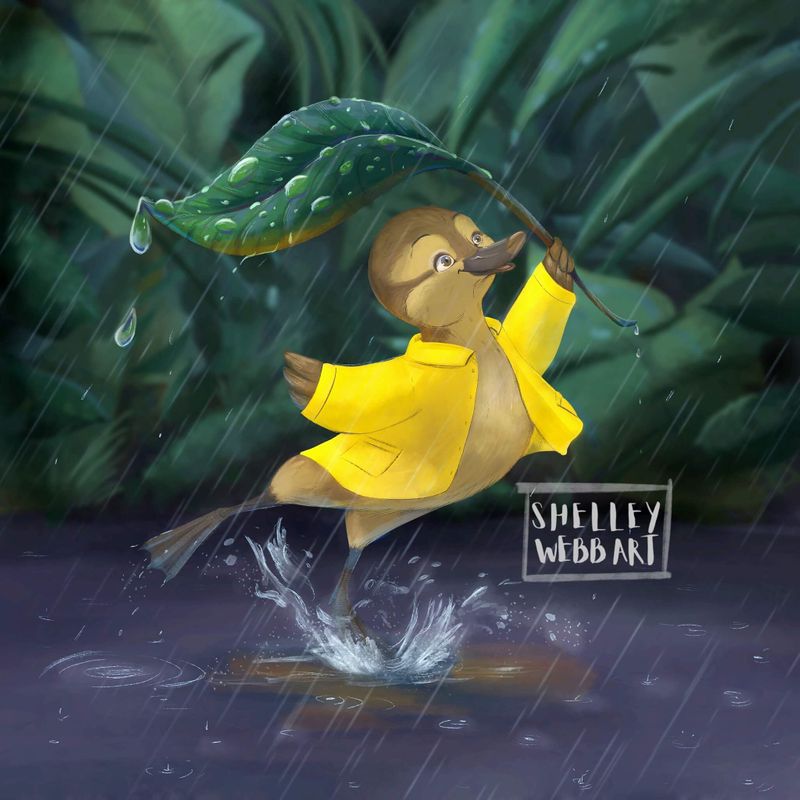
Hi Shelley,
I love the changes - my initial impression was that the character got lost in the background. Much better now! I have only passive observations - Like Adam, I do feel the yellow jacket is too bright, especially compared to the other elements. Additionally, I'd consider changing the direction of the rain so that it's falling from behind and the duck isn't looking directly into the direction of the rainfall; this would also allow the leaf to cover the duck from the rain. I like the angles of everything though too and perhaps rain falling the same direction as the duck is looking (to the right) would feel too uniform - so maybe even consider rain falling straight down? Great image though; so many interesting visual elements - those feet, the splash and the reflection in the puddle all make the bottom half of the comp just as appealing as the top. I love it.