Society of Visual Storytelling

    SVSLearn Forums

    • Register
    • Login
    • Search
    • Recent
    • Tags
    • Popular
    • Users
    • Groups
    • Search

    Digital Sketching Series WIP

    Artwork
    22
    38
    1909
    Loading More Posts
    • Oldest to Newest
    • Newest to Oldest
    • Most Votes
    Reply
    • Reply as topic
    Log in to reply
    This topic has been deleted. Only users with topic management privileges can see it.
    • Gary Wilkinson
      Gary Wilkinson last edited by

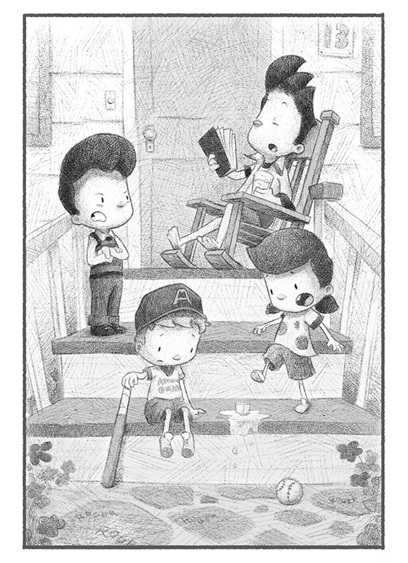
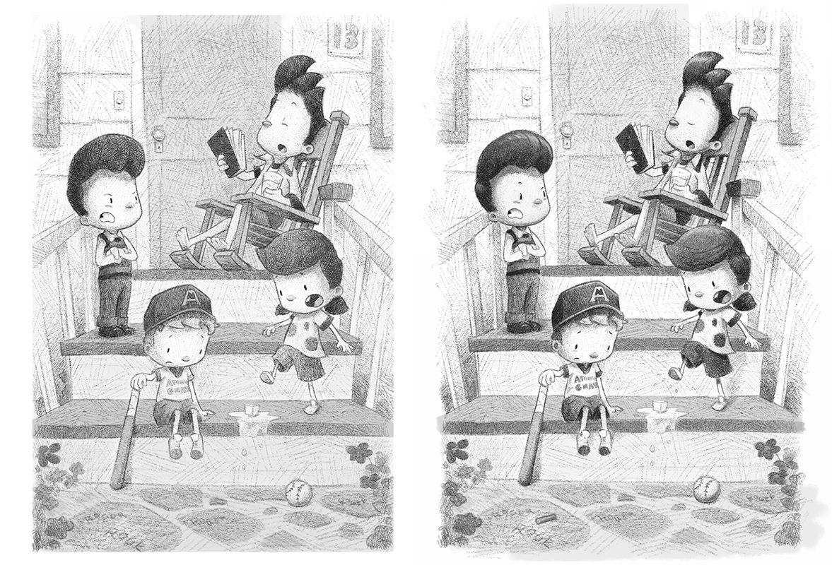
      This one was a bit more tricky to get it done at it needed 4 characters in a small space (on the porch). I wanted the composition to look nice so it seem like a good idea to put them all on different steps.

      I've added a quick step by step of my process for how it was done. The most important step was to get the sketch right and from that I would put some flat shades down before cross hatching with the brush. Another important step was to choose where to place the focus through composition and value, to bring the viewers eye to the character in the chair.

      6 baseball sm.jpg

      Untitled-1.jpg

      www.garywilkinsonart.com
      www.instagram.com/gwillustration/
      www.twitter.com/GWillustration

      1 Reply Last reply Reply Quote 5
      • Gary Wilkinson
        Gary Wilkinson last edited by

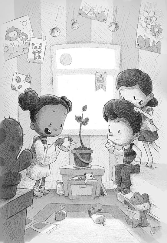
        Had to do this picture twice as I was unhappy with how it first turn out. Took a while, but much happier with it now

        RD OAK 6 sm.jpg

        www.garywilkinsonart.com
        www.instagram.com/gwillustration/
        www.twitter.com/GWillustration

        1 Reply Last reply Reply Quote 1
        • Gary Wilkinson
          Gary Wilkinson last edited by

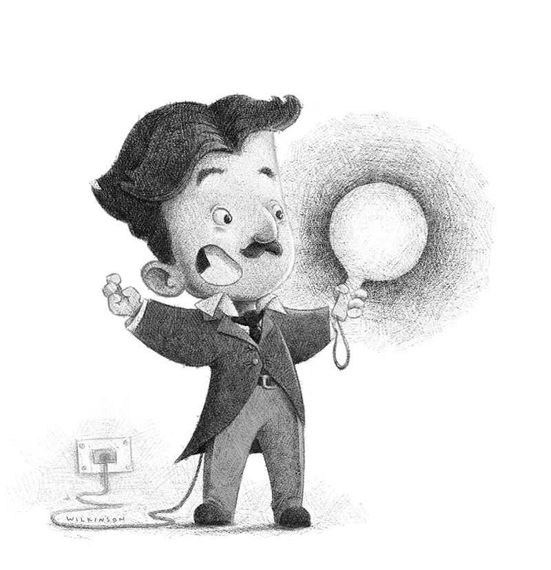
          Not part of this series, but to save making a new topic I'll add it here. Wanted to try mix up caricaturing with this pencil style. Went into more detail with the crosshatching, though Ithink it can work well both ways. Might be hard to guess but this is Nikola Tesla done for facebook contest

          tesla 4sm.jpg

          www.garywilkinsonart.com
          www.instagram.com/gwillustration/
          www.twitter.com/GWillustration

          1 Reply Last reply Reply Quote 3
          • Gary Wilkinson
            Gary Wilkinson last edited by

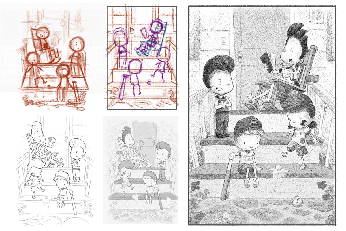
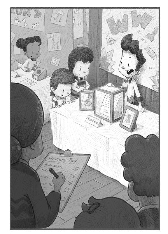
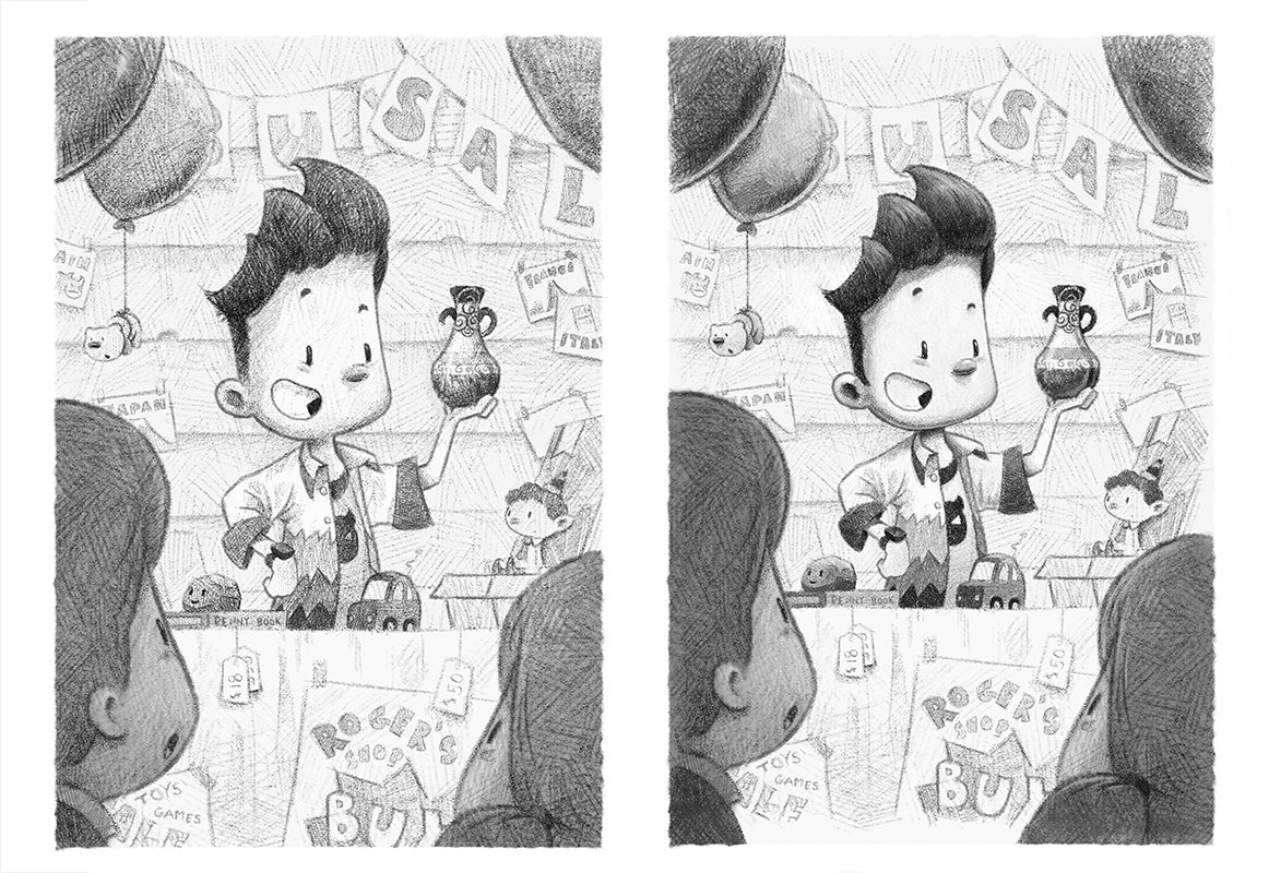
            Back to the series. Took a while to find a composition I was happy with as I needed to fit in a bunch of characters in a portrait frame as well as showing the 3 items on the table clearly enough.

            9 history fair sm.jpg

            www.garywilkinsonart.com
            www.instagram.com/gwillustration/
            www.twitter.com/GWillustration

            Melissa_Bailey 1 Reply Last reply Reply Quote 3
            • Melissa_Bailey
              Melissa_Bailey @Gary Wilkinson last edited by

              @Gary-Wilkinson nice composition! You did a great job solving the problem of multiple characters in a vertical format. The overhead POV works.

              illustrator - author - smiley person
              mbaileyart.com
              instagram.com/mbaileyart/

              1 Reply Last reply Reply Quote 0
              • Gary Wilkinson
                Gary Wilkinson last edited by

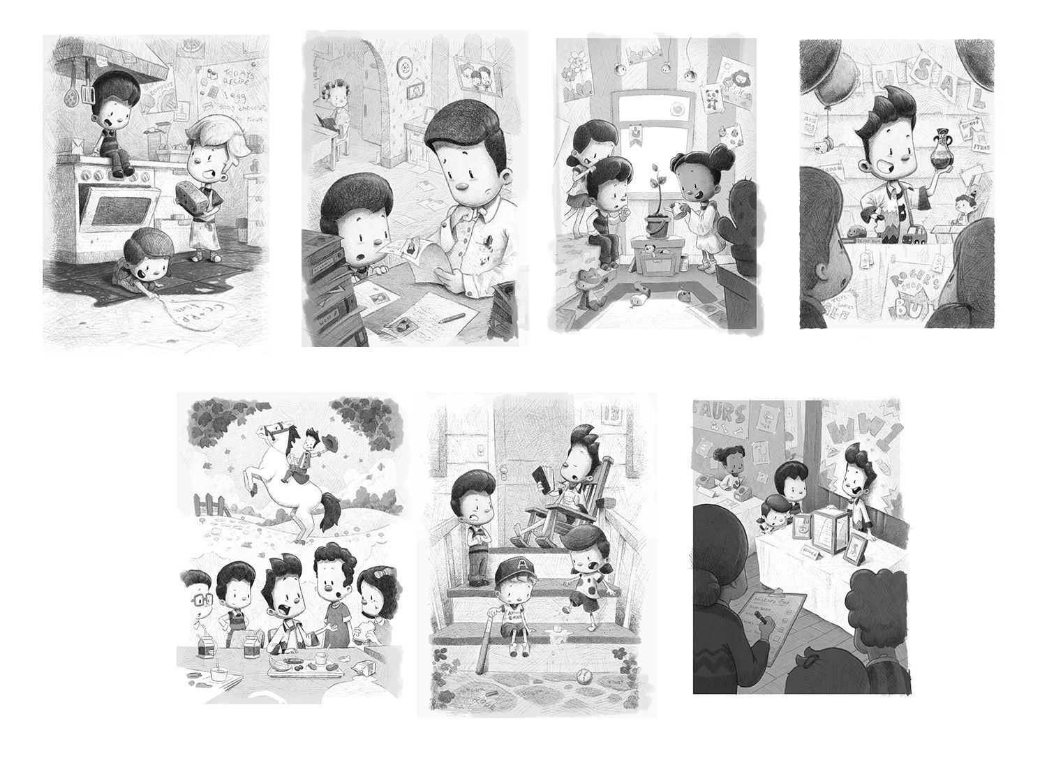
                After practicing more of my digital sketching skills and after taking a second look at theses sketches I'm started to add more detail and refine/ push the contrast in them, especially in the areas that stand out.

                I hope this heads the image overall. What do you think of the adjustments?

                7 artifact update.jpg

                6 baseballsm.jpg

                www.garywilkinsonart.com
                www.instagram.com/gwillustration/
                www.twitter.com/GWillustration

                Melissa_Bailey Iain Davidson Matthew Oberdier 3 Replies Last reply Reply Quote 2
                • Melissa_Bailey
                  Melissa_Bailey @Gary Wilkinson last edited by

                  Love your work, Gary! The pencil style is really working -- looks traditional and love the loose scribbles/hatching.

                  Pushing the contrast really makes these illustrations read better, especially the one where the girl is directly in front of the rocking chair. The values are so similar there that adding some highlights and shadow helps differentiate the two.

                  illustrator - author - smiley person
                  mbaileyart.com
                  instagram.com/mbaileyart/

                  1 Reply Last reply Reply Quote 1
                  • Iain Davidson
                    Iain Davidson @Gary Wilkinson last edited by

                    Thanks for sharing these @Gary-Wilkinson it’s really great watching the series progress, and it’s stunning work.

                    I agree with @Melissa-Bailey-0 that the contrast boost helps. Looking forward to the next one!

                    Born again artist/illustrator.
                    IG: http://instagram.com/iain.draws
                    IG: http://instagram.com/iain.designs

                    1 Reply Last reply Reply Quote 2
                    • Laurel Aylesworth 0
                      Laurel Aylesworth 0 last edited by

                      This is really good. That's all I got! lol

                      1 Reply Last reply Reply Quote 0
                      • Matthew Oberdier
                        Matthew Oberdier @Gary Wilkinson last edited by

                        @Gary-Wilkinson These are so tight, you win the steady hand award. I wish I could get my lines to be so smooth. Of course, the compositions are great too.

                        Instagram.com/mattoberdier

                        1 Reply Last reply Reply Quote 1
                        • ruth
                          ruth last edited by

                          Wow, these are all amazing @Gary-Wilkinson. I love the style. I was just scrolling through and thinking they couldn't get any better and then you upped the contrast and they did! Ha! Thanks for sharing your progress. 🙂

                          1 Reply Last reply Reply Quote 1
                          • Gary Wilkinson
                            Gary Wilkinson last edited by

                            Thank you for all the comments. I think that everyone's advice on pushing the contrast has really helped improve the pictures. Got about 3 left to go, but happy how it's moving forward

                            pp.jpg

                            www.garywilkinsonart.com
                            www.instagram.com/gwillustration/
                            www.twitter.com/GWillustration

                            Judy Elizabeth Wilson 1 Reply Last reply Reply Quote 2
                            • Tristan Lapetz
                              Tristan Lapetz last edited by Tristan Lapetz

                              Sorry I'm chiming in so late but this has a great vibe to it. I think you absolutely create a more traditional leaning atmosphere. There are still small details that tell me it's digital. Specifically, the evenly thick and evenly textured line on the front side of their faces. This part nudges digital but I don't think it's all that noticeable and don't think it impacts your aesthetic much. Again, this is pretty darn awesome, I love the way you crosshatched in perspective on the floor, that makes a massive difference!

                              Happy creating,
                              Tristan

                              IG: https://www.instagram.com/t_lapetz/

                              1 Reply Last reply Reply Quote 0
                              • Judy Elizabeth Wilson
                                Judy Elizabeth Wilson SVS OG @Gary Wilkinson last edited by

                                @Gary-Wilkinson Just want to say these are really great Gary.

                                Website http://www.judyelizabethwilson.com/

                                Instagram https://www.instagram.com/judyelizabethart/

                                Sharing positivity through art.

                                1 Reply Last reply Reply Quote 0
                                • TaniaGomesArt
                                  TaniaGomesArt last edited by

                                  Another late chiming in just to say that I love this style. Definitely looks traditional and I do love seeing digital pencil rendering.

                                  1 Reply Last reply Reply Quote 0
                                  • O
                                    Oliver Itson last edited by

                                    Well I'm super late replying on your posts, I've been away from the forum for quite awhile. Anyway I think what you got going here is very nice. Keep it up.

                                    1 Reply Last reply Reply Quote 0
                                    • DoodleMick
                                      DoodleMick last edited by

                                      Pencil looks nice. Maybe a little light though. I usually darken up my sketched by duplicating the layer once or twice, and then reduce the opacity if needed. Overall, it looks and feels authentic to a true pencil sketch.

                                      Wannabe Caricature Artist and Illustrator.

                                      https://www.flickr.com/photos/doodlemick/
                                      https://www.instagram.com/doodlemick619/

                                      1 Reply Last reply Reply Quote 0
                                      • Pamela Fraley
                                        Pamela Fraley SVS OG @Gary Wilkinson last edited by

                                        @gary-wilkinson that is gorgeous! I think you pulled it off beautifully!! Can’t wait to see this project finished.

                                        instagram.com/fraleycreates

                                        1 Reply Last reply Reply Quote 0
                                        • AngelinaKizz
                                          AngelinaKizz last edited by

                                          Love it! They definitely have a traditional feel. I agree though that they could use the odd smudge here and there to really up the confusion to digital or traditional. Fabulous work!

                                          www.evarartistry.com
                                          www.Instagram.com/evarartistry/

                                          1 Reply Last reply Reply Quote 0
                                          • First post
                                            Last post