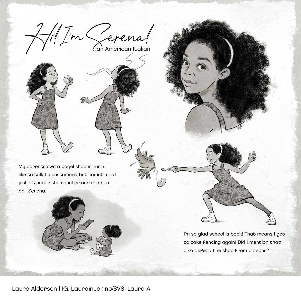
September contest WIP
-
@demotlj Good point about the text and picture order. The problem is that I have such a number puzzle of a composition going on! (Remember those little plastic puzzles where you had to move all the squares around to put the numbers in order?) I'll take another look at it. Thanks!
-
@Melissa-Bailey-0 Thanks for your feedback! I see that I have a bit of a readability problem with the text being at the bottom and the fencing action at the top. But true, it should be legible anyway.
Great idea about the lighting! I was iffy about that stool. The real Serena does sit under a stool under a counter, but there's no reason I can't take poetic license. I also find it funny that her mom has to look for the iPad when she needs to process a payment, but maybe that's too ambitious for a character sheet.
Baby Serena really is the doll's name, in real life. Who knows why she named it after herself? Maybe because her family designed a custom American Girl doll to look like her? I didn't want to call Baby Serena a doll because I wanted to highlight Serena's pretend world, but I need to make it clearer that she is a doll.
The backgrounds were to help divide the space, but I can play with the value. I get the idea that I still need to work on the layout!
You confirmed my idea about the font. I think it's my middle-aged prejudice that fonts have to be large
 .
.And yeah, still working on the head sizes and exact expressions. I have a tendency to make hands too large, so will look at those extended arms. I looked up the fencing pose, though, and read that the arm should be parallel to the body during the lunge. I'll see if there are other poses, though, and work on softening the expression. I had a hunch it was a little too violent, and since you guys have confirmed all my suspicions generally as to poses, the stool, font, etc. I now know what I need to do. Thanks!
-
@Melissa-Bailey-0 Oh yeah, And I can make it ink for now, and then if I want it to be pencil for style consistency in my portfolio later, I can change it back!
-
@LauraA glad we helped you figure it out! Looking forward to seeing it in Critique Arena!
illustrator - author - smiley person
mbaileyart.com
instagram.com/mbaileyart/ -
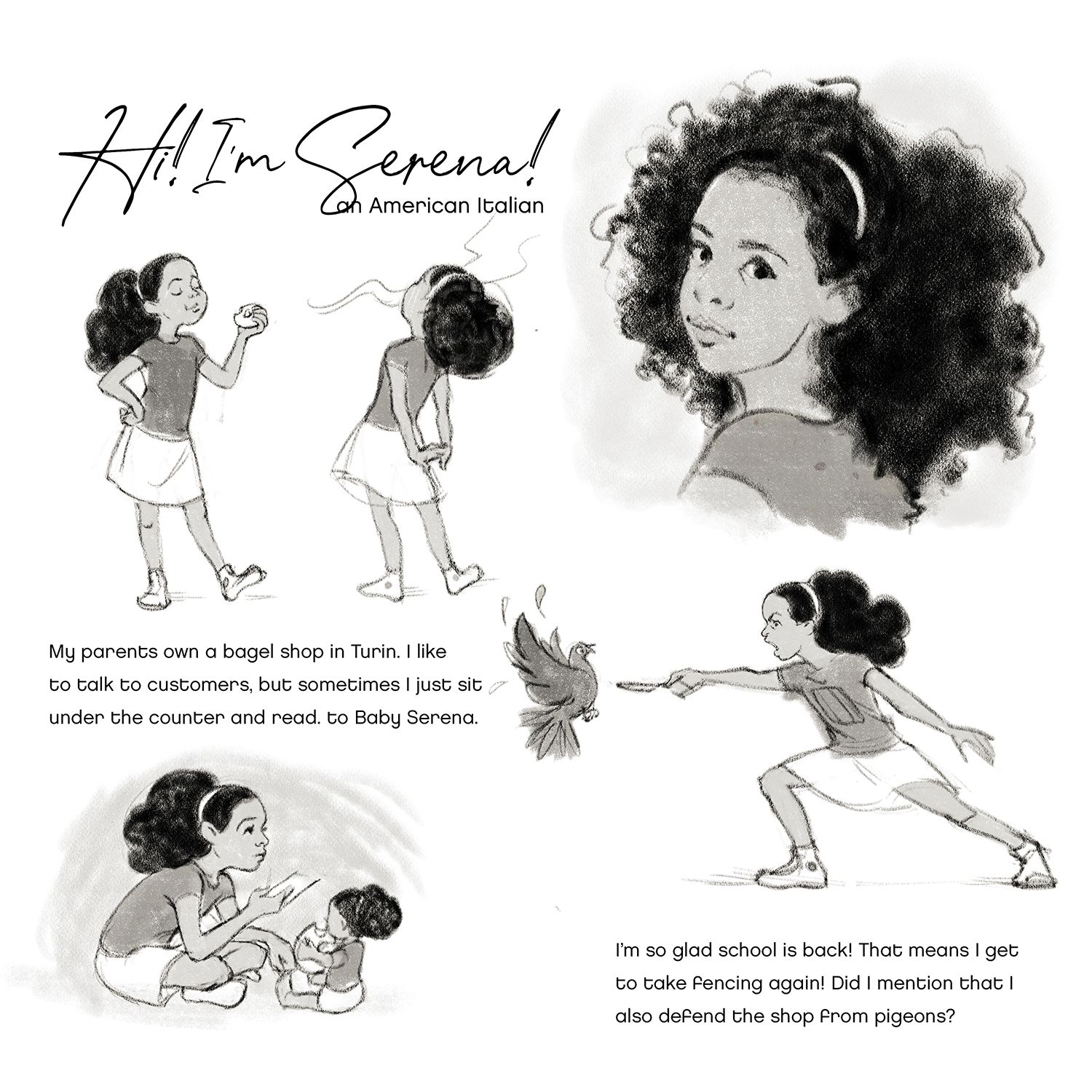
Simply for the layout and not for expressions, drawing or poses, how does this work? Is it clear story-wise and does the composition work? I'll probably lighten up the pigeon because he's drawing too much attention in the center.
-
@LauraA flip the fencing pose back around the way you had it, and you should be good to go!
illustrator - author - smiley person
mbaileyart.com
instagram.com/mbaileyart/ -
@Melissa-Bailey-0 I flipped it because didn't want to make the pose face away from the others. I felt it would lead the eye off the page. I'll try it, though.
-
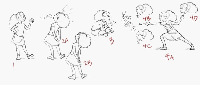
Here are some pose and expression alternatives (for poses 2 and 4). The pigeon is now dropping a bagel, but that's 3 bagels so I may remove the one on the doll's arm. Do any of these alternatives tell the story better? Are the proportions of all 4looking more consistent? I haven't changed the close up yet.
Thank you!
-
@LauraA this is so sweet. It's so perfect!
Portfolio: nyrrylcadiz.com
Instagram: https://www.instagram.com/nyrryl_cadiz/
YouTube: https://www.youtube.com/channel/UCbJCF1Im8ZO7hpGWTKOJMuA -
Thanks, @Nyrryl-Cadiz!
-
I felt the new order of pictures and text makes it read much better. I also like your idea of having the pigeon dropping a bagel if you can fit it in because it explains why she needs to defend against pigeons. Lovely work.
Laurie DeMott
instagram.com/demotlj -
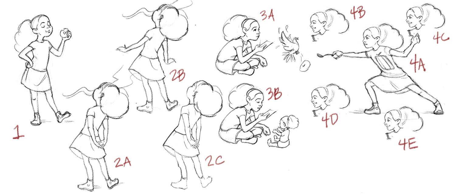
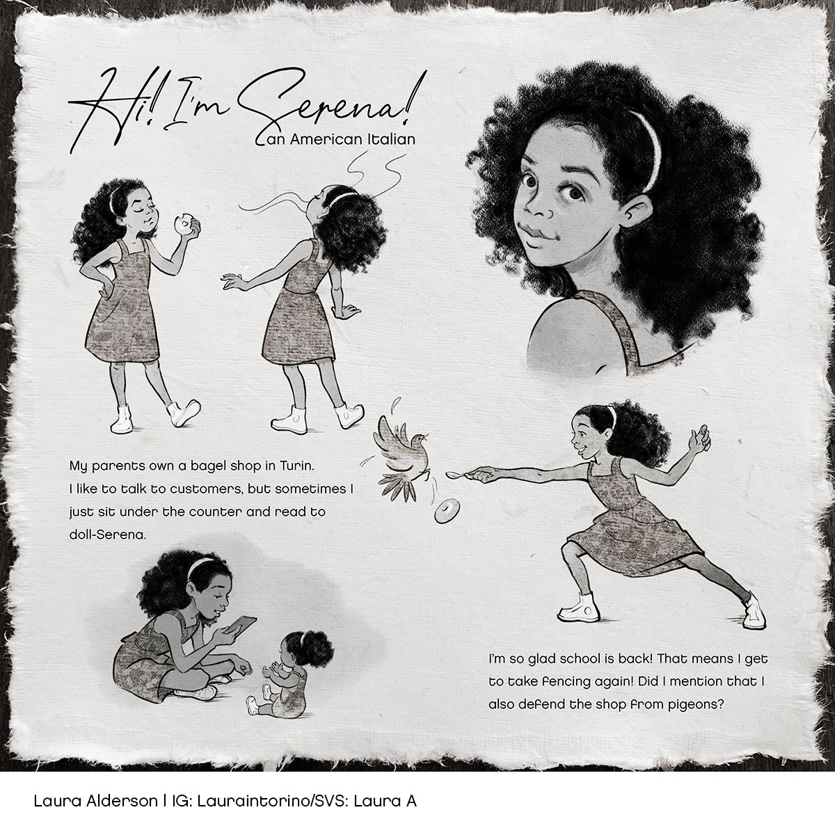
I revised some of the figures this morning.
- Better bagel silhouette
- Thought the hands in 2A, although graceful, might not be anatomically likely, so experimented with alternatives 2B and 2C.
- Without the text with the mom's voice offstage, there's no reason for her to be looking up (3A), so I came up with 3B in which she is clearly reading to her doll. Is it clearer now that it's a doll? If not, I'll clarify the accompanying text.
- I still wasn't quite sure about the angry expression in the fencing pose, so I came up with various smiles that range from determined and slightly mean to just delighted. Do any of these help tell the story better?
Thanks for any feedback!
-
@LauraA looking good!
Actually, 2A looks correct and would be my choice.
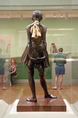
Were you inspired by Degas' Little Dancer?
3B is much clearer and more character-focused. It's very clear now that she's reading to a doll.
For the fencing pose, I really like 4C -- there is some sass and personality to that smile. It's a little more playful.
Check your proportions on the fencing pose. Are the arms the correct length? The extended arm looks short, specially her forearm. Are the legs the same size? The extended left leg looks like it would be much shorter than the right leg.
You've really worked hard on improving the storytelling, and it shows. Amazing!
illustrator - author - smiley person
mbaileyart.com
instagram.com/mbaileyart/ -
@Melissa-Bailey-0 In fact, I did look at the little dancer! At first I only had the idea of the girl sniffing and lifting herself up and drew her as such, but because I spent so many years in the Metropolitan Museum, at some point it came to me that I was going for something similar, and I looked at some photos of the dancer from various angles. I also tried to photograph my own hands. Not very doable from the back!

Thanks for the hints about proportions. I tried to straighten out her limbs, but it was hard to do entirely. I should come up with another way.
I'm not entirely sure which poses I will go with in the end, also because I have heard varying opinions, but since there are only two more days, I will start working on the finish by tomorrow.
I am a big fan of your Albert, by the way! (And Mag's!) I notice that you did have him turned towards the right even though he's on the right side of the page. I always thought things on the right should turn inwards. I may keep Serena turned in, but I would be interested in hearing your reasoning!
-
@LauraA thanks! (And I thought I detected some Little Dancer inspo!
)My reasoning for turning Albert towards the right? The illustration was intended for the picture book audience, so the medium those illustrations will appear in are books. You'll notice that in picture books, most of the action goes from left to right. This is because of page turns. Main characters especially usually point towards the right, as that subconsciously encourages the reader to turn the page and see what happens next.
A character pointed right is moving forward, pointing towards the future. If a character's action is going right to left, it often feels weird to the reader (they might not know why) and feels like the character is moving backward or contrary to the way they're supposed to go. So because Albert is the main character, I intentionally placed him so that he's moving "forward" through the "picture book" -- we subconsciously want to know where he goes and what happens next. While the supporting characters are interesting and interacting with Albert in the scene, we're not as emotionally invested in them; they can be placed anywhere on the page.
(A great example of this is the book The BIG Umbrella by Amy June Bates with Juniper Bates. The big umbrella expands to include all characters and is usually shown on the verso page pointed right; when a character approaches the umbrella, they come from the right on the recto page, pointed left towards the big umbrella. Another example: David Wiesner. He is a master at using movement and character position to tell a story -- check out Tuesday and Art & Max.)
Sometimes, this "rule" is intentionally broken to great effect. This is usually when the illustrator wants to heighten the tension and/or give the feeling that the character is going back to where they were, going back in time, or has changed direction or their mind. If the entire book has the character moving in one direction and the climax is them doing an opposite action, they might point towards the left instead of the right. (This happens in Olivia the Spy by Ian Falconer and The Grey Lady and the Strawberry Snatcher by Molly Bang.)
Of course, this rule gets thrown out the window when it's two characters talking or if there are two or more main characters. Sometimes it makes more sense to have a main character pointed to the left; having everyone pointed right would look unnatural or strange. (A book that intentionally plays with character placement is Sulwe by Lupita Nyong'o & illustrated by Vashti Harrison -- in the story-within-the-story of Day and Night, Day is always on the left while Night is always on the right facing left. Color and character placement heightens how opposite these two sisters are.)
And of course, this isn't a hard and fast rule. There are always exceptions. While you'll find characters pointing and moving towards the right in the majority of picture books, you'll also find exceptions that work wonderfully in telling that specific story. Because, at the end of the day, what works the best is what best tells the story.
Wow, I got wordy! Hope you enjoyed this little "Character Placement 101"!
illustrator - author - smiley person
mbaileyart.com
instagram.com/mbaileyart/ -
@Melissa-Bailey-0 I just didn't know that the rules of book character placement applied to a character sheet, as there isn't a facing page! I guess I was thinking of it as both pages, or at least a self-contained composition.
That's a really good exposition of character placement, though, and I like all your examples. I'm glad I asked for it! As I recall, Jakes Little Bot and Sparrow also goes back on the page at one point, as Little Bot is recalling his memories.
-
@LauraA yep, totally! (And you're welcome!
 )
)I don't think that rule applies to a character sheet, but it might also depend on what the project is and who your client is. For picture books, I just default to right facing, unless, of course, the composition or story calls for something different -- even in character sheets. My answer was more about the whys of the Albert composition rather than your character sheet.
-
So, here's two versions of the finished piece. Favorite? I'm getting up early tomorrow my time to post one or the other.
-
@LauraA looks great! My vote would be for the first one, since it has more contrast in value. Awesome job!
illustrator - author - smiley person
mbaileyart.com
instagram.com/mbaileyart/ -
@Melissa-Bailey-0 And by the time I saw this, that's the one I had chosen! I was originally going to get up this morning and post one, but in the end, as it was 1 a.m, I just wanted to submit one and sleep well. Thank you for following me on this piece, Melissa, Laurie and Nyrryl!