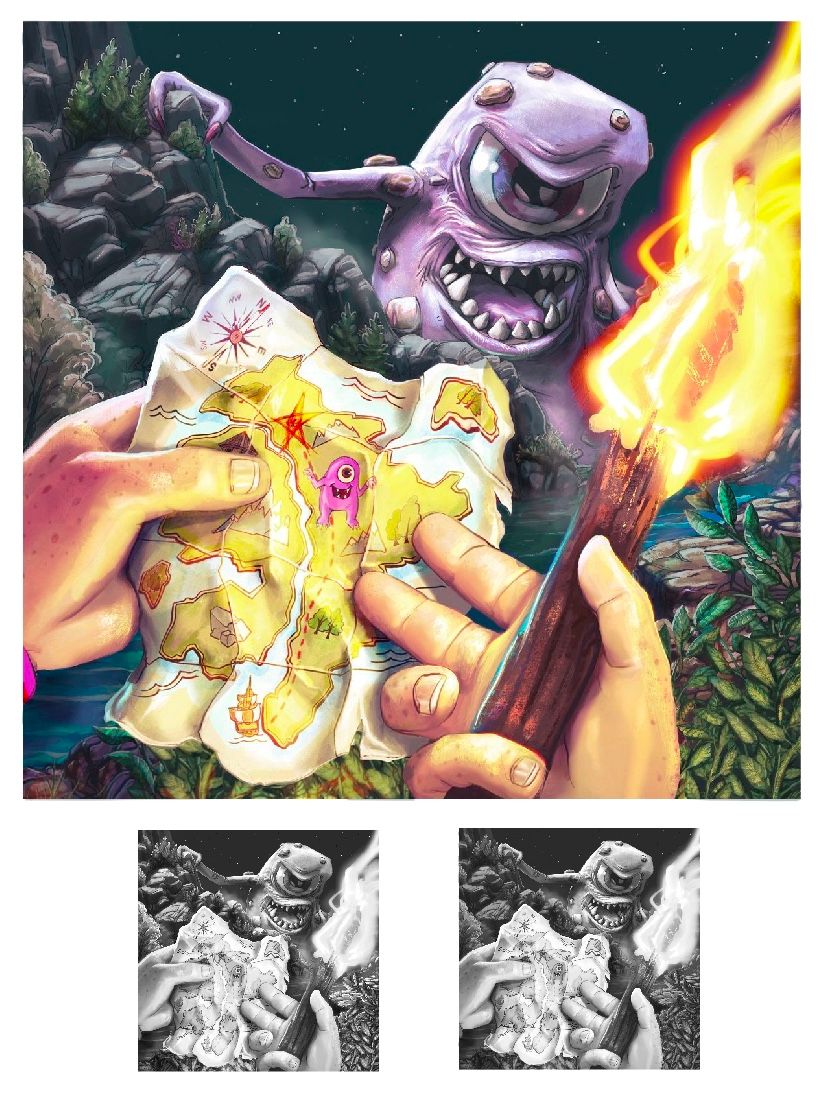
To blur or not to blur (with poll)?
-
Hi @Jeremiahbrown, the rendering and idea is awesome!
Personally, I like the non blur better, but maybe with more atmospheric rendering. The background, foreground and middle all have same crispness, so you might want to look at more variety.
Also, I put my JWL (Jake, Will and Lee) hat on and here’s what I think they would say.
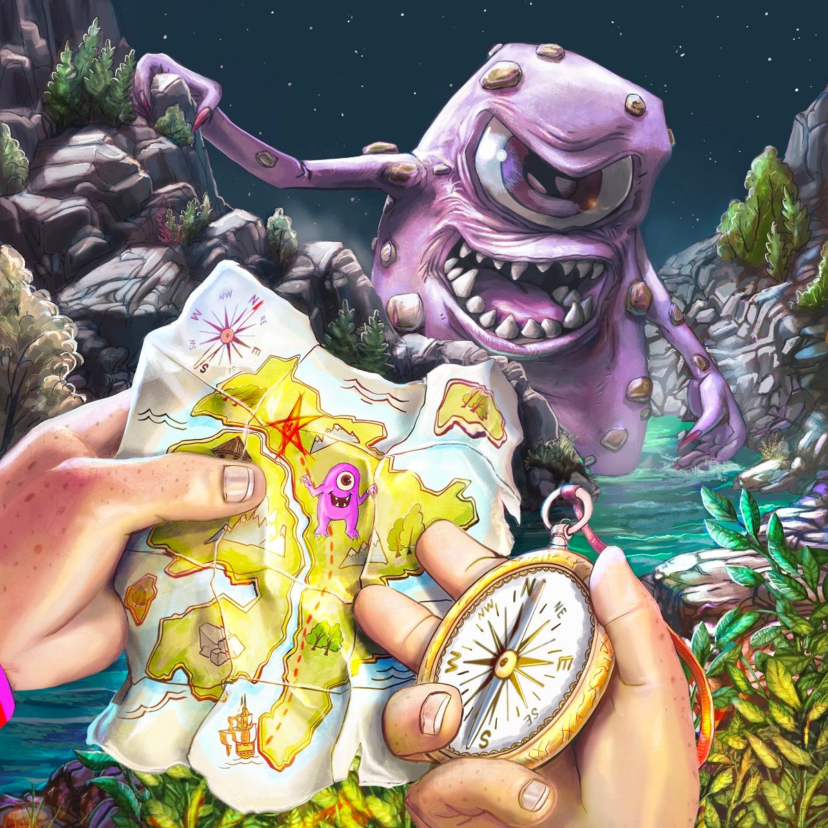
“The rendering is awesome, but the monster feels too close to the subject. Like, if it were real life, the character holding the map wouldn’t be so calm with the proximity of the monster.”
“Maybe hide the monster or make it a pink rock with eye slightly opened so that’s it hidden but clearly visible with the audience?”
“Also, the scene feels slightly over lit for a night scene”
Hope this helps!
-
@TessaW Thank you! That's great feedback/insight!
@Jeremy-Ross No one asked you Jeremy.
 Jk, haha. You're spot on with most of what you said. I did a fairly rough tweaking. Do you think this makes more sense?
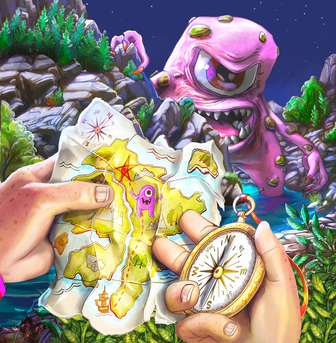
-
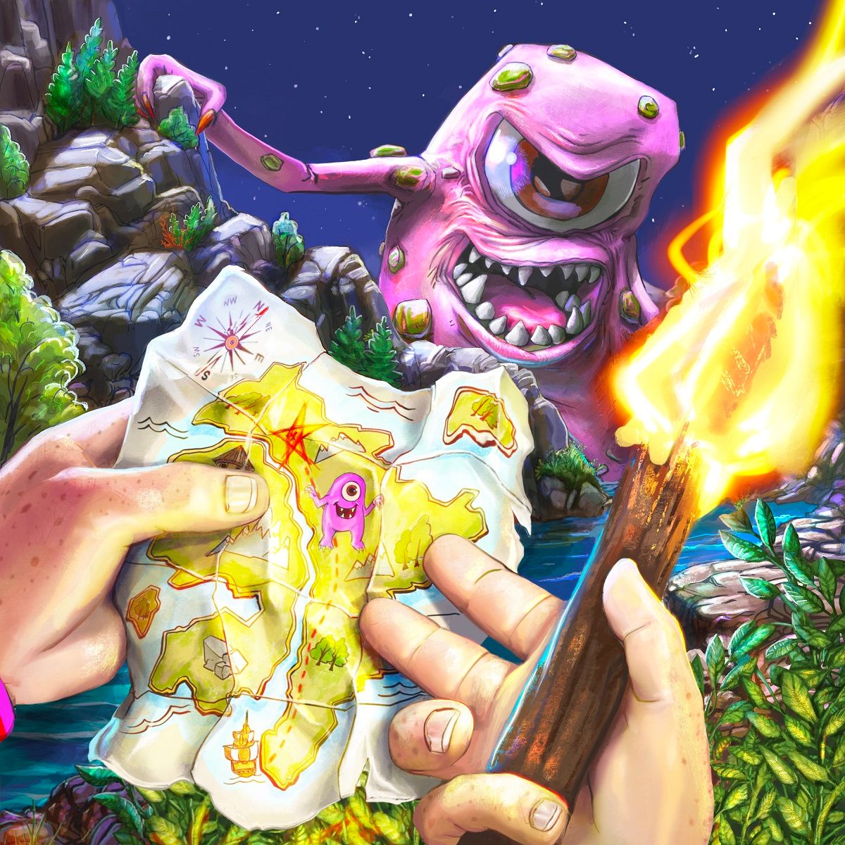
I could go either way with the blur. I do like the monster behind the rock.
But what @Jeremy-Ross said about it being a night scene makes me wonder about the light source. If it is the moon, I think there would be more shadows. I wonder if darker shadows would actually really make it look a bit scarier and mysterious?
-
LMAO @Jeremiahbrown! I do like this one better!
-
Thanks again for all of the feedback! I took it all in and was having trouble with making the picture look right without making it look too dark so I went a slightly different direction. I think there's more of a story her now and the light is starting to look a bit better?
-
Hi Jeremiah! This concept is so funny and awesome. I love the cute little monster on the map.
")
Here are some thoughts in case they’re helpful, but of course follow your own gut if these suggestions seem off to you.
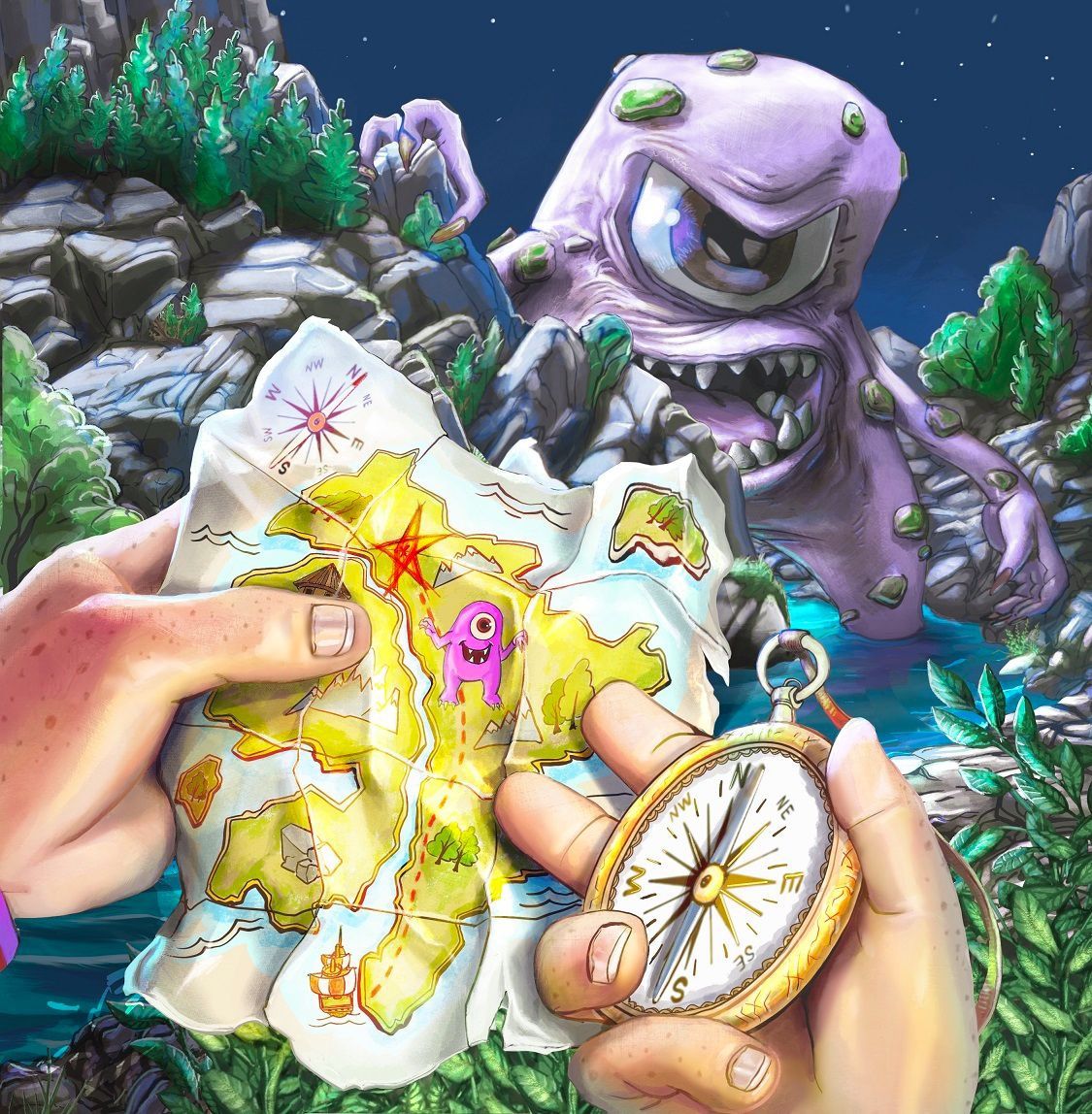
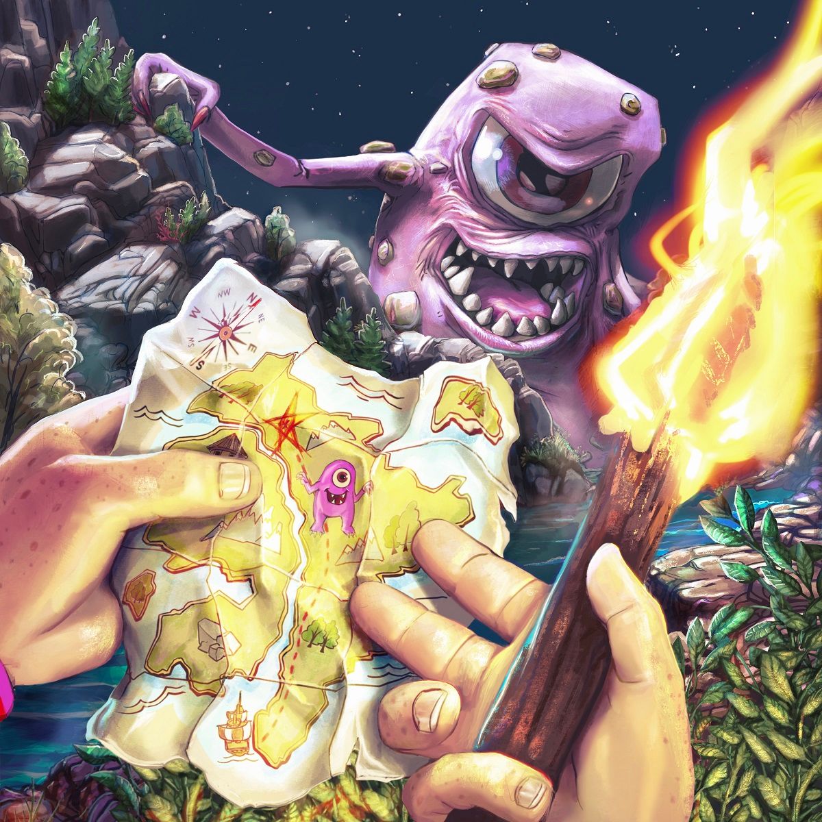
First of all, I really like how you hid the monster behind the rock. I think that was a great move, and the most recent version where his face is showing more looks great to me. I actually like the compass more. The flame draws your eye immediately instead of letting the story of the monster and the map take center stage.
As for lighting, I think your night scene values look really good. It’s not too bright in my opinion. What might give you more of a night time feel, I think, is saturation. You know when you’re outside at night and everything almost looks black and white? I threw a blue filter over your background to give an example.
As for the hands and map, there could easily be some off scene lighting illuminating them, so their brightness doesn’t bother me.
Hope this is helpful. Thanks for sharing the progress of your piece for others to learn from along side you.
-
@KathrynAdebayo Thanks so much for the feedback! I think the filter is a great idea. Back to the drawing board
-
I'll stop flooding the forum after this but here are the next 2 iterations based on suggestions. Thanks again!!
-
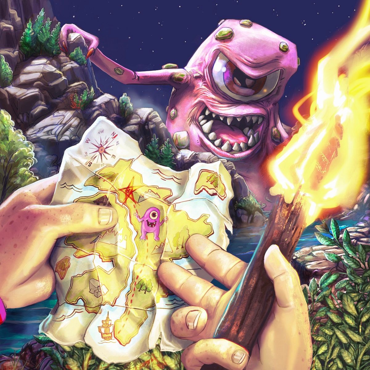
@Jeremiahbrown I like the torch version, it really sells the illumination of the map.
-
I wonder if you tried the torch version but desaturating the stuff in the background? I think it would make the map pop even more and make it truly feel like night?
You are getting close! It is looking great.
-
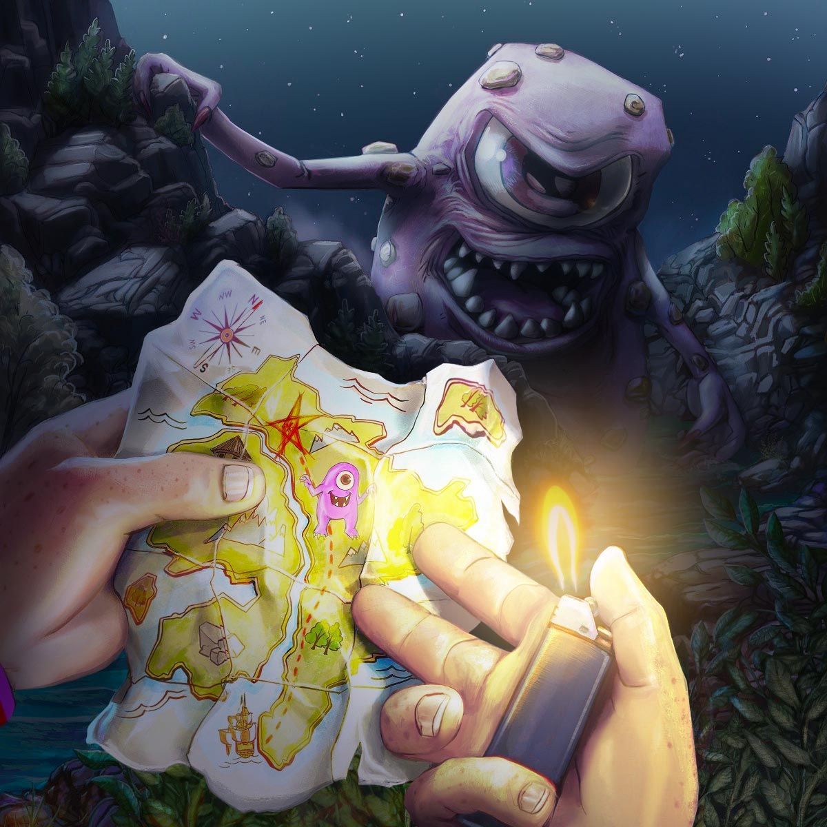
@Matthew-Oberdier and @theprairiefox Thank you and here's are two tweaks as recommended.
-
I can see why you did the blur but it rather disorients me. I think if you adjusted the value of the back ground because it feels like it's at the same intensity as the foreground character.
-
Your painterly style is so fun! I think the warm/cool color palette you chose looks really good for a night scene. It’s been great to see all the different versions you’ve been working on. I agree with Heather, I think the values are making it hard to separate the monster from the rocks.
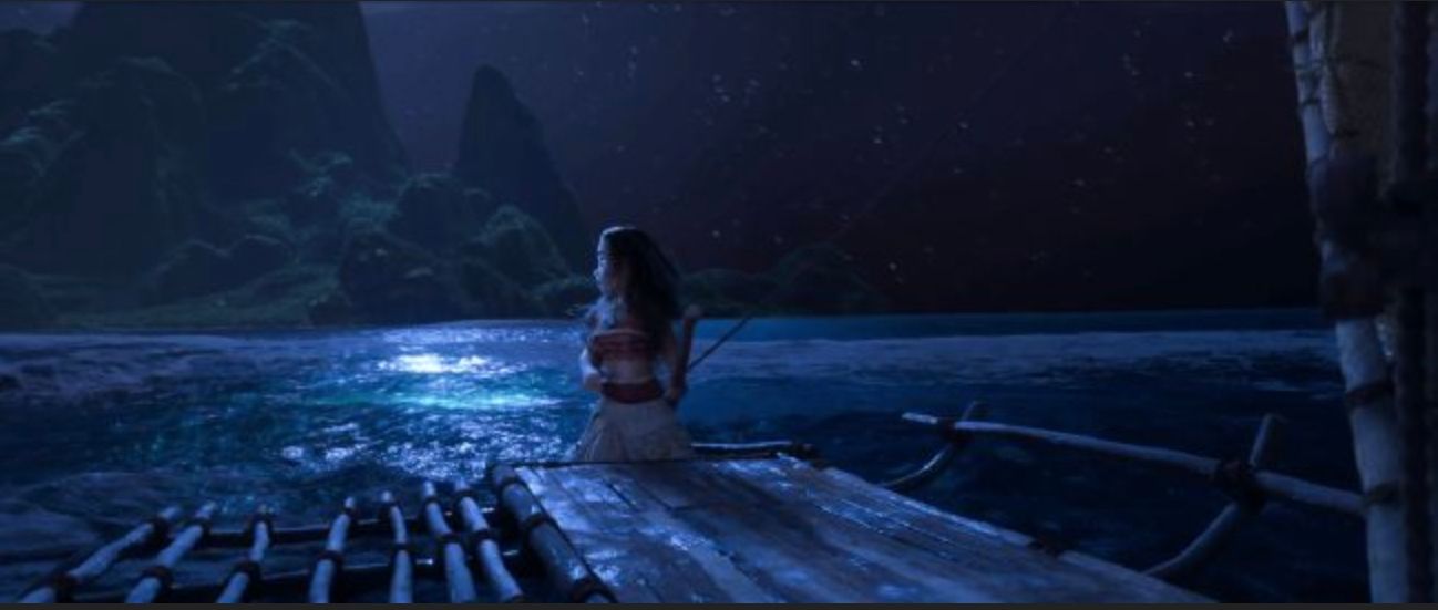
For reference for a jungle night scene, I looked up screenshots from Moana:
In your painting, the rocks have details that range from nearly white to nearly black. I think you can get away with much lower contrast. I hope you don’t mind I did a quick paint over of your latest version:
I used the eyedrop color picker tool to select the sky color. Then I did a layer of flat color over everything that wasn’t the hands or the monster, and made the layer transparent. On the bottom is a grayscale comparison, left is the original, right is the paint-over. -
@LouD Wow, thanks a lot! That does look better.
-
@Jeremiahbrown I love the scene with the backdrop toned down.
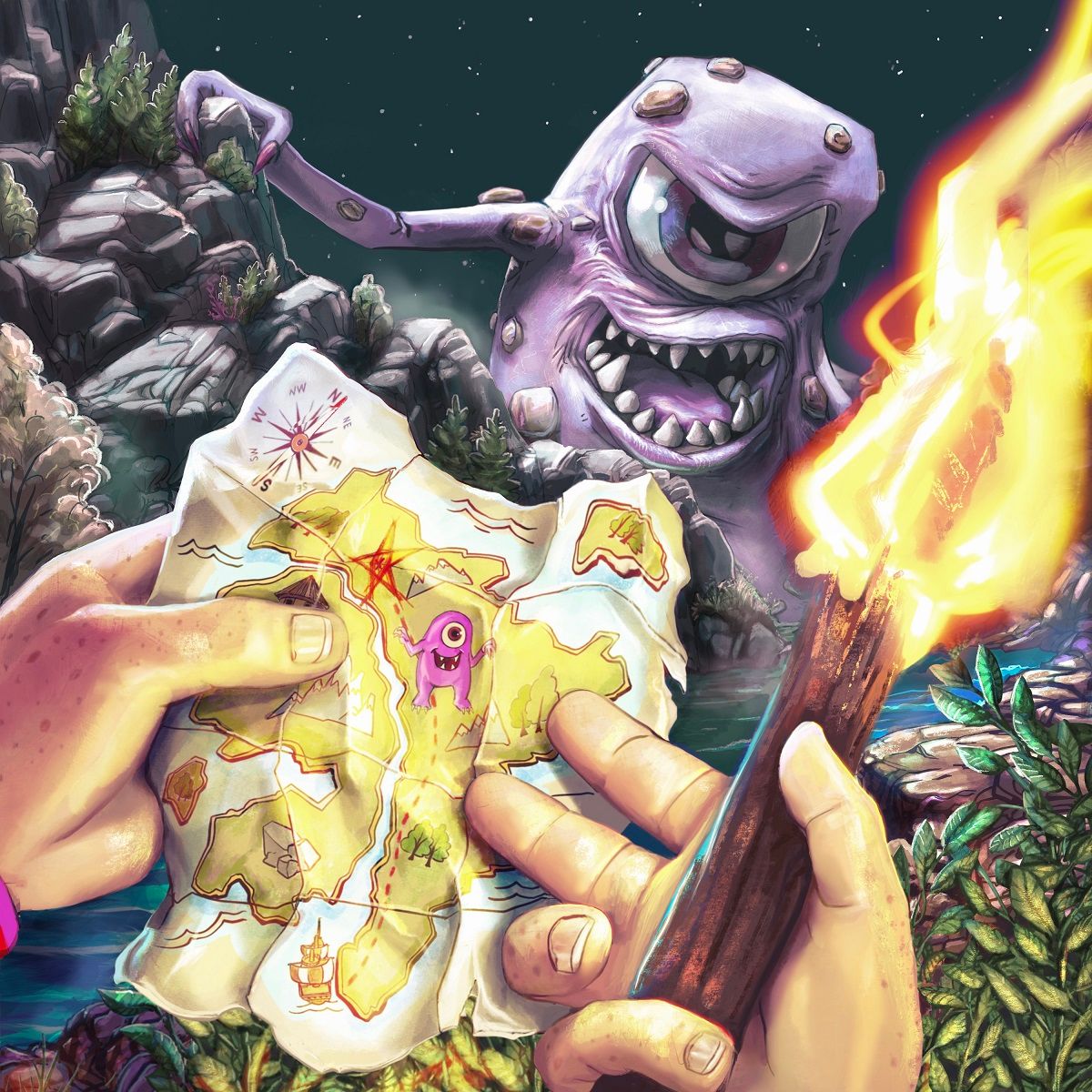
I am going to be a naysayer here. I think the torch makes everything cramped. It also creates three large objects on the page which all compete with each other: the torch, the monster, and the map. And then the fact is the brightest thing on the page makes it even more of a competitive element. My vote would be to delete the torch and go with the lighting dimmed out on the rocks.Looks good!
-
@chrisaakins Ha, I like your naysayerness!
In light of that I made another version (I'll stop soon!). Still distracting?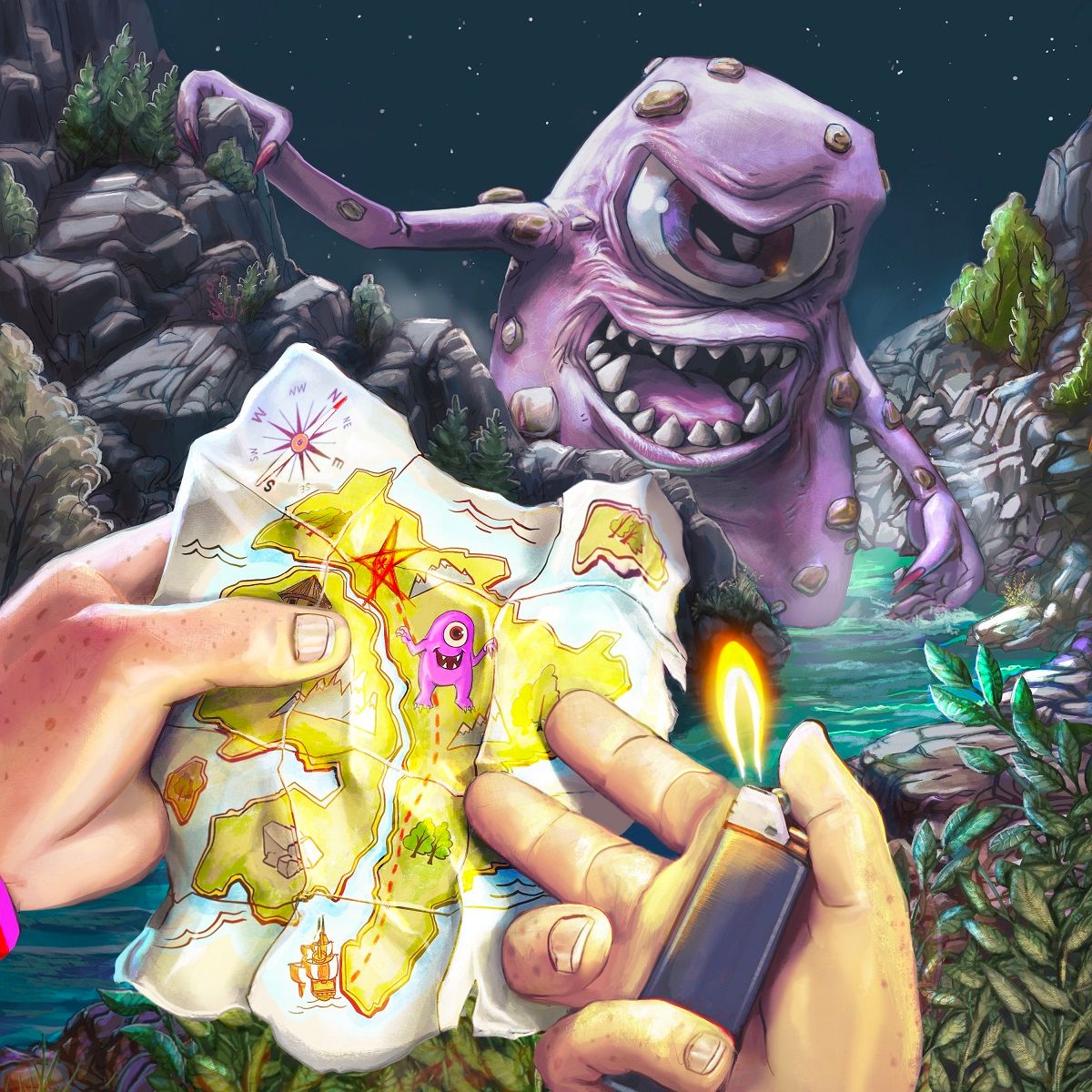
-
@Jeremiahbrown I think this last version is about right!
-
Looks great! Cool to see the evolution.
What happens if you blur the foreground instead of the background like you were initially thinking? I don't know what the end focus is supposed to be, so this might not be applicable. But I had thought since the foreground is so close, visually you won't lose any of what we'd be looking at, but it'd be super clear you're supposed to see the monster first.
-
Hi @Jeremiahbrown. Nice work iterating on this! I'm chiming in because I've had to paint a few night scenes recently.
I think the separation of values is what's going to really sell things and guide the viewer's eye here. Overall, my feeling is it's still much too bright and saturated to be convincing, and with so many bright values it's hard to know where to look first. You should be very sparing with things that approach 90-100% brightness and over 50% saturation in lighting situations like this. I've done a quick paintover of my own to demonstrate a few things - apologies for butchering your work!
It's easy to forget that the entire night sky is a source of light too, so it should be far from the darkest thing in your image. It doesn't need much adjustment itself - most of the effect here comes from bringing down the values of the background so it looks brighter by comparison.
I've been a little heavy-handed darkening the background and midground, but I think this is around the value range you should be looking at. It's going to be receiving weak cold light from the entire sky, and a slightly stronger cool light from...the moon out of frame, or an aurora, maybe? Same goes with our monster buddy. He's receiving a little more ambient light, but not enough to lift any of his values above the 70-80 range. I haven't spent long on preserving highlights, but remember to keep contrast on them subtle - probably no more than a 10-20% variation in brightness. All of the darkening I've done with a blue-grey brush on a Multiply layer, about 20% saturation and 30-40% brightness.
Regarding the flame - as the primary light source it'll obviously be the brightest thing in the image. But it's a really weak light, and it's not going to reach very far at all. Inverse square law, y'know. You could still go for a few warm highlights on the leaves in the midground, but less is more in this case, I reckon.
Anyhow, that's just how I'd approach it, for what it's worth. Best of luck!
-
@Jeremiahbrown I agree with @blamillo and the draw-over regarding lighting. I've been following this thread and every time you desaturated the monster and accentuated the values difference, I thought it got better but I kept thinking it could be pushed even farther. The whole composition is so great and I think having the monster and the map really stand out as the focal point by darkening the rest as @blamillo did gives the viewer a real feel for the story.