Critique Requested - November prompt - Star
-

First time in the forum! Honest feedback please. -
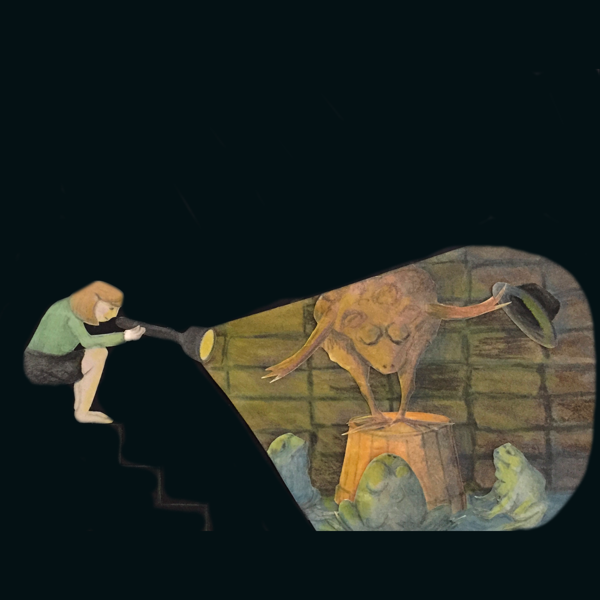
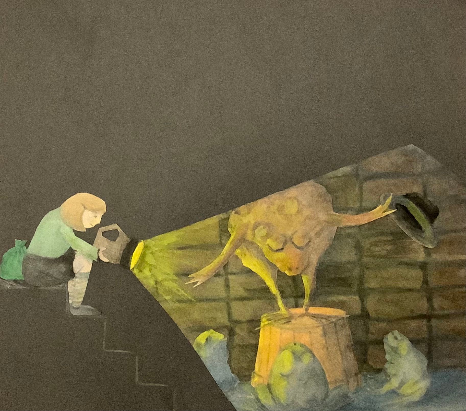
@Helen I think the concept is cute and the execution has a nice handmade feel to it. I especially like the way the frogs are rendered. And although I suspect that your cut-out technique isn't meant to be exactly naturalistic, I do think your piece would benefit nonetheless some from thinking about how it focuses the viewer's attention.
For instance, I'd probably soften the beam of light, since the sharp edges are competing with the frog himself. Or maybe you could make the wall a bit darker behind him to add contrast. The beam shape would still read.
Also, the girl's bare legs contrasted with the black are attracting so much attention that I find myself distracted from the frog and instead wondering why she isn't wearing shoes, and then wondering what she is sitting on. (I only saw the stair after staring for a long time.)
In general that black background is such a strong presence that you might also want to think about cropping the whole piece so that the girl and frog show take up more of the composition. Or you could try making it brown, like the darker colors in your frog scene.
Also, I would like a few more hints about the story. Did she start to walk down into the basement and discovered a performing frog? She is playing stage hand? Who are those other frogs and how did this girl come to live in their world? Maybe a few more clues would enrich your story. (I am trying to concentrate on this in my own work right now, as I know I need improvement in this area.)
I hope my way of stating these things isn't too abrupt. I just dropped in and thought I would reply, but then got interrupted several times, so I figure it's better to go ahead and post than think too much about how my tone comes across.
Anyway, welcome to the forums and good luck in the contest!
-
@lauraa thank you so much for that wealth of valuable info! I will definitely revisit it.
-
-
Sorry @Helen, I got sucked down the Thanksgiving rabbit hole! I do think this is better, but that cut out line for the beam of light is still a bit distracting. I'm not sure how you take care of that, though, because it is a cut out. Maybe someone else who does cut outs would have an idea?
