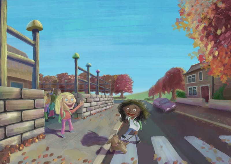
"First day back to school" Critique very much appreciated!
-
Hi all,
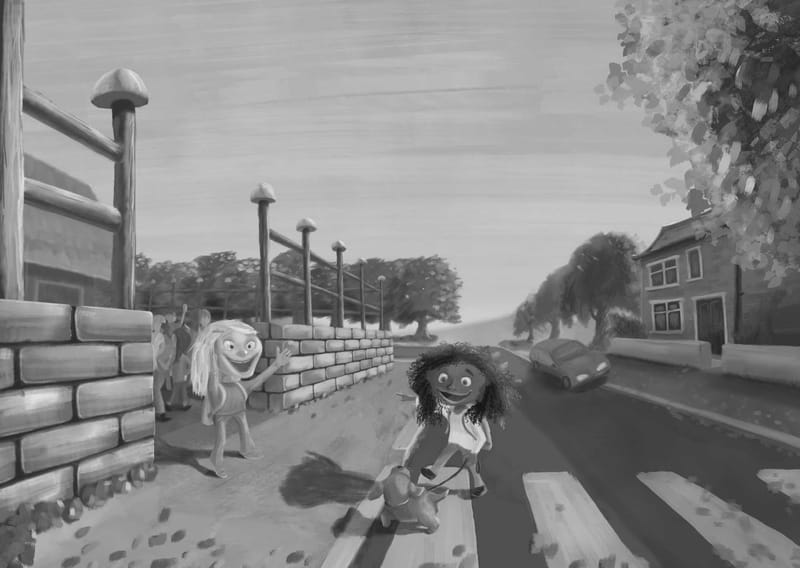
I've just finished a painting called "First day back to school" and hoping that you might be able to critique it. I've also included a greyscale version.
Anything that comes to your mind would be great. However, in particular what do you feel about the fundamentals - values, shapes, edges, colour, lighting and composition.
What might you do differently?
Thanks so very much for any words you can offer!
Adam
-
Hi @adam-thornton-0, cool piece!
Here are a few thoughts for your consideration:
-
I’m feeling a sense of danger with the car leaning towards the girl on the street. I believe it’s parked, but still feels tension.
-
The sky is taking up a lot of space. Is that intentional for text?
-
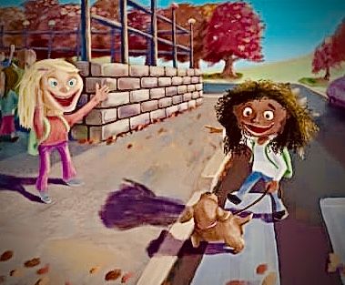
I’m not quite sure where to look. You might consider moving the camera angle down to look up at the characters or crop for increased focus of the two friends. I hope you don’t mind, but I did a quick crop as pasted below as an example, with a few color adjustments.
What I like:
- Love the friendship being shown here.
- I like the painterly style! It’s really tough to do; kudos!
- I like the fall trees and leaves, very seasonal.
Definitely a portfolio worthy piece!
-
-
@jeremy-ross Thanks very much, Jeremy. That's great and much appreciated feedback. You are very good at that!
Yes, I see what you mean about the car. It is parked. Perhaps I might change the shape of the headlights and darken their value. After reading your notes I do think the headlights look quite mean.
The space for the sky is intentional for text. I used to put black blocks, to symbolise text sentences, in those spaces. But someone told me not to do that. They aren't an illustrator though, so perhaps I will do that again. What do you think?
I'm thinking about what you said regarding not being sure where to look. I do see what you mean, but would initially like to try and improve that by way of values, edges and better atmospheric perspective, before cropping. Re. values, I'm thinking that the contrast between the girls/dog and their immediate background isn't enough.
Certainly don't mind you amending it.Thanks for saying what you like. I am hoping that it will become a portfolio piece.
Yes, their friendship was important to me. The painterly style is something that I am working hard at. I'm hugely inspired by Marco Bucci, and am trying to emulate his style. It is tough, but the better I get, the more satisfying it is. I'm feeling that once I've got it, my own style will grow from that.Thanks again, Jeremy.
-
Hi @adam-thornton-0, maybe consider adding the text of the story and see how that looks?
Cheers!
-
Hi Adam,
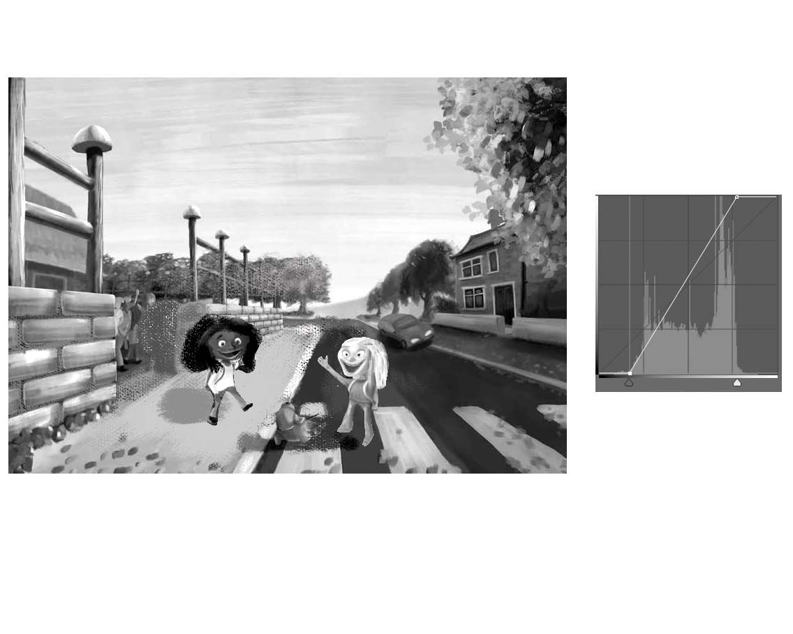
Beautiful image! The excitement of the first day of school is definitely there and I agree with Jeremy that the friendship is really lovely to see. I also love the colors you chose. They're so welcoming and peaceful and perfect for an image like this. The first thing that caught my attention was the brick wall. It seems to be the most rendered object in the whole painting and has the crispest edges so that's where my eyes tend to go. I think the characters are getting lost as well because they're in front of things that have similar values to them. My suggestion would be to have them swap places as below. I tried to place them in areas that help them stand out against the background. I lightened the cracks in the brick wall as well to draw less attention to them.
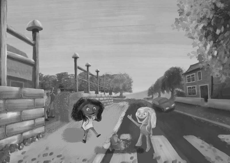
I also feel that you could push the contrast more overall. If you look at the curves adjustment in Photoshop, you can see that you're missing very light values and very dark values. Everything is kind of in the middle. I included sample images for comparison:
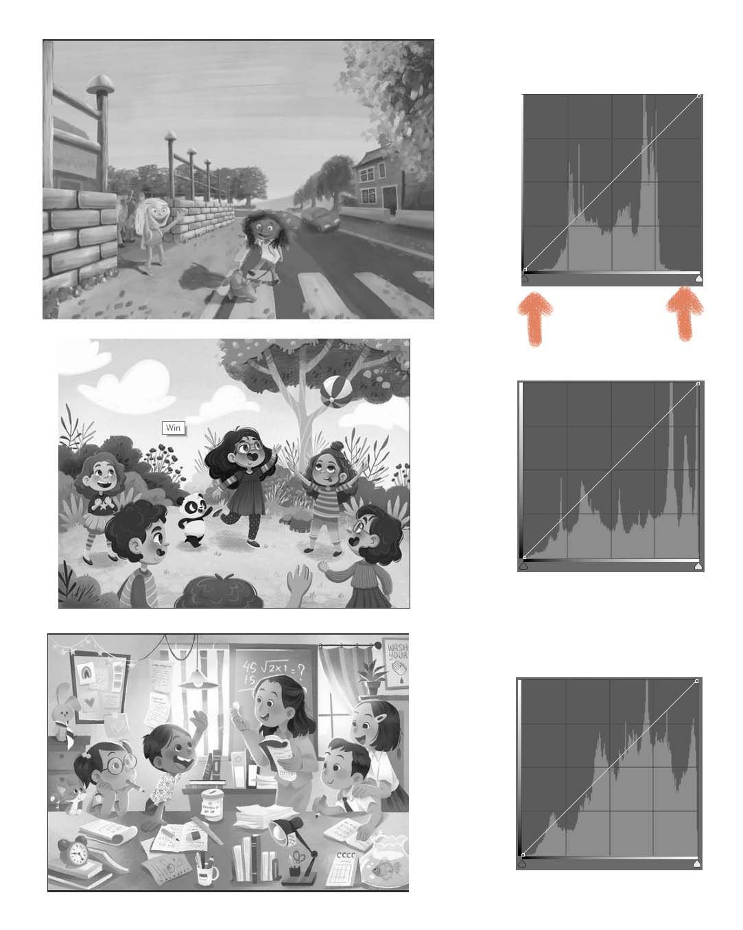
Here's the same image after adjusting the curves:
It's not the most graceful solution, lol, but you get the gist. I hope this is somewhat helpful. And sorry if I'm over-explaining things. I tend to get super lost with technical things so I appreciate when people over-explain things to me, but I realize not everyone is like me.
Thank you for sharing your work with us!
-
@adam-thornton-0 this will be a nice portfolio piece for picture books -- always great to have a school scene! And blending it with friendship is even better!
Going to agree with @aprilshin -- swap the characters so they stand out better. Much easier to read.
Some feedback regarding storytelling:
-
There is a lot of foreground and background. Is this a story about going to school, where we need to see more of the surroundings? Or is the focus of the storytelling the interaction between the characters? If it's the characters, can you zoom in a bit or make them larger so that they are more substantial elements in the overall composition? (If text is supposed to be on that page, of course leaving room for text.)
-
(Related to point 1) What is the purpose of the fence? It's the dominant element in the composition. Does it need to be there? While it is well rendered, it is not allowing us to see the school building or the schoolyard -- what's going on inside? Does it have anything to do with the story? As a viewer, I'd like to see the actual school instead of its fencing, or at least a sign or something that makes it obvious that this is a school. Because we can't see past the fence, this could be a house, a daycare, any old building. Why not do an image search to find different school buildings and schoolyards for inspiration?
-
Does the car have anything to do with telling the story? If not, consider removing it because it is drawing attention away from what's going on between the two characters. It's creating a secondary story that is distracting.
Please let us see the finished piece -- looking forward to seeing how this portfolio piece evolves!
illustrator - author - smiley person
mbaileyart.com
instagram.com/mbaileyart/ -
-
@adam-thornton-0 Hi Adam I find this a really fun piece and agree with Jeremy on changing the focus from the street scene to just the greeting scene as this gets rid of the over focused brick wall - my eyes kept leaping there and staying - it is a lovely wall though. Also sorry but I find the girl on the left a bit creepy, her eyes seem slightly crossed and combined with the large smile I could see the other girl running back across the road not approaching.
Is that being over critical or helpful.
I love your palette too.
Cheers
Helen -
@adam-thornton-0 sorry one more thing - the shadow of the girl crossing the road is maybe not quite right - it looks like her hair would be standing up and out or am I reading it wrong?
-
@helen Thanks very much Helen.
Yes, I agree with you. Foolishly I was trying to incorporate overly-detailed features that I liked (i.e. the brick wall) and lost sight of the overall composition.
But it is supposed to be a 'scene', rather than just about the two girls, so I think I need to reduce the volume of the surrounding features. I'm still learning though. Trying to figure out how masters such as Will Terry can have detail all around but still show a cohesive illustration that reads well (e.g. https://www.willterry.com/art/alien-tp).
It's funny you should mention the girl on the left. The more I look at her the more she takes on a bit of a demonic expression! Actually I previously thought I'd painted her eyes too far apart for the perspective of her head, so I moved them together. Looks like I overdid it!
Agree with you about the shadow too.
Thanks again!
Adam
-
@aprilshin April, that's amazing! Thank you so much for explaining everything so perfectly and taking the time to show me those examples.
Yeah, that brick wall has become something of an elephant in the room! I was too inspired by Marco Bucci's painting of the boy and monster on the bridge (https://www.marcobucci.com/personal-work?lightbox=dataItem-isf32u92), so tried to incorporate some of that magic here. But it clearly didn't work and the composition suffered.
It's funny but I was watching a Marco Bucci class a while ago and always remembered him saying that the main thing that separates an amateur from the pro illustrator is their use of values/contrast. Despite that, I still didn't do it right! Clearly I've got to concentrate on that more. So thank you very much for bringing that to my attention.
I'll get to changing it today!
Thanks again, very much!
-
@melissa-bailey-0 Hi Melissa,
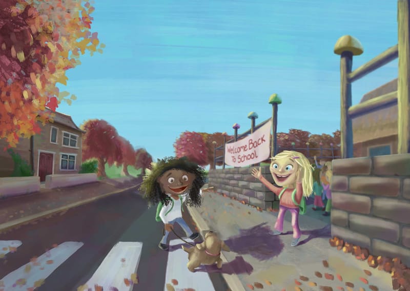
Thanks very much indeed for your feedback. It has been really useful. Everyone who commented has been so helpful!I've now made a lot of changes, based on people's sugggestions and my own subsequent observations.
I flipped the whole image, so the girl is walking from left to right. I thought that would read better.
Although I didn't swap the girls over, they are bigger and there's a lot more value contrast now throughout, and main focal point of the two girls and dog should stand out better. I think, if I was going to do this again, I would indeed have the darker skinned girl in the sunlight and the fairer girl in the shadow. but hopefull there's enough light on both their faces.
I've also improved the fairer girl's maniacal expression! Got her eyes in better perspective and reduced the intensity of her smile.The car's gone! I also toned down the walls a lot.
Although I kept the fencing (it's what a lot of primary schools look like here in the UK), I blurred them, as well as other aspects of the background and near foreground. However, it should now be clear that it's a school due to the sign. Again, some primary schools put this sort of signage up. I know it's right in the middle of the focal point, but I blurred it and am happy with it being there as I think it helps the story.
The take-home lesson I have learnt from this one is to plan complex painting A LOT better! I should learn from Lee White and do a lot more thumbnails and colour roughs.
Thanks again for your help!
Adam.
-
@adam-thornton-0 you're so very welcome! Good call on flipping the image -- having the characters walk from left to right, the same way that we read, encourages readers to turn the page and see what happens next. Well done!
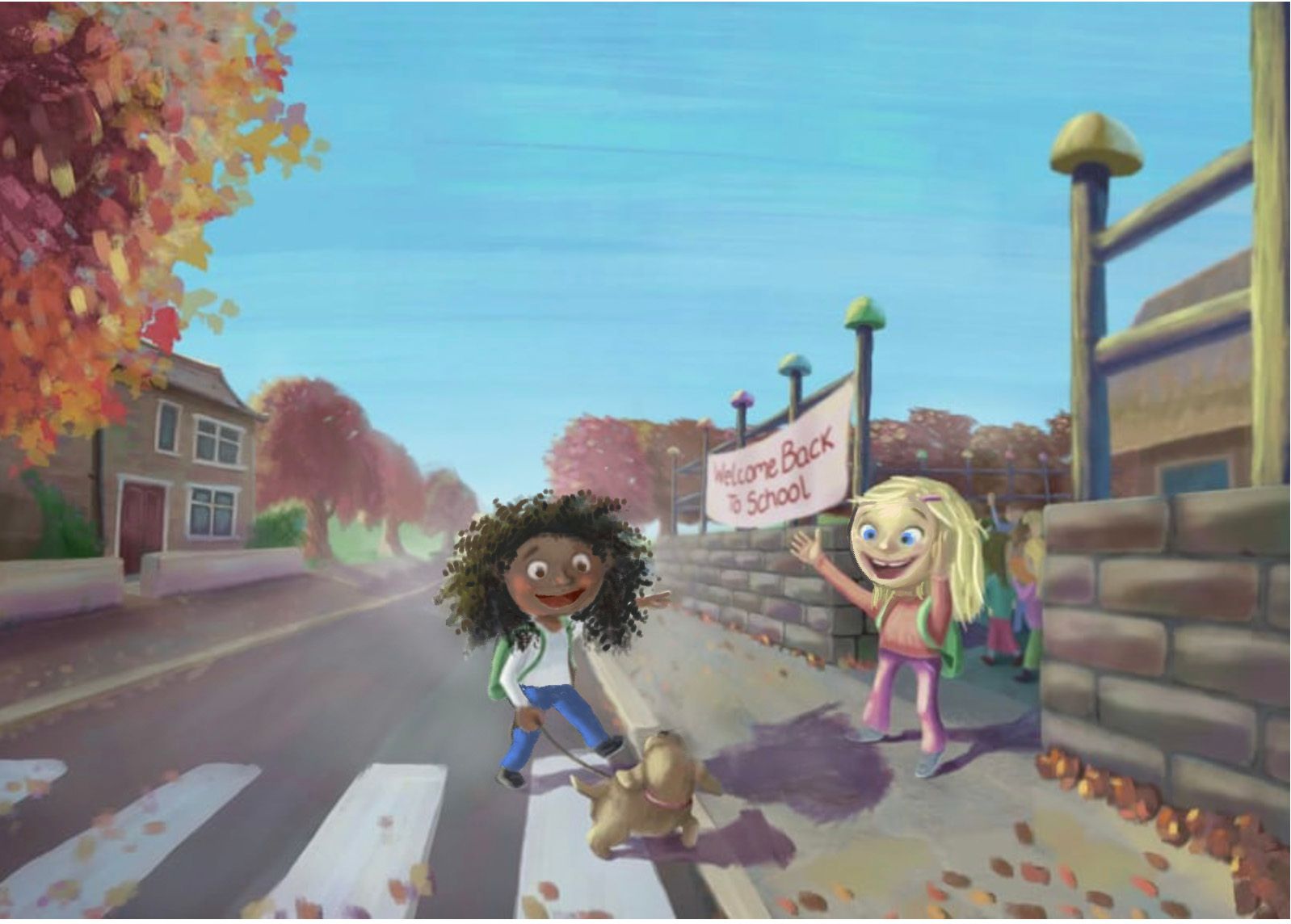
You've made a lot of changes that have improved the piece -- there is a focus to the storytelling now and the eye is drawn immediately to the characters.
A few changes you may want to consider making:
-
Push the values even more. While you've improved the contrast around the blonde girl, the other girl still blends into the background, and that's not good. If you have diverse characters in your piece, you want to make sure that your values work for ALL of them equally. I'm sure you don't want it to appear as if you're favoring one race, color, or nationality over another.(Changing the shirt color isn't enough, especially on a character with darker skin.)
-
Related to #1: Make sure that diverse characters are drawn and rendered authentically. In this piece, the black girl's hair isn't behaving naturally. If you've never had experience with textured hair, consult someone who does to make sure that you're drawing it how it naturally looks and behaves. The biggest issue, though, is the color of the lips. Lips are always darker than a person's skin, no matter what their skin tone is. A black character with lighter lips could be offensive to some viewers as they might feel that it refers to blackface. Again, if you are drawing a character outside of your experience, nationality, or race, do what you can to make sure it is authentic. That often requires reaching out to someone from that race or culture and asking them for honest feedback.
-
Regarding the expression on the blonde girl that you were struggling with: some of the issue might stem from her face shape. She has a very pointed chin and her eyes are set on the top third of her head, which usually reads more adult than child. Her very light blue irises want to blend in with the whites of her eyes, which can make those dark pupils appear creepy. Consider rounding her face, giving her more childlike chubby cheeks, and darkening the irises of her eyes. That might help her look cuter and less "demonic".
-
Question about storytelling: is the story about taking the dog to school? Or is the story about friends greeting one another? Where the eyes are looking will help you tell that story. If it's about taking the dog to school, have both girls look at the dog. If it's about friends greeting, have the girls looking at each other. Right now, because the black girl is looking at the dog and the blonde girl is looking at her friend, the story is confusing.
To help visually communicate these suggestions, I did a quick draw-over: lightening the background to increase the contrast (which also has an added benefit of adding depth) and making those recommended edits to the characters. Hope you find it helpful.
That's what I saw after looking at your revised piece. Overall, it's really shaping up! Please keep us apprised of its progress.
illustrator - author - smiley person
mbaileyart.com
instagram.com/mbaileyart/ -
-
@melissa-bailey-0
That's great Melissa! Thanks again for your help. It is very much appreciated.
To be honest, I'm not satisfied with this painting. I can see its potential in there somewhere, but I've realised I didn't plan it very well, and that includes using enough reference images. I used a few, but it looks like the suggestions that you have made all relate to better planning. Lesson learnt!Thanks for the info about lip colour. I had to google blackface. Not heard of that before. Hopefully that's now assigned to history. I had seen in some photos of African-origin people that when they smile their lips are relatively lighter. Perhaps it is the reflection of the light? I also thought I'd make them a bit lighter because her face is in more shadow, so I wanted to distinguish the mouth shape better.
Are you aware of any good quality painting classes that teach how to draw/paint different races etc.? It is something I would like to get better at.Thanks for suggesting I push the values even more. I think I needed 'permission' from someone to do that. It's funny but I notice value contrast a lot in other people's artwork, but less so my own!
Re the storytelling, it's about the friends greeting again on the first day of the school term. I did initially drew the girls looking at each other, but the black girls face was too hidden. So I decided to show her looking at her dog and pointing to her friend, as if to say "look doggy, there's my best friend!". But now I'm thinking that you can't see her pointing hand very clearly. Maybe her hair should be behind her raised arm?
I like what you did with the draw-over. I'll follow that.
Thanks again, Melissa.
-
@adam-thornton-0 Hi! Good job making this piece. I'm a bit short on time so I'll just point out the thing that standout for my the most. And that is the kids' faces. They look creepy especially the blonde girl. My suggestion is tone down her grin.
Portfolio: nyrrylcadiz.com
Instagram: https://www.instagram.com/nyrryl_cadiz/
YouTube: https://www.youtube.com/channel/UCbJCF1Im8ZO7hpGWTKOJMuA -
@nyrryl-cadiz Hi Nyrryl,
Thanks for this. Yes, you're not the first person to have said that! She does look a bit demonic, doesn't she! I've got a few things to change with the illustration, particularly the value contrast.
Hope all's well with you.
Thanks again.
Adam.