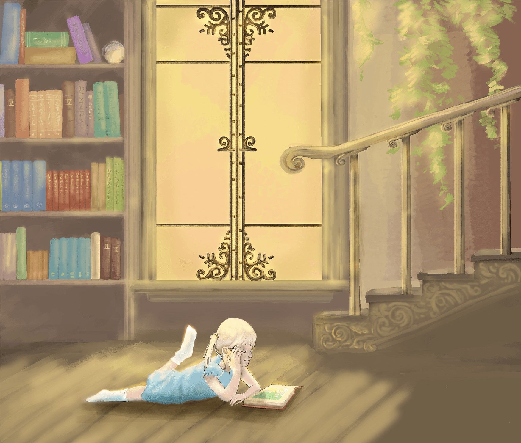
Portfolio piece? Feel free to critique!
-
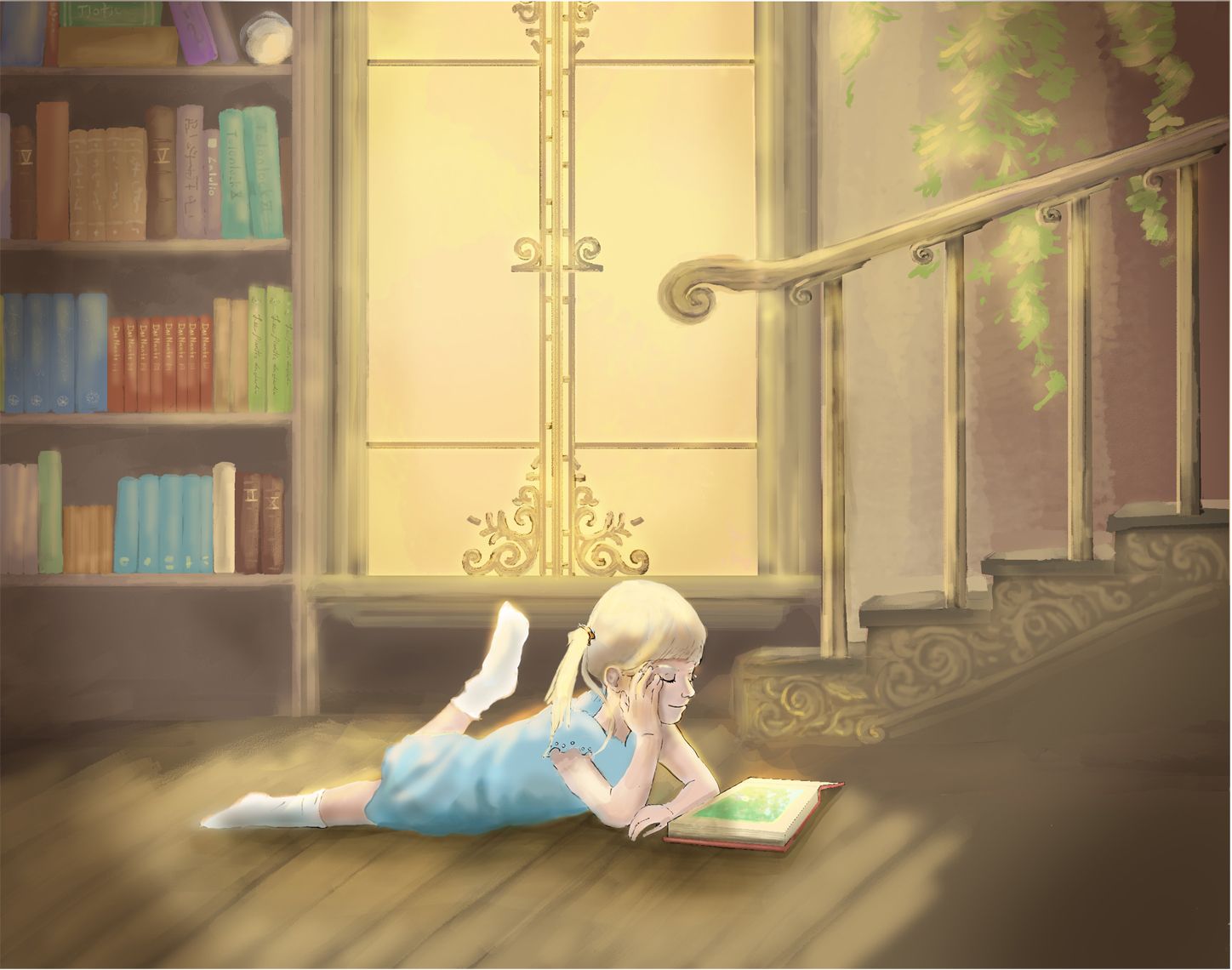
Hey y'all! I'm trying to build a portfolio for the children's books market. A few questions. Does seem high enough caliber, or are there some major problems with rendering, composition, or unity? Does it seem overly digital? Is the style on the girl too different from the background? She's the only one with any inking lines. Any other critiques are welcome, and definitely don't feel obligated to answer all the questions if you do not wish to. Thank y'all, I appreciate it very much!
Instagram:
@jmoglesby
@santa_fiesta -
@jmoglesby I like the rendering but I feel it’s a little inconsistent. Having some dark line work here and there. Right now my focus goes right to the window which is beautiful but you probably wanted the girl as the focal point.
-
@jmoglesby I agree with what @Asyas_illos said. You probably want the girl to be the focus. Maybe finish the line work all over the girl, not just the head and arms. Try either fading the lines on the beautiful window design or maybe add light line work to everything else in the background as well to help it match. Just some ideas, I'm just learning this stuff

One small thing I noticed with the girl is her hand that is touching the floor almost looks wrong as far as the spacing looks big between the last fingers, making it almost look like a thumb, you might shrink that gap a little.
This really is a lovely piece!
-
The thing that caught my eye were the girl’s legs. It’s kind of hard to tell which is the left and which is the right leg. I can switch them back and forth in my mind. The other thing that caught my eye were the stairs. They look to be kind of close to the wall. Other then that, it looks very nicely done. Good Job.
Wannabe Caricature Artist and Illustrator.
https://www.flickr.com/photos/doodlemick/
https://www.instagram.com/doodlemick619/ -
@jmoglesby beautiful mood! You've illustrated such a peaceful scene!
A question for you: since this is for children's illustration, what is the story you're telling here? Is there more to the story than just a peaceful reading scene?
To address your questions: while there are some lovely things you're doing, especially in drawing the girl's face, there are some issues with rendering, composition, and unity. It seems like you already knew that. Because of the inconsistency of rendering, it looks like this illustration is unfinished. While having one portion of an illustration highly rendered and the rest more abstract or painterly could work (lots of pros do this), the focal point should be the most highly detailed and rendered object. In this illustration, that's the window. But it seems like you intend the girl to be the focal point.
There are many ways you could do this. Here are a few suggestions:
-
Value.
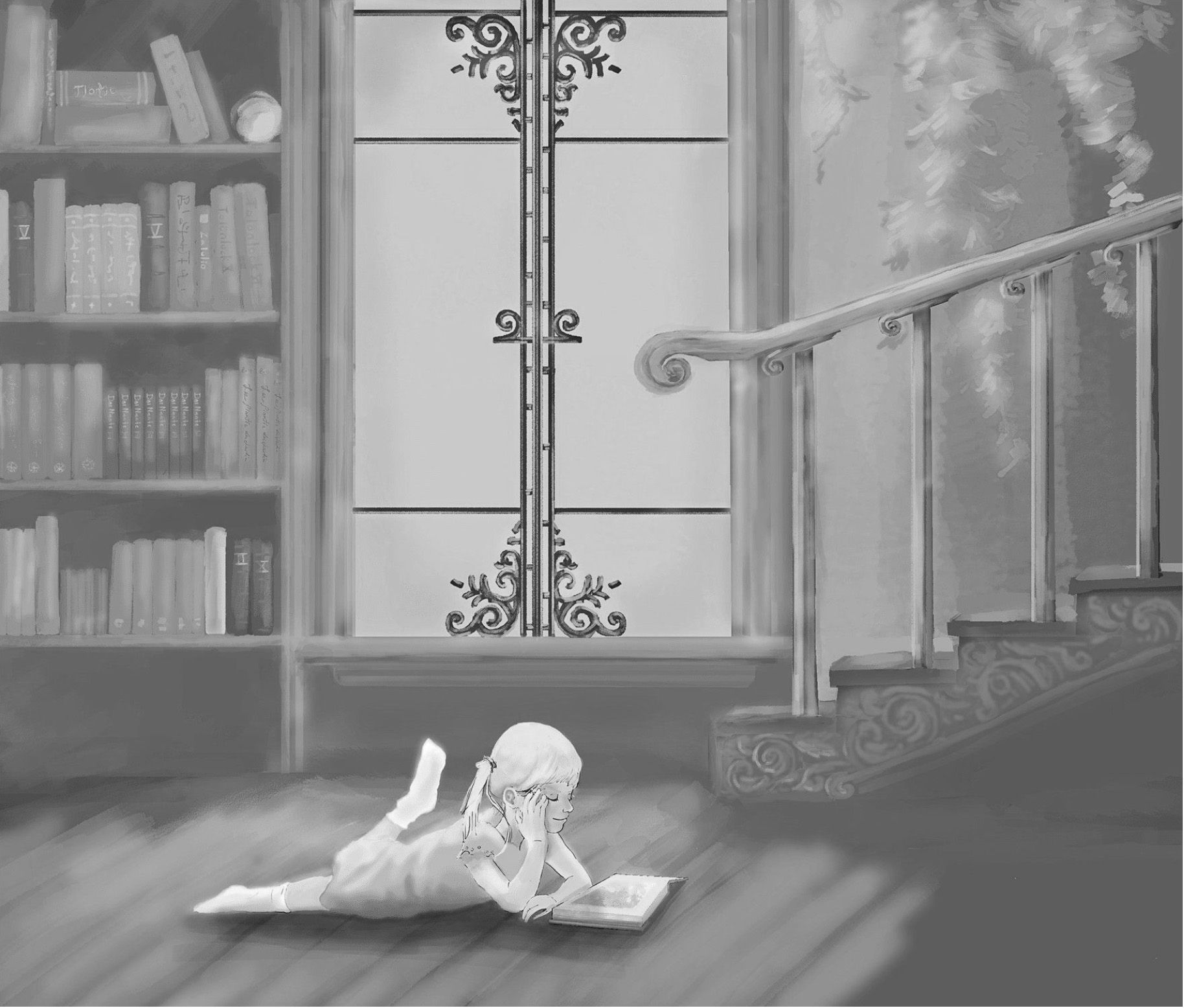
This is a grayscale of your illustration (hope you don't mind me taking a screenshot, only for example purposes). The lightest value is the girl, which is great. However, the rest of the values are all midtones with the darkest dark being window details. Because that contrast makes them stand out even more, the girl and the window are competing for attention. Could you utilize value to help in the storytelling? -
Proportion and scale.
What is the age of your character? She's reading on her own, and her proportions make it seem like she's at least 6 or 7 years old. But then compare her height with the height of the stair rail. Stair rails range from 34 to 38 inches high. That's the height of the average 3-year-old. Also, compare the size of the books to the size of the book she's reading. Why is the book she's reading so much smaller than the books on the shelf in the background? With a more realistic style, make sure you get the details right and everything is in the right scale. Otherwise, something will look "off" to the viewer. Check your proportions (the girl looks out of proportion to me, perhaps look again at your reference) and make sure that your character actually moves the way a body naturally would. While little girls are extremely flexible, her leg probably would be bent at a shallower angle. -
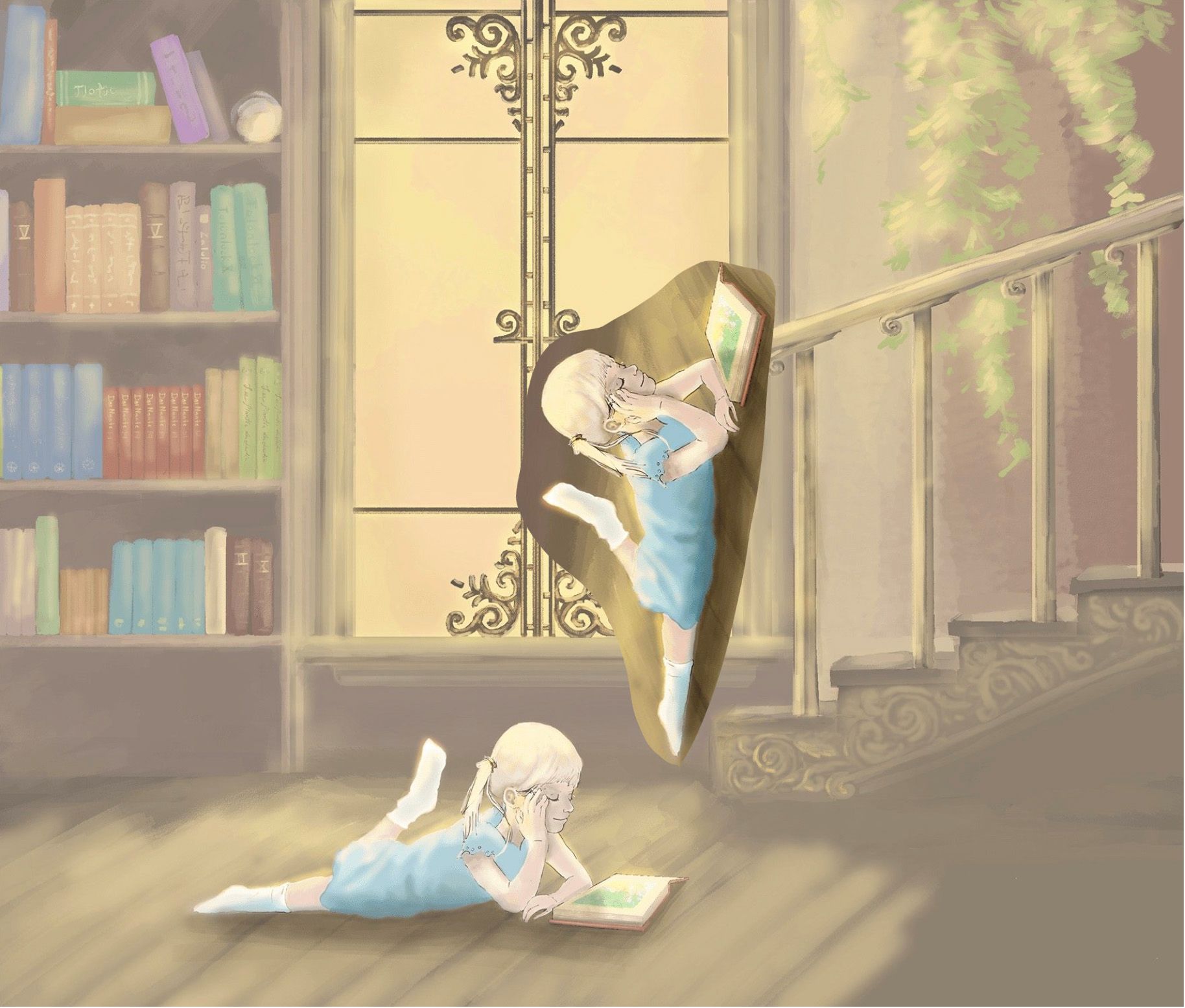
Cropping and focus.
Here's a little draw-over, just one way you could approach this illustration. The focus is all on the girl, removing most of the window detail. Value was adjusted, darkening the corners so it looks like light is streaming in through the window. Because the girl is backlit, areas that would be in shadow were slightly darkened. Highlights on the girl help her stand out even more. Scale was adjusted, making her about the height of a 7-year-old. Composition cropped -- does all the background need to be there to tell the story? Or could cropping bring the viewer in and keep the focus on the girl?
Again, there are so many ways to approach this illustration. You have areas of really nice rendering and detail -- if you're going to have a style that's both highly detailed and painterly, keep the tight rendering and details on your focal point. Make sure that your visual storytelling is strong and make artistic choices that help you tell that story.
Lovely work! Please show us how this piece evolves and please show us more of your portfolio!
illustrator - author - smiley person
mbaileyart.com
instagram.com/mbaileyart/ -
-
@frogpunzel Thank you! I think that adding a little more line work all around is something I’ll explore. I’m trying to go for a more painterly style without much line work, but it’s just harder to do and keep things clear with the girl being so small in proportion to the rest of the piece. The original piece actually didn’t have the girl in it and the window was the focal point, so I think adding her in is also causing the fight between the two for dominance.
-
@doodlemick Thank you! The leg part was actually something I hadn’t noticed, but I will definitely take that into account. Perhaps I could make it more clear with a shadow in the right spot. I may also need to push the stairs out a bit, so thanks for pointing that out! I appreciate it!
-
@melissa-bailey-0 Thank you so much! I had been thinking about the proportions of the girl, and those of the book had never occurred to me. I also think making the values a little more contrasty on her and less on the window is a great idea as well! Thanks, I’ll be applying your advice when I get back to work on it on Monday!
Instagram:
@jmoglesby
@santa_fiesta -
@melissa-bailey-0 you always amaze me with your feedback, always so helpful, I always learn from you even if it’s not me your speaking to!
-
@jmoglesby you’re so welcome! Glad you found it helpful.
-
@asyas_illos aww, thanks a bunch!

-
An update! Not quite sure I'm done yet, I'm still fighting the fading of the window detail more, but its getting there. Thanks for y'all's comments!