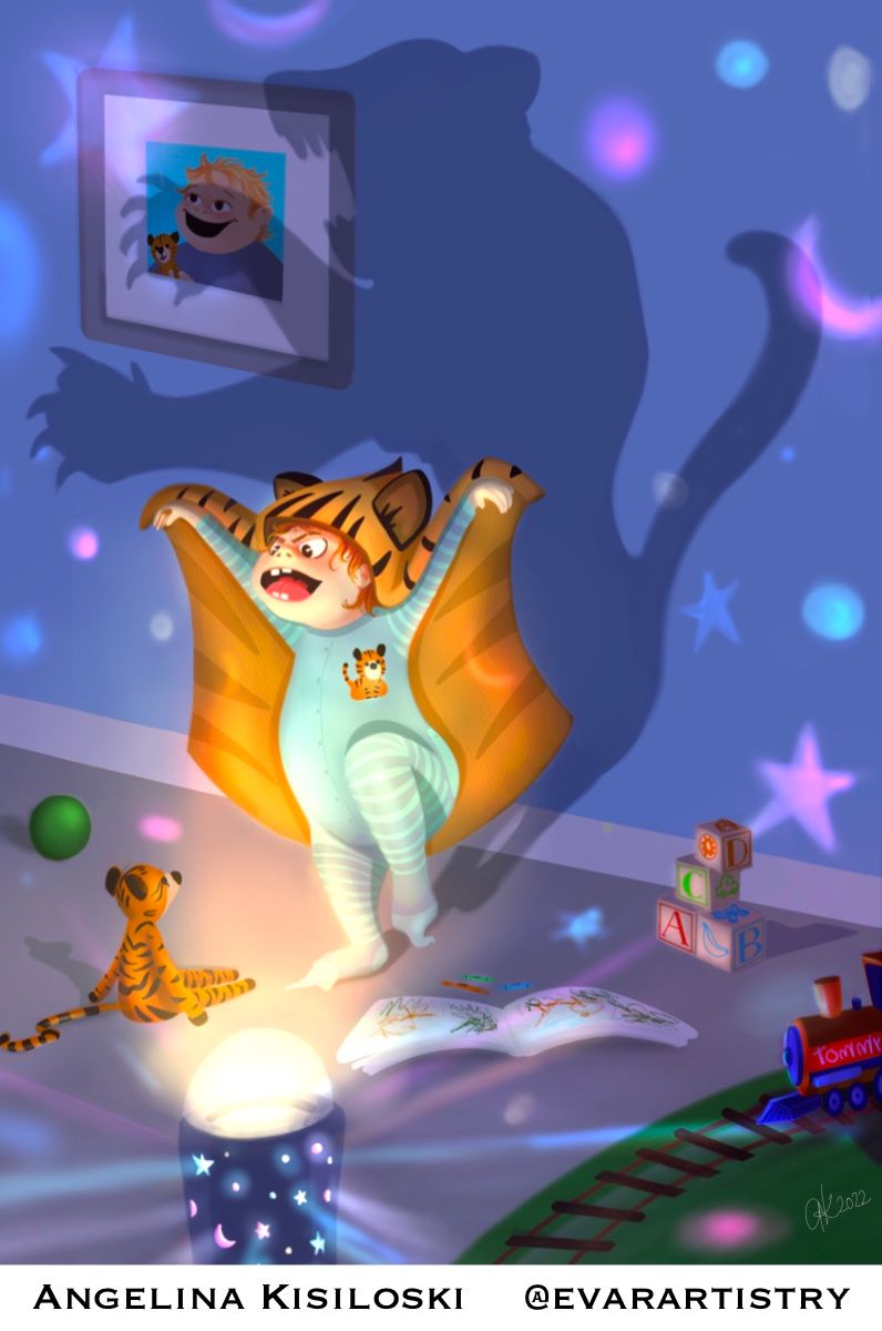
Tiger
-
Hello,
This is my first post in the forum. I’ve been a member for almost a year now. I’ve spent my art career as a photorealistic portrait artist, but as a kid my big dream was to be an illustrator or an animator. I got so busy with portraits that I stopped focusing on illustrative work. In Feb 2020 I had an accident that caused permanent damage to my dominant hand, and forced me to cancel a big list of booked portraits. Instead of getting down and out,I spent the last two years watching classes, and teaching my left hand to take over, and reminding myself that those childhood dreams are still within reach.
So here’s my Tiger, done with my non dominant hand. I super proud of this little guy, and I’d love to hear feedback on it.
I’m looking forward to learning more from all of you.

-
@angelinakizz wow! Good for you on moving forward with your life and to find new ways to keep doing what you love! It’s really good especially knowing youre working with your non dominant hand! And welcome to the forum! I have to add, its amazing since you pretty much started from scratch two years ago!
-
@asyas_illos
Thanks Asyas. I love all of the pieces you’ve posted. My favourite is the ferocious tiger. You’ve got a great style. -
@angelinakizz welcome to the forum and congratulations on your first post! Thank you for sharing your story -- it's inspiring how you refused to give up and have worked past something that could easily derail an artist.
And doing this all with your non-dominant hand? AMAZING.
I love your color palette and especially love your storytelling -- all the little details are great! A little feedback -- the thing that's most distracting to me is the picture on the wall -- it's unnecessarily complicating the shadow and also taking me out of the story because I'm wondering why it's there. For me, I think the composition would be stronger without it.
Other little things you may want to consider: moving the shadow a smidge to the right so the boy and the shadow each have their own space. Even though they're connected, it might be more visually striking to have a little more separation, as would naturally happen with a real shadow. You may also want to tone down the reflections, just a bit, so that they're not competing with the focal point.
These are nitpicky things and only mentioned with the intention to help. You've got a great illustration here! Looking forward to seeing how it does in Critique Arena!
-
@angelinakizz
 thank you
 -
Thankyou so much! I love nitpicky critique, I don’t get offended or discouraged. I prefer the down to every last detail picky.
I did try at first having the shadow moved over to the right, but felt that it wasn’t fluent with the lightsource. It felt off. I know one of the bigger challenges I faced, was that I moved the light towards the very end of the piece because it didn’t feel right where it was. So then the shadow became a challenge to get it to sit somewhere naturally. Initially the photo of Tommy and his tiger wasn’t covered by the shadow. And I wanted to show that his tiger, is the tiger that goes with him everywhere. That deep kid/stuffy love, that tiger love. My kiddo loves his lion and everything has to be lions for him. But I agree that the shadow covering him, does distract a bit. I will try a version where the photo isn’t there and see how it feels.
Thanks!
-
Nicely done @angelinakizz, especially with non-dominant hand! Look forward to seeing more of your work here.
-
This is great @AngelinaKizz and to have done it with your non-dominant hand! Amazing!