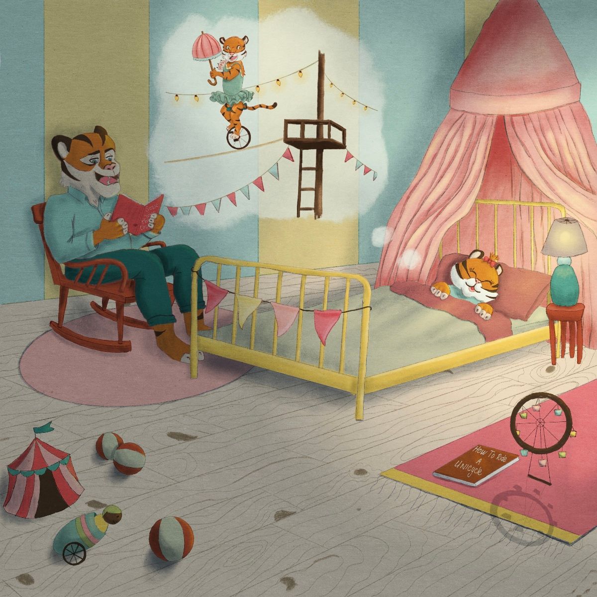
Possibly final tiger image. Opinions welcome
-
@reelynn
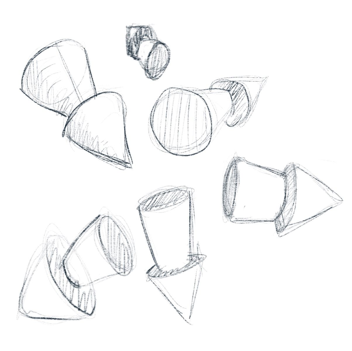
For your first illustration, this is really cute.What I would work on, is your light source. You have shadows going in several different directions, and it causes some confusion as to where the light is coming from. It helps to place an arrow where your light will be coming from. When you’re painting on a physical canvas, try drawing your arrow on a post it, and sticking it on the surface you have your work on (table, easle, drafting table). This helps that you don’t lose sight of direction while you work. It’s also really helpful if the arrow is 3D.
Here’s a really rough example of 3D directional arrows. I hope this helps.
-
@angelinakizz thank you! I was noticing while I was doing it that I wasn’t very clear on the shadows. I need to learn more about light and shadow for sure. Any ideas for how to use a 3d shape idea on a physical canvas? I can put one in a digital layer, but I struggle with figuring out a representative in physical. I did do a small color composite (well I guess 8x8 isn’t small). I should have worked out the shadows in that as well.
-
@reelynn
A post it note! Something that you can tack down to the surface around you but easily move around, should you decide you want to Mid process. -
@angelinakizz oh, great idea. Thanks.
-
I love the colors and sense of whimsy! On my screen, the color of tightrope tiger's tutu is kind of blending into the background. I wonder if she would stand out more if there were an outline or if the tutu/costume were darker. I think you could test this out pretty easily digitally.
-
So cute!
I love the concept. I can tell you put a lot of work into this! It's such a fun drawing.
Few things to consider in the future:
Don't be afraid to overlap to help your work have more depth. One of the balls could be in front of another, Parent tiger could be closer to the bed and the left foot would be behind. Etc.
Your color palette is mostly red to yellow, and then turquoise, which totally works. However, your pinks and forest greens are a bit odd man out. You could switch any colors around. I just picked the odd men out based on the rest of your illustration. The main lesson there is to decide on your color palette and stick to it. You can totally make a painting with every color in the rainbow, but things get pretty tricky when it comes to harmony.
Also, consider the time of day. Hard to go to sleep with all the lights on or in the middle of the day, which this seems to suggest since it is very bright.
")
I took the liberty of doing a paint over, and a screenshot of a suggested palette. I desaturated the whole thing a little bit, and then replaced the pinks with red, the greens with turquoise, and I switched a red flag for a yellow one to help clarify it from the rug. I then added the suggestion of a lamp in a dark room, while keeping the dream bright. You could draw a lamp and add it in and make it super magical. (I did this super quick, so it's just for ideas.)


-
@elinore-eaton thank for the great ideas!
-
@angela-sagues thank you. I noticed that too
-
@AngelinaKizz, @Angela-Sagues and @Elinore-Eaton i am thinking now I need to totally redo it before I enter it. Fix the shadows and such and add a lamp.
-
@reelynn Welcome! They are just ideas. Different things to consider.

-
@reelynn you don’t necessarily have to redo the piece. There’s plenty of room to keep adding and tweaking your current piece. What medium did you Use? Do you have an option to work digitally?
-
@angelinakizz I did the original drawing digitally, but printed it and painted it with gouache and colored pencils. I can try to do it digitally as I have the drawing and color ideas digital already. I am just not comfortable with that medium yet. But no time like the present, right?

-
@reelynn use the photo you uploaded here, in your digital program, and add a new layer over top of it. Work in the new layer, just like you’re using paint to “correct”. You can use the color picker, or eye dropper, to grab the color you were originally working with, to paint over the shadows you want to move. In a new layer, you can add new shadows. If you throw an entire layer of dark blue over the entire painting, and then reduce the opacity (usually in your layer options) then it’ll cast a lights out effect over the whole painting. You can then go in and erase where light would hit, say from a night light, or a lamp. And, if it doesn’t work out, then just remove the layers you added over the original and you’re back to square one.
-
@angelinakizz thanks for the advice. I will try it.
-
I did a digital version
-
@reelynn Yes!
 Great work! The lighting makes it feel so much more atmospheric. Well done!
 -
@reelynn What a great update. The focus of interest is so much more clear now too. Excellent work!
-
@reelynn awesome. I have such a hard time with digital l I enjoy the colors and subject matter. It looks like its straight out of a children’s book
-
This is looking great