Society of Visual Storytelling

    SVSLearn Forums

    • Register
    • Login
    • Search
    • Recent
    • Tags
    • Popular
    • Users
    • Groups
    • Search

    Riley's Robot in 3D

    Artwork
    7
    16
    707
    Loading More Posts
    • Oldest to Newest
    • Newest to Oldest
    • Most Votes
    Reply
    • Reply as topic
    Log in to reply
    This topic has been deleted. Only users with topic management privileges can see it.
    • notfitkid
      notfitkid @Kevin Longueil last edited by

      @kevin-longueil Thank you, Kevin!

      Albert Lee
      Serial Doodler and Illustrator
      www.AlbertLeeIllustration.com
      https://www.instagram.com/albertleeillustration/

      1 Reply Last reply Reply Quote 0
      • notfitkid
        notfitkid @ThomCharles last edited by

        @thomcharles Thanks Thom. You are absolutely right about the ability to explore a variety of camera angles in 3D. The tedious nature of redrawing scenes from varying vantage points is what I dread most (I am not that adept at drawing in perspective fluidly yet). I will definitely be trying a new layout from a more compelling vantage point now that I have a 3D reference to rely on. Thank you for your helpful advice!

        Albert Lee
        Serial Doodler and Illustrator
        www.AlbertLeeIllustration.com
        https://www.instagram.com/albertleeillustration/

        1 Reply Last reply Reply Quote 0
        • miranda-hoover
          miranda-hoover @notfitkid last edited by

          @notfitkid This is so impressive!!! Great job!

          https://www.instagram.com/mirananemone

          notfitkid 1 Reply Last reply Reply Quote 1
          • notfitkid
            notfitkid @ThomCharles last edited by

            @thomcharles February_2022_prompt-_Albert-Lee_v3.jpg 
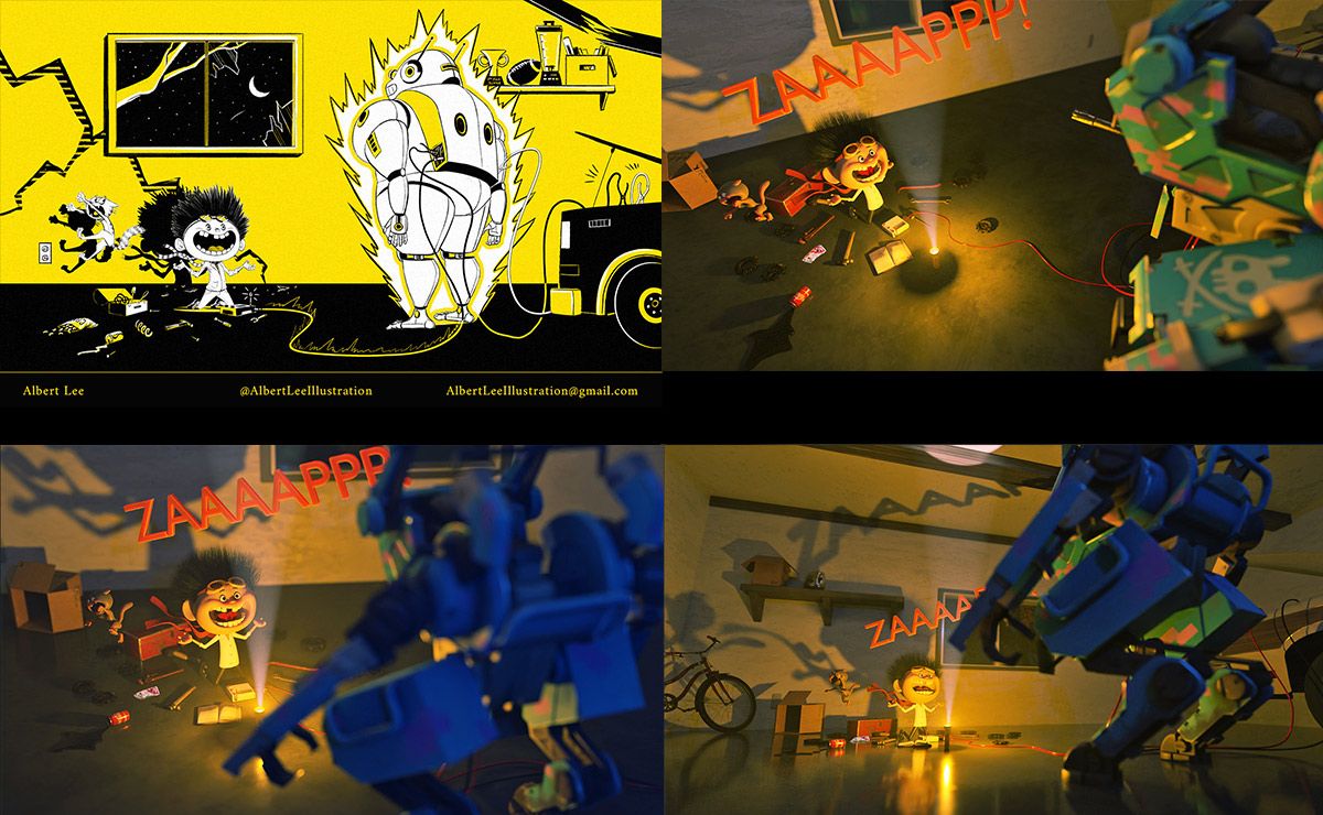
I took your advice and tried a few other angles with a wider angled lens.

            If it isn't too much trouble, could you please let me know which of the 3 angles you prefer? Personally, I am drawn to the Upper Right but the lower right image tells more of the story.

            Albert Lee
            Serial Doodler and Illustrator
            www.AlbertLeeIllustration.com
            https://www.instagram.com/albertleeillustration/

            demotlj T F 3 Replies Last reply Reply Quote 0
            • demotlj
              demotlj SVS OG @notfitkid last edited by

              @notfitkid I was immediately drawn to the top right as well. I think its very dynamic and leaves the nature of the robot more mysterious.

              Laurie DeMott
              instagram.com/demotlj

              notfitkid 1 Reply Last reply Reply Quote 1
              • notfitkid
                notfitkid @demotlj last edited by

                @demotlj Thank you, Laurie! Sometimes less is more for sure

                Albert Lee
                Serial Doodler and Illustrator
                www.AlbertLeeIllustration.com
                https://www.instagram.com/albertleeillustration/

                1 Reply Last reply Reply Quote 0
                • notfitkid
                  notfitkid @miranda-hoover last edited by

                  @miranda-hoover Thank you, Miranda!

                  Albert Lee
                  Serial Doodler and Illustrator
                  www.AlbertLeeIllustration.com
                  https://www.instagram.com/albertleeillustration/

                  1 Reply Last reply Reply Quote 1
                  • T
                    ThomCharles @notfitkid last edited by

                    @notfitkid For me, the best composition is the lower left…the negative space between the kid and the robot feels right. Also the echo of the robot hand and the shadow is a nice detail that connects the foreground and background…

                    notfitkid 1 Reply Last reply Reply Quote 1
                    • F
                      Frogpunzel @notfitkid last edited by

                      @notfitkid I too would say lower left.

                      notfitkid 1 Reply Last reply Reply Quote 1
                      • notfitkid
                        notfitkid @ThomCharles last edited by

                        @thomcharles I see your point. There definitely seems to be too much negative space in the one on the upper right. The one of the bottom left seems more balanced for sure and has a heightened sense of foreboding.

                        Albert Lee
                        Serial Doodler and Illustrator
                        www.AlbertLeeIllustration.com
                        https://www.instagram.com/albertleeillustration/

                        1 Reply Last reply Reply Quote 0
                        • notfitkid
                          notfitkid @Frogpunzel last edited by

                          @frogpunzel Thank you!

                          Albert Lee
                          Serial Doodler and Illustrator
                          www.AlbertLeeIllustration.com
                          https://www.instagram.com/albertleeillustration/

                          1 Reply Last reply Reply Quote 0
                          • First post
                            Last post