Illustration critique
-
Hi everyone,
I'm reworking my style to try and find something marketable for children's books. Posted below is my revised version of an old illustration which i tried to make more organic. I'll also post the old illustration below.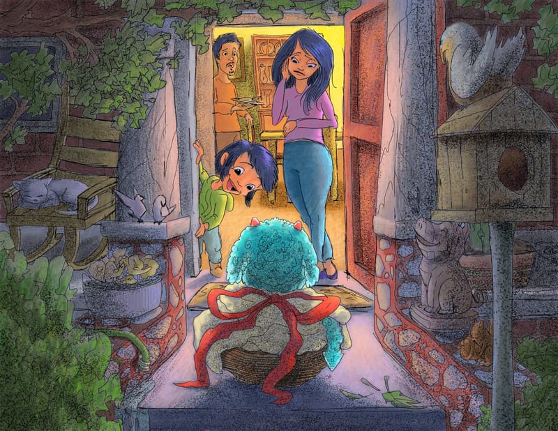
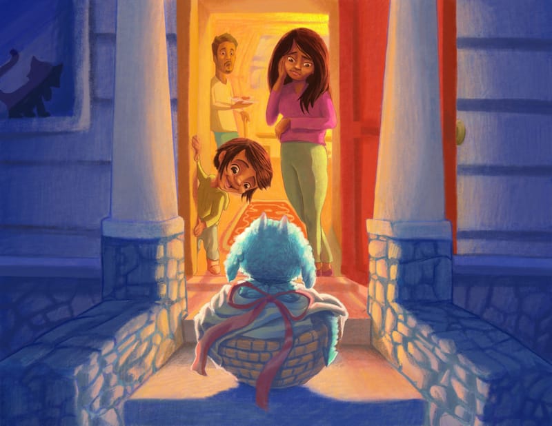
old illustration below
-
@Solomon-Designs I love the new style! It reminds me of the books I loved growing up. Personally I think your old style could also work as well.
-
I like your newer version quite a bit more than the older one. But I think there are some elements to the older one you could still use. I think the newer style has the potential of becoming to busy or cluttered looking which can distract from the focus, the focus in the original is pretty dang clear even if the image is less interesting overall than the newer one. But that's also not to say that you shouldn't put that detail in there, its just how you approach it.
So for instance, I think the background inside the house could be more hinted at as it is in the original. Let the light wash some of that detail out so the mom and child don't compete with the interior. I would do the same with the leaves possibly, not trying to draw them all individually but group more of them together with a few individual ones drawn to hint at them.
I hope that makes some kind of sense. It feels like I'm saying YES to all the Detail, but Less detail. It's always going to be a balancing act haha. But I really like where you're going with the newer style more so than the older one personally.
")
Draw, Draw, Draw, Draw and Draw Some More!
Instagram: https://www.instagram.com/levisimpson55/ -
@Blitz55 Yes, that makes sense. It is a balancing act for sure. I will definitely apply your feed back to this illustration as I had thoughts about the inside of the house competing with the focal point. Me and leaves don't always get along lol. You made good points. Thank you!
-
Hey there! I agree with what @Blitz55 brought up in his assessment.
My 2 cents - Both 'styles' are good and marketable to the CB market. I think the composition is what needs work.Everything is very centered.
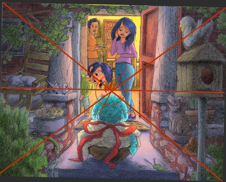
Maybe think of the rule of thirds. I brought the cat back from your first piece and brought over the branch to the right side as well.
Again my 2 cents - and I'm procrastinating from working on my webcomic!
Best of luck
Cheers.
-
@Solomon-Designs said in Illustration critique:
@Blitz55 Yes, that makes sense. It is a balancing act for sure. I will definitely apply your feed back to this illustration as I had thoughts about the inside of the house competing with the focal point. Me and leaves don't always get along lol. You made good points. Thank you!
Glad it made some kind of sense.

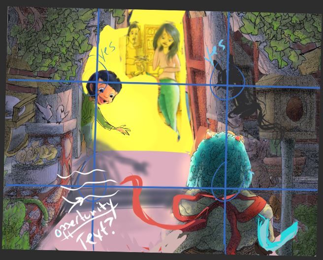
And yes, leaves can be a pain, I struggle with them myself, but with enough practice at simplifying them in large groups with fewer detailed out the happier you will be, because you no longer have to draw every one! Haha. Or so it felt to me.A good practice is to just take your sketchbook out and draw trees, but give yourself a specific amount of time to finish the tree so that it forces you to not get lost in detail. But not so short a time that you can't focus on capturing the tree.
OH, I did have one question for you, are you drawing and painting these digitally? If so, one way to keep detail but also push it back (Like the interior of the house here) is to use a different color for your linework, which is easy to do and adjust digitally. So since the interior is a warm yellow, use maybe a red'ish line for the drawing, it will sit back there in the light nicely and not be as dominant as a black line would be. Takes a bit of playing around but it could become another element in the evolution of your style
Draw, Draw, Draw, Draw and Draw Some More!
Instagram: https://www.instagram.com/levisimpson55/ -
@KatrinaF Thank you for your feed back. I thought a centered composition would work in this instance but now I'm not to sure lol Thank you for taking your time to provide me good feed back and good luck on your webcomic.
-
Personally, I prefer the older style. But I do agree that the composition and color values could use some tweaking
-
@Blitz55 Yes, I am drawing digitally. Good idea, the black is definitely overpowering in some of the lighter places. Thanks again for your feedback.
-
It’s great that you’ve included more objects in the new one and you’ve also introduced texture which makes it feel a bit less digital. Here are some issues I’ve noticed though. I like to work through this visual hierarchy I learned at one point which is (in order from greatest importance to lowest) composition > form > value > color. I can’t recall if lighting is supposed to be in there but it’s pretty hand in hand with value.
In your case the composition isn’t distracting or too confusing so I don’t think there’s an issue there. Form includes things like shape language and line quality. I think improving line quality could go a long ways in this piece. You use a pretty thin line without much variation in line weight which is totally fine if that isn’t what you’re going for in your style but if you want thin, clean lines then the line work has to be really spot on. It seems unclear if you want a messier line quality or a clean one. Take a look at some artists you’d like to emulate and practice how they do their line work as well as other qualities of their work. That’s what often helps me at least, hope this helps!
-
@Griffin Cool, thanks for your feedback. I like the visual hierarchy list. It will give me some structure for my illustrations. Thank you.