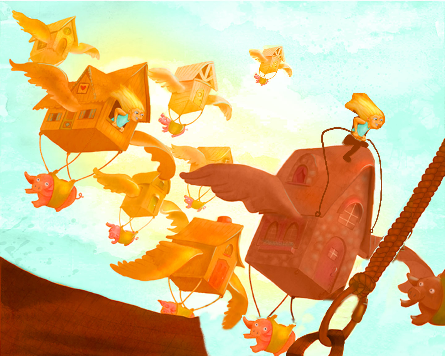
Flying Pigs WIP, Feedback appreciated!
-
I've been pushing (digital) paint around on this one for a while now, and it just feels like it's missing something. Any suggestions?
-
Wow fun and bright, nice going!
-
Ha, awesome

What might help could be shifting the focal point toward the character. Even though you made the character sharp blue to bring more attention to it, it is still fighting a tough fight with the leading building, And since it seems to me you wanted to depict a character flying somewhere in these crazy houses, there should be biggest contrast around the main character instead of the leading house. -
I agree with Jiří Kůs' advice. I'd like to see the character more as the focus as well.
While I like your color palette of gold, amber and teal, everything has a fairly high level of saturation and is fighting for dominance. You're starting to do it with some of the houses in the background, but I think things need to be pushed a little more. The girl in the house is getting lost because her skin is the same color and value as the house, and her hair not much different.
I also feel like the composition is being cut in half at a diagonal, with the upper-right side being empty, and all the objects in the bottom-left. Just a little shifting of elements can solve it.
You have a nice sense of color, and a fun whimsical style and concepts. I like the smooth, almost watercolor-like transition in the painting of the houses. Keep up the good work!
-
@Maile-McCarthy What a wonderful idea! I like your bright and warm colors. Feels just like summer… ^^
I accord with Jiří Kůs' and Shannon's advice and I have some ideas, too.
At first glance I thought the house in front (on the bottom line) is a landing place/field or something like that. Shorten the house to 1/3 maybe increase the airiness. Because I'm not good with words I draw my notes – hope you don't mind.
-
I love the composition and the brightness! Its really fun to watch! More focus on the character is a very good idea! Keep up the good work Maile!
-
Hi everyone. Thank you for the feedback! Here's my update.
I added text to the image. Did that fix the feeling that the top was too empty, or do you still think it needs more?
@Jiří-Kůs @Shannon-Perkins (and everyone, really), Thanks for pointing out the contrast/focal point issues with the girl. I worked on this a bunch, and I think it's a lot better in the new version. I did keep everything really saturated. Not sure if that's working or not.
@Fabienne Thanks for the paint over. That helped a lot. I like the space you created moving the foreground element down. (I also really liked the girl sitting on top of the house-- I didn't keep it, but I did add some more kids to the other windows. I think I might render them out a little more).
@Leontine-Gaasenbeek Thanks for the feedback. It's super helpful to hear that multiple people are having the same issues.
-
Looks great to me, Really fun.
-
@Lee-Holland Thanks

-
Well done, its so much fun to watch!
-
Superb! There is so much to explore!
Only one point: Which house is in the front? Shouldn't be the kids-house darker, because it's closer to the viewer? -
@Fabienne Yes, I see that now. The front one definitely needs to be darker. I'll go update it. Thank you!
-
Awesome work at creating action in this piece Maile! The incline of the houses really adds a great line of motion.
-
Great , I was immediately looking at the character

-
@Jiří-Kůs @Dan-Tavis Thanks so much!
-
I like the update, much easier to see the character, and the atmospheric perspective you used on the farthest house really adds a sense of depth. Also, having the text in there fills in that empty space I mentioned earlier. Picture books need that open space for text, earlier I was looking at it from a stand-alone piece. Good work!
-
This is really nice, I like it very much
