Yeti house redo
-
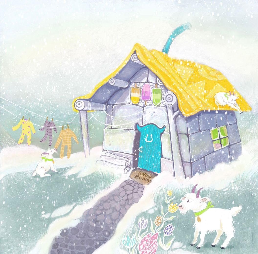
I have been working on my portfolio lately and trying to make sure things are more in my two best styles. I thought I would share the improved yeti house here since this was where I was first prompted with it.
-
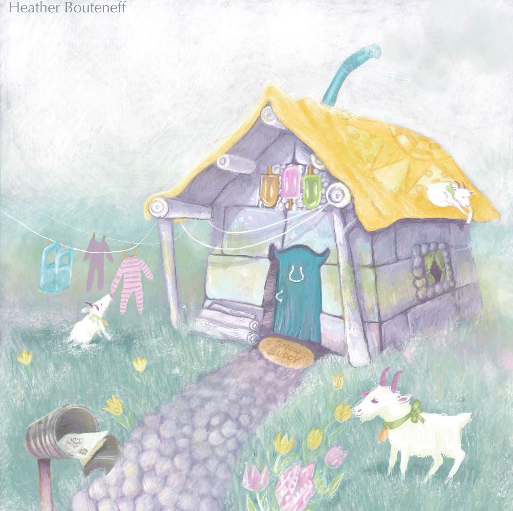
I remember you entry, I actually really loved your original one, which I believe is the bottom one? It has such a beautiful softness to it.
-
@Asyas_illos aw thank you! Yes the softer one was the older one. I had a portfolio review that had a lot of advice to saturate my pieces more. I tend to go full pastel Care Bear is what I’ve noticed
-
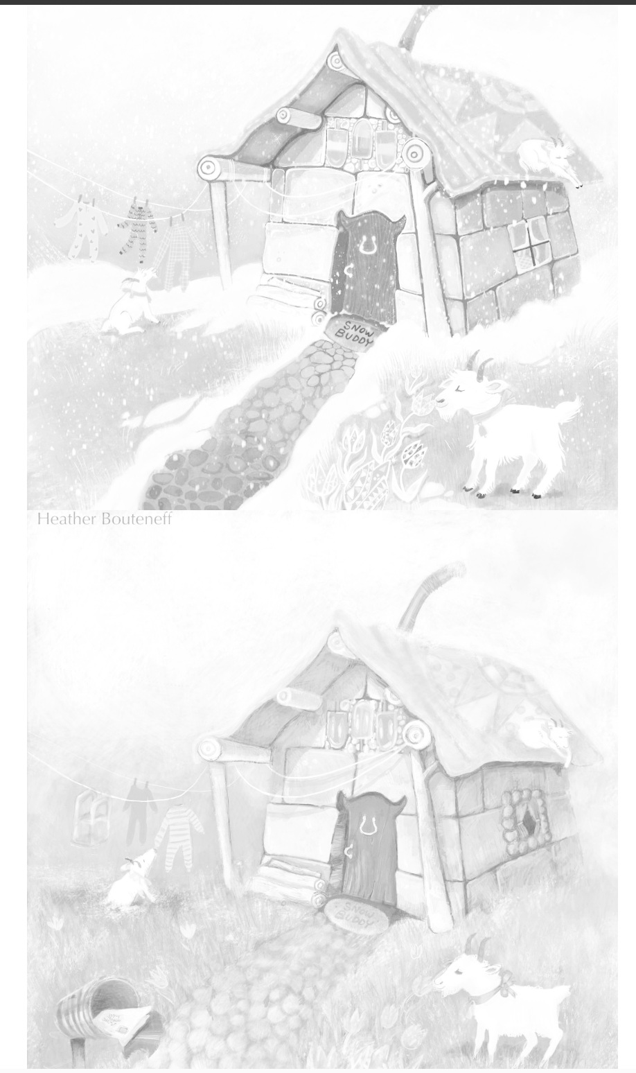
@HeatherB I agree with Asyas, that I prefer the colors in the second, and even the design of the second image over the reworked. I don't think your issue is saturation rather its an issue of values. I flipped your drawings next to each other in to black and white, and you can see that almost all of your values are the same level and ideas get lost, or the prominent features are the wrong areas of focus. Even with changing the saturation, your values didn't really improve. I really like your muted tones, rather than the higher key tones you added. I would suggest keeping the same pallette but adjusting your values, rather than just making some colors brighter.
-
@HeatherB Agree with Asyas and Angelina too. I do actually prefer the overall feel of the original work, even though the redone piece definitely looks more finished/polished, and the colors of the original look slightly faded. The pure white of the snow in the redone piece seems slightly overbearing. Just a suggestion from my POV, but perhaps the piece could be improved with a stronger sense of lighting and shadow to improve contrast (eg. where is light shining from and where should the cast shadows from the roof be falling). Also in the redone piece, various elements of the house are highly saturated, and I can't quite figure out which one I should be focussing on.
Since the main subject is the yeti, and it's probably the uniquely-shaped door that most clearly tells the viewer the story (that this is a yeti house), you could consider emphasizing that element more instead of having it as saturated as the roof, trinkets on top, window etc.?
-
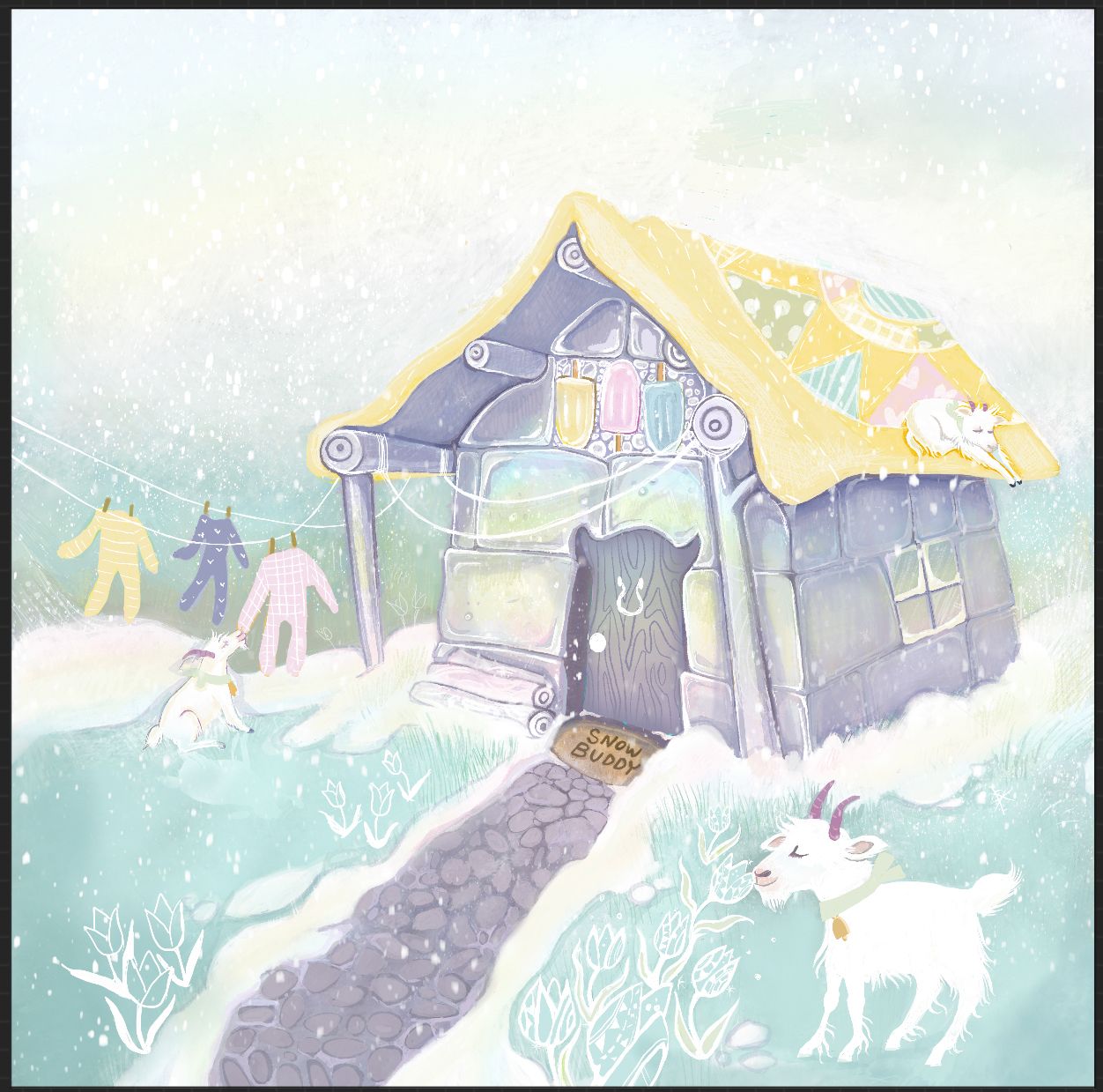
Thank you for the feedback and help! I’m not done yet but is this headed in the right direction?
-
@HeatherB I do think you've managed to recapture the soft and airy feel of the original while having an overall more polished rendering!
-
@HeatherB Yes- much stronger!