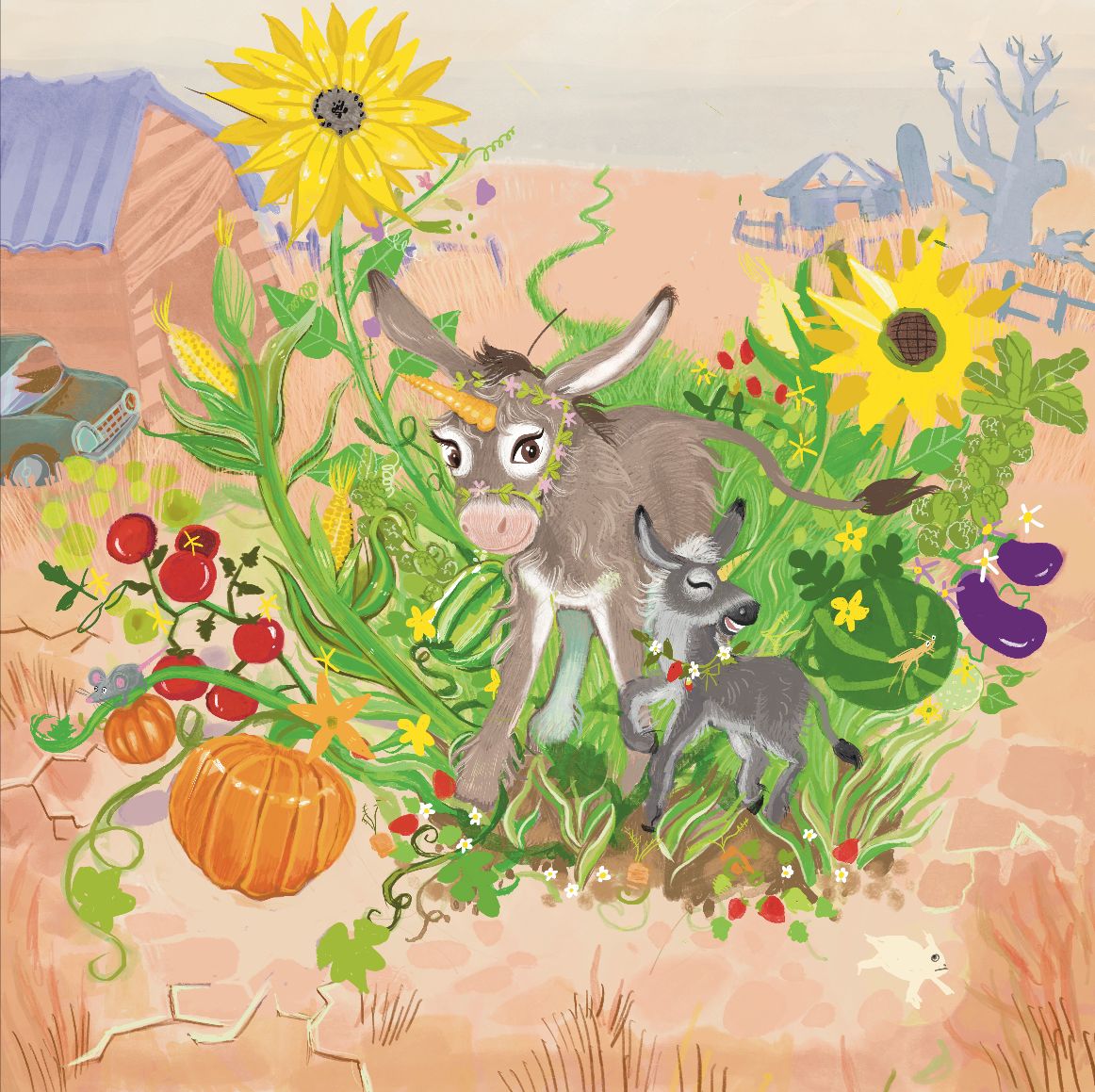
Unicorn donkey too corny?
-
I’ve been fussing with this series idea of unconventional unicorns as season representatives and I might have bitten off too much with this magical summer donkeycorn but I would appreciate some advice if there is something I need to change or I just need to finish it
-
Hi @HeatherB, sounds like a great idea!
I might consider changing the color of the main horn on the donkeycorn since it blends into the background. Perhaps try white? Also, you might consider making the horn larger for the mother donkeycorn.
Again, cool concept!
-
Hi Heather, the concept is super cute, but I think you need to re-evaluate your values. If you squint, it's really hard to differentiate your main character from your background. I think if you play with your values this will improve.
-
Very adorable illustration and the suggestions are solid. You might want to lose the horn, it’s an interesting idea, but the donkeys are so well rendered it sorta looks out of place. Nice work can’t wait to see the finished piece.
-
@HeatherB I'd mute all the colors way down. They can look healthy without being the brightest thing on your paper.
-
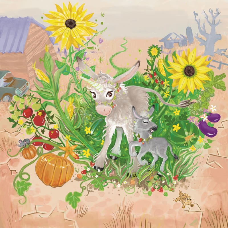
I tried a lot of the suggestions with this and ended up here, I am happier with it but not 100%. I think Im going to work on other projects a bit then come back to it and maybe darken the background a little. I wish I could do muted palette more but it never feels like me and I always change it back
-
@HeatherB I like the improvements. You can give the baby a dark mane to set it off from the mother. The front legs, below the knee, on the baby are anatomically a bit too long, especially between the lowest joint (pastern) and the hoof. If you shortened them, you could use the black hooves to further separate the baby from the background (mother). Fun facts - Male donkeys are called jacks and females - jennies. I'm pretty sure the babies are called foals just like horses.