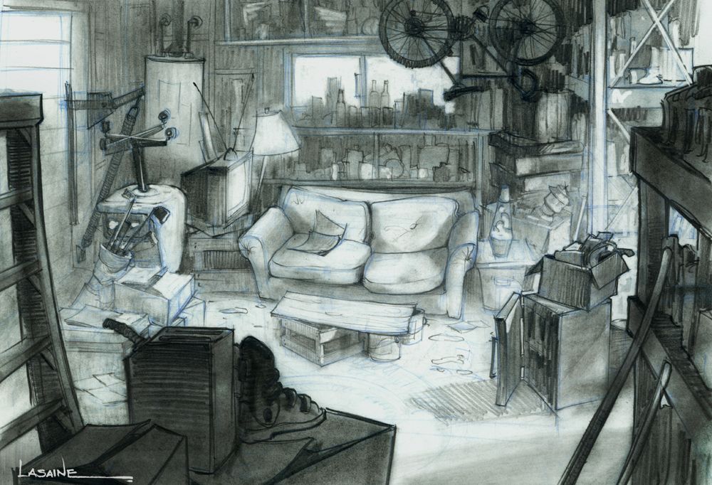
Feedback please—Working on opening composition
-
@patricialamas Awesome! Good catch! Love it. I'll try to post revisions. Thank you!
-
@JessicaLinnEvans looking awesome! So cute and full of life
-
@Eliana-Bastidas Thank you so much!
")
-
@Lee-White said in Feedback please—Working on opening composition:
value grouping and lighting
Hi Lee, Can you think of an SVS video class off the top of your head that covers grouping to manipulate viewer focus? I feel like I've got a pretty good handle on lighting and value, but grouping is not something I've considered much.
-
@JessicaLinnEvans have you tried the creative composition course?
-
@Asyas_illos Thank you! I'll look into it! I watched Will''s Draw 50 Things class and it was super helpful!
-
@JessicaLinnEvans I go over it a bit in my lighting and shadow class too. Here's some great examples from someone much better than me - Paul Lasaine. Notice how he has lots of detail, but they are all grouped into areas of light and dark:
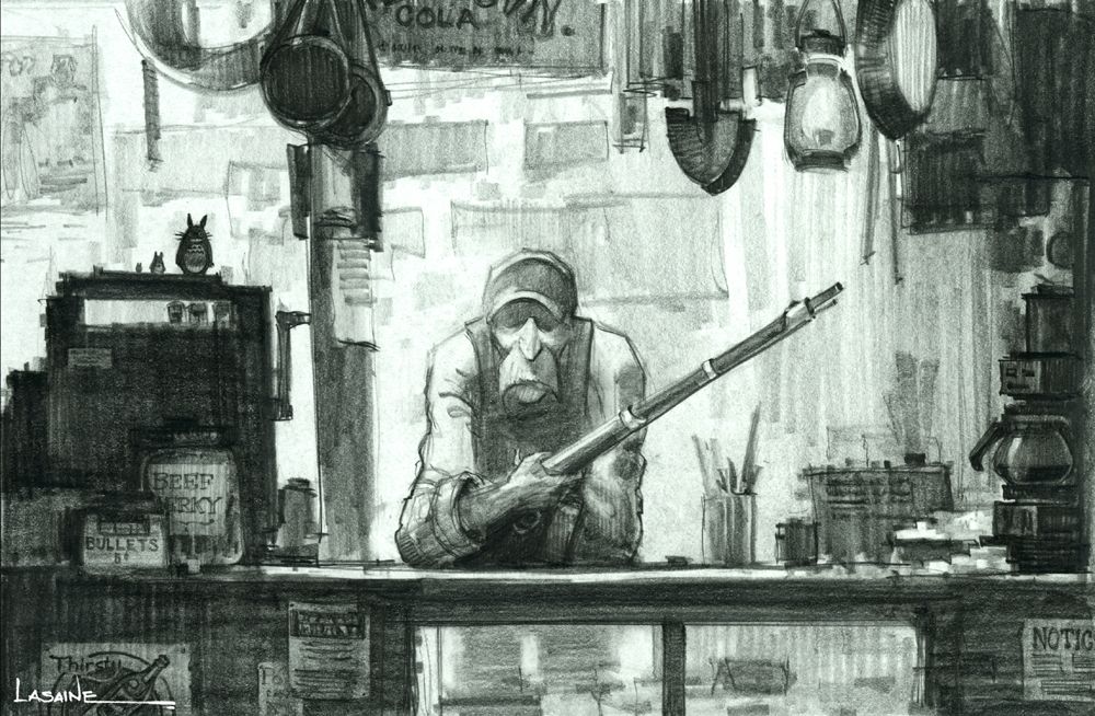
SVS Faculty Instructor
www.leewhiteillustration.com -
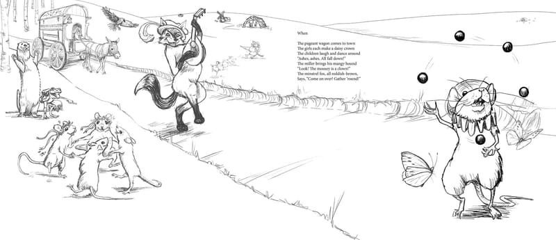
@Melissa_Bailey @patricialamas @Lee-White Thanks again for all your feedback, ya'all. Here's the edits to the sketch for this spread. I'll move the stage image to the next page and put the "camera" behind the actors so you can see that they're on the stage, but also can see all the villagers that came.
This is for a collection of Aesop's fables that I've retold in verse. The animals will act out each fable, but the book will be illustrated with veiws of backstage and everything going wrong for the acting troupe and stage hands. (None of the foibles will be in the text, just the fables).
-
@Lee-White Oh, excellent! I didn't see this comment. Okay, I'll head over there again and check it out! Thank you so much!
-
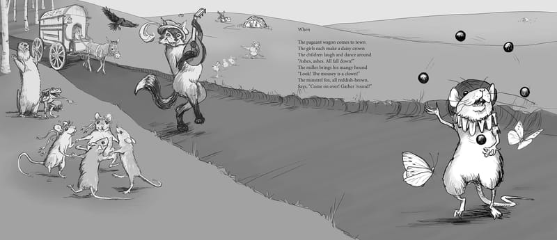
@JessicaLinnEvans Okay, here's a tonal version. My first ever! Ha! Maybe my illustrations will be better if I do this more often.
-
@JessicaLinnEvans You're so welcome! Looking really nice!
-
@JessicaLinnEvans yes -- tonal versions are key! Doing value studies at the sketch stage has greatly helped me improve as an artist.
Another thing that you should seriously think about doing is using a grid template for full page and spread illustrations. There are specific parameters that we can't change and have to work with, especially margins and gutters. In this sketch, you've left sufficient space for text, but it hugs the gutter, which can be difficult to read. Consider nudging the text to the right.
Are you planning on adding more elements to the foreground and background? There are two busy groupings, but there is also an empty swath running through the illustration, and it separates the groups, making them into two scenes instead of one.
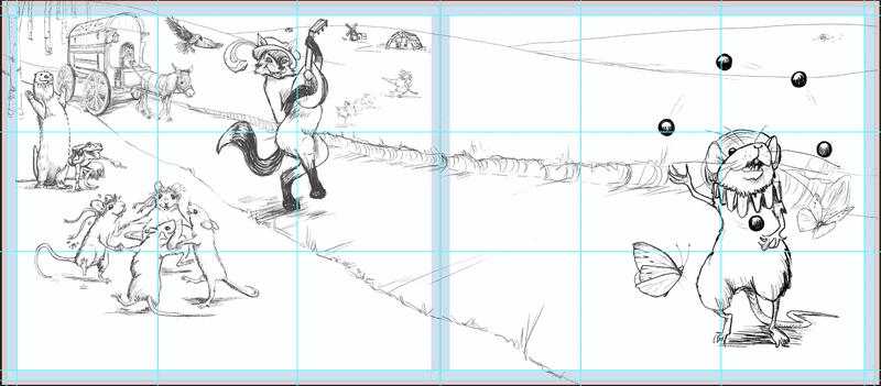
Moving a few of these elements around will give you a more balanced illustration, which will also improve the flow and readability. I took a screenshot and did a little visual example of one way this composition could be adjusted.
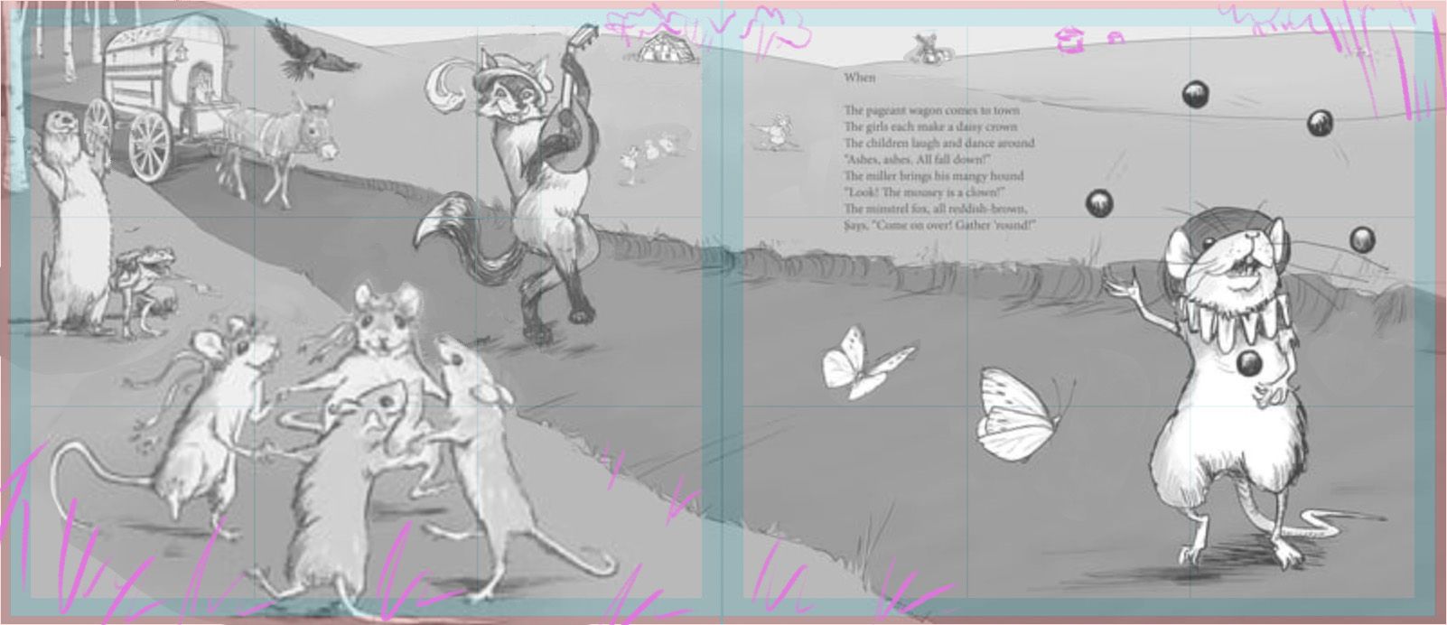
The text was moved over a smidge. The groupings are spaced out more and the scale was adjusted for some of the animals, as previously suggested by @patricialamas -- to make it feel more natural and to help with the flow. The pink squiggles show where some foreground and background foliage could be added.
Hope this is helpful. So looking forward to you sharing more of your process and seeing the progress with this illustration!
illustrator - author - smiley person
mbaileyart.com
instagram.com/mbaileyart/ -
@Melissa_Bailey This is what I was working with. I live on the Palouse, so I guess I thought the bare hills were okay. LOL! Not everyone thinks treeless rolling hills are normal. (I'm actually working on a tall tale to explain how it happened, and how we got the giant Palouse earthworm... but that's a different story!)
-
@Melissa_Bailey I love all your feedback! Thank you so much!!!
-
@JessicaLinnEvans you're so welcome! And I LOVE the idea of a giant Palouse earthworm story. It has to happen!
And please know, if you want to have bare hills, have bare hills. This is YOUR story. The trees were only a suggestion of one of the ways you could balance the composition.
illustrator - author - smiley person
mbaileyart.com
instagram.com/mbaileyart/ -
@Melissa_Bailey Haha! Thanks! I'm trying both ways. You're awesome! Thanks so much for all your time and expertise!
