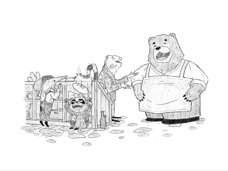
Feedback: Hatching with flat values
-
So I often struggle with values anyways and now that I’ve added hatching into the mix it feels even trickier. I definitely want this piece to be black and white so I have some black and white work for my portfolio but I was wondering if black and white pieces should literally be black and white rather than grayscale. If so then that using other values doesn’t even matter.
I tried the 3 value technique to try to figure things out but it didn’t help a whole lot, I still feel a bit lost. Since hatching already adds value should I figure out flat values and then figure out hatching afterwards? Should I ditch doing flat values and just do it all with hatching? Let me know your thoughts and as always if you have any additional feedback on anything else I’m all ears!
-
@Griffin I really like the hatching only, I think it provides enough value as it is. Or maybe try adding more layers of hatching to areas that you’d like to be a darker value.
-
@Asyas_illos that’s what I’m leaning towards
-
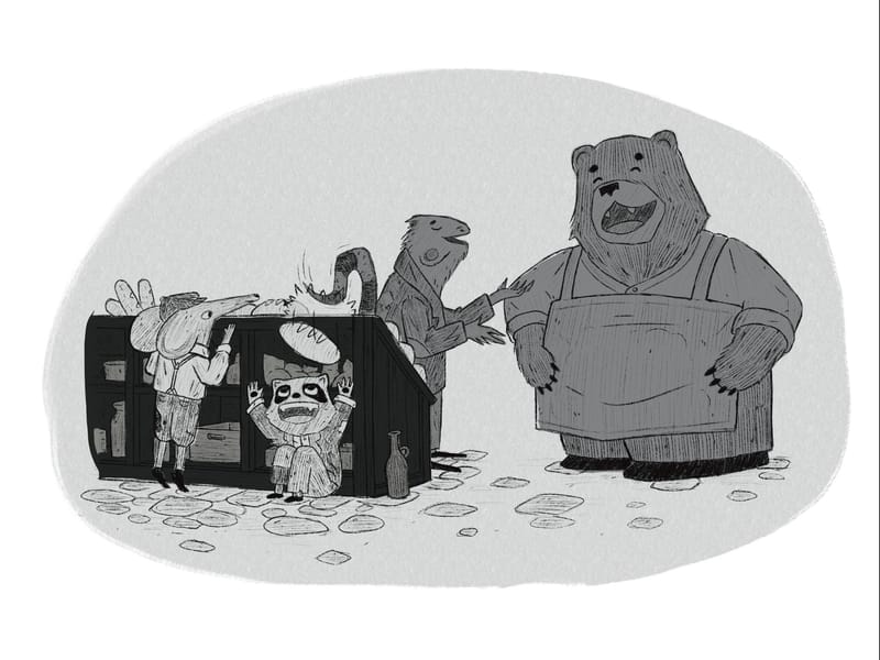
Between the two you've shared, I prefer the first one with hatching only, but that could be because there's no white in the second one, so the whole thing reads as dark. Also, the flats are, well, flat. I think there could be more variation within each character.
I don't have a ton of black ink experience, but one (analog) approach I learned from an urban sketching book by Gabi Campanario (@gabicampanario on Insta), was to:
1- lay down a light ink wash everywhere that wasn't meant to be full white highlights
2- layer that same light wash to create some shadows
3- layer a darker wash to emphasize very dark shadows
4- finish with some light hatching to describe the shape of forms a bit moreThat's just one approach (which could be done digitally too), and maybe that way of thinking could be helpful to you.
Also check out Alfredo Cáceres (@redolaf on Insta). A lot of his work has color, but throw a black and white filter on them and you can see how hatching and washes can interact.
-
@Griffin I like the flat values, but I'd experiment with dialing them all down like 60%. Make sure that your areas of greatest contrast support the focal points of the image. In the hatched illustration, I think the focus is on the conversation between the lizard and the bear. In the flat value, my eye goes straight to the raccoon action. Just depends what you want.
-
@Valerie-Light I definitely want that raccoon and the bread to be the main focus. I’m planning on Moana that area much lighter, almost glowing. That’s part of the reason I want to use flat values but maybe I should just try one thing at a time and see if I can pull it off with just hatching
-
@Rebecca-Jensen the flat values aren’t finished. I was just trying a technique I learned where you just use 3 values to block in objects to create a good balance of values but I’m not sure I got that balance right