Feedback: Full Spread Composition
-
Onto the next piece for my portfolio project.
This is the first full spread illustration I’ve ever done and also the first one I’ve done that leaves room for text so I’m bitting off a lot but hopefully not more than I can chew.
I’m sure full spreads with text offer some compositional challenges so I really want to have a spot on composition for this. I’d like this piece to feel tense and exciting so bare that in mind and let me know what I can improve on!
-
@Griffin wow you are cruising along! Faster than me!
 I think this is headed in good direction, I can see how tense it will shape up to be. It’s a little hard to judge at this stage, just make sure you have ample room around the gutter and you should be good. Over looks like a great start
-
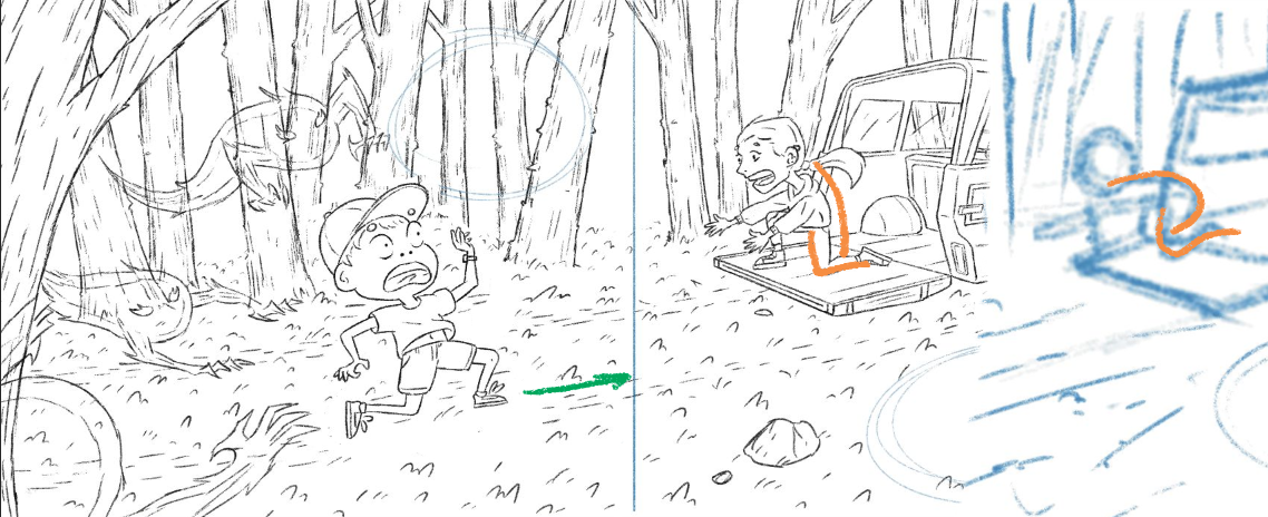
UPDATE: line stage is done. I was hoping to be done with this piece by the end of today so I’m going to head right in into color but if there are any issues you see with the line stage let me know!
Things to note: a lot of this piece hinges on the colors and lighting so some things will look wrong right now like the flame ghost things looking messy due to overlapping with the background but they will be translucent when colored so it should look alright. I the woods look a bit empty but that will be filled in with painted tree shapes without lines so they fade into the background a bit more.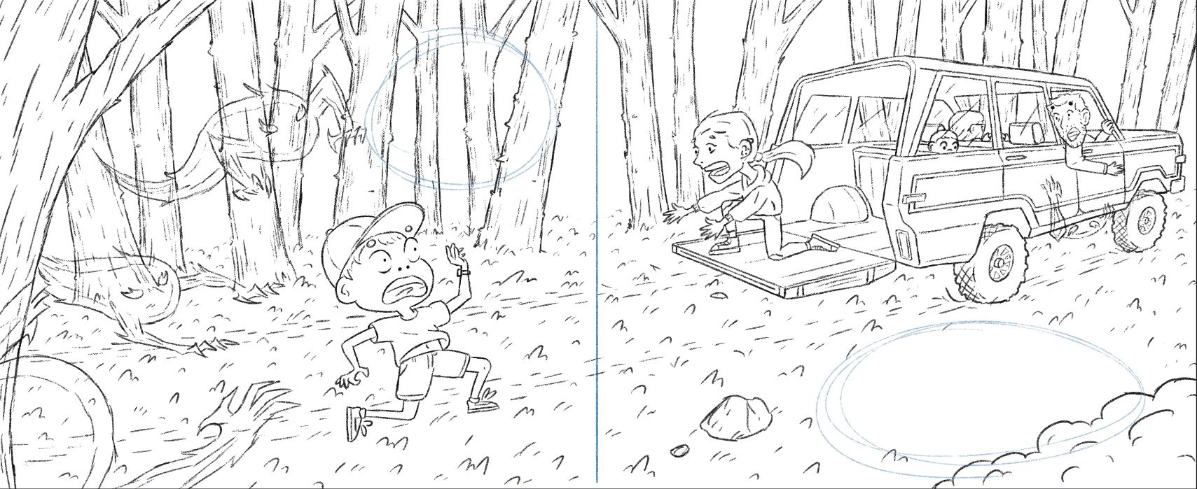
-
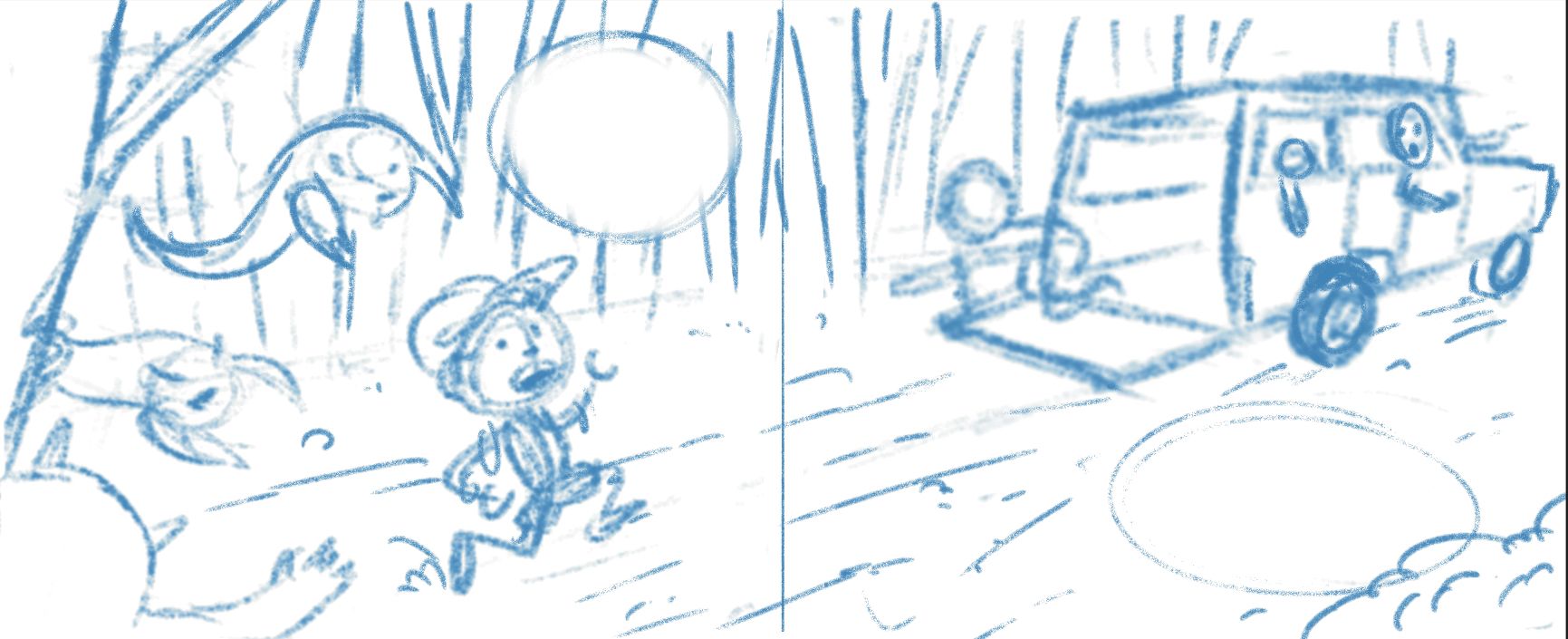
@Griffin are planning to put actual text in the spaces provided? Or just showing you can do so? To me the left page looks a bit crowded I would tuck that top spirit up and back a little and give your text a little breathing room.
-
@Griffin here’s a visual
-
@Asyas_illos there won't actually be text, just a faded spot to show text would go there. Nonetheless I think you're right about it being overcrowded, thanks!
-
@Griffin This is looking so great! If feels like a complete and believable environment and I feel the urgency in the character's faces.
One thing that stuck out at me is how in your quick sketch the body pose of the kid in the back of the bronco is more dynamic and reaching. In your line art, the pose has stiffened up, and makes it seem like the vehicle is parked rather than moving. (And I'm unsure now which it is supposed to be).
Another little thing, is that I felt like the running kid's path would make more sense closer to the road path. You could move this kid more into the road, or curve the road, if you thought they should be in the path.
Sorry if these are late comments! I'm looking forward to seeing the color!