Society of Visual Storytelling

    SVSLearn Forums

    • Register
    • Login
    • Search
    • Recent
    • Tags
    • Popular
    • Users
    • Groups
    • Search

    WIP Portfolio Piece

    Artwork
    6
    25
    1390
    Loading More Posts
    • Oldest to Newest
    • Newest to Oldest
    • Most Votes
    Reply
    • Reply as topic
    Log in to reply
    This topic has been deleted. Only users with topic management privileges can see it.
    • kayleenartlover
      kayleenartlover last edited by

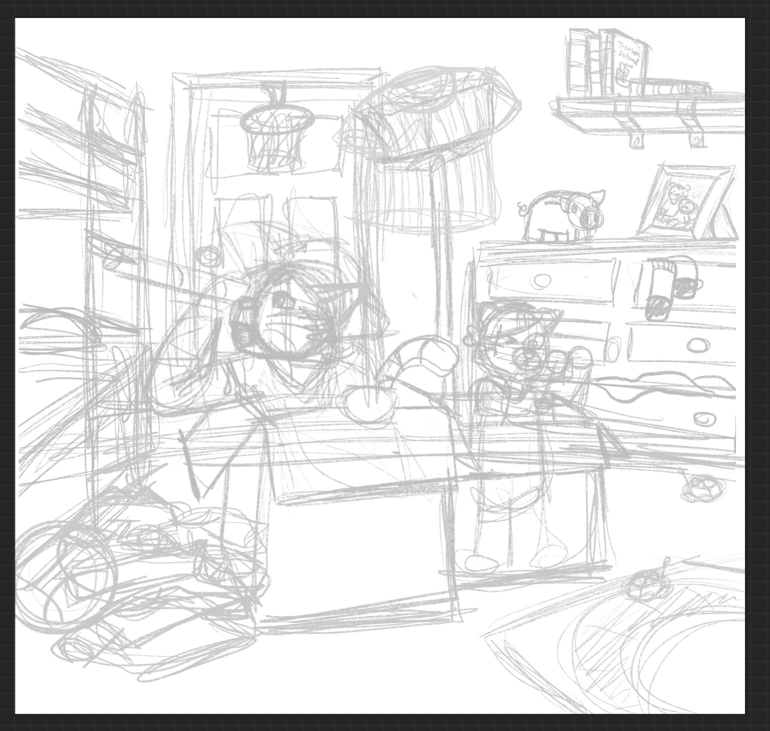
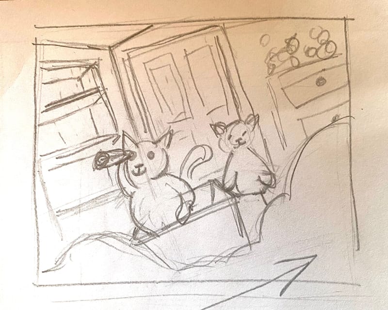
      Here is two cat brothers playing pirates in their room. Should I put something in the foreground, like a shadowy border made of toys somewhere? Any other tips on changes I should make in the composition before I draw it?
      B5384F92-E82E-4CD7-84A7-7260AB80D62D.jpeg

      1 Reply Last reply Reply Quote 0
      • kayleenartlover
        kayleenartlover last edited by

        4EAFE566-2210-4833-9C16-6C817DCB8FB7.jpeg
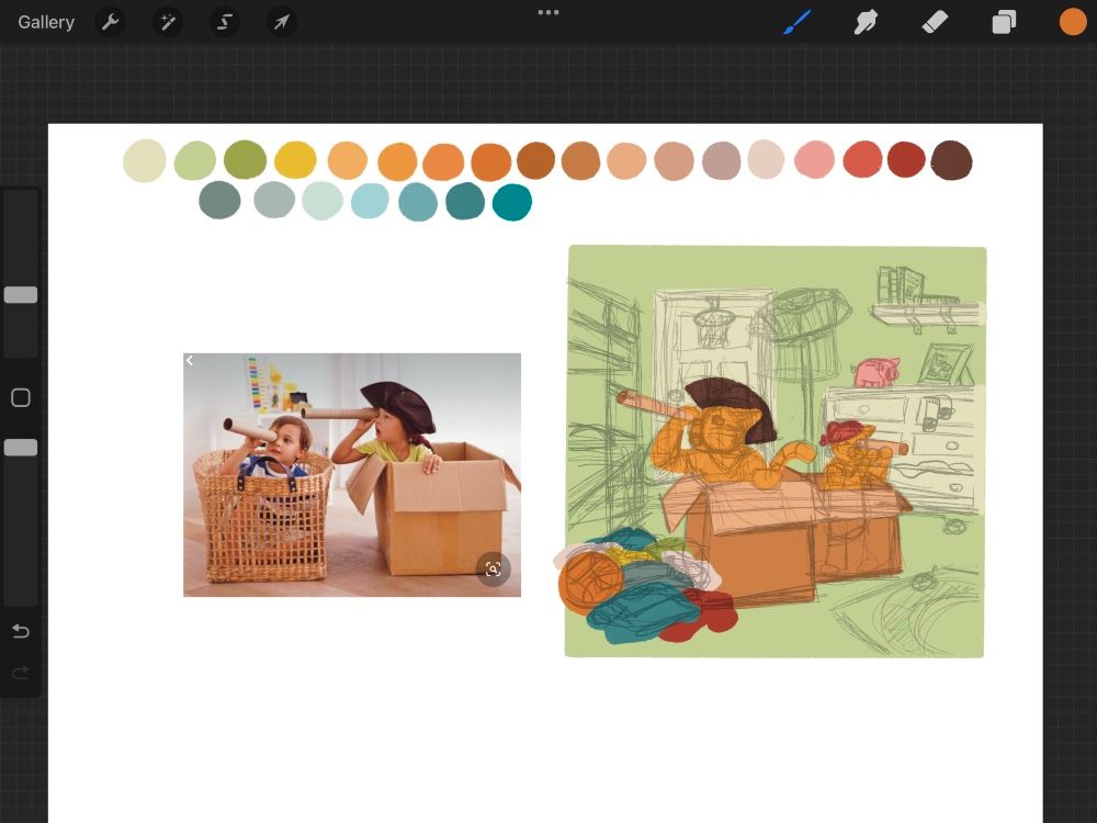
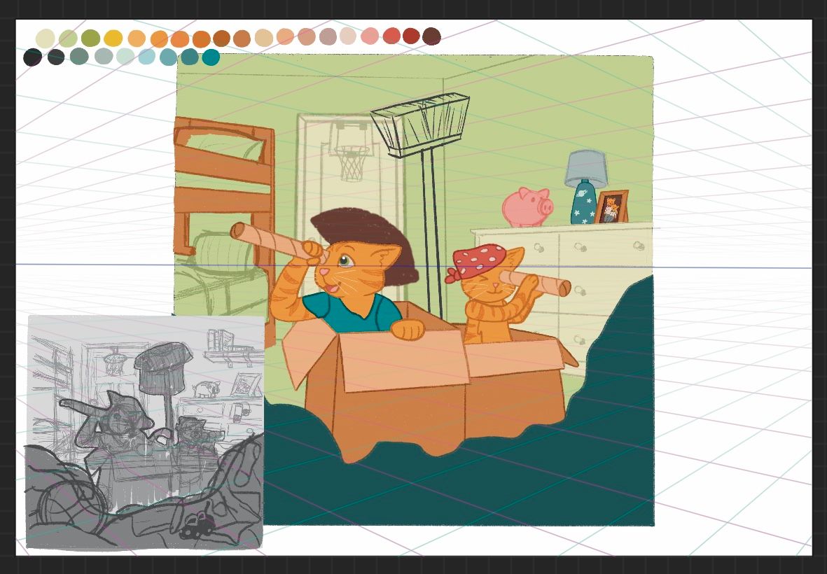
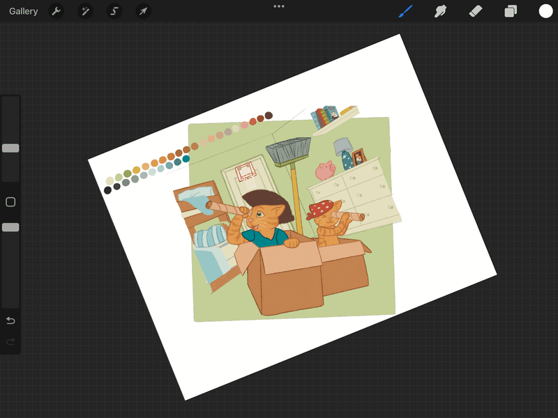
        Started working on picking colors and seeing what works where best. I’m a bit stuck on picking a color for the carpet floor though…

        Asyas_illos kirsten-mcg 2 Replies Last reply Reply Quote 0
        • Asyas_illos
          Asyas_illos @kayleenartlover last edited by

          @kayleenartlover looks like a great start, you could wood floor that would help create a sense of depth. Yes something in the for ground would be beneficial, to pull us into the room

          Asyasewardillos@gmail.com
          www.Instagram.com/asyas_illos/
          https://asyasewardillos.wixsite.com/mysite

          1 Reply Last reply Reply Quote 1
          • kirsten-mcg
            kirsten-mcg @kayleenartlover last edited by

            @kayleenartlover Someone once told me that the best thing about children's art is that the colors don't have to be realistic! So a wooden floor could be green blue, etc. I would say go with something that works with your color scheme and don't worry too much about making it "real life."

            Instagram: https://www.instagram.com/kirsten.mcgonigal.art/
            Portfolio Site: www.kirstenmcgonigalart.com

            1 Reply Last reply Reply Quote 1
            • kayleenartlover
              kayleenartlover last edited by

              B65D95B1-55A8-4680-8EB6-5BAD14A3ECB8.jpeg
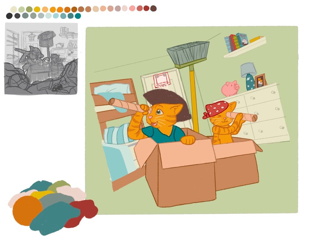
              Okay so, what if I have the room so messy that it looks as if they are sailing in ocean waves? Yay or Nay?

              Griffin McPherson kirsten-mcg ArtistErin 3 Replies Last reply Reply Quote 3
              • Griffin McPherson
                Griffin McPherson @kayleenartlover last edited by

                @kayleenartlover definitely helps to have something in the foreground. Be careful with cover too much of the mid ground area with the foreground elements though. You could have some of the mess around the boxes to make it look more ocean like but still have the closer stuff around the frame. I think the ocean of mess is a great idea.

                1 Reply Last reply Reply Quote 2
                • kirsten-mcg
                  kirsten-mcg @kayleenartlover last edited by

                  @kayleenartlover I love the idea of ocean waves! You could also tilt the camera angle so that things are at and angle. That would help with the pirate/wave feeling.

                  Instagram: https://www.instagram.com/kirsten.mcgonigal.art/
                  Portfolio Site: www.kirstenmcgonigalart.com

                  1 Reply Last reply Reply Quote 0
                  • ArtistErin
                    ArtistErin @kayleenartlover last edited by

                    @kayleenartlover @Griffin @kayleenartlover I agree waves at a tilted angle would definitely give this piece a great perspective.

                    Erin Richardson
                    instagram.com/erinrichardsondesigns21
                    www.erinrichardsondesigns.com

                    1 Reply Last reply Reply Quote 1
                    • kayleenartlover
                      kayleenartlover last edited by

                      22EB5DEF-382A-4454-9068-65E0A4228AFE.jpeg

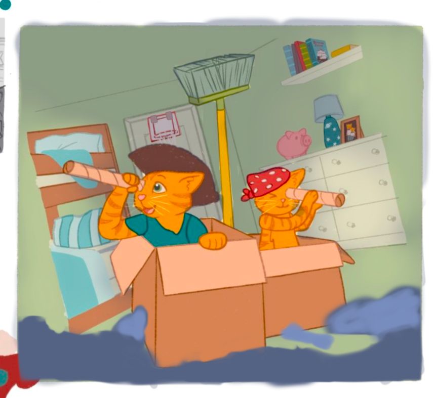
                      A closeup at some details I’ve added. It’s coming along well.

                      1 Reply Last reply Reply Quote 0
                      • kayleenartlover
                        kayleenartlover last edited by kayleenartlover

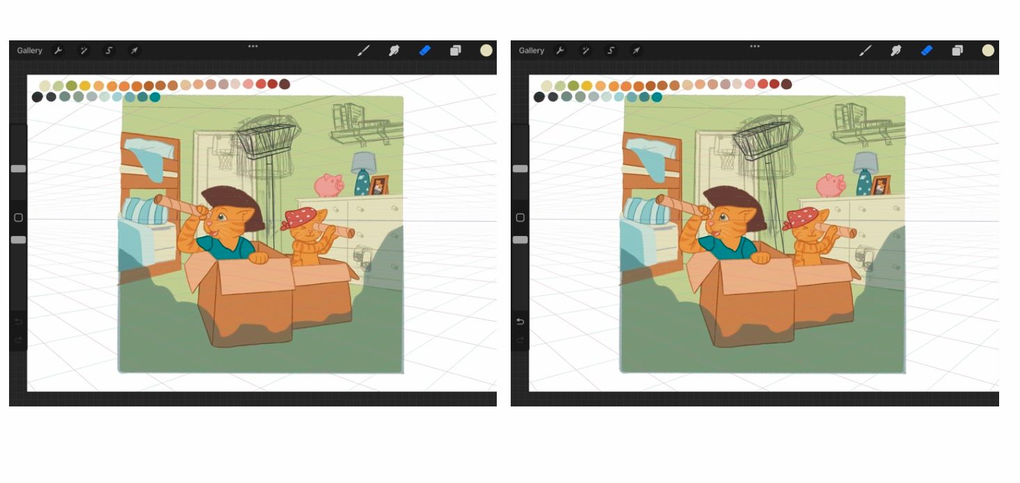
                        I’m trying to picture what others said about making the foreground a different perspective to look like a wave. I might need an example drawn over… Or do you mean like a literal wave folding over just made of items? But wouldn’t that push the foreground to middle ground?

                        BDF2998B-3119-4F41-B0B2-0C67CEDFC9AF.jpeg

                        Also… bit of a nitpick but trying to decide how to place the broom so it maintains fun ship silhouette while matching the perspective and avoiding creating tangents like with the corner of the wall…

                        D2CA9AD7-4B5A-45BA-8C00-8E6184DAF78E.jpeg

                        kirsten-mcg 1 Reply Last reply Reply Quote 0
                        • kayleenartlover
                          kayleenartlover last edited by

                          1D43CCC7-39FE-4A97-906A-8AF6919A2568.jpeg EDE46972-FB2B-4C0A-9795-8E853CD7D110.jpeg

                          1 Reply Last reply Reply Quote 2
                          • kirsten-mcg
                            kirsten-mcg @kayleenartlover last edited by

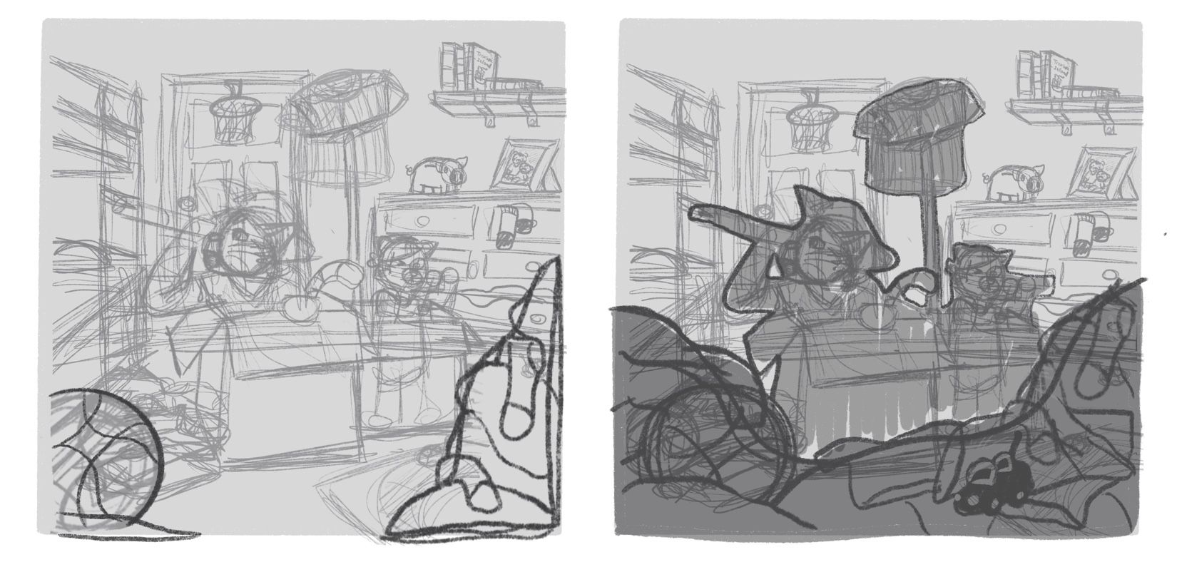
                            @kayleenartlover sorry I should have done a quick sketch to show you what I mean when I first commented! I just meant to tilt the entire picture one way, like this. Hope my messy sketch is clear enough for you to see what I mean! 😅E94FC954-8E82-47A7-8DEB-0DC2B83FF955.jpeg

                            Instagram: https://www.instagram.com/kirsten.mcgonigal.art/
                            Portfolio Site: www.kirstenmcgonigalart.com

                            kayleenartlover 1 Reply Last reply Reply Quote 3
                            • kayleenartlover
                              kayleenartlover @kirsten-mcg last edited by

                              @kirsten-mcg I’m not sure if this is a change I should make… I would also lose the bookshelf that I spent a couple hours making, and I still don’t know how to make the foreground look right so I haven’t drawn it yet.

                              8F23900A-44DA-471D-B103-7146DF4A8EE8.png

                              kirsten-mcg 1 Reply Last reply Reply Quote 1
                              • kayleenartlover
                                kayleenartlover last edited by

                                E58B5A94-0D50-4FE3-BAE1-87FF3AA712C5.jpeg

                                ArtMelC Griffin McPherson 3 Replies Last reply Reply Quote 0
                                • ArtMelC
                                  ArtMelC @kayleenartlover last edited by

                                  @kayleenartlover Oh this is looking good and the tilt lends itself to more story!

                                  If I may suggest:

                                  1. The brown bunk bed frame is blending into the cat and the box colour, confusing the silhouette. Try to change it to a different colour? Preferably something that recedes back
                                  2. Hmm the door and basketball hoop are interfering with the silhouette quite a bit especially cos of the red line. Any way to knock them back or remove them altogether?

                                  I think you're off to a good start. Keep at it!

                                  www.instagram.com/art.melc.illo/
                                  www.artmelc.com
                                  I write weekly on mondayblues.substack.com

                                  1 Reply Last reply Reply Quote 0
                                  • Griffin McPherson
                                    Griffin McPherson @kayleenartlover last edited by

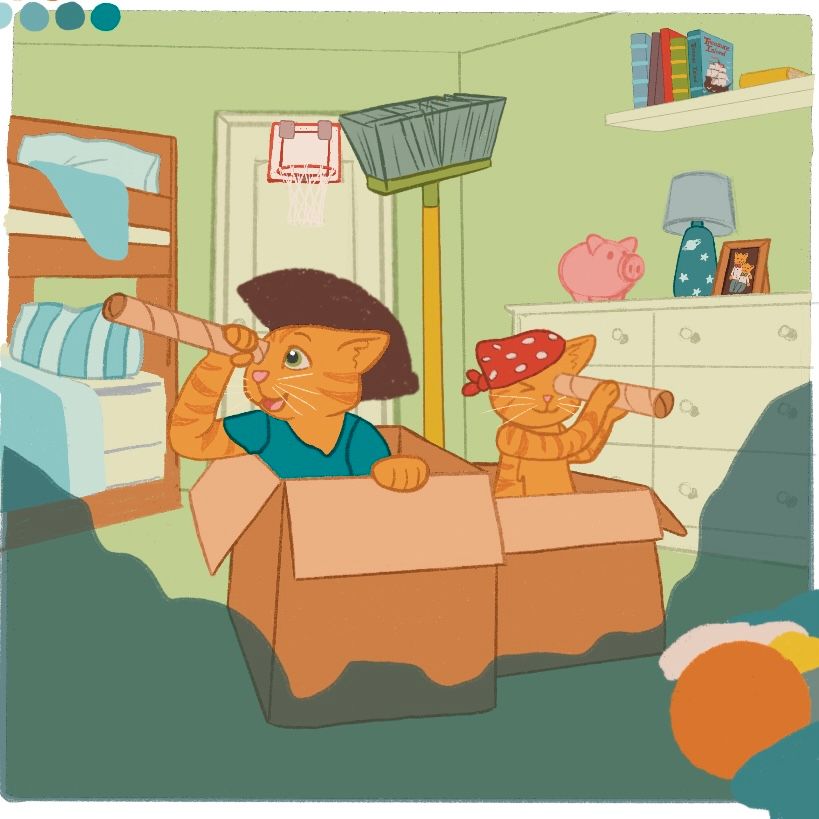
                                    @kayleenartlover I think adding some more value contrast could help right now. It’s a very bright illustration over all which doesn’t really guide the viewers eye to focal points. I think darkening the background could bring a pleasant contrast to the image. Bright characters on a dark background is often a good approach. Right now it’s more like light characters on alight background

                                    1 Reply Last reply Reply Quote 0
                                    • kayleenartlover
                                      kayleenartlover last edited by

                                      ECC37FD0-9E4D-4F5F-83F9-8FB5AC0618A4.jpeg

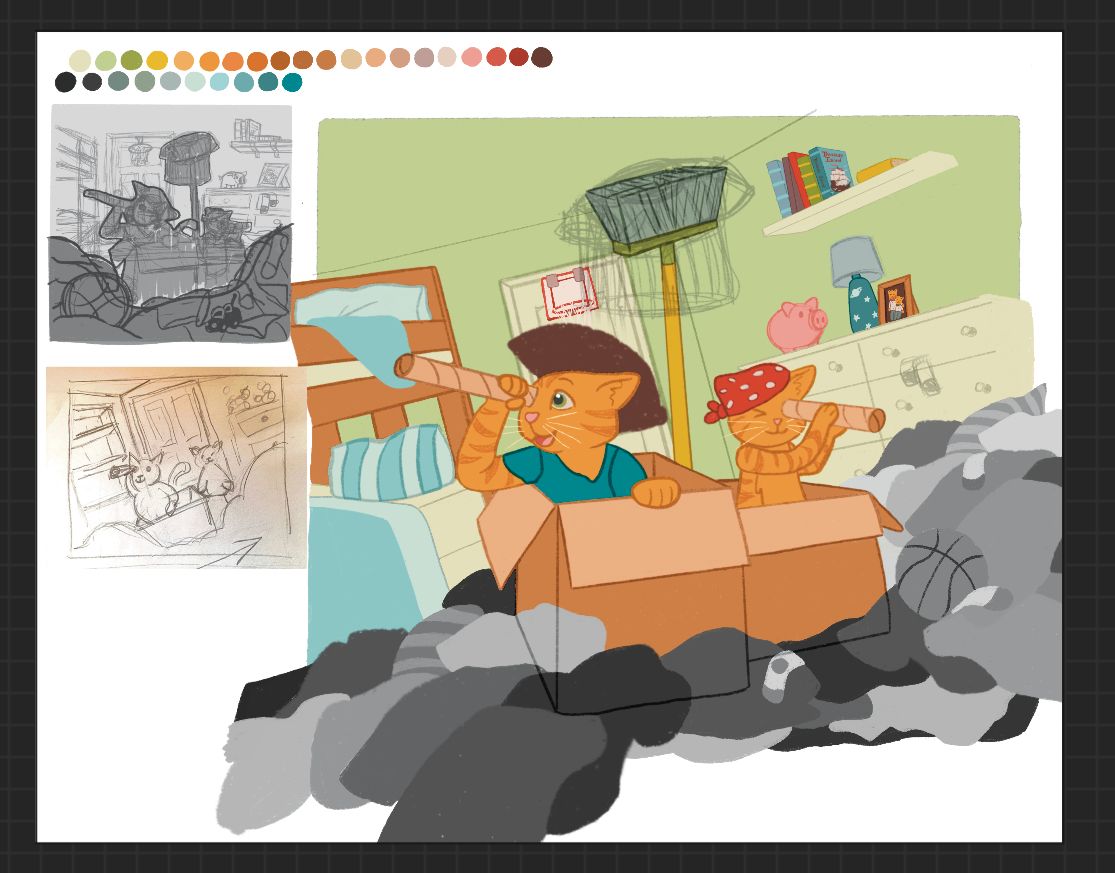
                                      I’ll be adding shading, either darkening the background or middle ground more, once I finish the foreground. It’s starting to look better, but I had to change it to grey scale because I was getting distracted from making the overall shape of the piles to make it imply ocean waves. I also still need to add the shirt over the broom for a sail.

                                      1 Reply Last reply Reply Quote 0
                                      • Griffin McPherson
                                        Griffin McPherson @kayleenartlover last edited by

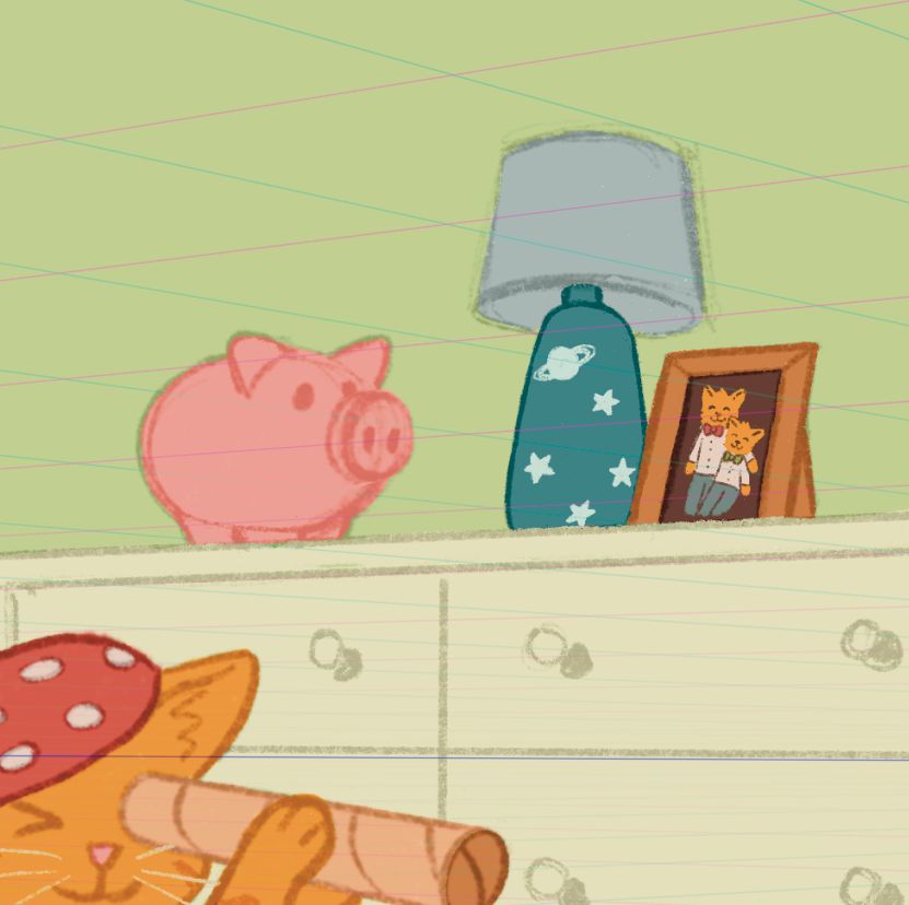
                                        @kayleenartlover I did just a quick paint over to figure out how a darker background might look along with the clothes around the floor. DF4CFD42-B23F-4A2A-A3AA-004F1360ABE8.jpeg

                                        1 Reply Last reply Reply Quote 1
                                        • kirsten-mcg
                                          kirsten-mcg @kayleenartlover last edited by

                                          @kayleenartlover You could just tilt the entire scene. Room, cats, background, etc! That way you wouldn't have to redraw anything and it would probably make it more dramatic. Think about using a camera and taking a picture of some kids playing pirates. You could actually tilt the camera (which would cause everything to tip) to give the illusion of rocking on the ocean waves. But really it's just a suggestion! If you like it better without the tilt, or can't figure out how to make it look right, by all means stick with your original angle. Sometimes when I get a critique, I will stick with my original idea, but then end up incorporating critique suggestions into later pieces. I think one of the most important things critiques do is help us think more critically about the art we create next time.

                                          Instagram: https://www.instagram.com/kirsten.mcgonigal.art/
                                          Portfolio Site: www.kirstenmcgonigalart.com

                                          1 Reply Last reply Reply Quote 0
                                          • kayleenartlover
                                            kayleenartlover last edited by kayleenartlover

                                            2DD53BE7-C652-4BE9-8FE0-69E9D5822055.jpeg

                                            54715A74-F194-41C4-9C21-C46DF4CA1AE8.jpeg

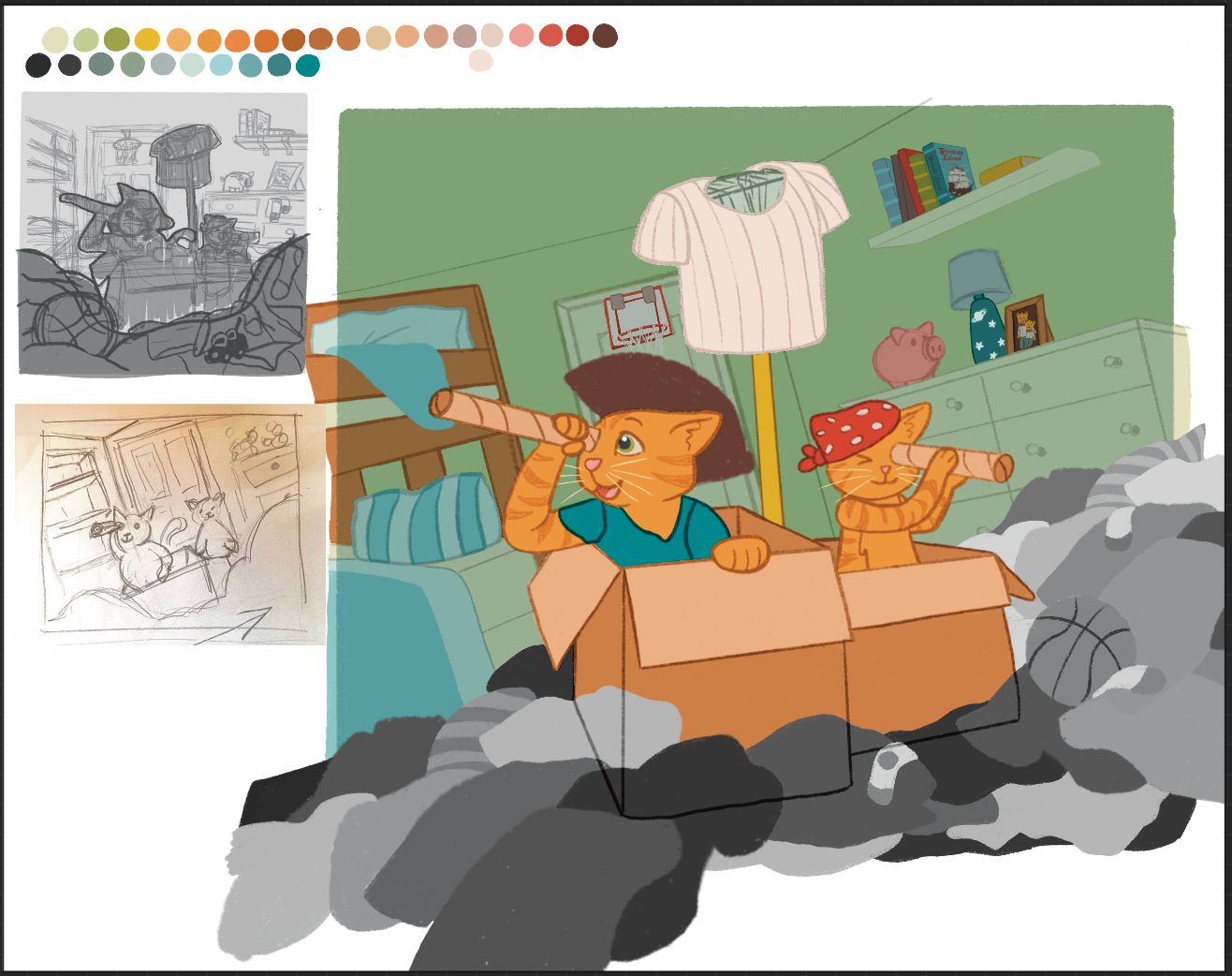
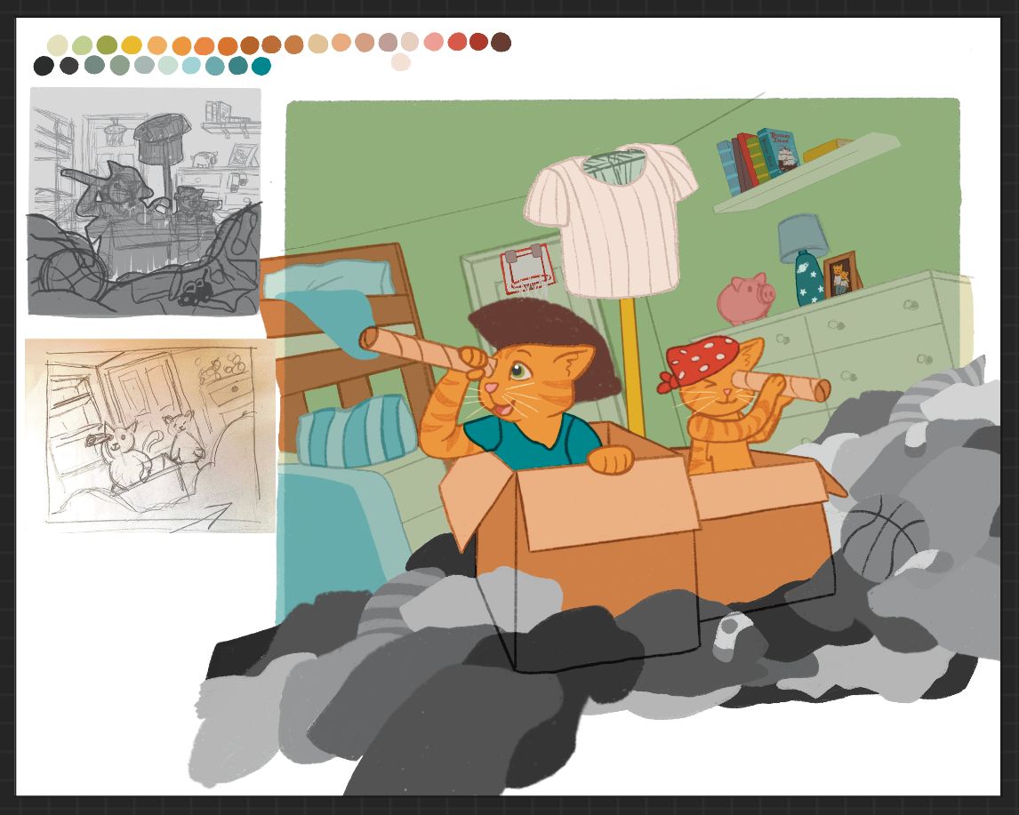
                                            Top one has darker background…

                                            1 Reply Last reply Reply Quote 0
                                            • First post
                                              Last post