Glow — Rough Sketch — Critiques Welcome
-
Hi folks,
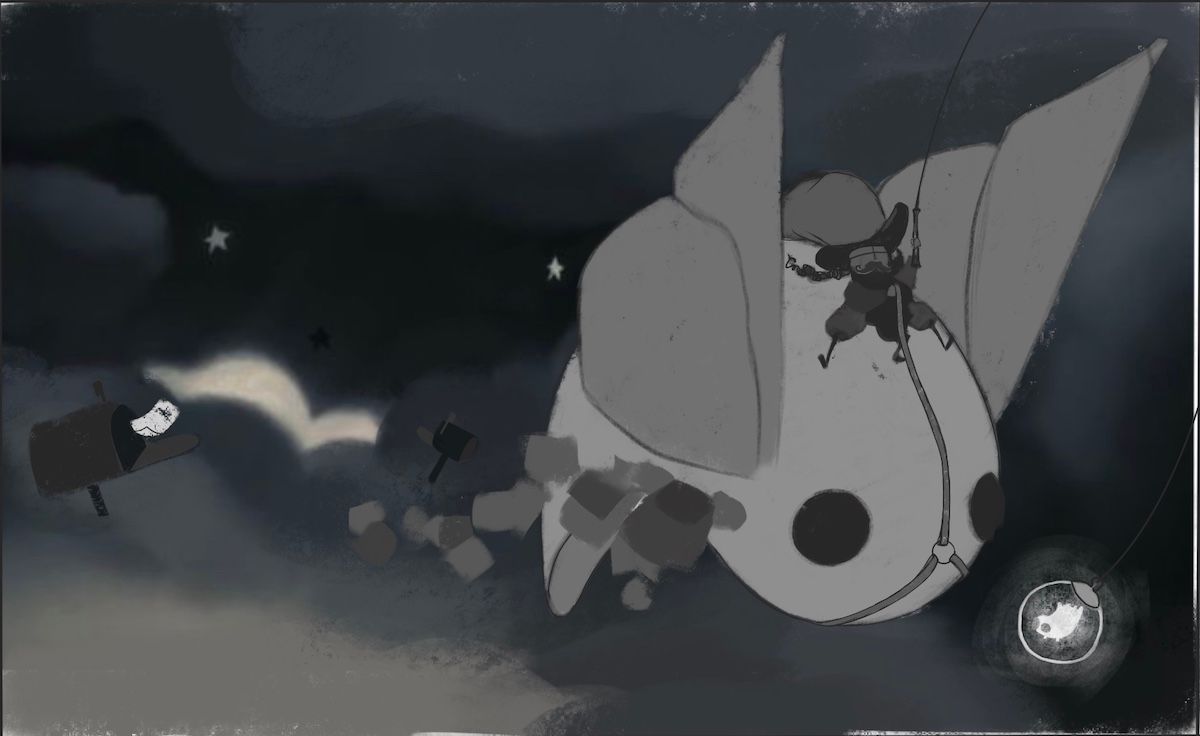
I was hoping for some feedback on my rough sketch for "Glow" for this month's Critique Arena. The concept is that it's an illustration of "The Night Post" — a dapper postman riding a giant moth through the night sky delivering mail. He steers with the glowing creature on the end of his "fishing pole". All of the squares and rectangles dangling off the moth are parcels to be delivered.
Thanks so much! Hope everyone's enjoying the theme — it's a ripper!
the site: katherinetyson.com
instagram: instagram.com/katherinetysonart -
@Katherine Great concept! I love the moth creature and the glow creature.
Without the explanation, I don’t think I would have understood that he was a postman or that those squares were packages to be delivered (although after fully rendering they may be more clear).
Maybe you could emphasize the mailbox a bit more (bigger size, more lighting), and show the postman throwing a package into it?
Looking forward to seeing how it comes out!
-
@Katherine I agree I’m not sure I would’ve picked up on “postman” without the explanation. Maybe the outfit can be adjusted a little bit to feel more post man? Maybe more emphasis on a Mail bag?
I’m also wondering if adjusting the balance a little might bring the mailbox more into the picture. To me, it feels very heavy on the right. I’m guessing this is a spread that needs to avoid the gutter, but maybe there’s room to bring the moth over a little?
Also, will we know what the glowing object is when this fleshes out more?
-
@Katherine You have a great concept here. I think it would work better to swap the moth and mailboxes, so the moth looks like it is flying into the scene, esp if the parcels are "to be delivered". I would also lower the wings some to give the moth a more "in-flight" look, and tilt the moth to the right slightly.
I know this is still rough, but I don't understand the mailboxes in the clouds, or the paper coming out of the far left one.
-
This is an excellent idea! I wouldn't have understood the mail concept either however I know this is in the rough stages, and it helps to nail down the perspective before you take it much further... so yes for sure I would clearly define the mailman uniform and maybe have the mail bag a bit bigger so we see that's the job at hand. It's such a cool idea though! Looking forward to seeing the finished piece!
-
@Katherine This is such a cool idea! I agree with the feedback that everyone else had...the story does need to be a little clearer. I'm wondering if switching the format might help? Maybe play around with thumbnail sketches a little more. See how it would look as a vertical format, as well as try moving the moth into a different position in the horizontal format you have here. I think it would also help if we were really clear that the glowing creature is hanging in front of the giant moth as bait to make it fly. That might mean making the string and the fishing pole lighter so that they show up more, or zooming out a little so that we can see the whole line. Cropped and dark like it is it's kind of hard to make out. Good luck! Can't wait to see how you proceed with this!
-
Thank you to everybody for the critiques on my rough! After many thumbnails I decided this composition seemed to solve some of the problems so I did a few iterations of it.
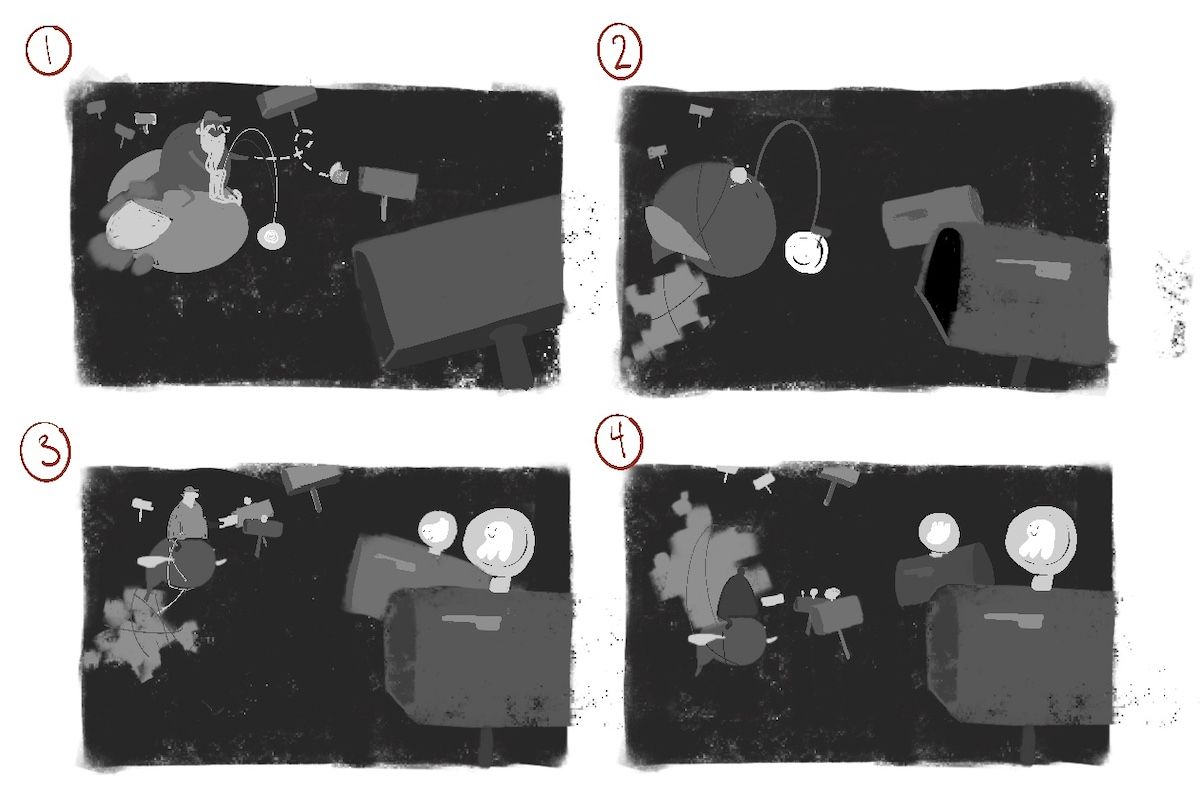
Some things that you can't see from the thumbnails but that I hope will solve some of the problems:
-
Some of the letterboxes are yet to have mail delivered to them (in the foreground)
-
Some of the letterboxes have already received deliveries and will have mail visible and the little flag up
-
3 of the thumbnails show the mailman actively delivering mail to a letterbox.
The other thing I should explain is that I played with another concept I had — instead of having the glowing object be something at the end of a fishing pole with which to steer the moth, the 2 bottom thumbnails have little "light bulb" creatures on top that light up before delivery and turn off/go to sleep after delivery — the ones in the background will have unlit "bulbs" and the ones in the foreground are glowing with happy little glowing creatures inside with cute, smiley faces.
And finally, there will still be clouds out of which the letterboxes are emerging — I just didn't bother to draw them for the thumbnails.
Sorry this was so long! Thank you for reading, if you're still here. Let me know what you think!
the site: katherinetyson.com
instagram: instagram.com/katherinetysonart -
-
@Katherine I like nr 4 with the packages trailing behind like that most composition wise. Followed by nr 1 when you want to use that bulb as bait for the moth. It has a clearer track along the mailboxes. Maybe the nr4 is harder to understand as a story without explanation. Looking forward to see it finished!
-
This post is deleted! -
@Katherine Good for you for going back to the thumbnail stage! That means you're not afraid to to work hard to come up with a clear concept! I think I get the clearest idea of the story in #1. I also like the composition. But I also like the idea of the glow being part of a system for telling which mailboxes still need mail delivered. I wonder if it would be hard to read if the glow has gone out in the boxes in the background though? The boxes will be very small, and so without glow they might just recede into the background. What if they light up once the mail is delivered, instead of going out? Kind of like the little number alerts on email and social media that let you know you have messages. Then we would be able to see the mailboxes in the background that are lit up because they contain mail. What if you were to try combining thumbnails #1 and #3, so that the light was coming on above the mailbox as the mail is being delivered? This makes the "glow" more an important part of the story than just a cool side element. Keep sharing your progress! I'm excited to see where this goes!
-
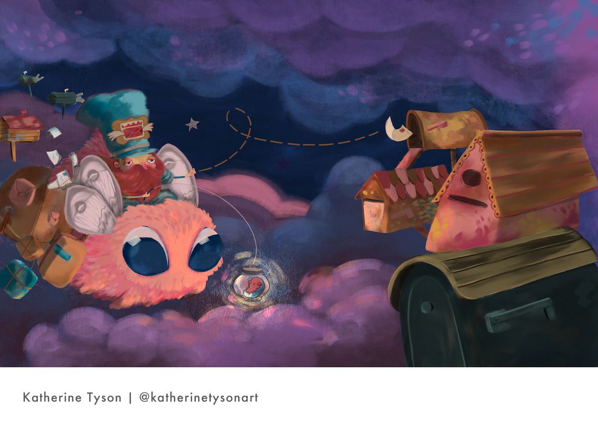
Just wanted to give everyone a massive thank you for the invaluable feedback on my roughs. You saved me from taking a completely incomprehensible rough to final art
 Here's my submission. I don't usually work with such saturated colours so I'm finding it a bit hard to look at. I'm very new to working digitally so I find digital colour quite tricky. Anyhoo... excuses, excuses...