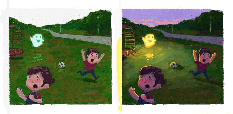
My Glowing WIP (wow, that sounds vein, but GLOW is the topic, so cut me some slack, please)
-
@susanhowarth-art I like the thought and I'll keep it in mind as I keep going forward. Right now, at least, it's just not working with my treeline as I get rid of trees to create that. Feels more like a tangent. Might be able texture through later, though. Thanks!
-
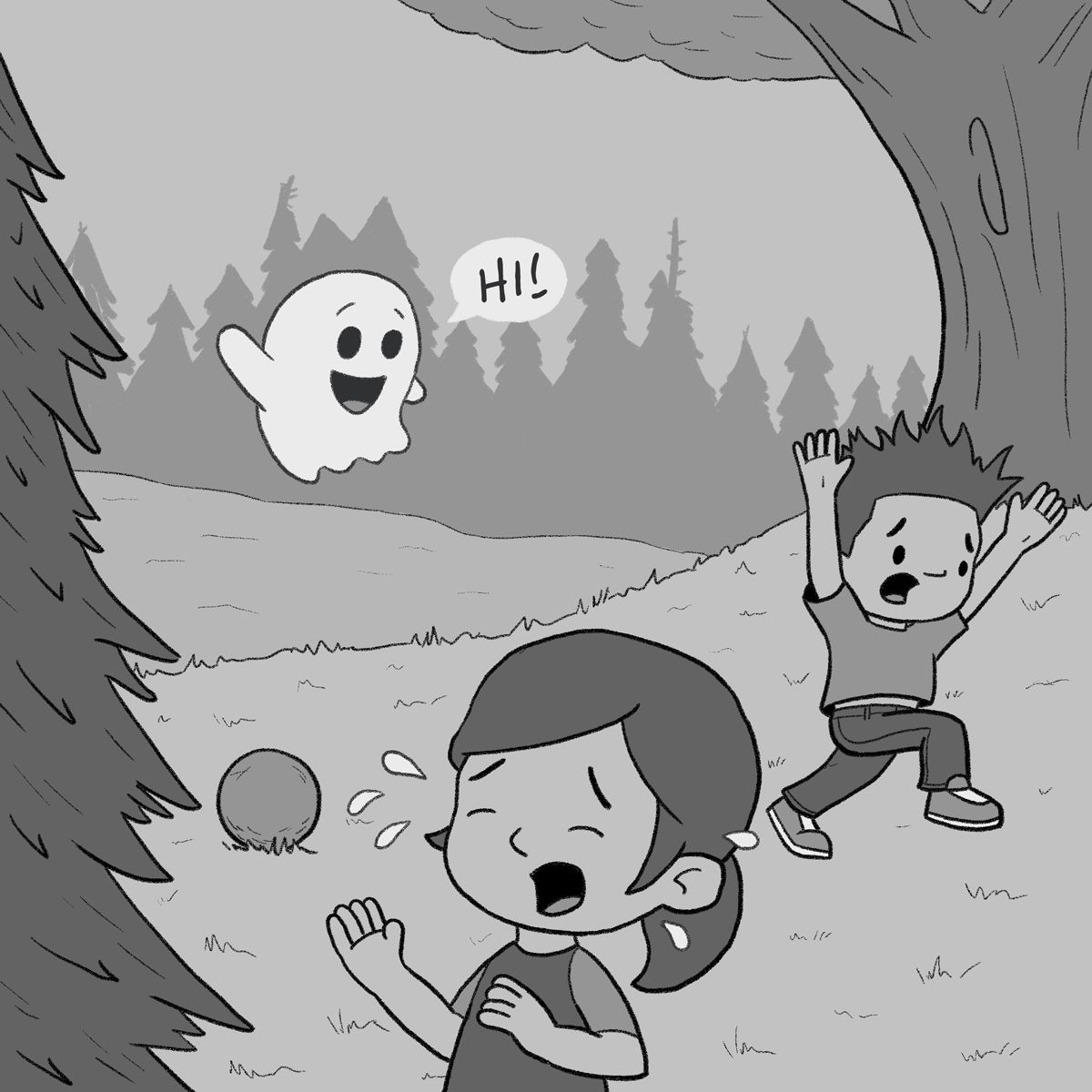
Tweaks per feedback. Thank you!
-
@KevinTreaccar she’s crying because she dropped her cookie


-
-
@KevinTreaccar ok I’m sorry it’s a soccerball!
-
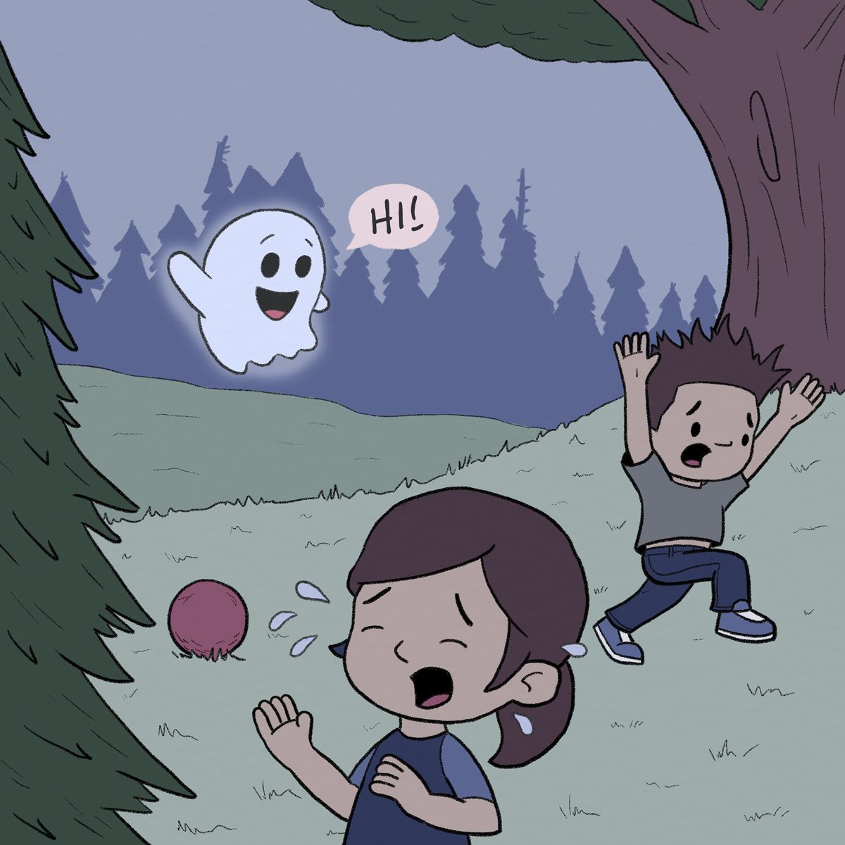
And a first pass at color.
-
Added 10% gray throughout the entire background. Which do you prefer – left or right version?
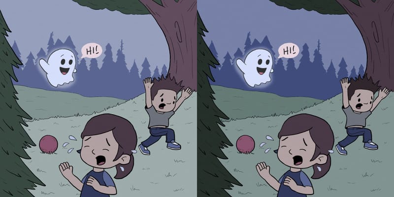
Thanks
-
@KevinTreaccar I prefer the one on the left. The treeline looks more hazy / far away, which I like.
-
@susanhowarth-art Hazy. I like that thought. Thanks.
-
Figured out it was really just the grass I didn’t like on the left. Added more tone to that and now I’m leaning into hazy.
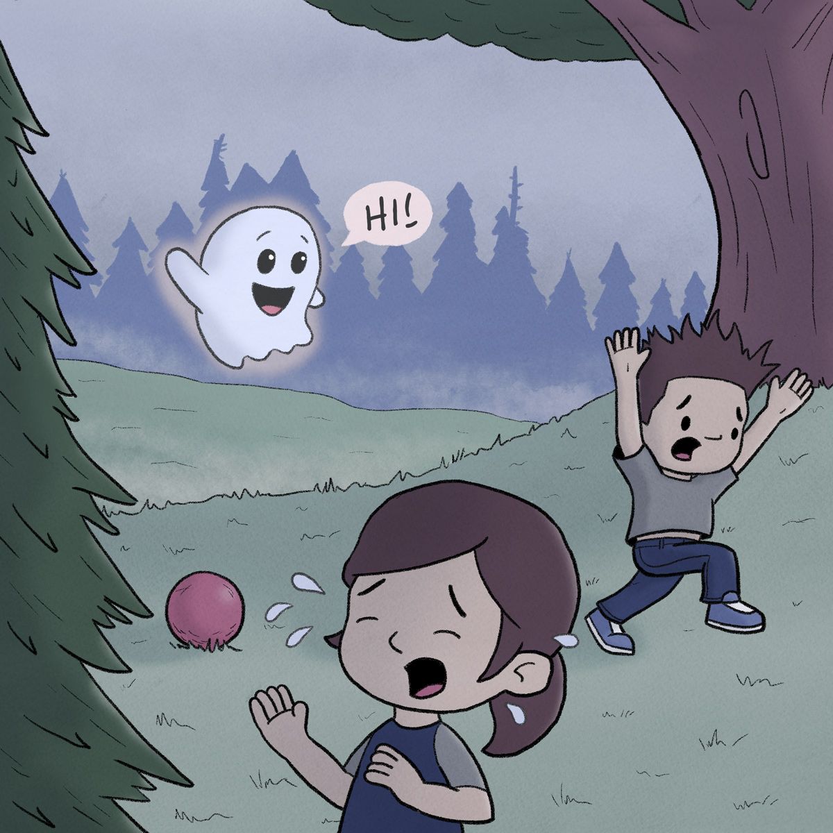
Wondering if I’m ready to start adding textures to the image.
-
@KevinTreaccar looking good!
-
-
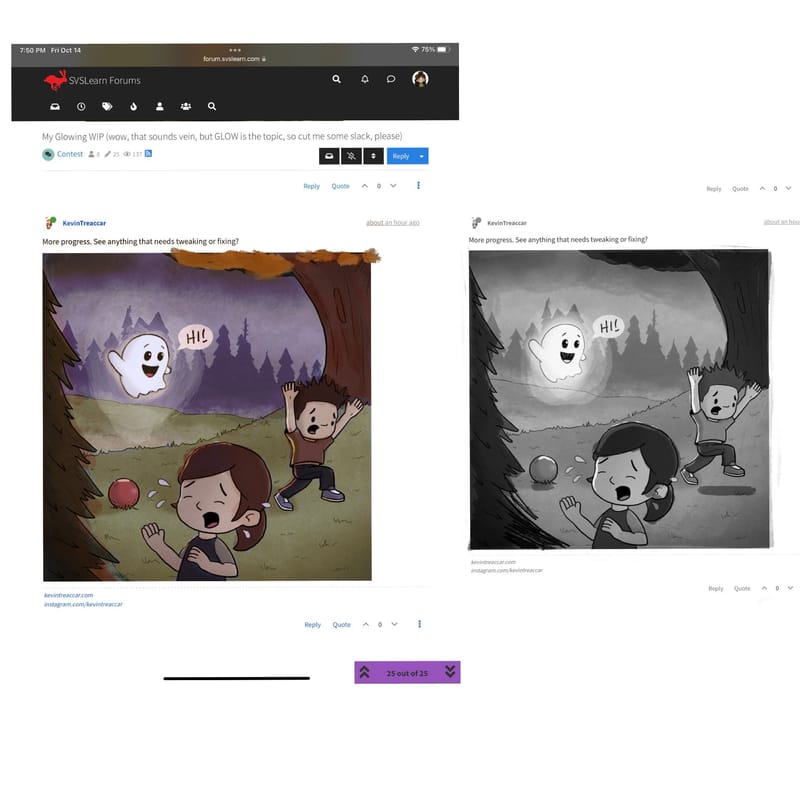
More progress. See anything that needs tweaking or fixing?
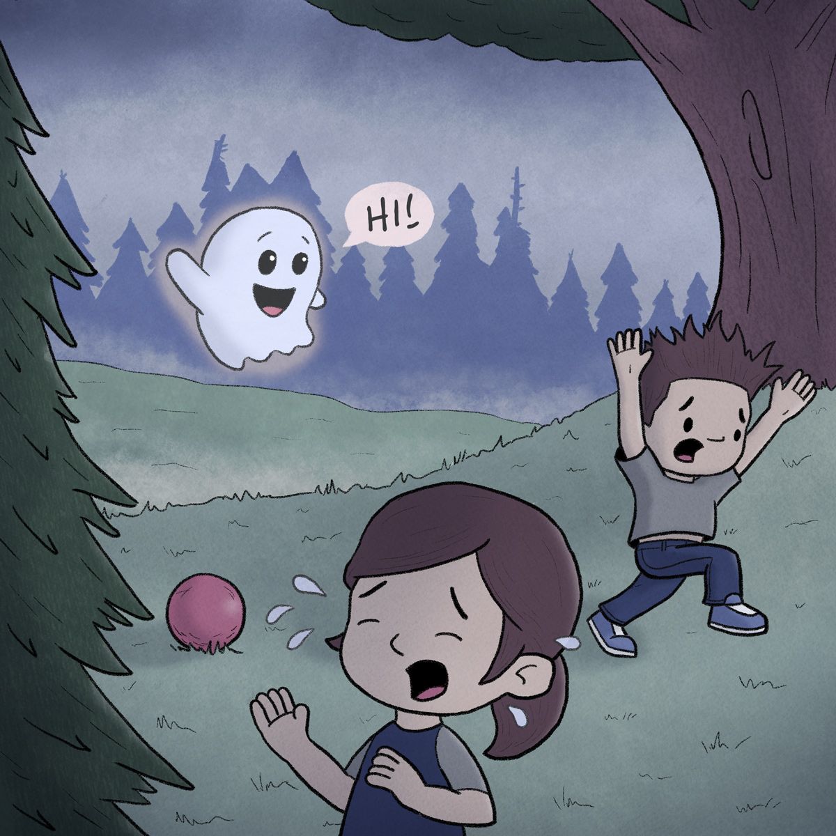
-
@KevinTreaccar please don’t take this wrong way, but I feel like I see this color palette from you often, have you tried any others? A warm fall color palette would look nice or even black and white or greys? also adding a bit of the glow as highlights on a few things would help out. Hope that is helpful to you
-
@Asyas_illos I actually had the same thought on color, so I’m definitely not offended. And while I have plenty of things that still need a lot of work, color scheme is what I’m least confident in.
It’s probably hard to believe, but it’s 100% coincidence – which probably reveals the big hole in my color picking process. I accidentally started with similar blues for GLOW and CLOUD, then process of elimination sent me down the same track. RABBIT ROAD RACE started with green and then wound up the same.

Thank you for the ideas on colors. I’ll give your scheme a try and also try some others, too, because I need to figure out how to break my one-scheme track.
And I like your idea on the size of the glow and reflecting off more objects. Not how I was originally seeing it, but that’s definitely more visually interesting – and that’s what matters.
Thank you
-
@KevinTreaccar that’s why we’re here, always good to see what others see and to know what they’d do differently even if it’s not in your wheelhouse, at the least it’s broadened our perspectives.
-
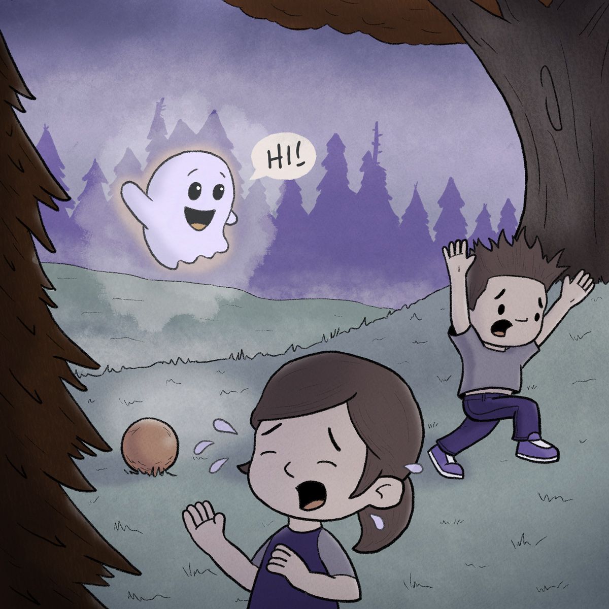
New color scheme. Now with more glow.
-
@KevinTreaccar I like the glow reflecting on the grass. It makes the ghost itself seems more glowing.
The glow around the ghost seems a bit stained, not sure if you want an effect like that or not, but maybe you could have it fading out more gradual? Is the ghost the only source of lighting in this piece? The shadows of the kids and on the boys sweater doesn't seem to be matching the ghost as light source.
Suddenly looking at the picture I was wondering that the kids are dressed like daytime, while the colours, ghost and light suggest it is surely passed their bed time? That's probably my mommy perspective kicking in
-
@Chantal-Goetheer If it makes you feel better, I had to find that balance for this with a ghost and kids playing outside. It’s evening on a cloudy day so the mom has warned them it’s almost time to go home.
And the almost-setting sun is the primary light source that’s throwing you off with the kids.
I’ll take opinions on what I see as a flash as the ghost appears. The yellow ghost is what would be the sustained light, so I treat that with a little more fade. But if the outer glow/flash is throwing people, I can definitely tweak.
-
Hi Kevin, i know you are already far with your picture, here is few ideas from my point of view to the discussion though:
on Storytelling: the story is clear, but may be stronger if putting more elements of 'playground' to the design of environment. The running pose of the boy might still be a bit more adjusted/pushed. The crying girl is setting the mood away from what you might have intended.
Some technical ideas: the composition seems a bit squeezed. There are few 'almost tangents' between the characters. The head of the boy is dissapearing in the same value of the tree behind him. The light scheme you have decided for is not easy, but since working digitally, you can build it up from local colors in a diffuse light setting (that might be even enough) and/or adding more light (blue tone by dawn, additional direct light, etc.) on top. It should help you to keep your light sources more organised, your colors more viable and the ghost more glowing.
Here is two sketches over your picture to see what i mean: