Glow - Work in Progress - Critiques Encouraged!
-
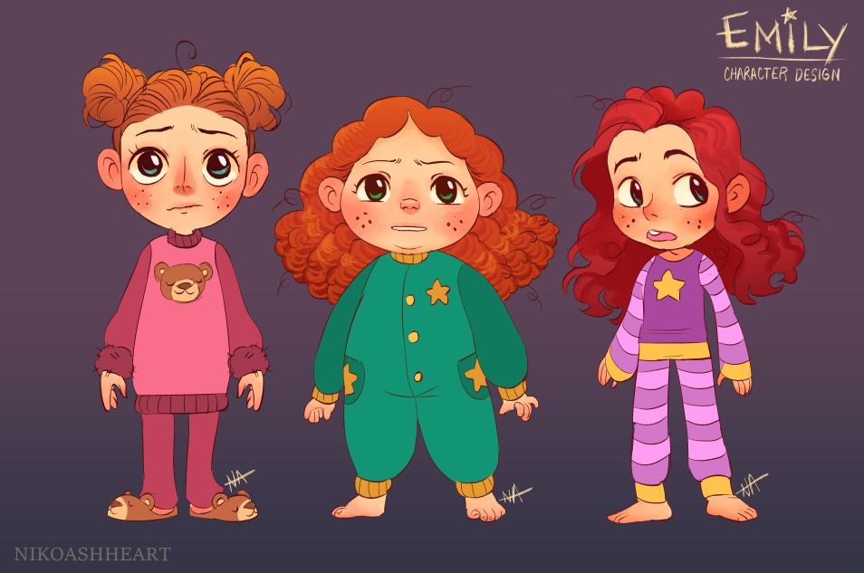
In my thinking of story for this prompt, I wound up coming up with a complete story to go with it, so rather than just doing a single one off drawing for it, I'm actually going to put a little time in to do some rough concept work into the world/characters before I actually do my illustration, so of course I'm starting with my main character, Emily! Emily spends a good amount of time in the story feeling a bit anxious due to her fear of the dark, so I thought it best to reflect that in her concept art. Right now I'm leaning towards the middle and the right versions, but what do you all think? I'd love some feedback!
-
@nikoashheart I am drawn most to the one on the right. Good job on your character designs! One piece of feedback I would share is that at first I thought the collar on the center one was a beard, because of the coloring I think
 My 3 yr old loves them all, she told me so as she was looking over my shoulder
-
@nikoashheart The middle one grabbed me, she’s great! My vote is on her!
-
@nikoashheart Looking good! My kids (2 & 4) voted for the right one. I think too that those colours are most appealing. My eye also goes most out to the right version. It does depend a bit on what age you had in mind for your character, because the girl on the right is older and the girl in the middle seems younger with her cute chubbiness. I also like that chubby little girl in the middle, but somehow the colours seem less appealing. Also now I looked at her collar as a beard I can't unsee it anymore
. Looking forward to see the worldbuilding and final piece! -
@nikoashheart This character design is so great! I would choose the right one as well, but I love the hairstyle on the left one.
-
@Frogpunzel Haha, and this is why we share our work for feedback, yeah? I absolutely missed the beard and you're so right. Now that I've seen it, I can't unsee it! Thanks for the feedback, and for showing it to your kiddo! Hers and other kids' critique is most important, don't you think?
-
@Mia-Clarke Thank you so much! I like her too, but it seems like most people are gravitating towards the girl on the right. I might try to fuse the two of them a little. Maybe go with Right's colors, hair and face, but make her softer and more plump? Might have to give her those star pockets too, because I'm in love with those. I'll have to give it a go at least!
-
@Chantal-Goetheer Ah, thanks so much for showing it to your little ones! Their opinions are so important, since it's all for them, you know? You're right about the age, I thought that too. I'm not quite settled on an age for Emily! Being afraid of the dark is a major part of her story, but that's true for so many little ones of various ages! I'm thinking somewhere between 5 and 8, so it's quite a big range developmentally. I'll keep it in mind when drawing her, thanks for the feedback!
-
@susanhowarth-art Thank you! The original pigtail buns were sort of an echo of her bear-theme in that design. I had a little segment in the story where she puts on all her bear stuff (including the buns!) to feel as brave as her teddy bear, but I'll likely have to cut it for word count reasons. I'm still fond of it, though, haha! Thanks again~
-
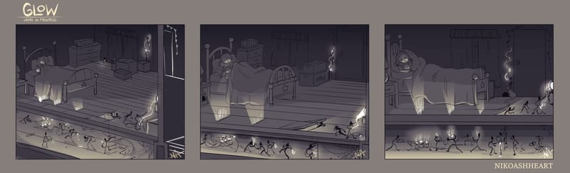
While I work on updating Emily's design, I also got started on my thumbnails! These are all pretty similar because I knew I wanted to go for a side shot with a glimpse to the action under the floorboards, but I wasn't quite sure what angle to go for that would be the most interesting/appealing to look at. What do you all think? Do you have a preference for one layout over the other?
-
@nikoashheart I like the right one. It's simpler, not showing too much detail of the room while showing the important bits well, with the little guys under the floor. It seems more like two frames but they connect nicely through the glow coming through the floor and the ladder and little guy crawling into the room. Can really see it glowing. Love the idea of them being under the floor boards. Looking forward to the next phases of it!
-
This post is deleted! -
@nikoashheart These are all good! I think it comes down to what story you are trying to tell. If the story is more about what's happening under the floor boards, then #3 works best. If the story is more about he girl in the bed who is seeing the glowing light, then I like #2.
-
@nikoashheart I love your concept! Can’t wait to see it finished up!
-
@nikoashheart I like the idea of the little people living under the floorboards trying to help her out.
I do like the third layout because it is easier to see everything, but I feel like number 1 and 2 show that there are people under the floorboard better than number 3. It almost looks like the line between the bed and under the floor are separating two illustrations. I recommend showing the floorboard that is coming up to split the lines so that we can see that it does come up and that they are coming out of it. I hope that makes sense. -
Seems like most of you like number 3, so I think that'll be the one I go with! I'll get to finishing that up ASAP! I've been sick the last few days so I haven't had much time to work on it, but I'll get to that refined sketch and lineart soon~!
-
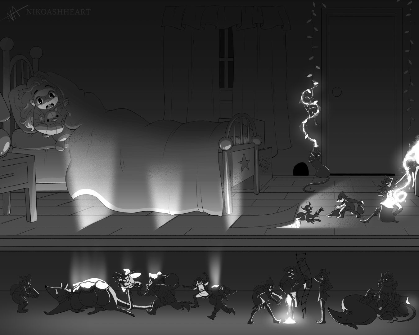
Here's the update on the illustration! These are inks and rough values thus far! Let me know what you all think~!
-
@nikoashheart so fun to watch what the little fellas do with their bags of glowing magic powder. It is a little hard to see under the floor boards because there is apart from the glow little contrast, very similar values. The ladder almost fades away into the background, could it get some glow too from the pile of glow in the floor? Does the little girl has two blankets? Is she pulling her blanket over het head because she's scared? Couldnt tell very easily. But the glow really glows and I think it connects the two sections well. So much fun stuff to discover in your illustration!
-
Unfortunately I wasn't able to finish this piece in time for the deadline due to personal issues, but I will still be finishing it in the near future! Thanks everyone who has given me feedback so far, it means a lot!