October Contest: GLOW!
-
@LauraA First, this is a beautiful illustration! I love the wall paper, and furniture design, and the characters are very expressive. The effect you used on the ghost woman is great. It's clear that she's a ghost, and she looks ethereal.
Here's what I see:
An old man was sleeping & just woke up with a ghost beside him. I thought, "Wow, he must have done something terrible to her!", because the ghost seems very vengeful. She is about to attack him with scissors (that are real, not ghostly).
The young woman on the right seems to be a maid or caregiver. It's hard to tell what is in her hands, but the one behind her back might be a medical syringe? So maybe the man is hallucinating? But I think she's looking at the ghost, so I think the ghost is real and the man is in danger, unless the girl can stop the ghost.It's good storytelling, even though I can't tell exactly what is going on. It makes you want to hear more of the story.
-
@LauraA Instead of taking out the desk & mirror, you could lighten the color so there's less contrast (e.g. make the top 1/2 of the mirror more like the part at the bottom part next to the picture frame).
You could also try changing the reflection / shine lines to angle a little more toward the ghost, instead of toward the chair (although, the fairly vertical slant does represent that kind of shine, so I'm not sure if it will read the same if you change it much).
-
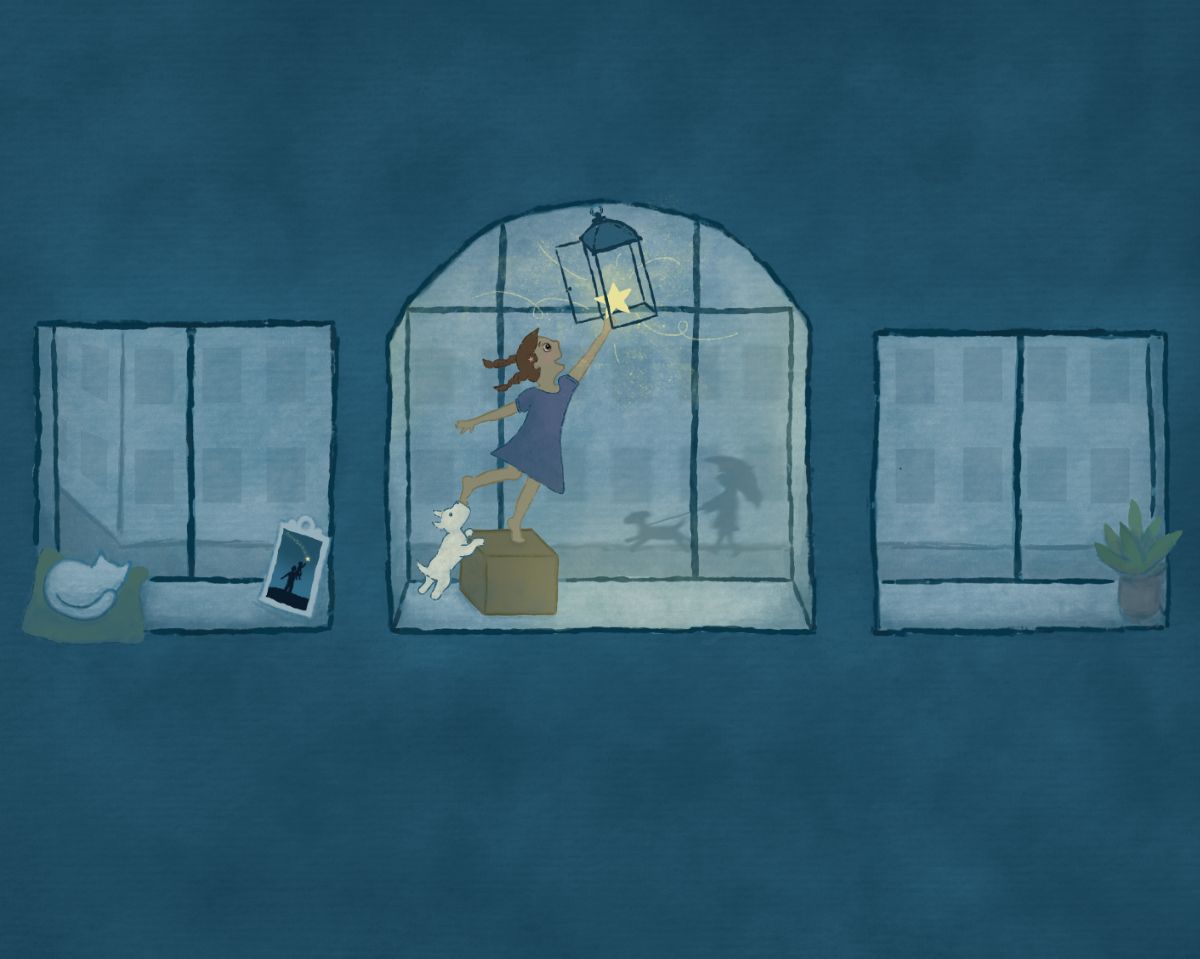
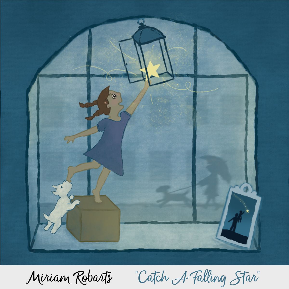
I didn't finish on time, but here is my idea for glow, so I thought I'd share it.
At first, I liked the idea of having a wall with three windows. (I would have added more people walking in the rain in the background, & maybe some trees along the street.)

But then I realized it would probably be better to crop it down.

This is inspired by the song, "Catch a Falling Star". ("Catch a falling star & put it your pocket, save it for a rainy day.")
The story is that the girl caught a falling star with the help of her dad (that's what the photo is trying to show, but I don't know if that comes through), and now that it's a dim, rainy day, she's climbing up to put the star in the lantern. I didn't get as much "glow" as I intended, but I did get some practice drawing humans! -
@Heather-Boyd Thanks! I always seem to lean toward simplicity
 can't help myself. But may try otherwise in a future challenge.
 -
@kirsten-mcg hehe thank you!
-
@Pamela-Fraley Thank you!

-
Top sixteen are up on insta. Congrats to the top 16.
-
@Jeremiahbrown I love looking at this image!! The palette is gorgeous
-
@Rachel-Horne Thanks so much!

-
Congrats to the Top 16!! They'll be going head-to-head TODAY during our regularly scheduled Critique Arena

Be sure to join us live to cast your votes! We'll be getting started at 2pm MST (check here for other time zones).
As always, let me know if you didn't get a Zoom link! You can also find the link in the Critique Arena class in the subscription.
If you aren't currently a member, you can also watch on our YouTube channel.
And yes, we'll be recording!
See ya soon!
-
Getting started in just a few!
-
This month had so many amazing entries. I can't get over it. Top notch work everyone!! Thank you for sharing and inspiring!
-
Amazing arena this month! CONGRATS MARC AND AMANDA
-
Congratulations Amanda! And thank you everyone,i wasn't expecting to do so well, especially against such amazing work. It was crazy how many beautiful pieces there were. We could of easily had a top 50 arena.
-
@LisaF Yes, I felt so lucky to be a part of this one! We really have built up a great community of artists.