Society of Visual Storytelling

    SVSLearn Forums

    • Register
    • Login
    • Search
    • Recent
    • Tags
    • Popular
    • Users
    • Groups
    • Search

    Kamari Thumbnails — Critiques Welcome

    Contest
    6
    17
    1232
    Loading More Posts
    • Oldest to Newest
    • Newest to Oldest
    • Most Votes
    Reply
    • Reply as topic
    Log in to reply
    This topic has been deleted. Only users with topic management privileges can see it.
    • Chantal Goetheer
      Chantal Goetheer @Katherine last edited by

      @Katherine I would say 1.
      2 is clear to me but my guess is that that line of thought is bound to be around often. Nr 1 is more unique and a nice touch with the giant snail. Agree with @KevinTreaccar to try what happens if you flip it around.

      Katherine 1 Reply Last reply Reply Quote 0
      • Katherine
        Katherine last edited by

        Thanks guys! Here's my first rough — I changed the snail from just being her steed to being her home. As always critiques are very welcome 😃

        Kamari Rough 2—Internet.jpeg

        the site: katherinetyson.com
        instagram: instagram.com/katherinetysonart

        MarcRobinson 1 Reply Last reply Reply Quote 1
        • Katherine
          Katherine @MarcRobinson last edited by

          @MarcRobinson Thanks Marc — I thought I might combine the two and have some glowy motes rising up from the snail whilst the new friend is in the background.

          the site: katherinetyson.com
          instagram: instagram.com/katherinetysonart

          1 Reply Last reply Reply Quote 0
          • Katherine
            Katherine @KevinTreaccar last edited by

            @KevinTreaccar Thanks Kevin — that was a good suggestion and I just realised I didn't do it 😐 Shoot.

            the site: katherinetyson.com
            instagram: instagram.com/katherinetysonart

            KevinTreaccar 1 Reply Last reply Reply Quote 1
            • Katherine
              Katherine @Chantal Goetheer last edited by

              @Chantal-Goetheer Thanks Chantal — yeah I should've tried flipping it! Drat!

              the site: katherinetyson.com
              instagram: instagram.com/katherinetysonart

              1 Reply Last reply Reply Quote 0
              • MarcRobinson
                MarcRobinson @Katherine last edited by

                @Katherine Nice one, I'm really liking the direction you're going with this one.

                1 Reply Last reply Reply Quote 0
                • KevinTreaccar
                  KevinTreaccar @Katherine last edited by

                  @Katherine Haha, just don’t let it happen again.

                  kevintreaccar.com
                  instagram.com/kevintreaccar

                  Katherine 1 Reply Last reply Reply Quote 0
                  • Katherine
                    Katherine @KevinTreaccar last edited by

                    @KevinTreaccar ahaha! Pinky promise, Kevin!

                    the site: katherinetyson.com
                    instagram: instagram.com/katherinetysonart

                    1 Reply Last reply Reply Quote 0
                    • Katherine
                      Katherine last edited by

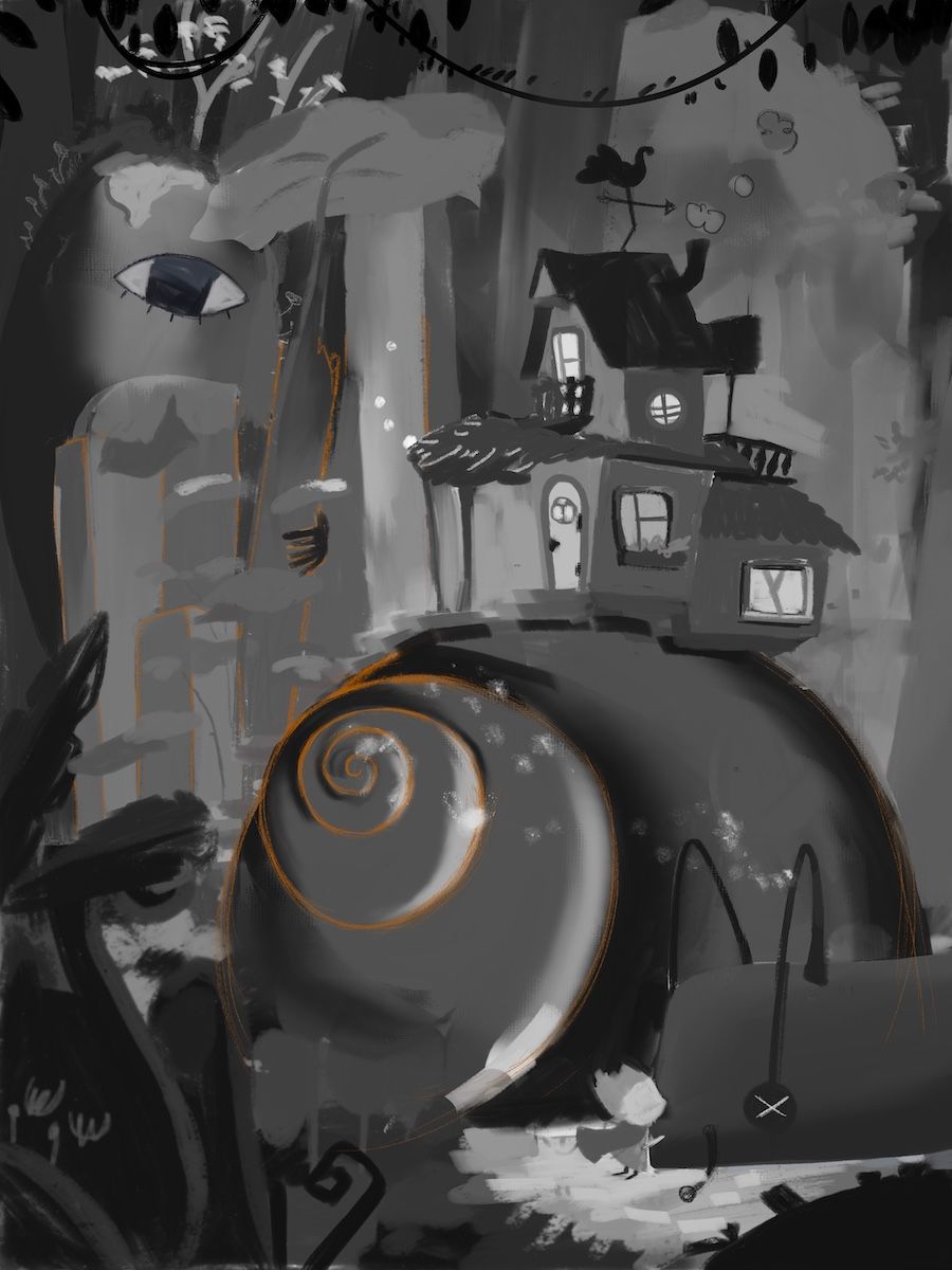
                      So I've combined my initial concepts from the thumbnails in this rough — Kamari could be interpreted to be either the snail or the person farewelling the snail.

                      The snail's spirit is being welcomed by a "Shinigami", a supernatural spirit that invites humans (or in this case a snail) toward death.

                      The human (now very tiny), is saying farewell to the snail and will be dressed with travel gear and rucksack because they are also leaving their home behind.

                      The reason I changed it up is because I thought the new beginning wasn't very clear in the last rough. As stand-alone pieces I'm not sure either is better than the other. As entries into Critique Arena I think the second rough is better but I could be wrong.

                      What do you think?

                      Kamari Rough 3-internet.jpeg

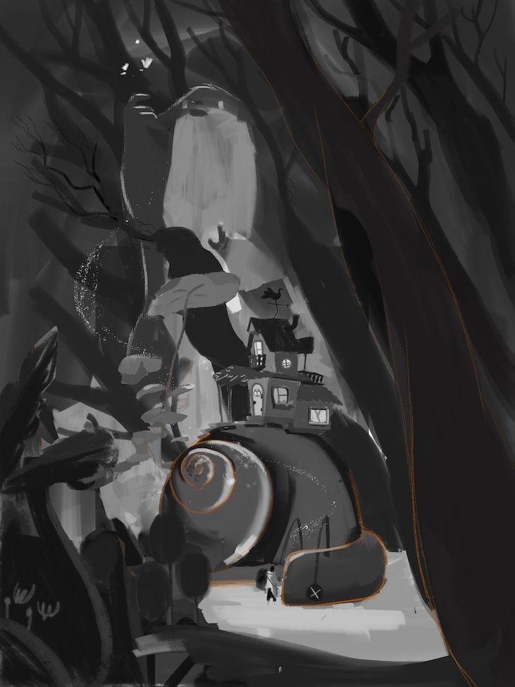
                      And if it helps, here they are side by side:

                      Untitled_Artwork 106.jpg

                      the site: katherinetyson.com
                      instagram: instagram.com/katherinetysonart

                      kirsten-mcg Griffin McPherson 2 Replies Last reply Reply Quote 1
                      • Katherine
                        Katherine last edited by

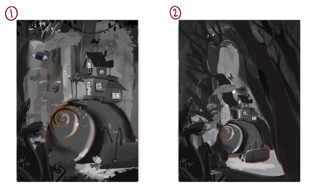
                        So I've just realised I can simplify the illustration and illustrate the dead snail and the character with a rucksack on his back saying goodby to the snail and that covers both the end and the beginning!!! mind-blown. Why am I so slow... hahaha. The question is should I go with one of the other 2 roughs anyway because they're a bit more visually interesting or stick with the simpler illustration?

                        the site: katherinetyson.com
                        instagram: instagram.com/katherinetysonart

                        MarcRobinson 1 Reply Last reply Reply Quote 1
                        • MarcRobinson
                          MarcRobinson @Katherine last edited by

                          @Katherine I really like the framing effect of the second composition, but I hear that simplifying the image is usually the way to go. Sorry that's not much help ha.

                          1 Reply Last reply Reply Quote 0
                          • kirsten-mcg
                            kirsten-mcg @Katherine last edited by

                            @Katherine I really like the composition of your roughs. I'm more drawn to the first one because the character is larger and easier to see. That said, it might be better to go with your simpler idea. Complex stories can be hard to get across with only pictures! I think that's why this prompt is so hard. 😖

                            Instagram: https://www.instagram.com/kirsten.mcgonigal.art/
                            Portfolio Site: www.kirstenmcgonigalart.com

                            1 Reply Last reply Reply Quote 0
                            • Griffin McPherson
                              Griffin McPherson @Katherine last edited by

                              @Katherine I really like how the 2nd option looks but I don’t think the whole new beginning concept is clear. I wish I had something more helpful to offer but I’m not sure how this could be clarified without making a very different image. I really do like it on it’s own though. I’m looking forward to whatever you come up with!

                              1 Reply Last reply Reply Quote 0
                              • Katherine
                                Katherine last edited by

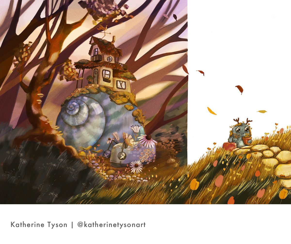
                                Hi folks, thank you to everyone for your help on this one! I ended up going with the simplest version of my concept. It turned out incredibly different to the roughs I shared with you! At a certain point I realised I'd run out of time to share progress and get critiques and just had to finish it though 😛

                                Did anyone else have immense trouble deciding on the colour palette for this one?! With the 2 conflicting themes I felt like I had to choose between a more gloomy palette and a more hopeful one — I ended up going with the more hopeful palette.

                                katherine-tyson-nov2022.jpg

                                the site: katherinetyson.com
                                instagram: instagram.com/katherinetysonart

                                1 Reply Last reply Reply Quote 2
                                • First post
                                  Last post