Critique on Glow that's not Top 16 Material Please!
-
Hi @Katherine, I really like your piece; but you’re right - The sweet 16 are top notch! I submitted 2; neither made it (whomp-whomp) lol
I’m not sure why yours didn’t make it, but perhaps it’s because they didn’t think it was “glowy” enough.
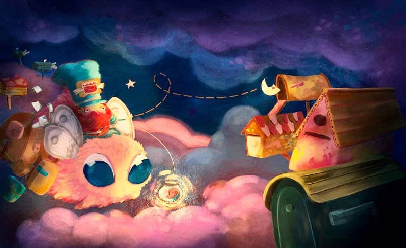
I did a quick paint over with more glow for consideration.

-
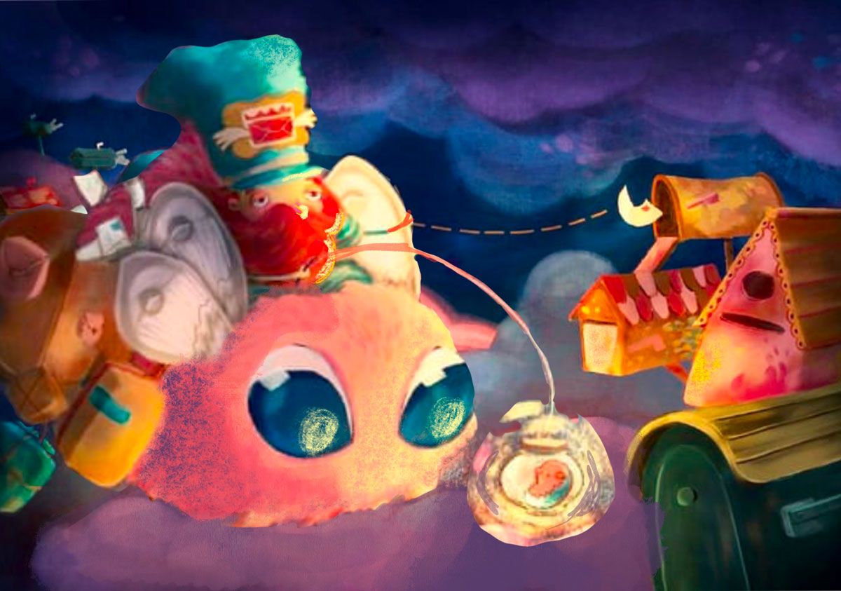
@Katherine I really like how whimsical the illustration is and the concept. I agree with @Jeremy-Ross that there isn't a glow. I did a quick draw-over too (from Jeremy's draw-over). I think everything is the same size in your illustration, so I enlarged the characters so there is something big, medium, and small. It also felt like you had a big empty space in the middle of your composition, so making the characters larger helps with that. I didn't use a brush that fit with your style, but I did try to add highlights and shading to some area to emphasize or de-emphasize things. I really think that this is a great idea.
-
@Katherine I had to miss critique arena and only saw a few minutes of initial thoughts so far on YouTube, so I don’t have all of the feedback context, but I’m guessing the glow may have been deemed too light.
Looking at it again, I’m noticing the driver now. I don’t think I saw him before. The eyes of the flyer are so cute that I missed that part of the story before.
Yes, he’s sandwiched into wings and has red, but my eyes get pulled to the big eyes just below. Maybe if his pose was more dynamic.
Maybe a little more could be added to the story if the driver flew his route using the glow ball hanging from the stick, but now he’s struggling because a firefly has caught his flyer’s attention and there’s a hint of wrangler to what the driver’s having to do.
That might add even more life to the image in this fun, imaginative world. Humor, too. More of a unique “Then one day” moment than an everyday moment.
The illustration is fun and gorgeous. Maybe something like that would help push it.
-
@Jeremy-Ross I completely agree that it wasn't glowy enough, Jeremy! I was way too stingy with the darks so the lights didn't pop.
-
@Kim-Rosenlof I would desperately love to see this draw-over Kim!!! I always secretly hope for draw-overs when I submit to the forum

RE everything being the same size — that's interesting because I was trying to be very conscious of that — I wonder if it's because the individual things overlapping read as one thing and when the letterboxes on the right are combined into one group and the moth/rider/parcels on the left are combined into one group those two clusters are of equal size — is that what you're seeing?
The empty centre is because I was trying to avoid the gutter but perhaps design-wise it would look better having some unimportant elements spanning the "pages", like a letterbox.
-
@KevinTreaccar Thank you for the feedback, Kevin! It's always so interesting hearing what people do and don't see when they look at your work with fresh eyes! I'm going to spend one more day re-working this illustration, which won't be enough time to incorporate your feedback because it would require a complete re-do but I do appreciate the insights. I always figure even if I don't incorporate feedback for the piece at hand I can always take it forward to the next piece, so I still appreciate it!
-
@Katherine Totally understand. As I said, the piece is good. Just ideas to push it – and maybe the thoughts help down the road on another project. Plenty of times I can’t use feedback in the short term but it helps on another project.
-
Hi Katherine, i have just few ideas for light and color in your picture. (i also agree with the objects/shapes organisation/sizing, that others already mentioned)
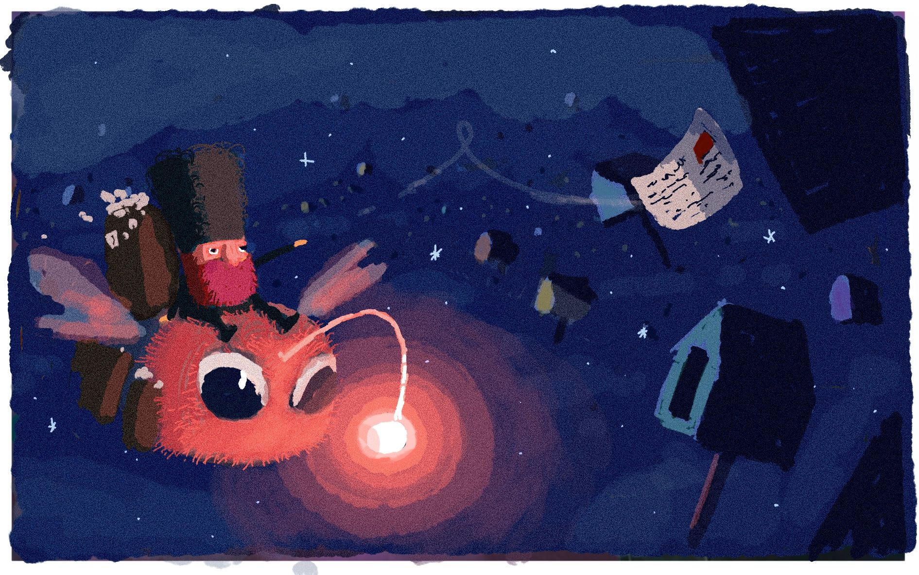
If still having "glow" as the theme, you could make the light of the creature the main direkt light source and the rest be lit by just moon light/ blue sky. It could overall better divide the light and dark values/colors, direkt focus on important objects and show the effect of the glowing light clearer ( and maybe feel it more magical?)
I did a scribble over your picture ( and yes its is a completely different picture, that i scribbled) just to show what i meant about the colors. Hope you dont mind.
-
@Katherine Whoops! I completely forgot to upload the image
 .
.
And yes, for me the mailboxes read as a group and the left side seemed like a group.
-
@Kim-Rosenlof I think that @marek-halko has a great solution. It is better than my draw-over
 .
. -
@marek-halko Marek, I've been meaning to reply to this for so long but I've been so focused on getting my Kamari illustration finished! Marek this draw-over is incredible and I feel like you've solved every problem. I'm going to do a huge re-do on this illustration

-
@Katherine Cool! Happy you found it helpful
 ️!
️!